The title of your poster goes here keep

- Slides: 1

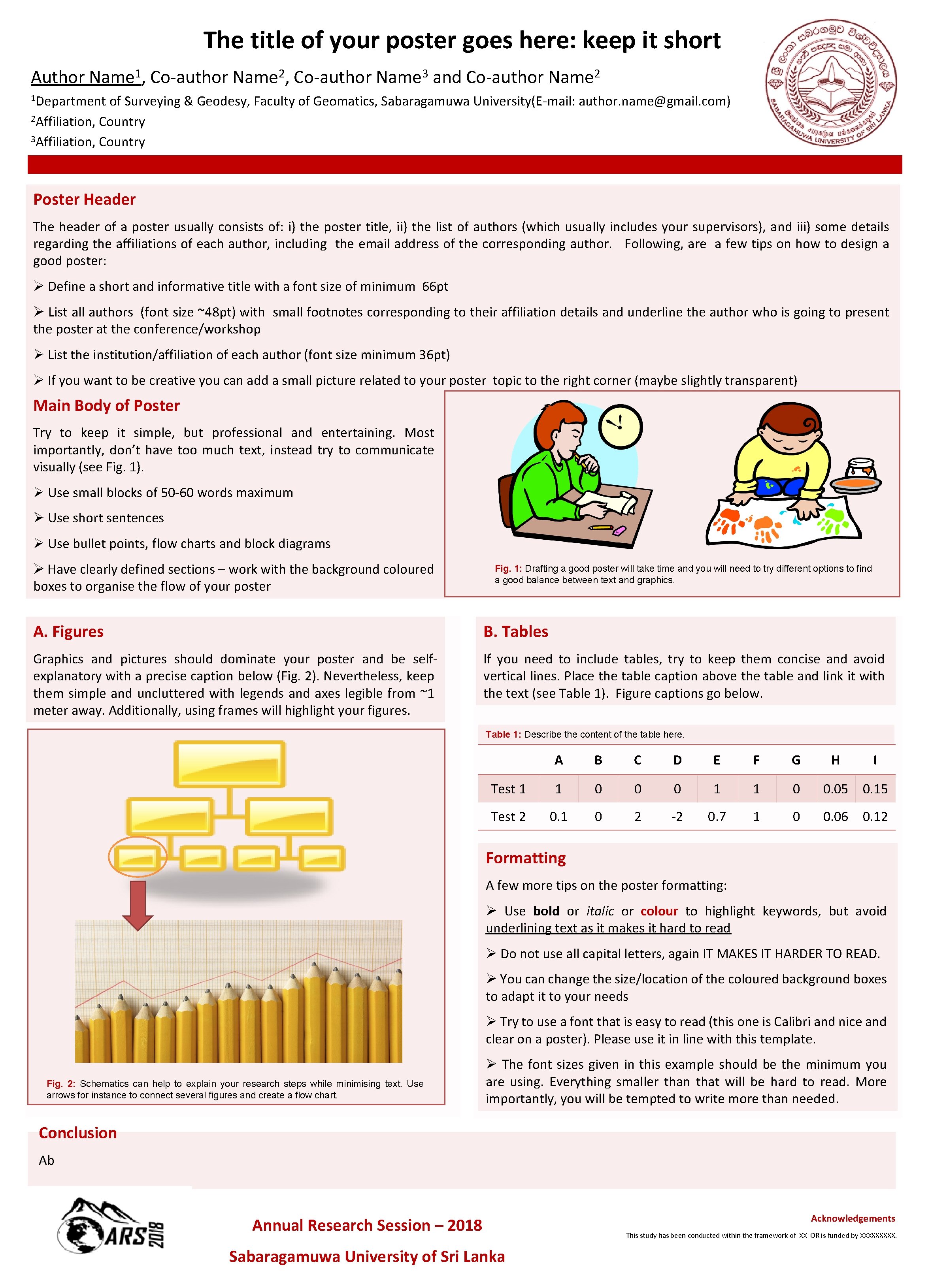
The title of your poster goes here: keep it short Author 1 Name , Co-author 2 Name , Co-author 3 Name and Co-author 2 Name 1 Department of Surveying & Geodesy, Faculty of Geomatics, Sabaragamuwa University(E-mail: author. name@gmail. com) 2 Affiliation, Country 3 Affiliation, Country Poster Header The header of a poster usually consists of: i) the poster title, ii) the list of authors (which usually includes your supervisors), and iii) some details regarding the affiliations of each author, including the email address of the corresponding author. Following, are a few tips on how to design a good poster: Ø Define a short and informative title with a font size of minimum 66 pt Ø List all authors (font size ~48 pt) with small footnotes corresponding to their affiliation details and underline the author who is going to present the poster at the conference/workshop Ø List the institution/affiliation of each author (font size minimum 36 pt) Ø If you want to be creative you can add a small picture related to your poster topic to the right corner (maybe slightly transparent) Main Body of Poster Try to keep it simple, but professional and entertaining. Most importantly, don’t have too much text, instead try to communicate visually (see Fig. 1). Ø Use small blocks of 50 -60 words maximum Ø Use short sentences Ø Use bullet points, flow charts and block diagrams Ø Have clearly defined sections – work with the background coloured boxes to organise the flow of your poster Fig. 1: Drafting a good poster will take time and you will need to try different options to find a good balance between text and graphics. A. Figures B. Tables Graphics and pictures should dominate your poster and be selfexplanatory with a precise caption below (Fig. 2). Nevertheless, keep them simple and uncluttered with legends and axes legible from ~1 meter away. Additionally, using frames will highlight your figures. If you need to include tables, try to keep them concise and avoid vertical lines. Place the table caption above the table and link it with the text (see Table 1). Figure captions go below. Table 1: Describe the content of the table here. A B C D E F G H I Test 1 1 0 0 0 1 1 0 0. 05 0. 15 Test 2 0. 1 0 2 -2 0. 7 1 0 0. 06 0. 12 Formatting A few more tips on the poster formatting: Ø Use bold or italic or colour to highlight keywords, but avoid underlining text as it makes it hard to read Ø Do not use all capital letters, again IT MAKES IT HARDER TO READ. Ø You can change the size/location of the coloured background boxes to adapt it to your needs Ø Try to use a font that is easy to read (this one is Calibri and nice and clear on a poster). Please use it in line with this template. Fig. 2: Schematics can help to explain your research steps while minimising text. Use arrows for instance to connect several figures and create a flow chart. Ø The font sizes given in this example should be the minimum you are using. Everything smaller than that will be hard to read. More importantly, you will be tempted to write more than needed. Conclusion Ab Annual Research Session – 2018 Sabaragamuwa University of Sri Lanka Acknowledgements This study has been conducted within the framework of XX OR is funded by XXXXX.