The Peters vs Mercator Map Projection The Peters



- Slides: 33

The Peters vs Mercator Map Projection

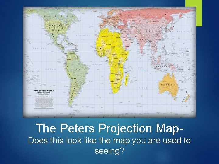
The Peters Projection Map. Does this look like the map you are used to seeing?

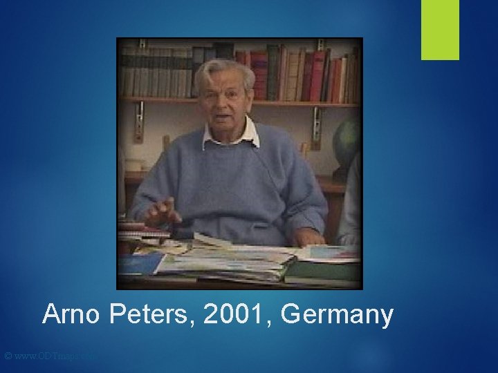
Arno Peters, 2001, Germany © www. ODTmaps. com

Dr. Arno Peters was working on a history of the world in 1950. He was frustrated to discover that most maps in use at the time did not represent country sizes accurately.

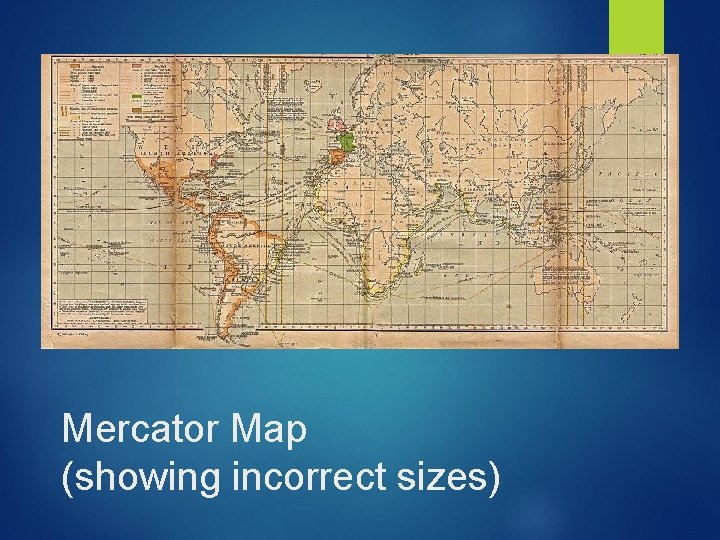
Mercator Map (showing incorrect sizes)

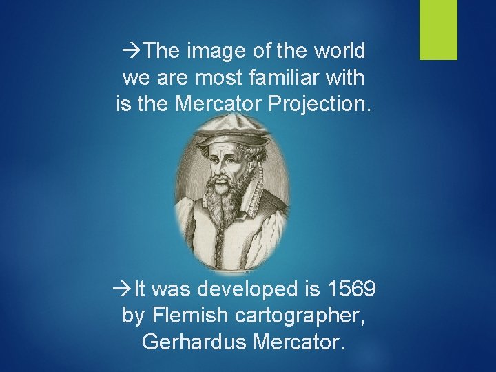
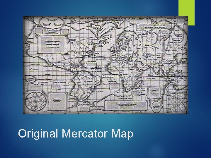
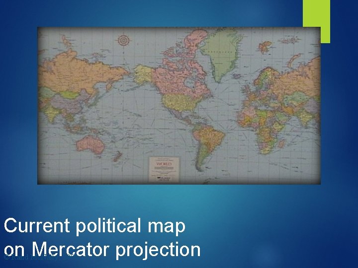
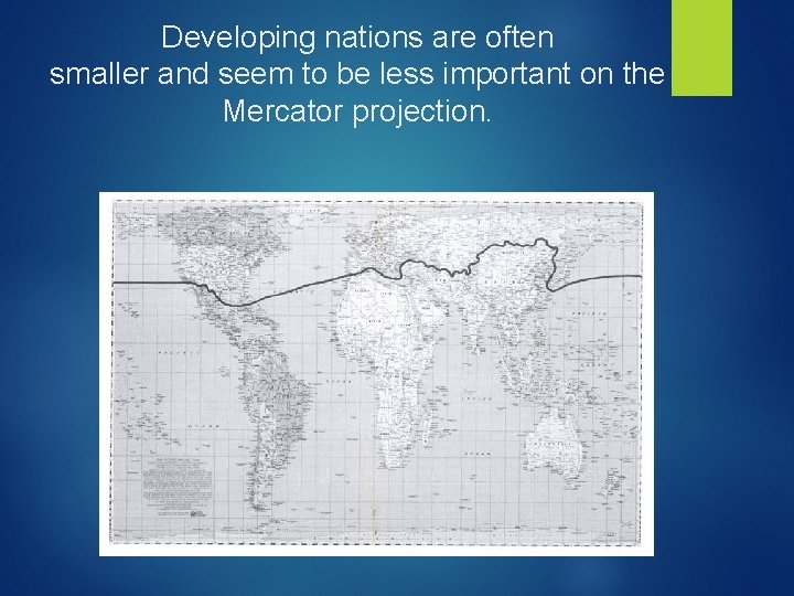
The image of the world we are most familiar with is the Mercator Projection. It was developed is 1569 by Flemish cartographer, Gerhardus Mercator.

Original Mercator Map

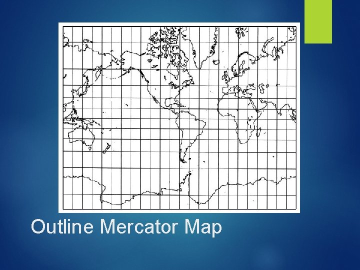
Outline Mercator Map

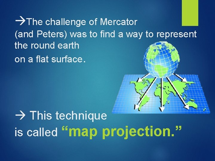
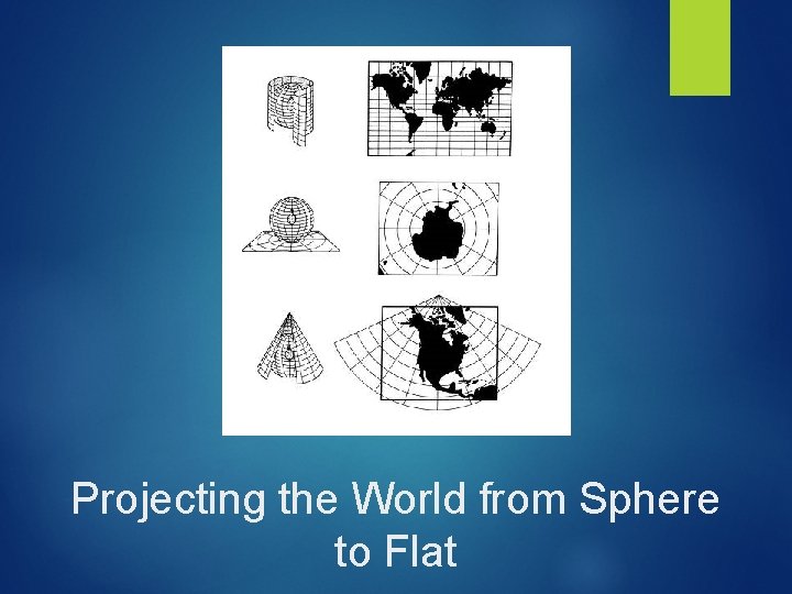
The challenge of Mercator (and Peters) was to find a way to represent the round earth on a flat surface. This technique is called “map projection. ”

Projecting the World from Sphere to Flat

Mercator's map projection was intended to help with navigation (moving around the earth, usually by boat)

Current political map on Mercator projection © Rand Mc. Nally, 2001

Unfortunately, the widespread popularity of Mercator's image introduces some false ideas about the world we live in.

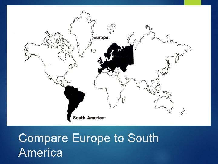
Compare Europe to South America

Europe dominated the Mercator image. Can you guess which land mass is larger? Europe or South America?

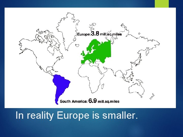
In reality Europe is smaller.

South America is almost double the size of Europe. The size distortions of the Mercator contribute to some very misleading ideas about how the world “looks. ”

Here’s another example…

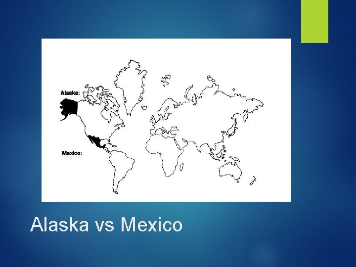
Which is bigger… Alaska or Mexico?

Alaska vs Mexico

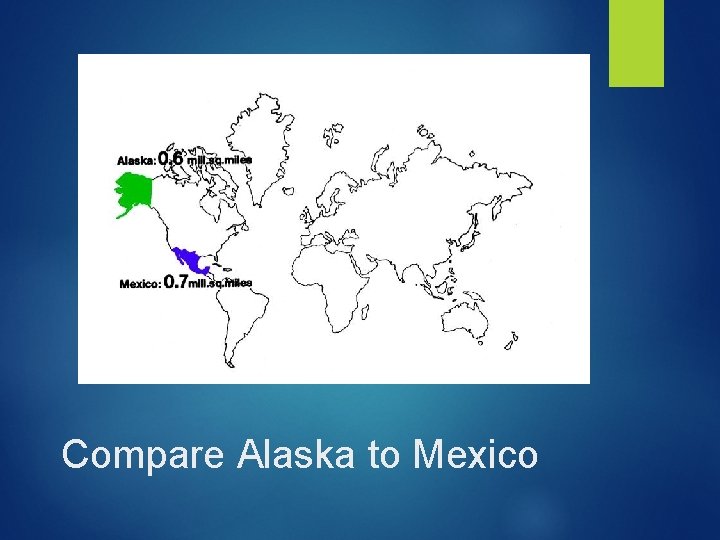
Alaska looks a lot bigger, but…

Compare Alaska to Mexico

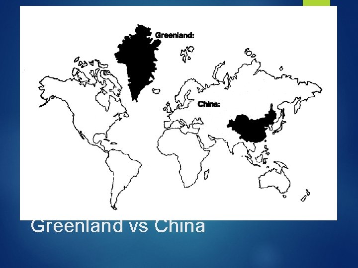
Another example: Greenland vs. China

Greenland vs China

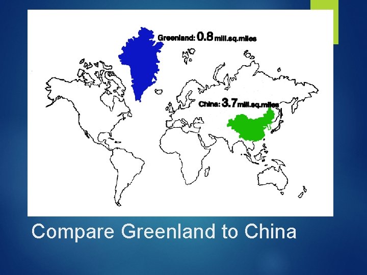
China is over four times as large.

Compare Greenland to China

Developing nations are often smaller and seem to be less important on the Mercator projection.

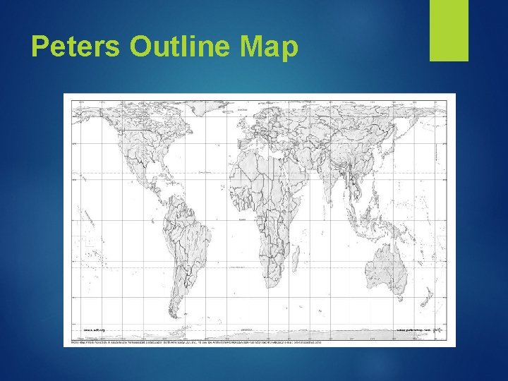
This is why… -In 1974, Peters introduced a map that represented all countries at true size and true proportion.

Peters Outline Map

Peters felt it was time to move beyond an image of the world that was created by those who HAVE POWER He was concerned with world poverty and the unfairness between the developed nations and the developing nations.

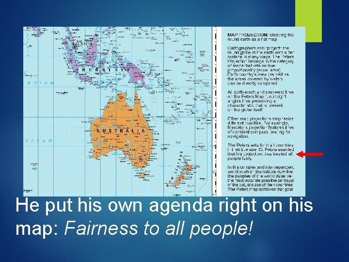
He put his own agenda right on his map: Fairness to all people!

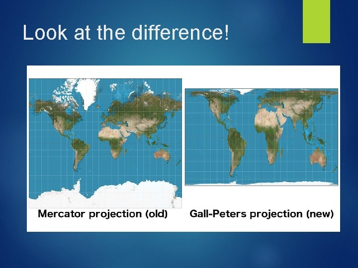
Look at the difference!

What does this say about social justice?