The PC Insurance Industry and the U S





- Slides: 47

The P/C Insurance Industry and the U. S. Economy: Issues & Outlook Midwest Actuarial Forum Fall Meeting Bloomington, IL September 16, 2016 Steven N. Weisbart, Ph. D. , CLU, Senior Vice President & Chief Economist Insurance Information Institute 110 William Street New York, NY 10038 Tel: 212. 346. 5540 Cell: 917. 494. 5945 stevenw@iii. org www. iii. org

First, the Good News about the P/C Insurance Industry: 2013 -15 Were Three Good Years in a Row 2016 Could Be the Fourth 2

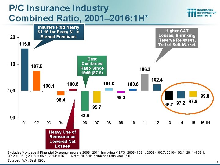
P/C Insurance Industry Combined Ratio, 2001– 2016: 1 H* Insurers Paid Nearly $1. 16 for Every $1 in Earned Premiums Higher CAT Losses, Shrinking Reserve Releases, Toll of Soft Market Best Combined Ratio Since 1949 (87. 6) Heavy Use of Reinsurance Lowered Net Losses Excludes Mortgage & Financial Guaranty insurers 2008 --2014. Including M&FG, 2008=105. 1, 2009=100. 7, 2010=102. 4, 2011=108. 1; 2012: =103. 2; 2013: = 96. 1; 2014: = 97. 0. Note: 2015: 1 H combined ratio was 97. 6 Sources: A. M. Best, ISO. 3

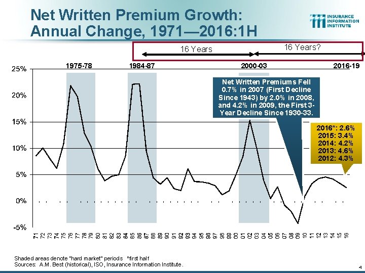
Net Written Premium Growth: Annual Change, 1971— 2016: 1 H 16 Years? 16 Years 1975 -78 1984 -87 2000 -03 2016 -19 Net Written Premiums Fell 0. 7% in 2007 (First Decline Since 1943) by 2. 0% in 2008, and 4. 2% in 2009, the First 3 Year Decline Since 1930 -33. 2016*: 2. 6% 2015: 3. 4% 2014: 4. 2% 2013: 4. 6% 2012: 4. 3% Shaded areas denote “hard market” periods *first half Sources: A. M. Best (historical), ISO, Insurance Information Institute. 4

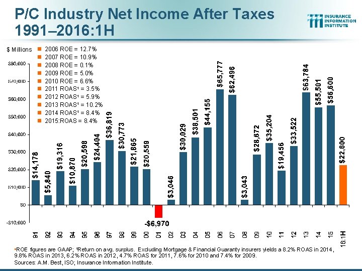
P/C Industry Net Income After Taxes 1991– 2016: 1 H $ Millions n n n n n 2006 ROE = 12. 7% 2007 ROE = 10. 9% 2008 ROE = 0. 1% 2009 ROE = 5. 0% 2010 ROE = 6. 6% 2011 ROAS 1 = 3. 5% 2012 ROAS 1 = 5. 9% 2013 ROAS 1 = 10. 2% 2014 ROAS 1 = 8. 4% 2015: ROAS = 8. 4% • ROE figures are GAAP; 1 Return on avg. surplus. Excluding Mortgage & Financial Guaranty insurers yields a 8. 2% ROAS in 2014, 9. 8% ROAS in 2013, 6. 2% ROAS in 2012, 4. 7% ROAS for 2011, 7. 6% for 2010 and 7. 4% for 2009. Sources: A. M. Best, ISO; Insurance Information Institute.

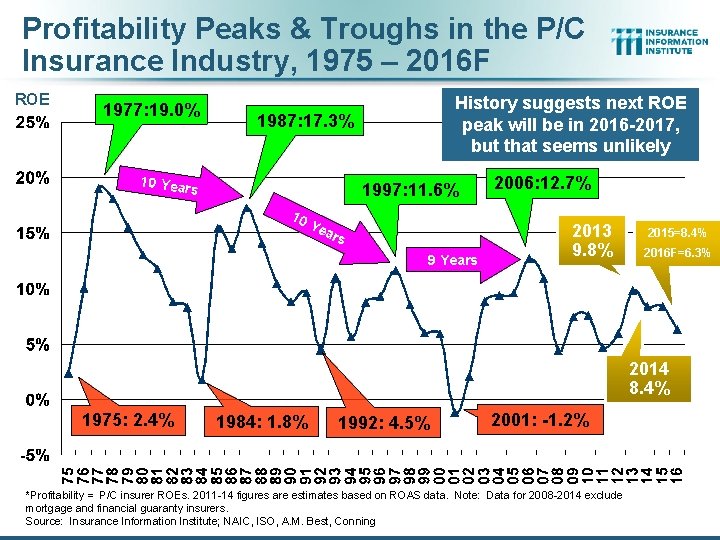
Profitability Peaks & Troughs in the P/C Insurance Industry, 1975 – 2016 F ROE 1977: 19. 0% History suggests next ROE peak will be in 2016 -2017, but that seems unlikely 1987: 17. 3% 10 Year s 1997: 11. 6% 10 Ye ars 9 Years 2006: 12. 7% 2013 9. 8% 2015=8. 4% 2016 F=6. 3% 2014 8. 4% 1975: 2. 4% 1984: 1. 8% 1992: 4. 5% 2001: -1. 2% *Profitability = P/C insurer ROEs. 2011 -14 figures are estimates based on ROAS data. Note: Data for 2008 -2014 exclude mortgage and financial guaranty insurers. Source: Insurance Information Institute; NAIC, ISO, A. M. Best, Conning

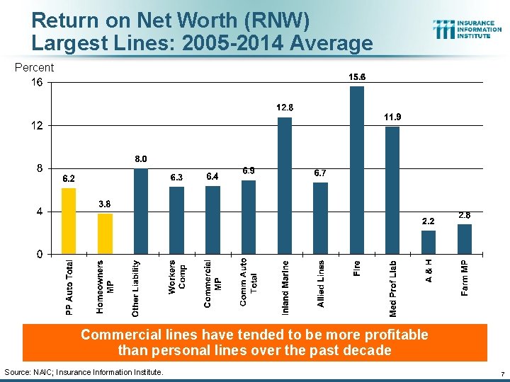
Return on Net Worth (RNW) Largest Lines: 2005 -2014 Average Percent Commercial lines have tended to be more profitable than personal lines over the past decade Source: NAIC; Insurance Information Institute. 7

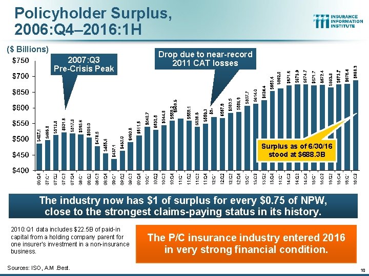
Policyholder Surplus, 2006: Q 4– 2016: 1 H ($ Billions) 2007: Q 3 Pre-Crisis Peak Drop due to near-record 2011 CAT losses Surplus as of 6/30/16 stood at $688. 3 B The industry now has $1 of surplus for every $0. 75 of NPW, close to the strongest claims-paying status in its history. 2010: Q 1 data includes $22. 5 B of paid-in capital from a holding company parent for one insurer’s investment in a non-insurance business. Sources: ISO, A. M. Best. The P/C insurance industry entered 2016 in very strong financial condition. 10

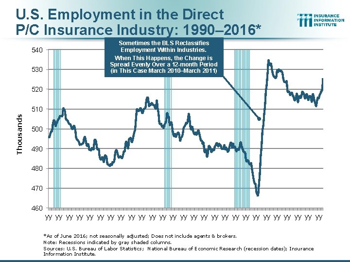
U. S. Employment in the Direct P/C Insurance Industry: 1990– 2016* 540 530 Sometimes the BLS Reclassifies Employment Within Industries. When This Happens, the Change is Spread Evenly Over a 12 -month Period (in This Case March 2010–March 2011) 520 Thousands 510 500 490 480 470 460 yy yy yy yy yy yy yy *As of June 2016; not seasonally adjusted; Does not include agents & brokers. Note: Recessions indicated by gray shaded columns. Sources: U. S. Bureau of Labor Statistics; National Bureau of Economic Research (recession dates); Insurance Information Institute.

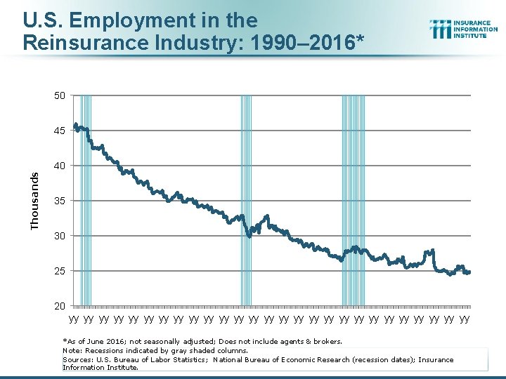
U. S. Employment in the Reinsurance Industry: 1990– 2016* 50 45 Thousands 40 35 30 25 20 yy yy yy yy yy yy yy *As of June 2016; not seasonally adjusted; Does not include agents & brokers. Note: Recessions indicated by gray shaded columns. Sources: U. S. Bureau of Labor Statistics; National Bureau of Economic Research (recession dates); Insurance Information Institute.

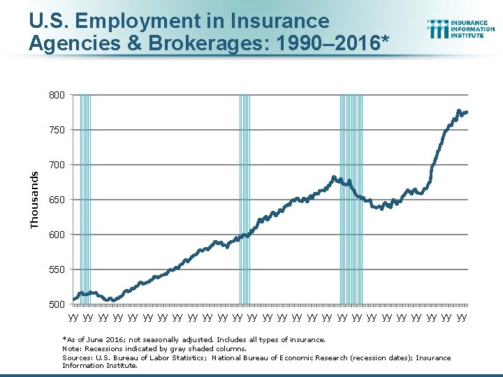
U. S. Employment in Insurance Agencies & Brokerages: 1990– 2016* 800 750 Thousands 700 650 600 550 500 yy yy yy yy yy yy yy *As of June 2016; not seasonally adjusted. Includes all types of insurance. Note: Recessions indicated by gray shaded columns. Sources: U. S. Bureau of Labor Statistics; National Bureau of Economic Research (recession dates); Insurance Information Institute.

Investment Performance: A Key Driver of Profitability Depressed Yields Will Continue to Affect Underwriting & Pricing 14

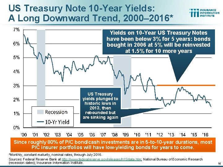
US Treasury Note 10 -Year Yields: A Long Downward Trend, 2000– 2016* Yields on 10 -Year US Treasury Notes have been below 3% for 5 years: bonds bought in 2006 at 5% will be reinvested at 1. 5% for 10 more years US Treasury yields plunged to historic lows in 2013, then rebounded but are sinking again Since roughly 80% of P/C bond/cash investments are in 5 -to-10 -year durations, most P/C insurer portfolios will have low-yielding bonds for years to come. *Monthly, constant maturity, nominal rates, through July 2016. Sources: Federal Reserve Bank at http: //www. federalreserve. gov/releases/h 15/data. htm; National Bureau of Economic Research (recession dates); Insurance Information Institute. 15

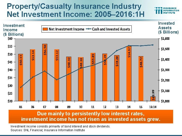
Property/Casualty Insurance Industry Net Investment Income: 2005– 2016: 1 H Investment Income ($ Billions) Invested Assets ($ Billions) Due mainly to persistently low interest rates, investment income has not risen as invested assets grew. Investment income consists primarily of bond interest and stock dividends. Sources: SNL Financial; Insurance Information Institute

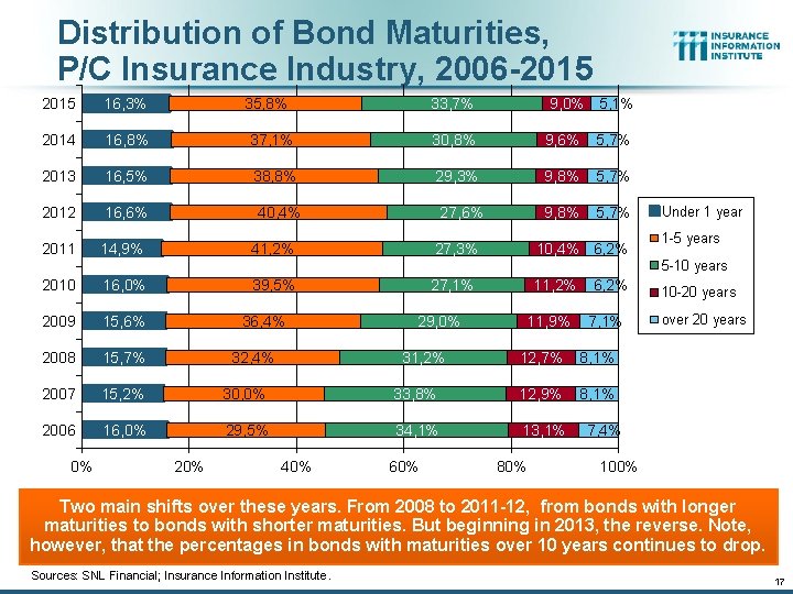
Distribution of Bond Maturities, P/C Insurance Industry, 2006 -2015 16, 3% 33, 7% 2014 16, 8% 37, 1% 30, 8% 9, 6% 5, 7% 2013 16, 5% 38, 8% 29, 3% 9, 8% 5, 7% 2012 16, 6% 27, 6% 9, 8% 5, 7% 2011 14, 9% 35, 8% 40, 4% 9, 0% 5, 1% 27, 3% 41, 2% 10, 4% 6, 2% Under 1 year 1 -5 years 5 -10 years 2010 16, 0% 2009 15, 6% 2008 15, 7% 2007 15, 2% 30, 0% 2006 16, 0% 29, 5% 0% 27, 1% 39, 5% 36, 4% 20% 29, 0% 31, 2% 32, 4% 40% 11, 2% 11, 9% 6, 2% 7, 1% 12, 7% 8, 1% 33, 8% 12, 9% 8, 1% 34, 1% 13, 1% 60% 80% 10 -20 years over 20 years 7, 4% 100% Two main shifts over these years. From 2008 to 2011 -12, from bonds with longer maturities to bonds with shorter maturities. But beginning in 2013, the reverse. Note, however, that the percentages in bonds with maturities over 10 years continues to drop. Sources: SNL Financial; Insurance Information Institute. 17

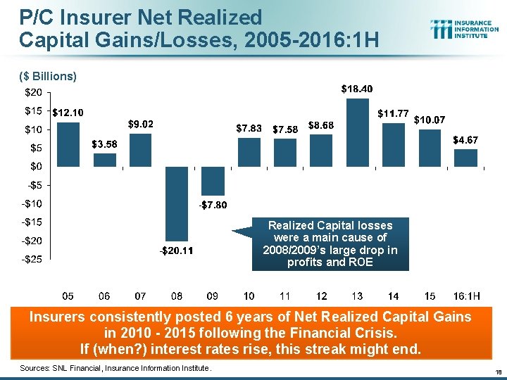
P/C Insurer Net Realized Capital Gains/Losses, 2005 -2016: 1 H ($ Billions) Realized Capital losses were a main cause of 2008/2009’s large drop in profits and ROE Insurers consistently posted 6 years of Net Realized Capital Gains in 2010 - 2015 following the Financial Crisis. If (when? ) interest rates rise, this streak might end. Sources: SNL Financial, Insurance Information Institute. 18

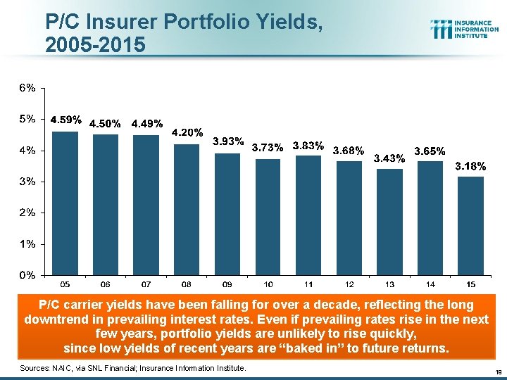
P/C Insurer Portfolio Yields, 2005 -2015 P/C carrier yields have been falling for over a decade, reflecting the long downtrend in prevailing interest rates. Even if prevailing rates rise in the next few years, portfolio yields are unlikely to rise quickly, since low yields of recent years are “baked in” to future returns. Sources: NAIC, via SNL Financial; Insurance Information Institute. 19

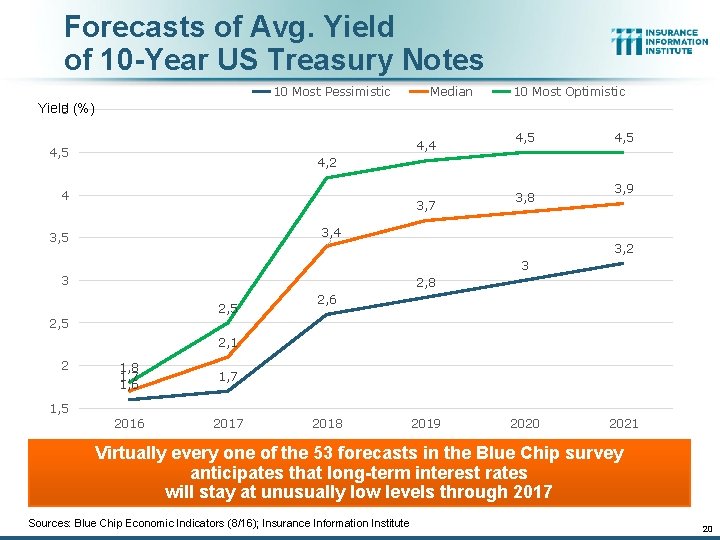
Forecasts of Avg. Yield of 10 -Year US Treasury Notes 10 Most Pessimistic Median 10 Most Optimistic Yield 5 (%) 4, 4 4, 5 4, 2 4 3, 7 3, 8 3, 9 3, 4 3, 5 3, 2 3 3 2, 8 2, 5 2, 6 2, 5 2, 1 2 1, 8 1, 7 1, 6 1, 7 2016 2017 1, 5 2018 2019 2020 2021 Virtually every one of the 53 forecasts in the Blue Chip survey anticipates that long-term interest rates will stay at unusually low levels through 2017 Sources: Blue Chip Economic Indicators (8/16); Insurance Information Institute 20

The Strength of the Economy Will Influence P/C Insurer Growth Opportunities Growth, Although Weak, Will Expand Insurer Exposure Base Across Most Lines 21

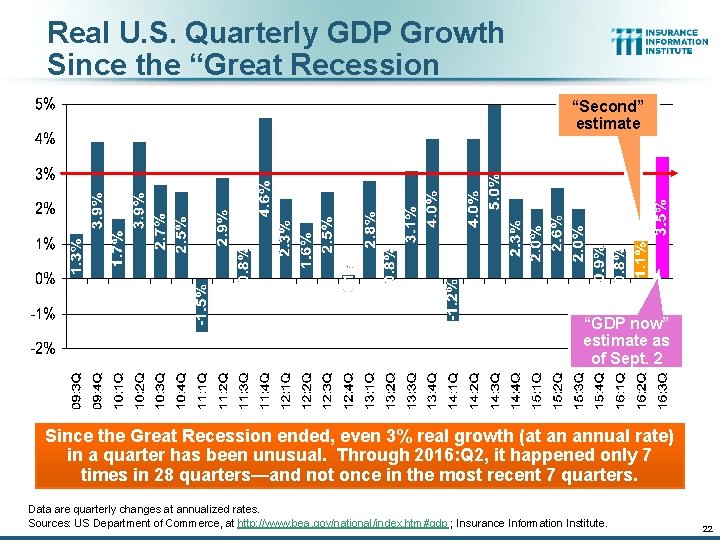
Real U. S. Quarterly GDP Growth Since the “Great Recession “Second” estimate “GDP now” estimate as of Sept. 2 Since the Great Recession ended, even 3% real growth (at an annual rate) in a quarter has been unusual. Through 2016: Q 2, it happened only 7 times in 28 quarters—and not once in the most recent 7 quarters. Data are quarterly changes at annualized rates. Sources: US Department of Commerce, at http: //www. bea. gov/national/index. htm#gdp ; Insurance Information Institute. 22

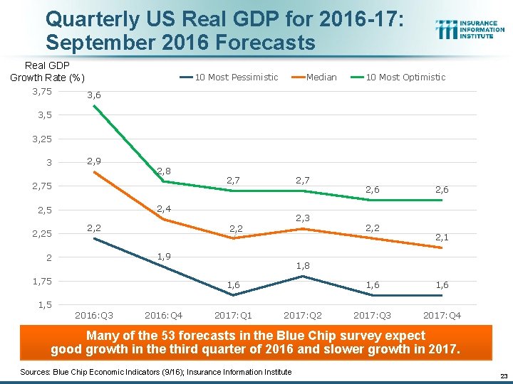
Quarterly US Real GDP for 2016 -17: September 2016 Forecasts Real GDP Growth Rate (%) 3, 75 10 Most Pessimistic Median 10 Most Optimistic 3, 6 3, 5 3, 25 3 2, 9 2, 8 2, 75 2, 7 2, 4 2, 5 2, 25 2, 7 2, 2 2, 3 2, 2 1, 9 2 1, 75 2, 6 2, 2 2, 6 2, 1 1, 8 1, 6 2017: Q 3 2017: Q 4 1, 5 2016: Q 3 2016: Q 4 2017: Q 1 2017: Q 2 Many of the 53 forecasts in the Blue Chip survey expect good growth in the third quarter of 2016 and slower growth in 2017. Sources: Blue Chip Economic Indicators (9/16); Insurance Information Institute 23

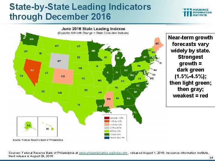
State-by-State Leading Indicators through December 2016 Near-term growth forecasts vary widely by state. Strongest growth = dark green (1. 5%-4. 5%); then light green; then gray; weakest = red Sources: Federal Reserve Bank of Philadelphia at www. philadelphiafed. org/index. cfm , released August 1, 2016; Insurance Information Institute. Next release is August 29, 2016 24

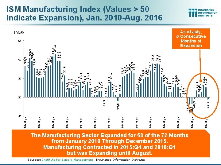
45 Sources: Institute for Supply Management; Insurance Information Institute. The Manufacturing Sector Expanded for 68 of the 72 Months from January 2010 Through December 2015. Manufacturing Contracted in 2015: Q 4 and 2016: Q 1 but was Expanding until August. MMM yy 49, 4 55, 7 56, 2 56, 4 57, 0 56, 5 51, 8 50, 8 51, 3 53, 2 52, 6 55, 5 56, 6 59, 0 58, 7 53, 2 53, 7 54, 9 55, 4 55, 3 57, 1 53, 5 52, 9 51, 5 52, 8 53, 5 52, 7 51, 1 50, 2 50, 1 51, 3 50, 9 53, 1 54, 2 51, 3 50, 7 50, 2 65 MMM yy 48, 6 48, 0 48, 2 49, 5 49, 0 49, 9 Index MMM yy MMM yy 51, 4 52, 5 51, 8 52, 2 53, 1 54, 1 51, 9 53, 3 54, 1 52, 5 50, 2 50, 5 50, 7 51, 6 51, 7 60, 8 61, 4 59, 7 55, 3 55, 1 55, 2 55, 3 56, 9 58, 2 58, 5 54, 2 55, 8 55 MMM yy 60, 4 59, 6 57, 8 58, 3 57, 1 60 MMM yy ISM Manufacturing Index (Values > 50 Indicate Expansion), Jan. 2010 -Aug. 2016 As of July, 5 Consecutive Months of Expansion 50

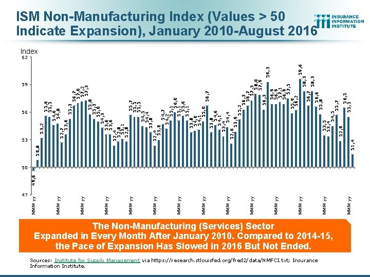
47 Sources: Institute for Supply Management via https: //research. stlouisfed. org/fred 2/data/NMFCI. txt; Insurance Information Institute. The Non-Manufacturing (Services) Sector Expanded in Every Month After January 2010. Compared to 2014 -15, the Pace of Expansion Has Slowed in 2016 But Not Ended. MMM yy MMM yy MMM yy 53, 2 51, 4 53, 5 53, 4 54, 5 55, 7 52, 9 56, 5 55, 5 56, 6 55, 8 56, 7 58, 3 59, 6 59, 3 58, 3 56, 9 57, 1 56, 9 57, 5 55, 9 56, 2 56, 7 57, 0 57, 2 57, 3 55, 8 55, 3 55, 0 54, 3 53, 6 52, 4 52, 8 53, 1 52, 8 55, 7 55, 5 54, 4 53, 8 52, 4 53, 0 54, 7 54, 2 55, 1 56, 0 55, 1 55, 6 55, 1 53, 8 54, 0 54, 1 55, 0 56, 7 53, 8 54, 6 54, 1 53, 4 54, 4 52, 6 53, 9 55, 2 56, 3 56, 7 57, 3 58, 0 57, 9 56, 3 55, 6 55, 5 54, 6 54, 8 52, 7 53, 6 53 MMM yy 50, 8 59 MMM yy 49, 6 56 MMM yy ISM Non-Manufacturing Index (Values > 50 Indicate Expansion), January 2010 -August 2016 Index 62 50

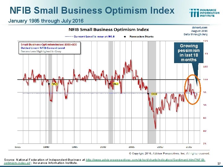
NFIB Small Business Optimism Index January 1985 through July 2016 Growing pessimism in last 18 months Source: National Federation of Independent Business at http: //www. advisorperspectives. com/dshort/charts/indicators/Sentiment. html? NFIBoptimism-index. gif ; Insurance Information Institute. 27

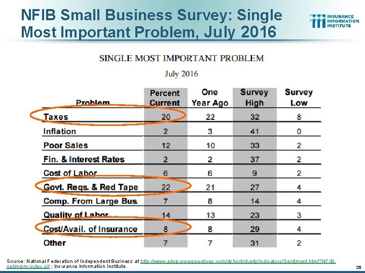
NFIB Small Business Survey: Single Most Important Problem, July 2016 Percent Source: National Federation of Independent Business at http: //www. advisorperspectives. com/dshort/charts/indicators/Sentiment. html? NFIBoptimism-index. gif ; Insurance Information Institute. 28

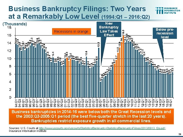
Business Bankruptcy Filings: Two Years at a Remarkably Low Level (1994: Q 1 – 2016: Q 2) (Thousands) Recessions in orange New Bankruptcy Law Takes Effect Below prerecession level Business bankruptcies in 2014 -16 were below both the Great Recession levels and the 2003: Q 3 -2005: Q 1 period (the best five-quarter stretch in the last 20 years). Bankruptcies restrict exposure growth in all commercial lines. Sources: U. S. Courts at http: //www. uscourts. gov/uscourts/Statistics/Bankruptcy. Filings/2013/0913_f 2 q. pdf ; Insurance Information Institute 29

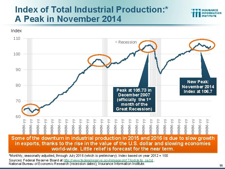
Index of Total Industrial Production: * A Peak in November 2014 Index 110 Recession 100 90 New Peak: November 2014 Index at 106. 7 80 Peak at 105. 73 in December 2007 (officially the 1 st month of the Great Recession) 70 MMM-yy MMM-yy MMM-yy MMM-yy MMM-yy MMM-yy MMM-yy 60 Some of the downturn in industrial production in 2015 and 2016 is due to slow growth in exports, thanks to the rise in the value of the U. S. dollar and slowing economies world-wide. Little relief is forecast for the near term. *Monthly, seasonally adjusted, through July 2016 (which is preliminary). Index based on year 2012 = 100 Sources: Federal Reserve Board at http: //www. federalreserve. gov/releases/g 17/ipdisk/ip_sa. txt. National Bureau of Economic Research (recession dates); Insurance Information Institute. 30

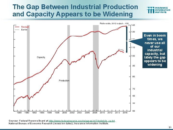
The Gap Between Industrial Production and Capacity Appears to be Widening Even in boom times, we never use all of our industrial capacity, but lately the gap appears to be widening Sources: Federal Reserve Board at http: //www. federalreserve. gov/releases/g 17/ipdisk/ip_sa. txt. National Bureau of Economic Research (recession dates); Insurance Information Institute. 31

Labor Market Trends We’re Now Gaining Jobs at a Good Pace, but We’re Not at “Full Employment” Yet, and There are Signs of Softening 32

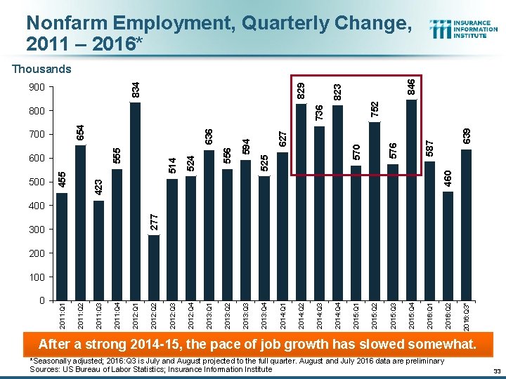
Nonfarm Employment, Quarterly Change, 2011 – 2016* 846 576 587 639 752 570 627 594 460 525 524 2012: Q 4 556 514 423 455 600 2012: Q 3 555 700 636 654 800 500 823 736 900 829 834 Thousands 277 400 300 2016: Q 3* 2016: Q 2 2016: Q 1 2015: Q 4 2015: Q 3 2015: Q 2 2015: Q 1 2014: Q 4 2014: Q 3 2014: Q 2 2014: Q 1 2013: Q 4 2013: Q 3 2013: Q 2 2013: Q 1 2012: Q 2 2012: Q 1 2011: Q 4 2011: Q 3 2011: Q 2 0 2011: Q 1 100 After a strong 2014 -15, the pace of job growth has slowed somewhat. *Seasonally adjusted; 2016: Q 3 is July and August projected to the full quarter. August and July 2016 data are preliminary Sources: US Bureau of Labor Statistics; Insurance Information Institute 33

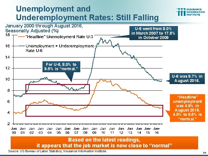
Unemployment and Underemployment Rates: Still Falling January 2000 through August 2016, Seasonally Adjusted (%) U-6 went from 8. 0% in March 2007 to 17. 5% in October 2009 For U-6, 8. 0% to 9. 5% is “normal. ” U-6 was 9. 7% in August 2016. “Headline” unemployment was 4. 9% in August 2016. 4. 5% to 5. 5% is “normal. ” Based on the latest readings, it appears that the job market is now close to “normal” Source: US Bureau of Labor Statistics; Insurance Information Institute. 34

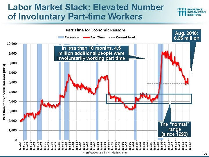
Labor Market Slack: Elevated Number of Involuntary Part-time Workers Aug. 2016: 6. 05 million In less than 18 months, 4. 5 million additional people were involuntarily working part time The “normal” range (since 1992) 35

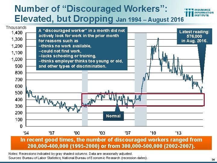
Number of “Discouraged Workers”: Elevated, but Dropping Jan 1994 – August 2016 Thousands A “discouraged worker” in a month did not actively look for work in the prior month for reasons such as --thinks no work available, --could not find work, --lacks schooling or training, --thinks employer thinks too young or old, and other types of discrimination. Latest reading: 576, 000 in Aug. 2016. Normal In recent good times, the number of discouraged workers ranged from 200, 000 -400, 000 (1995 -2000) or from 300, 000 -500, 000 (2002 -2007). Notes: Recessions indicated by gray shaded columns. Data are seasonally adjusted. Sources: Bureau of Labor Statistics; National Bureau of Economic Research (recession dates). 36

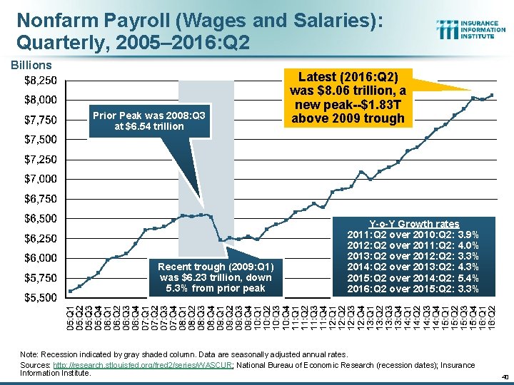
Nonfarm Payroll (Wages and Salaries): Quarterly, 2005– 2016: Q 2 Billions Prior Peak was 2008: Q 3 at $6. 54 trillion Recent trough (2009: Q 1) was $6. 23 trillion, down 5. 3% from prior peak Latest (2016: Q 2) was $8. 06 trillion, a new peak--$1. 83 T above 2009 trough Y-o-Y Growth rates 2011: Q 2 over 2010: Q 2: 3. 9% 2012: Q 2 over 2011: Q 2: 4. 0% 2013: Q 2 over 2012: Q 2: 3. 3% 2014: Q 2 over 2013: Q 2: 4. 3% 2015: Q 2 over 2014: Q 2: 5. 4% 2016: Q 2 over 2015: Q 2: 3. 3% Note: Recession indicated by gray shaded column. Data are seasonally adjusted annual rates. Sources: http: //research. stlouisfed. org/fred 2/series/WASCUR; National Bureau of Economic Research (recession dates); Insurance Information Institute. 40

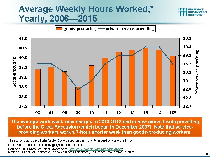
Average Weekly Hours Worked, * Yearly, 2006— 2015 The average work-week rose sharply in 2010 -2012 and is now above levels prevailing before the Great Recession (which began in December 2007). Note that serviceproviding workers work a 7 -hour shorter week than goods-producing workers. *Seasonally adjusted. Data for 2016 are based on Jan-July; June and July are prelimnary Note: Recessions indicated by gray shaded columns. Sources: US Bureau of Labor Statistics at http: //www. bls. gov/data/#employment; National Bureau of Economic Research (recession dates); Insurance Information Institute. 41

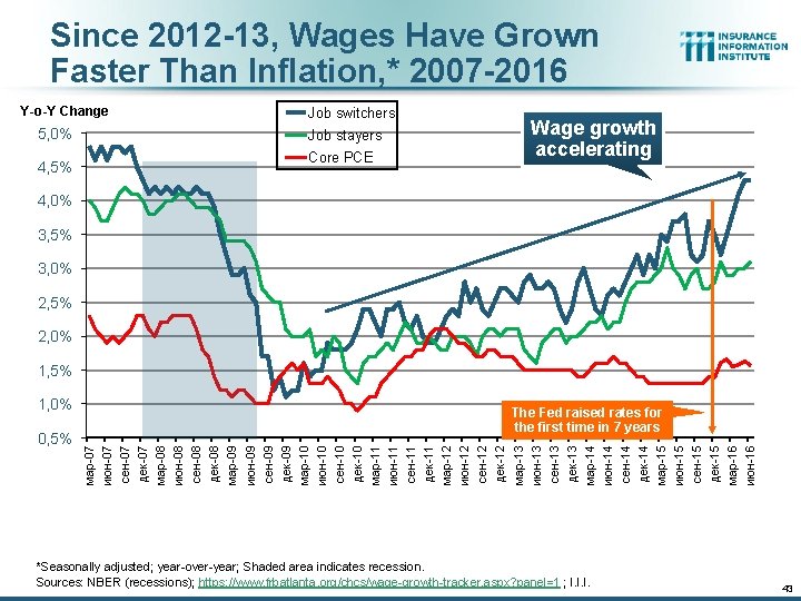
Since 2012 -13, Wages Have Grown Faster Than Inflation, * 2007 -2016 Y-o-Y Change 5, 0% 4, 5% Job switchers Job stayers Core PCE Wage growth accelerating 4, 0% 3, 5% 3, 0% 2, 5% 2, 0% 1, 5% 0, 5% The Fed raised rates for the first time in 7 years мар-07 июн-07 сен-07 дек-07 мар-08 июн-08 сен-08 дек-08 мар-09 июн-09 сен-09 дек-09 мар-10 июн-10 сен-10 дек-10 мар-11 июн-11 сен-11 дек-11 мар-12 июн-12 сен-12 дек-12 мар-13 июн-13 сен-13 дек-13 мар-14 июн-14 сен-14 дек-14 мар-15 июн-15 сен-15 дек-15 мар-16 июн-16 1, 0% *Seasonally adjusted; year-over-year; Shaded area indicates recession. Sources: NBER (recessions); https: //www. frbatlanta. org/chcs/wage-growth-tracker. aspx? panel=1 ; I. I. I. 43

U. S. Insured Catastrophe Loss Update 2014 -15 Had Below-Average CAT Activity 44

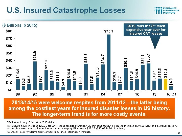
U. S. Insured Catastrophe Losses ($ Billions, $ 2015) 2012 was the 3 rd most expensive year ever for insured CAT losses 2013/14/15 were welcome respites from 2011/12—the latter being among the costliest years for insured disaster losses in US history. The longer-term trend is for more costly events. *Estimate through 3/31/16 in 2015 dollars. Note: 2001 figure includes $20. 3 B for 9/11 losses reported through 12/31/01 ($25. 9 B 2011 dollars). Includes only business and personal property claims, business interruption and auto claims. Non-prop/BI losses = $12. 2 B ($15. 6 B in 2011 dollars. ) Sources: Property Claims Service/ISO; Insurance Information Institute. 45 45

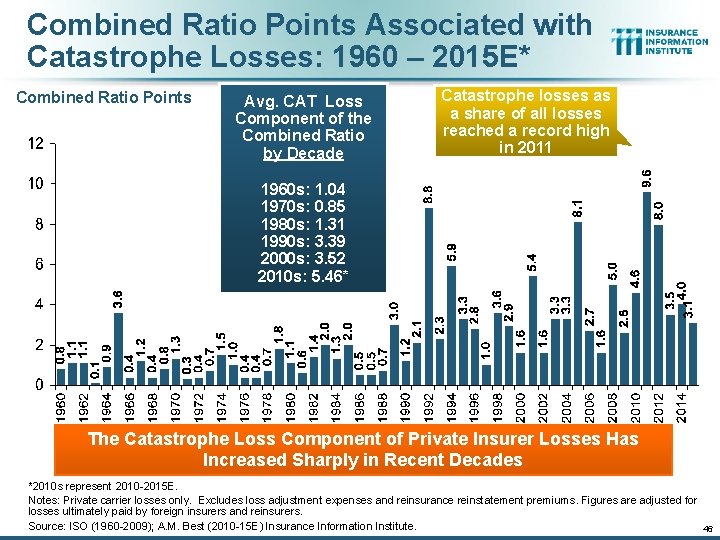
Combined Ratio Points Associated with Catastrophe Losses: 1960 – 2015 E* Combined Ratio Points Avg. CAT Loss Component of the Combined Ratio by Decade Catastrophe losses as a share of all losses reached a record high in 2011 1960 s: 1. 04 1970 s: 0. 85 1980 s: 1. 31 1990 s: 3. 39 2000 s: 3. 52 2010 s: 5. 46* The Catastrophe Loss Component of Private Insurer Losses Has Increased Sharply in Recent Decades *2010 s represent 2010 -2015 E. Notes: Private carrier losses only. Excludes loss adjustment expenses and reinsurance reinstatement premiums. Figures are adjusted for losses ultimately paid by foreign insurers and reinsurers. Source: ISO (1960 -2009); A. M. Best (2010 -15 E) Insurance Information Institute. 46

Inflation Affects P/C Pricing, Reserving, Investing, and Compensation. So What to Watch For? 47

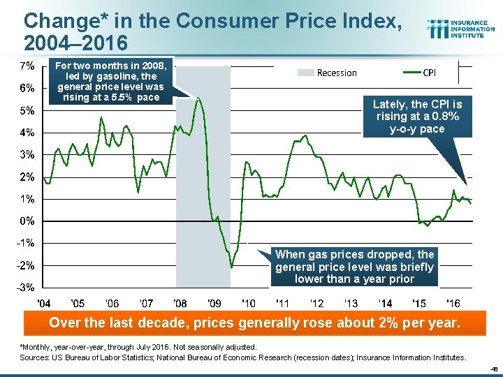
Change* in the Consumer Price Index, 2004– 2016 For two months in 2008, led by gasoline, the general price level was rising at a 5. 5% pace Lately, the CPI is rising at a 0. 8% y-o-y pace When gas prices dropped, the general price level was briefly lower than a year prior Over the last decade, prices generally rose about 2% per year. *Monthly, year-over-year, through July 2016. Not seasonally adjusted. Sources: US Bureau of Labor Statistics; National Bureau of Economic Research (recession dates); Insurance Information Institutes. 48

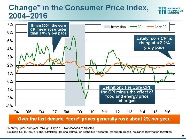
Change* in the Consumer Price Index, 2004– 2016 Since 2004, the core CPI never rose faster than a 3% y-o-y pace Lately, core CPI is rising at a 2. 2% y-o-y pace Definition: The Core CPI: the CPI minus the effect of food and energy price changes Over the last decade, “core” prices generally rose about 2% per year. *Monthly, year-over-year, through July 2016. Not seasonally adjusted. Sources: US Bureau of Labor Statistics; National Bureau of Economic Research (recession dates); Insurance Information Institutes. 49

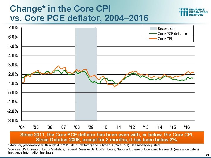
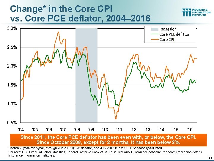
Change* in the Core CPI vs. Core PCE deflator, 2004– 2016 Since 2011, the Core PCE deflator has been even with, or below, the Core CPI. Since October 2008, except for 2 months, it has been below 2%. *Monthly, year-over-year, through Jun 2016 (PCE deflator) and July 2016 (Core CPI). Seasonally adjusted. Sources: US Bureau of Labor Statistics; Federal Reserve Bank of St. Louis; National Bureau of Economic Research (recession dates); Insurance Information Institutes. 50

Change* in the Core CPI vs. Core PCE deflator, 2004– 2016 Since 2011, the Core PCE deflator has been even with, or below, the Core CPI. Since October 2008, except for 2 months, it has been below 2%. *Monthly, year-over-year, through Jun 2016 (PCE deflator) and July 2016 (Core CPI). Seasonally adjusted. Sources: US Bureau of Labor Statistics; Federal Reserve Bank of St. Louis; National Bureau of Economic Research (recession dates); Insurance Information Institutes. 51

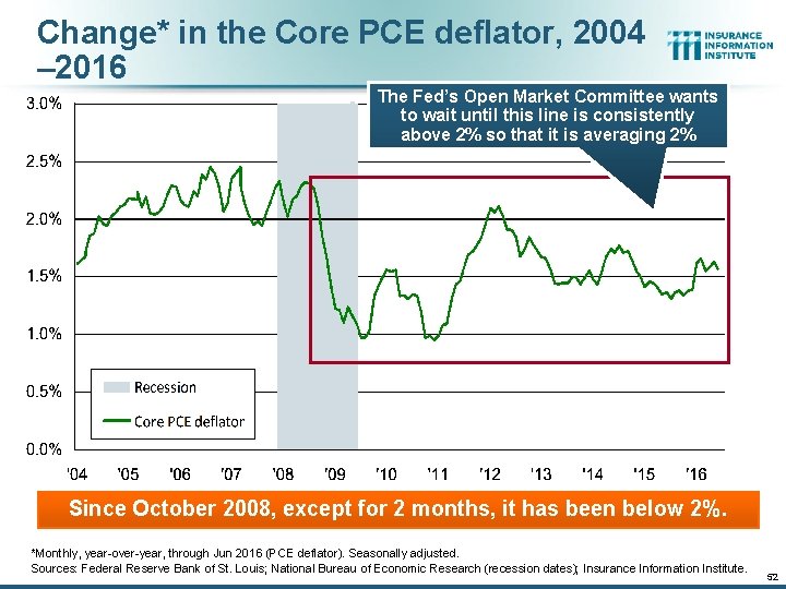
Change* in the Core PCE deflator, 2004 – 2016 The Fed’s Open Market Committee wants to wait until this line is consistently above 2% so that it is averaging 2% Since October 2008, except for 2 months, it has been below 2%. *Monthly, year-over-year, through Jun 2016 (PCE deflator). Seasonally adjusted. Sources: Federal Reserve Bank of St. Louis; National Bureau of Economic Research (recession dates); Insurance Information Institute. 52

Insurance Information Institute Online: www. iii. org Thank you for your time and your attention! 57