The left third of this magazine states the

- Slides: 1

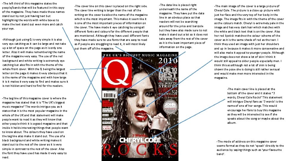
-The left third of this magazine states the people/bands that will be featured in this copy of the magazine. They have made these names stand out by not just having text but highlighting the words with white boxes to make the text stand out even more and catch your eye. -Although just using Q is very simple it is also very eye catching as it can be large and not take up a lot of space on the page as it is only one letter. Also it will make remembering the name of the magazine very easy. The use of the red background and white writing is extremely eye catching but also fits in with theme of the whole front cover. With the Q being the largest letter on the page it makes it very obvious that it is the name of the magazine and with how large it is it makes it very easy to find and makes sure it is not hidden and hard to find for the readers. -The tag line of this magazine cover is where the magazine has stated that it is “The UK’s biggest music magazine” The words intrigue you as it states that it is the most popular magazine in the whole of the UK and that statement will make people want to read it as they will know that other people think it is a good magazine and that inside it holds interesting things that people want to know about. The colours they have used on the tag line also make it stand out. The use of a black background and white writing makes it stand out to the rest of the cover as it is very simple in contrast to the rest of the cover. Also the font they have used has made it very easy to read. -The cover line on this cover is placed on the right side. The cover line writing is larger than the rest of the writing on the cover besides the name of the magazine which is the most important. This makes it seem like it is one of the most important pieces of information on the cover. The have made it eye catching by using all different fonts and colours for the different people that are mentioned. Although they have used different fonts they have made sure to use fonts that are easy to read as if people are struggling to read it, it will most likely put them off of the magazine. -The data line is placed right underneath the name of the magazine. They have put the data line in an obvious place so that readers will not be searching around for the price and barcode but they have also made sure to not make it stand out a lot so it does not take away from the rest of the cover as it is the least important piece of information on the page. -The main image of the cover is a large picture of Cheryl Cole. The picture is a close up picture with just her face and the very top of her body in the image. The image fits in with theme of the cover as the colours match. Cheryl is extremely pale in the image and has very dark hair which matches with the white and black text that is on the cover. Also her red lipstick matches the colour scheme of the cover as it is the same shade of red as the text. I think they used an image with just her shoulders and up in because it makes it more conservative and will also make it appeal to younger people. Although the image does not show a lot of skin I think it would still appeal to older people especially men. I think this as although not a lot of skin is being shown the pose she is doing is still rather sensual and would make men more interested in the magazine. -The main cover line is placed at the bottom of the cover and it states “ 3 words, Cheryl Cole Rocks” This statement will intrigue Cheryl fans as ‘ 3 words’ is the name of one of her songs. This would encourage her fans to buy this magazine as they will be interested to see if she speaks about the song or maybe about the album. -The mode of address on this magazine cover seems formal as they do not ‘speak’ directly to the audience by saying things such as ‘your favourite band’.