The importance of font type and size on
- Slides: 6

The importance of font type and size on magazine front covers and contents pages.

DEFINITION • A font is a particular size, weight and style of a typeface. • For example, Comic Sans MS, Impact and Calibri.

BRAND and IDENTITY • I found that each magazine used the font type and size to brand their magazine’s style and focus. The text, particularly the title, of a magazine is the first thing that you see. This means it needs to be aesthetically pleasing and fit in with the genre of magazine, as the primary audience will need to be attracted to it for them to be interested in the magazine and for them to be drawn to it, when it is sat on a shelf. If several fonts are used, these will need to look right together.

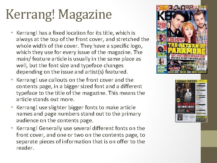
Kerrang! Magazine • Kerrang! has a fixed location for its title, which is always at the top of the front cover, and stretched the whole width of the cover. They have a specific logo, which they use for every issue of the magazine. The main/ feature article is usually in the same place as well, but the font size and typeface changes depending on the issue and artist(s) featured. • Kerrang! use callouts on the front cover and the contents page, in a bigger sized font and a different typeface to the title of the magazine. This means the article stands out more. • Kerrang! use slighter bigger fonts to make article names and page numbers stand out to the primary audience on the contents page. • Kerrang! Generally use several different fonts on the front cover, and one or two on the contents page, to separate pieces of information that is on offer to the reader.

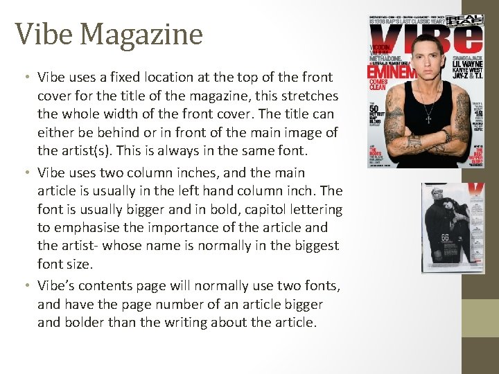
Vibe Magazine • Vibe uses a fixed location at the top of the front cover for the title of the magazine, this stretches the whole width of the front cover. The title can either be behind or in front of the main image of the artist(s). This is always in the same font. • Vibe uses two column inches, and the main article is usually in the left hand column inch. The font is usually bigger and in bold, capitol lettering to emphasise the importance of the article and the artist- whose name is normally in the biggest font size. • Vibe’s contents page will normally use two fonts, and have the page number of an article bigger and bolder than the writing about the article.

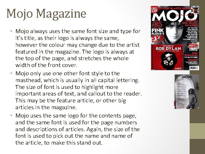
Mojo Magazine • Mojo always uses the same font size and type for it’s title, as their logo is always the same, however the colour may change due to the artist featured in the magazine. The logo is always at the top of the page, and stretches the whole width of the front cover. • Mojo only use one other font style to the masthead, which is usually in all capital lettering. The size of font is used to highlight more important areas of text, and callout to the reader. This may be the feature article, or other big articles in the magazine. • Mojo uses the same logo for the contents page, and the same font is used for the page numbers and descriptions of articles. Again, the size of the font is used to pick out the name and name of the article, to make this stand out.