THE GEOGRAPHY FIELDWORK PROCESSES The geographical enquiry can
- Slides: 19

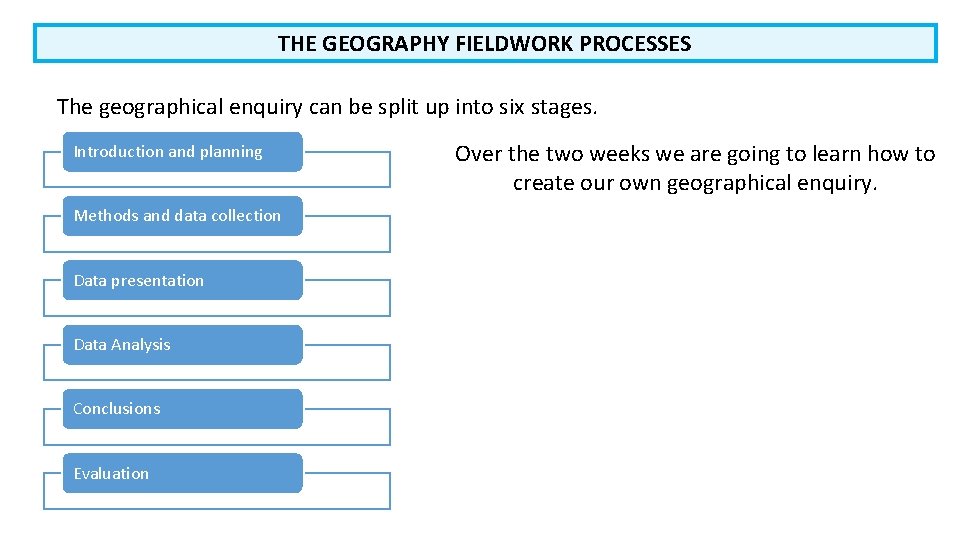
THE GEOGRAPHY FIELDWORK PROCESSES The geographical enquiry can be split up into six stages. Introduction and planning Methods and data collection Data presentation Data Analysis Conclusions Evaluation Over the two weeks we are going to learn how to create our own geographical enquiry.

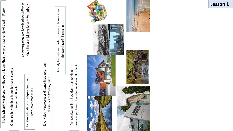
Lesson 1

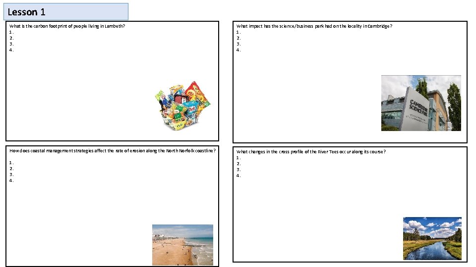
Lesson 1 What is the carbon footprint of people living in Lambeth? 1. 2. 3. 4. What impact has the science/business park had on the locality in Cambridge? 1. 2. 3. 4. How does coastal management strategies affect the rate of erosion along the North Norfolk coastline? What changes in the cross profile of the River Tees occur along its course? 1. 2. 3. 4. 1. 2. 3. 4.

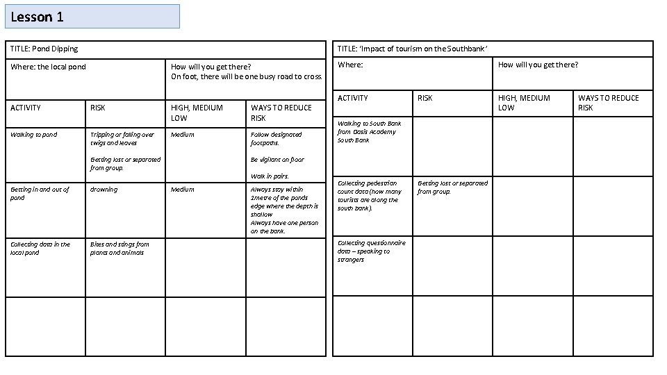
Lesson 1 TITLE: ‘Impact of tourism on the Southbank ’ TITLE: Pond Dipping Where: the local pond ACTIVITY Walking to pond How will you get there? On foot, there will be one busy road to cross. RISK Tripping or falling over twigs and leaves HIGH, MEDIUM LOW WAYS TO REDUCE RISK Medium Follow designated footpaths. Getting lost or separated from group. Getting in and out of pond drowning Collecting data in the local pond Bites and stings from plants and animals Where: ACTIVITY How will you get there? RISK Walking to South Bank from Oasis Academy South Bank Be vigilant on floor Walk in pairs. Medium Always stay within 1 metre of the ponds edge where the depth is shallow Always have one person on the bank. Collecting pedestrian count data (how many tourists are along the south bank). Collecting questionnaire data – speaking to strangers Getting lost or separated from group. HIGH, MEDIUM LOW WAYS TO REDUCE RISK

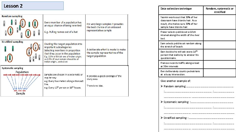
Lesson 2 Data collection technique Random, systematic or stratified Yasmin works out that 30% of her classroom have blonde hair. As a result, she makes sure 30% of her sample have blonde hair. Fraser selects pebbles at a 10 cm interval along the width of the river bed. Sam selects pebbles at random along the stretch of beach. Dan decides he will ask every 10 th person that walks by to answer his questionnaire. Frances records traffic along a road at 30 m intervals Ben deliberately counts pedestrians at a busy intersection. Give another example of: Random sampling: ………………………………. . : …………………………………. . …………………………… Systematic sampling: : ……………………………………………………………. . : …………………………………. . …………………………… Stratified sampling: : ……………………………………………………………. . : …………………………………. . ……………………………

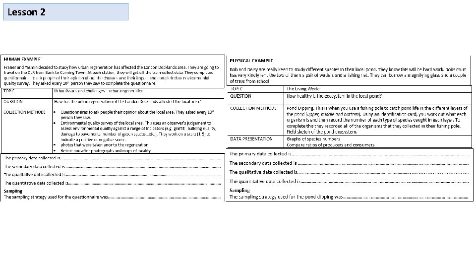
Lesson 2

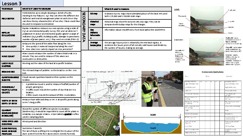
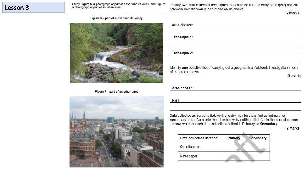
Lesson 3 TECHNIQUE WHAT IS IT USED TO MEASURE FIELD SKETCH defences and coastal management plans at each site or they can show the key characteristics of two sites. These could then be used to compare two locations. Bipolar evaluations measure our own opinion using a scale of. BIPOLAR EVALUATIONS E. g. an environmental quality survey. This uses an observer’s judgement to assess environmental quality against a range of indicators (e. g. graffiti, building quality, damage to pavements, number of green spaces…etc. ). They work on a scale (+5 to -5). Measures the speed of the water flow along the river. RIVER VELOCITY WAVE COUNT LAND VALUE MAPPING How quickly is material transported along the river? How does river velocity impact on river processes? Wave counts measure the number of waves that break in a minute. They are used to measure if the waves are constructive or destructive. Working out the value of the land at a specific location. BEDLOAD SIZE The size and shape of pebbles on the beach or on the river bed. QUESTIONNAIRES/ SURVEYS People answer questions based on their opinion on the location. • PEDESTRIAN / TRAFFIC / LITTER COUNTS WIDTH OF RIVER DEPTH OF RIVER QUADRAT SAMPLING (DONE IN BIOLOGY) • • A pedestrian count is used to measure footfall (number of people passing by). A traffic count records the number of cars that are in a location. A litter count records the amount of litter in a location. Measure how wide and deep a river is at specific points along a river’s long profile. Shows the number of different species in a location (biodiversity). It would be impossible to count all the plants in a habitat, so a sample is taken. A tool called a quadrat is often used in sampling plants. WIND SPEED AND DIRECTION Wind speed and direction. DUNE PROFILES, SAME AS BEACH PROFILING Succession Transects The aim of dune profiling is to investigate the structure of the dune system from the fore dunes (most recently formed). SECONDARY DATA Field sketches are a simple drawing or sketch of a site, showing its key features. e. g. they can show the different sea What is it used to measure OS map Ordnance Survey maps show a detailed picture of the land. We used both 1: 25, 000 and 1: 50, 000 scale maps KS 4 – The Geography Knowledge – Fieldwork techniques Historical maps show the area 50 -100 years ago. They can be maps compared with todays maps for the changes. Sea defence informatio n Information about sea defences, from local authorities and DEFRA. Average house price The average house price is released by the HM land registry. It combines the house prices of all recently sold houses and divides by the number of houses, making an average.

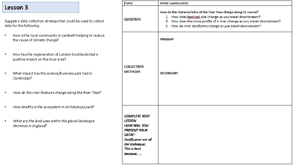
Lesson 3 Suggest a data collection strategy that could be used to collect data for the following: • How is the local community in Lambeth helping to reduce the cause of climate change? • How has the regeneration of London Docklands had a positive impact on the local area? • What impact has the science/business park had in Cambridge? • How do the river features change along the River Tees? • How healthy is the ecosystem in Archbishops park? • What are the land uses within the glacial landscape Pennines in England?

Lesson 3

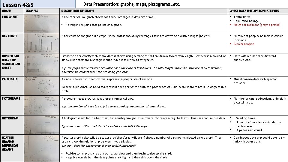
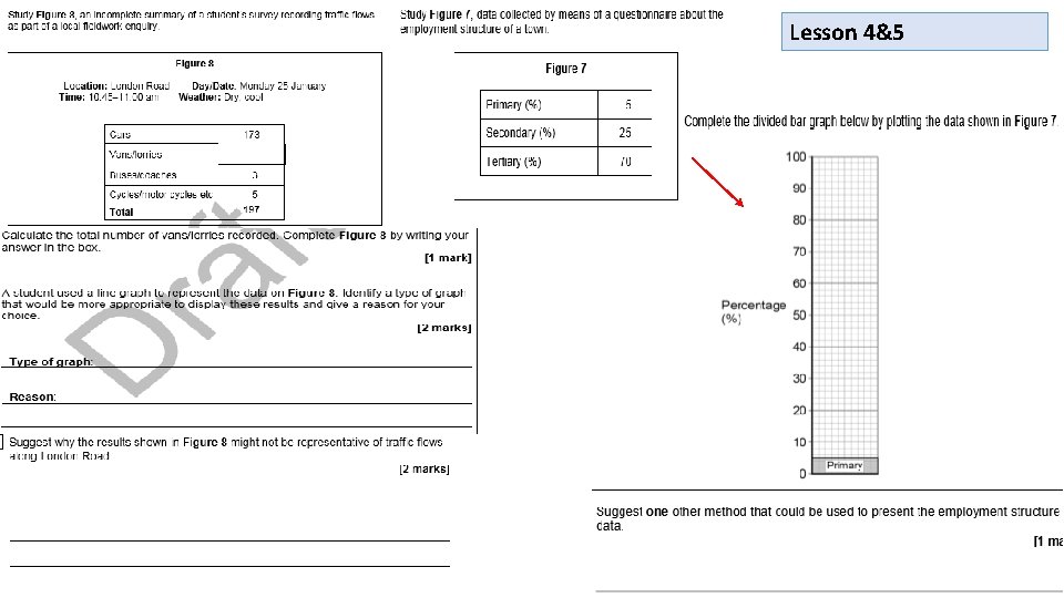
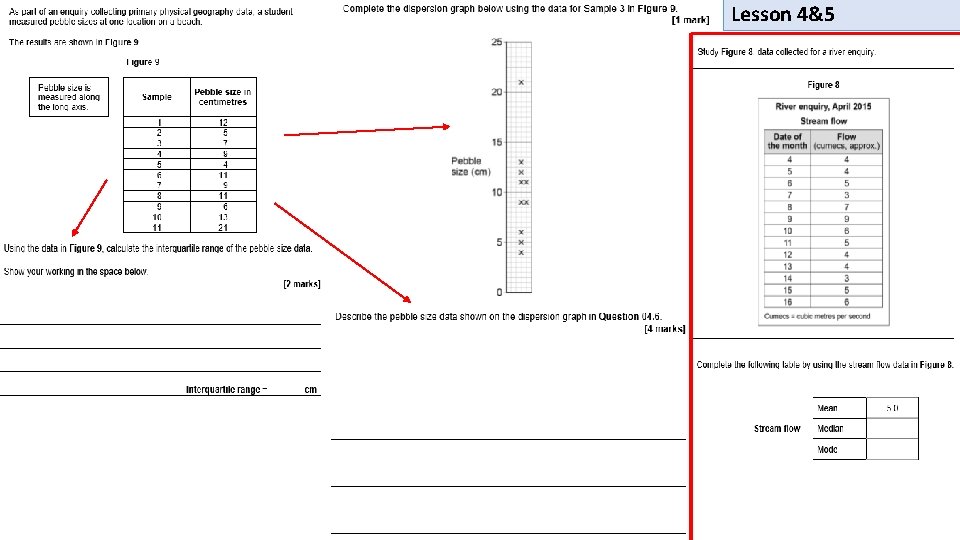
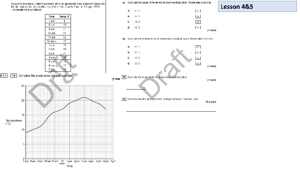
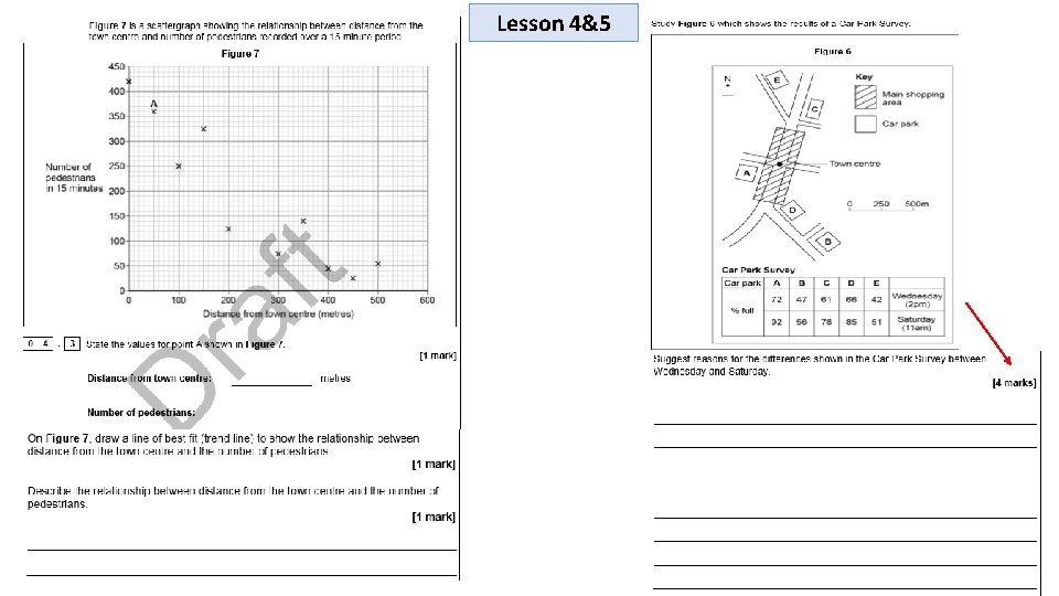
Lesson 4&5 GRAPH LINE CHART EXAMPLE Data Presentation: graphs, maps, pictograms…etc. DESCRIPTION OF GRAPH WHAT DATA IS IT APPROPRIATE FOR? A line chart or line graph shows continuous changes in data over time. • Traffic flows • Population Change • Height of sediment (groyne profile) • A straight line joins data points on a graph. BAR CHART A bar chart or bar graph is a graph where data is shown by rectangles that are drawn to a certain length (height). • Number of people/ animals in certain locations. • Bipolar analysis DIVIDED BAR CHART OR STACKED BAR CHART Similar to a bar chart/graph as the data is shown using rectangles that are drawn to a certain length. However in a divided or stacked bar chart the rectangle is subdivided into different categories. • Data with a number of different subdivisions. PIE CHARTS A circle is divided into sectors that represent a proportion of a whole. e. g. the graph shows different countries and their use of fossil fuels. The total length shows the total use of all fossil fuels, however the colours show the use of oil, gas, coal. To draw a pie chart, we need to represent each part of the data as a proportion of 360°, because there are 360° degrees in a circle. PICTOGRAMS A pictogram uses pictures to represent numerical data. e. g. the number of trees in a city is represented by the number of trees shown. HISTOGRAM • Number of cars, pedestrians, animals in a certain area. A histogram is similar to a bar chart, but a histogram groups numbers into range along the X axis. This uses continuous data. • • Eg. If the tree is 225 cm tall it will be added to the 200 -250 range. SCATTER GRAPHS/ DISPERSION GRAPHS • Questionnaire data with specific answers. A scatter graph (also called a scatter plot/chart/graph/diagram) show a number of data points plotted onto a graph. They usually show the relationship between two variables. e. g. how does life expectancy change as GDP increases? • Positive correlation: the data points start low and then begin to rise up the Y axis • Negative correlation: the data points start high and then sink down the Y axis • Waiting times Amount of people or animals in a certain area. A pedestrian count. • Continuous data that could potentially link with other data.

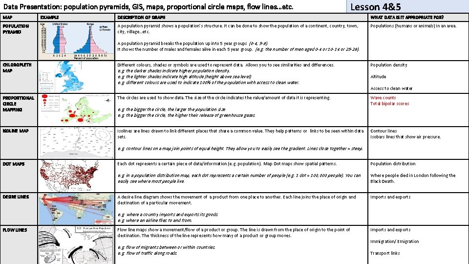
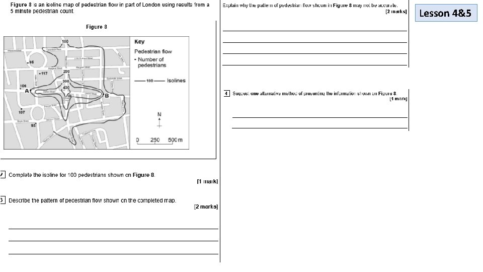
Data Presentation: population pyramids, GIS, maps, proportional circle maps, flow lines…etc. MAP POPULATION PYRAMID EXAMPLE Lesson 4&5 DESCRIPTION OF GRAPH WHAT DATA IS IT APPROPRIATE FOR? A population pyramid shows a population’s structure. It can be done to show the population of a continent, country, town, city, village…etc. Populations (humans or animals) in an area. A population pyramid breaks the population up into 5 year groups (0 -4, 5 -9). It shows the number of males and females alive in each 5 year group. (e. g. the number of men aged 0 -4 or 10 -14 or 25 -29). CHLOROPLETH MAP Different colours, shades or symbols are used to represent data. Allows you to see similarities and differences. e. g. the darker shades indicate higher population density. e. g. the lighter shades indicate high altitude (height above sea level) e. g. different colours are used to indicate 100% of the population with access to clean water. PROPORTIONAL CIRCLE MAPPING The circles are used to show data. The size of the circle indicates the value/amount of data it is representing. ISOLINE MAP Isolines are lines drawn to link different places that share a common value. They help patterns or links to be seen within data sets. e. g. the bigger the circle, the larger the population size e. g. the bigger the circle, the higher their release of greenhouse gases. Population density Altitude Access to clean water Wave counts Total bipolar scores Contour lines Isobars lines that show air pressure. e. g. contour lines on a map join points of equal height. They allow you to easily see the gradient. Lines close together = steep. DOT MAPS DESIRE LINES Each dot represents a certain piece of data/information (e. g. population). Map Dot maps show spatial patterns. Population distribution e. g. in a population distribution map, each dot represents a certain number of people (e. g. 1 dot = 100, 000 people). You can easily see where most people live. Where people died in London following the Black Death. A desire line diagram shows the movement of a product from one place to another. Each line joins the place of origin and destination of a particular movement. Imports and exports e. g. where a country imports and exports its goods. e. g. where an airline flies to and from. FLOW LINES Flow line maps show a movement/flow of a product or group. The line is drawn from the place of origin to the point of destination. The thickness of the line represents how many of a product or group moves. e. g. flow of migrants between or within countries. e. g. flow of traffic along roads. Imports and exports Immigration/ Emigration Transport links

Lesson 4&5

Lesson 4&5

Lesson 4&5

Lesson 4&5

Lesson 4&5

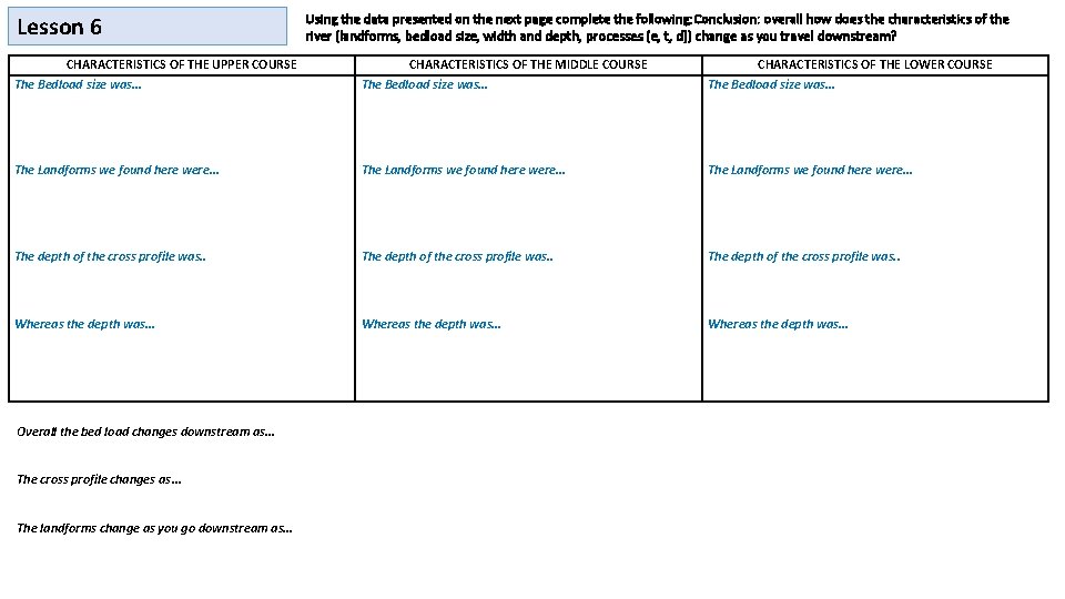
Lesson 6 CHARACTERISTICS OF THE UPPER COURSE Using the data presented on the next page complete the following: Conclusion: overall how does the characteristics of the river (landforms, bedload size, width and depth, processes (e, t, d)) change as you travel downstream? CHARACTERISTICS OF THE MIDDLE COURSE CHARACTERISTICS OF THE LOWER COURSE The Bedload size was… The Landforms we found here were… The depth of the cross profile was. . Whereas the depth was… Overall the bed load changes downstream as… The cross profile changes as… The landforms change as you go downstream as…

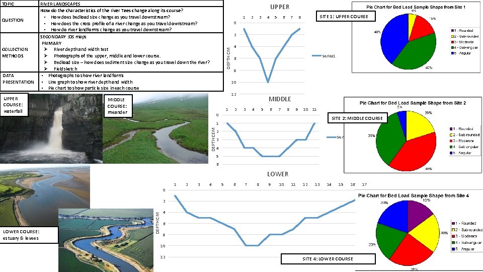
QUESTION COLLECTION METHODS DATA PRESENTATION UPPER COURSE: waterfall RIVER LANDSCAPES How do the characteristics of the river Tees change along its course? • How does bedload size change as you travel downstream? • How does the cross profile of a river change as you travel downstream? • How do river landforms change as you travel downstream? SECONDARY : OS maps PRIMARY River depth and width test Photographs of the upper, middle and lower course. Bedload size – how does sediment size change as you travel down the river? Fieldsketch • Photographs to show river landforms • Line graph to show river depth and width • Pie chart to show particle size in each course UPPER 0 1 2 3 5 6 7 SITE 1: UPPER COURSE 8 4 Series 1 6 8 10 12 MIDDLE COURSE: meander 4 2 DEPTH CM TOPIC 1 0 2 MIDDLE 3 4 5 6 7 8 9 10 11 SITE 2: MIDDLE COURSE DEPTH CEM 1 2 Series 1 3 4 5 6 LOWER 0 1 2 3 4 5 6 7 8 9 10 11 12 13 14 15 16 17 LOWER COURSE: estuary & levees DEPTH CM 2 4 Series 1 6 8 10 12 SITE 4: LOWER COURSE

Lesson 7