The gchart Procedure n The gchart Procedure is


- Slides: 34

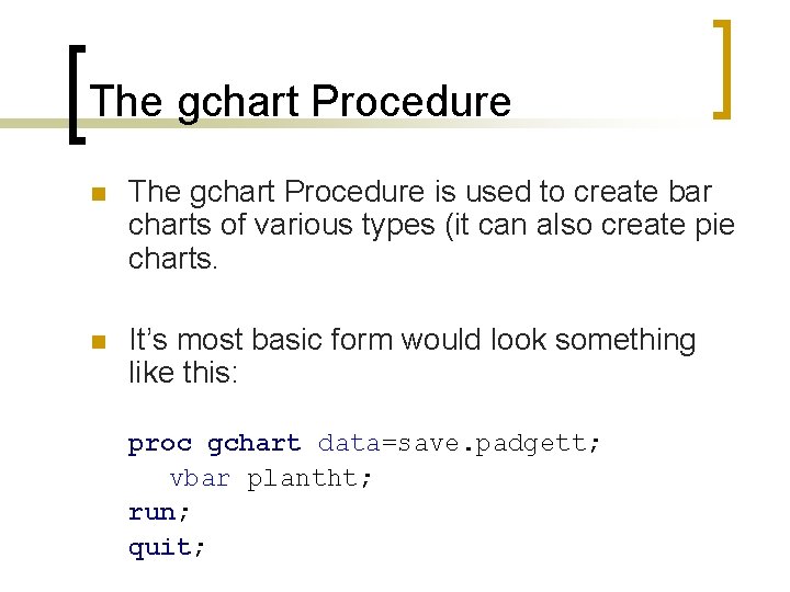
The gchart Procedure n The gchart Procedure is used to create bar charts of various types (it can also create pie charts. n It’s most basic form would look something like this: proc gchart data=save. padgett; vbar plantht; run; quit;

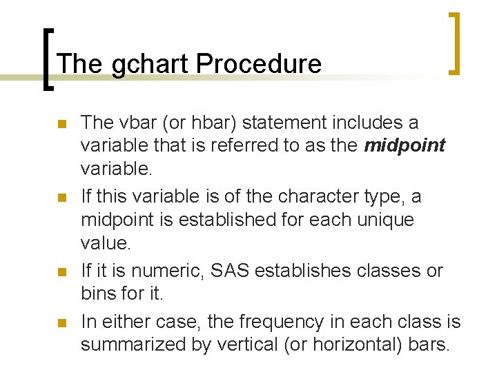
The gchart Procedure n n The vbar (or hbar) statement includes a variable that is referred to as the midpoint variable. If this variable is of the character type, a midpoint is established for each unique value. If it is numeric, SAS establishes classes or bins for it. In either case, the frequency in each class is summarized by vertical (or horizontal) bars.

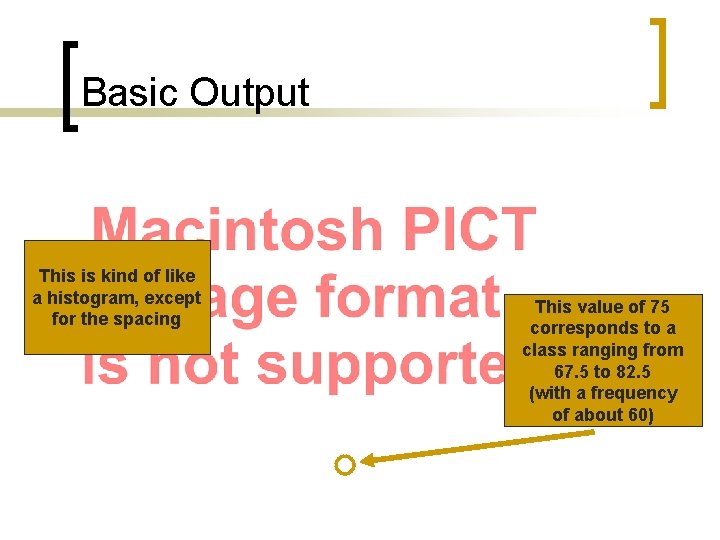
Basic Output This is kind of like a histogram, except for the spacing This value of 75 corresponds to a class ranging from 67. 5 to 82. 5 (with a frequency of about 60)

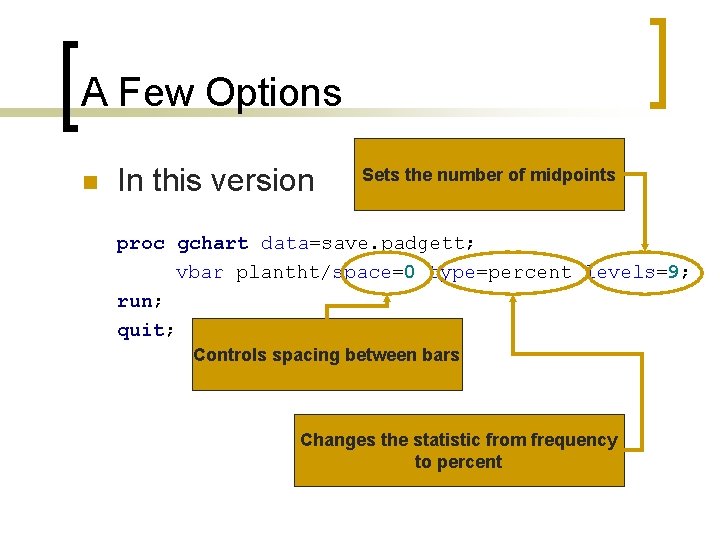
A Few Options n In this version Sets the number of midpoints proc gchart data=save. padgett; vbar plantht/space=0 type=percent levels=9; run; quit; Controls spacing between bars Changes the statistic from frequency to percent

So We Get… This is a histogram

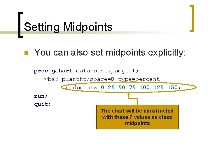
Setting Midpoints n You can also set midpoints explicitly: proc gchart data=save. padgett; vbar plantht/space=0 type=percent midpoints=0 25 50 75 100 125 150; run; quit; The chart will be constructed with these 7 values as class midpoints

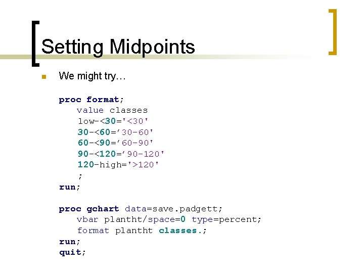
Setting Midpoints n We might try… proc format; value classes low-<30='<30' 30 -<60=’ 30 -60' 60 -<90=’ 60 -90' 90 -<120=’ 90 -120' 120 -high='>120' ; run; proc gchart data=save. padgett; vbar plantht/space=0 type=percent; format plantht classes. ; run; quit;

We Get… SAS establishes the midpoints first then applies the format Oops

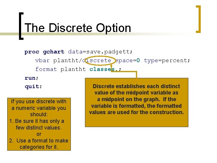
The Discrete Option proc gchart data=save. padgett; vbar plantht/discrete space=0 type=percent; format plantht classes. ; run; Discrete establishes each distinct quit; If you use discrete with a numeric variable you should: 1. Be sure it has only a few distinct values. or 2. Use a format to make categories for it. value of the midpoint variable as a midpoint on the graph. If the variable is formatted, the formatted values are used for the construction.

Result Bar width determines the space available for writing midpoint values

Bar Width proc gchart data=save. plantht; vbar plantht/discrete space=0 type=percent width=12; Sets bar width format plantht classes. ; run; quit;

Horizontal Bar Charts proc format; value $pol_type 'CO' = 'Carbon Monoxide' 'LEAD' = 'Lead' 'O 3' = 'Ozone' 'SO 2' = 'Sulfur Diox. '; run; proc gchart data=save. projects; hbar pol_type/discrete type=percent; format pol_type. ; run; quit;

Horizontal Bar Charts Besides the orientation of the bars, horizontal bar charts differ in that they produce a set of summary statistics by default. You can suppress this with the nostats option.

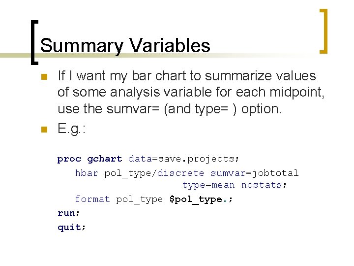
Summary Variables n n If I want my bar chart to summarize values of some analysis variable for each midpoint, use the sumvar= (and type= ) option. E. g. : proc gchart data=save. projects; hbar pol_type/discrete sumvar=jobtotal type=mean nostats; format pol_type $pol_type. ; run; quit;

Result Mean total cost is now summarized for each pollution type. Note: Only two types of statistics are available with summary variables, the sum (which is the default) and the mean

Where to find more…

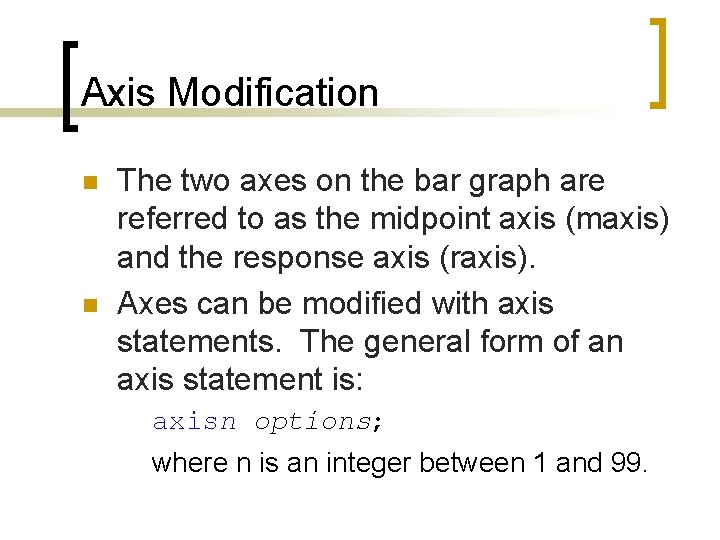
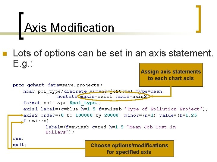
Axis Modification n n The two axes on the bar graph are referred to as the midpoint axis (maxis) and the response axis (raxis). Axes can be modified with axis statements. The general form of an axis statement is: axisn options; where n is an integer between 1 and 99.

Axis Modification n Lots of options can be set in an axis statement. E. g. : Assign axis statements to each chart axis proc gchart data=save. projects; hbar pol_type/discrete sumvar=jobtotal type=mean nostats maxis=axis 1 raxis=axis 2; format pol_type $pol_type. ; axis 1 label=(c=blue h=1. 5 f=swissb ’Type of Pollution Project'); axis 2 order=(0 to 100000 by 20000) minor=(n=1) value=(h=1. 25 f=swissb) label=(f=swissb c=red h=1. 5 'Mean Job Cost in Dollars'); run; quit; Choose options/modifications for specified axis

The Result

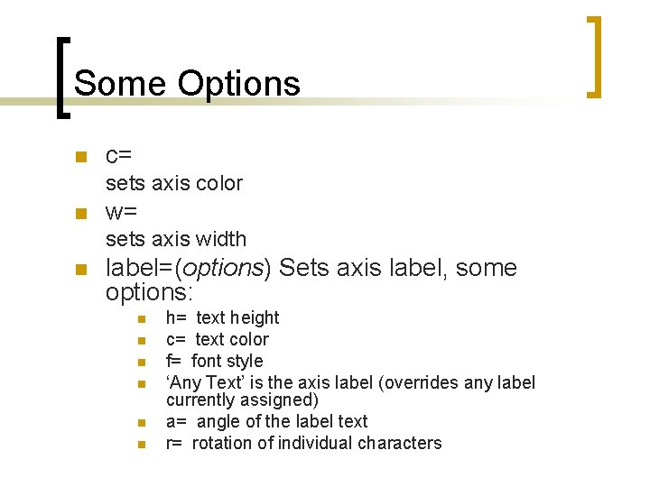
Some Options n c= sets axis color n w= sets axis width n label=(options) Sets axis label, some options: n n n h= text height c= text color f= font style ‘Any Text’ is the axis label (overrides any label currently assigned) a= angle of the label text r= rotation of individual characters

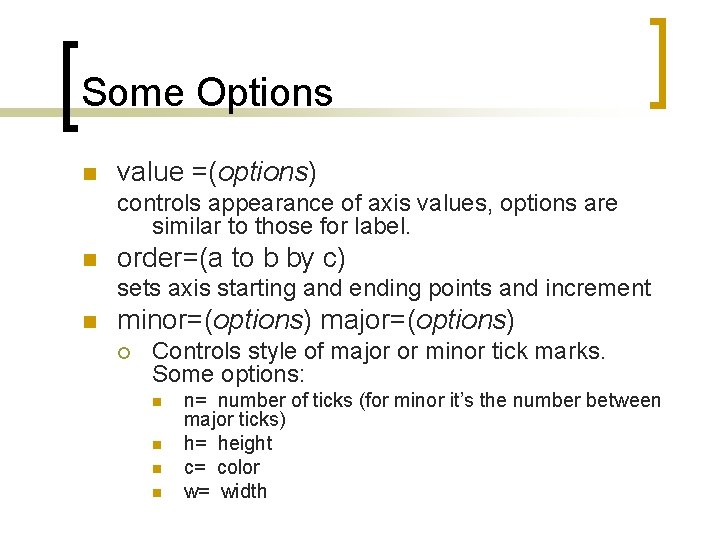
Some Options n value =(options) controls appearance of axis values, options are similar to those for label. n order=(a to b by c) sets axis starting and ending points and increment n minor=(options) major=(options) ¡ Controls style of major or minor tick marks. Some options: n n n= number of ticks (for minor it’s the number between major ticks) h= height c= color w= width

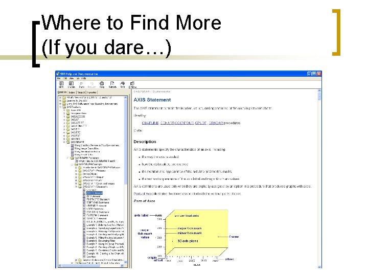
Where to Find More (If you dare…)

Bar Fill Patterns n n In all charts to this point, all bars have been red. It is possible to change the color, and it is possible to give each bar a different color. To give bars different colors, specify patternid=midpoint in the hbar or vbar statement.

Bar Fill Patterns patternid=midpoint gives each bar its own “pattern” or color

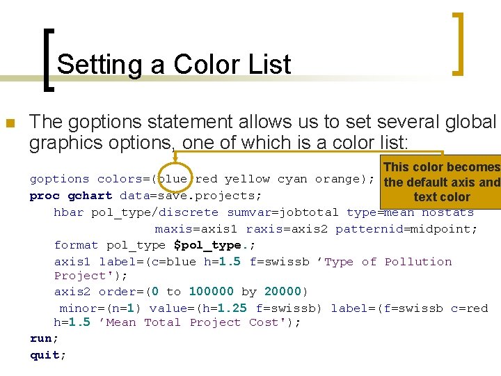
Setting a Color List n The goptions statement allows us to set several global graphics options, one of which is a color list: This color becomes goptions colors=(blue red yellow cyan orange); the default axis and proc gchart data=save. projects; text color hbar pol_type/discrete sumvar=jobtotal type=mean nostats maxis=axis 1 raxis=axis 2 patternid=midpoint; format pol_type $pol_type. ; axis 1 label=(c=blue h=1. 5 f=swissb ’Type of Pollution Project'); axis 2 order=(0 to 100000 by 20000) minor=(n=1) value=(h=1. 25 f=swissb) label=(f=swissb c=red h=1. 5 ’Mean Total Project Cost'); run; quit;

Setting a Color List n n Remember, setting a color is an option for any axis statement, so if you change the color list, you can always override the first color behavior in the axis statement. coutline= is an option you can use in the vbar or hbar statement to set the bar outline color.

Alternate Fill Patterns n n You can specify some alternate fill patterns for bars (particularly useful for creating black & white charts) with a pattern statement(s). The two major options in the pattern statement are c= and v=, for color and fill, respectively. Rules: ¡ ¡ ¡ If no color is specified, the fill pattern is applied for each color in the color list. If a color is specified, the fill pattern is applied only once. The fill pattern can be set to on of Ln, Rn or Xn; where n is an integer between 1 and 5.

An Example L, R and X correspond to left-leaning, right-leaning and crossed lines. The number controls the thickness Add these pattern statements to your previous code to get the above bar graph: pattern c=black v=L 1; pattern c=black v=R 1; pattern c=black v=X 1; pattern c=black v=L 5; pattern c=black v=R 5;

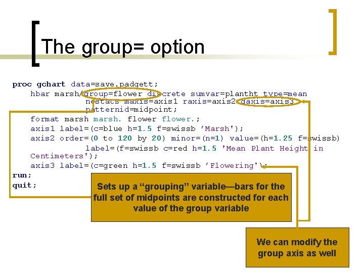
The group= option proc gchart data=save. padgett; hbar marsh/group=flower discrete sumvar=plantht type=mean nostats maxis=axis 1 raxis=axis 2 gaxis=axis 3 patternid=midpoint; format marsh. flower. ; axis 1 label=(c=blue h=1. 5 f=swissb ’Marsh'); axis 2 order=(0 to 120 by 20) minor=(n=1) value=(h=1. 25 f=swissb) label=(f=swissb c=red h=1. 5 'Mean Plant Height in Centimeters'); axis 3 label=(c=green h=1. 5 f=swissb ’Flowering'); run; quit; Sets up a “grouping” variable—bars for the full set of midpoints are constructed for each value of the group variable We can modify the group axis as well

Grouped Bar-Chart

The subgroup= option Subgroup creates stacked bars across levels of a variable. (Not appropriate for means)

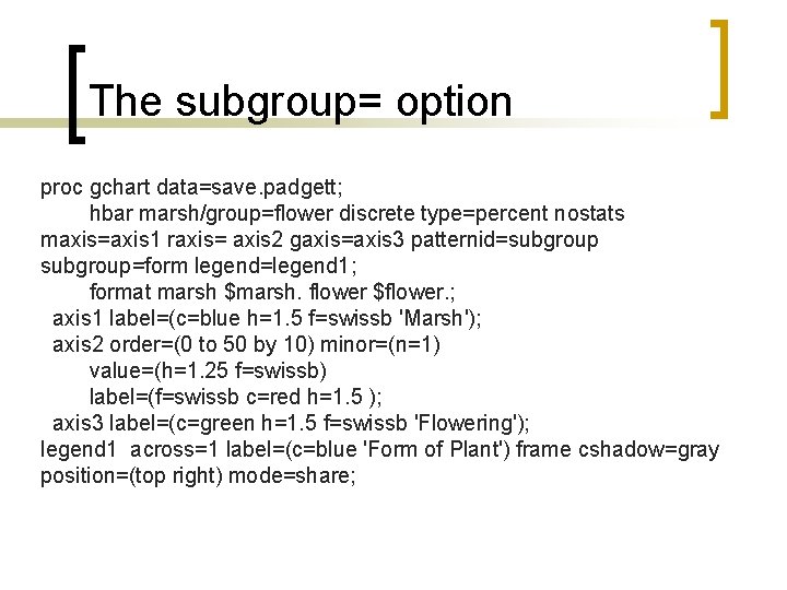
The subgroup= option proc gchart data=save. padgett; hbar marsh/group=flower discrete type=percent nostats maxis=axis 1 raxis= axis 2 gaxis=axis 3 patternid=subgroup=form legend=legend 1; format marsh $marsh. flower $flower. ; axis 1 label=(c=blue h=1. 5 f=swissb 'Marsh'); axis 2 order=(0 to 50 by 10) minor=(n=1) value=(h=1. 25 f=swissb) label=(f=swissb c=red h=1. 5 ); axis 3 label=(c=green h=1. 5 f=swissb 'Flowering'); legend 1 across=1 label=(c=blue 'Form of Plant') frame cshadow=gray position=(top right) mode=share;

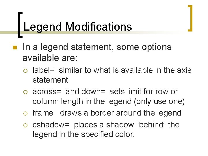
Legend Modifications n In a legend statement, some options available are: ¡ ¡ label= similar to what is available in the axis statement. across= and down= sets limit for row or column length in the legend (only use one) frame draws a border around the legend cshadow= places a shadow “behind” the legend in the specified color.

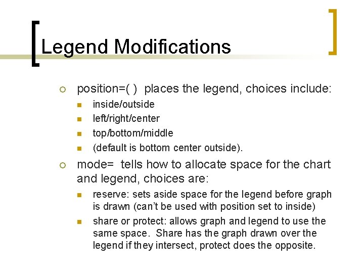
Legend Modifications ¡ position=( ) places the legend, choices include: n n ¡ inside/outside left/right/center top/bottom/middle (default is bottom center outside). mode= tells how to allocate space for the chart and legend, choices are: n n reserve: sets aside space for the legend before graph is drawn (can’t be used with position set to inside) share or protect: allows graph and legend to use the same space. Share has the graph drawn over the legend if they intersect, protect does the opposite.