The Elements of Design Colour Colour is a
- Slides: 8

The Elements of Design Colour

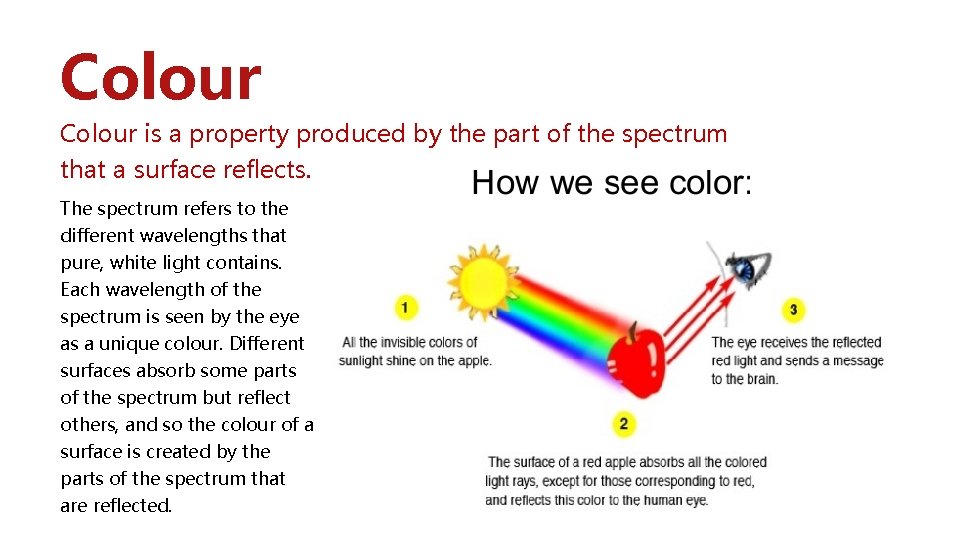
Colour is a property produced by the part of the spectrum that a surface reflects. The spectrum refers to the different wavelengths that pure, white light contains. Each wavelength of the spectrum is seen by the eye as a unique colour. Different surfaces absorb some parts of the spectrum but reflect others, and so the colour of a surface is created by the parts of the spectrum that are reflected.

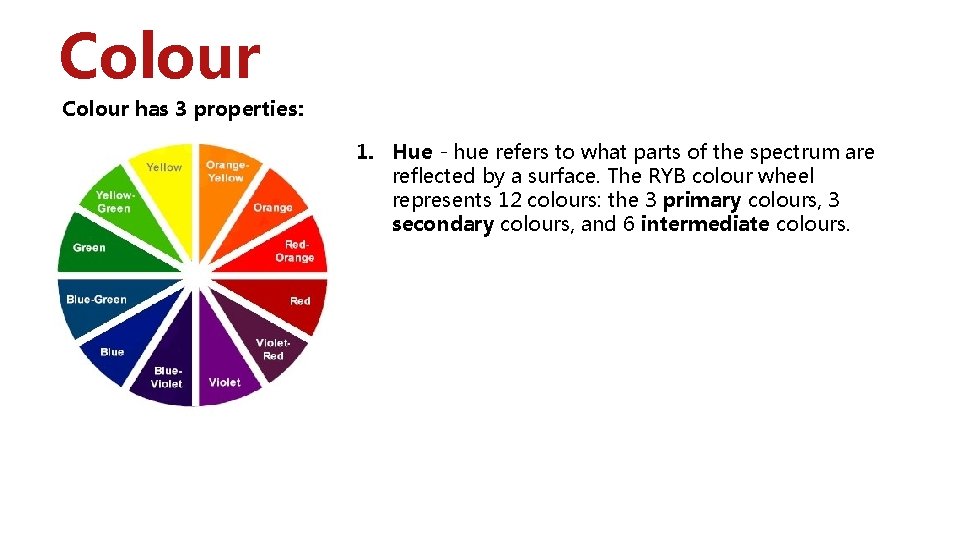
Colour has 3 properties: 1. Hue - hue refers to what parts of the spectrum are reflected by a surface. The RYB colour wheel represents 12 colours: the 3 primary colours, 3 secondary colours, and 6 intermediate colours.

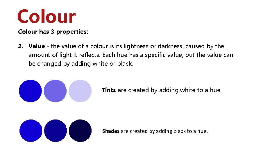
Colour has 3 properties: 2. Value - the value of a colour is its lightness or darkness, caused by the amount of light it reflects. Each hue has a specific value, but the value can be changed by adding white or black. Tints are created by adding white to a hue. Shades are created by adding black to a hue.

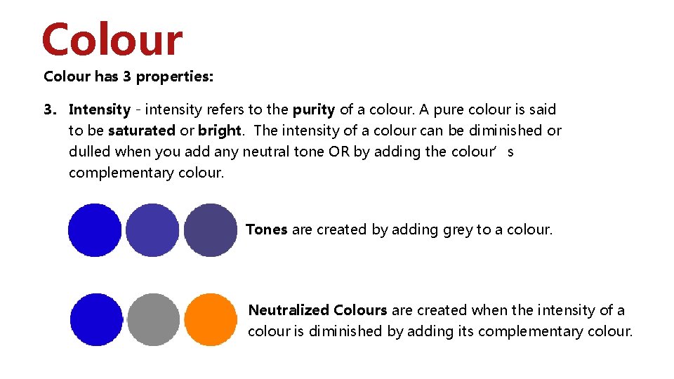
Colour has 3 properties: 3. Intensity - intensity refers to the purity of a colour. A pure colour is said to be saturated or bright. The intensity of a colour can be diminished or dulled when you add any neutral tone OR by adding the colour’s complementary colour. Tones are created by adding grey to a colour. Neutralized Colours are created when the intensity of a colour is diminished by adding its complementary colour.

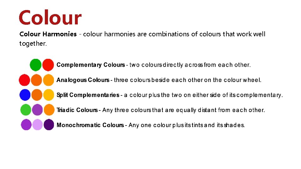
Colour Harmonies - colour harmonies are combinations of colours that work well together.

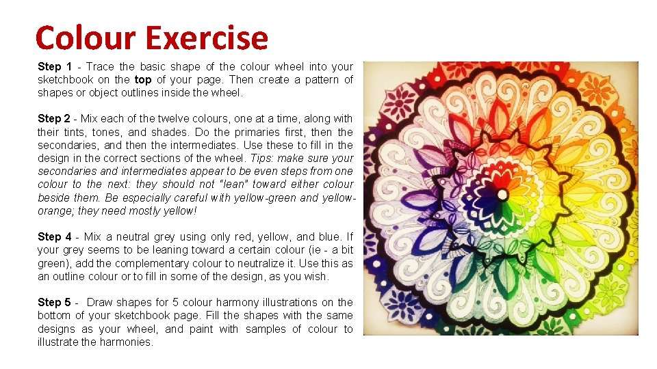
Colour Exercise Step 1 - Trace the basic shape of the colour wheel into your sketchbook on the top of your page. Then create a pattern of shapes or object outlines inside the wheel. Step 2 - Mix each of the twelve colours, one at a time, along with their tints, tones, and shades. Do the primaries first, then the secondaries, and then the intermediates. Use these to fill in the design in the correct sections of the wheel. Tips: make sure your secondaries and intermediates appear to be even steps from one colour to the next: they should not “lean” toward either colour beside them. Be especially careful with yellow-green and yelloworange; they need mostly yellow! Step 4 - Mix a neutral grey using only red, yellow, and blue. If your grey seems to be leaning toward a certain colour (ie - a bit green), add the complementary colour to neutralize it. Use this as an outline colour or to fill in some of the design, as you wish. Step 5 - Draw shapes for 5 colour harmony illustrations on the bottom of your sketchbook page. Fill the shapes with the same designs as your wheel, and paint with samples of colour to illustrate the harmonies.

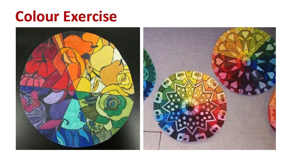
Colour Exercise