The cognitive style of powerpoint Adapted from Edward


- Slides: 28
The cognitive style of powerpoint Adapted from Edward Tufte
Lou Gerstner IBM
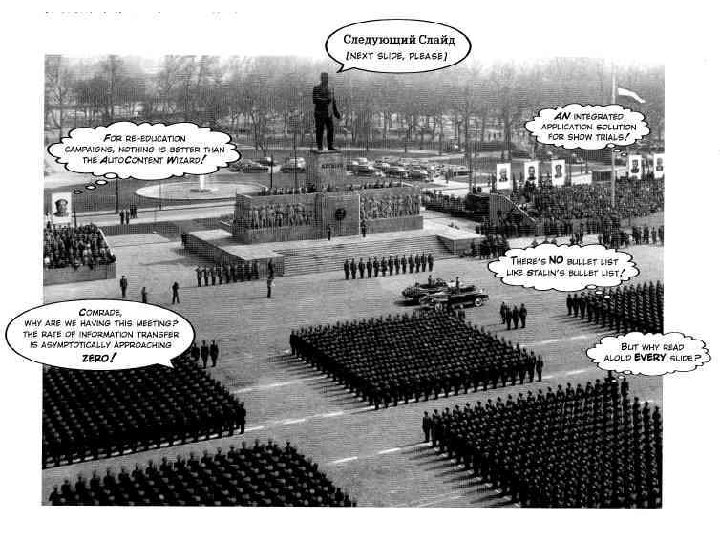
Issues of Slideware • More for the presenter than the audience – Reduce evidence and thought – Low resolution – Single path, single model for all content – Small narrative fragments – Single model for all presentations – Tendency to make everythig into a sales pitch
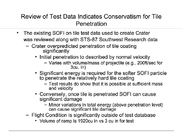
Lo-Fi • This slide from a statistics course shows a seriously incomplete statement. • Probably the shortest true statement that can be made about causality and correlation is "Empirically observed covariation is a necessary but not sufficient condition for causality. " • Or perhaps "Correlation is not causation but it sure is a hint. "
Lo-Fi Data
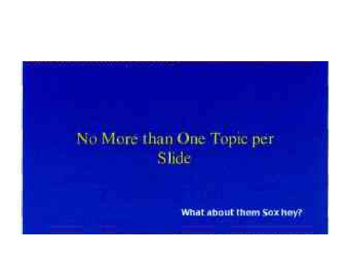
Bulleted Lists are Lazy • In every company we know, planning follows the standard format of the bullet outline. . . [But] bullet lists encourage us to be lazy in three specific, and related ways. • Bullet lists are typically too generic. They offer a series of things to do that could apply to any business. . • Bullets leave critical relationships unspecified. Lists can communicate only three logical relationships: – sequence (first to last in time); – priority (least to most important or vice versa); – or simple membership in a set (these items relate to one another in some way, but the nature of that relationship remains unstated). • And a list can show only one of those relationships at a time.
Example • What does this mean: – Increase market share by 25%. – Increase profits by 30%. – Increase new-product introductions to ten a year. • What are reasonable interpretations of this list? • Talk to your neighbour and come up with more than one.
Powerpoint shapes the Organisation
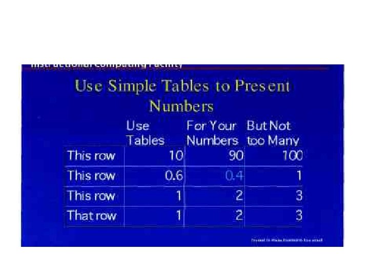
A picture is worth a 1000 words • The artist Ad Reinhardt said, "As for a picture, if it isn't worth a thousand words, the hell with it. " • People can quickly look over tables with hundreds of numbers in, say, financial or sports pages in newspapers. • People read 300 to 1, 000 printed words a minute, • and find their way around a printed map or a 35 mm slide displaying 5 to 40 MB in the visual field. • Often the visual channel is an intensely high-resolution channel.
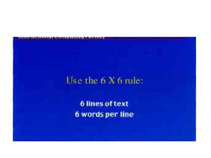
Why is Powerpoint so Lo-Fi? • Design styles often use 60% of the available space • Projection means powerpoints use big fonts. • Maybe the presenter doesn’t have much to say… • Better to use paper with more detailed information… • In areas like art, typography, cartography more detail adds clarity…
Gettysburg Address
Gettysburg Address
Now Consider a Powerpoint…
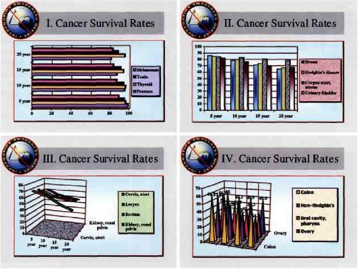
Data is often Dense
More thought, less fluff
What other questions arise? • Talk to your partner and develop two or three questions you’d like to ask about the cancer stats…
But look at Weather Data
Table of Casualties 1647
Further Issues • Pushing a decline in the density of text more widely. • Highly sequential presentations. • Loss of context because it can’t be held for long. • Sometimes line by line…
Better Presentations • Make content relevant, high quality and with high standards of integrity. • Weak presentations will bore the audience no matter how good the design is. • Be sensitive to when the presentation medium is distorting the content. • Power. Point is a competent slide manager and projector for low-resolution materials. And that's about it. • Never use PP templates to format paper reports or web screens. • Use PP as a projector for showing low-resolution color images, graphics, and videos that cannot be reproduced as printedhandouts at a presentation.