The Art of Graphical Presentation Types of Variables
The Art of Graphical Presentation • • • Types of Variables Guidelines for Good Graphics Charts Common Mistakes in Graphics Pictorial Games Special-Purpose Charts © 1998, Geoff Kuenning
Types of Variables • Qualitative – Ordered (e. g. , modem, Ethernet, satellite) – Unordered (e. g. , CS, math, literature) • Quantitative – Discrete (e. g. , number of terminals) – Continuous (e. g. , time) © 1998, Geoff Kuenning

Charting Based on Variable Types • Qualitative variables usually work best with bar charts or Kiviat graphs – If ordered, use bar charts to show order • Quantitative variables work well in X-Y graphs – Use points if discrete, lines if continuous – Bar charts sometimes work well for discrete © 1998, Geoff Kuenning
Guidelines for Good Graphics Charts • • • Principles of graphical excellence Principles of good graphics Specific hints for specific situations Aesthetics Friendliness © 1998, Geoff Kuenning
Principles of Graphical Excellence • Graphical excellence is the welldesigned presentation of interesting data: – Substance – Statistics – Design © 1998, Geoff Kuenning
Graphical Excellence (2) • Complex ideas get communicated with: – Clarity – Precision – Efficiency © 1998, Geoff Kuenning
Graphical Excellence (3) • Viewer gets: – Greatest number of ideas – In the shortest time – With the least ink – In the smallest space © 1998, Geoff Kuenning
Graphical Excellence (4) • Is nearly always multivariate • Requires telling truth about data © 1998, Geoff Kuenning
Principles of Good Graphics • • • Above all else show the data Maximize the data-ink ratio Erase non-data ink Erase redundant data ink Revise and edit © 1998, Geoff Kuenning
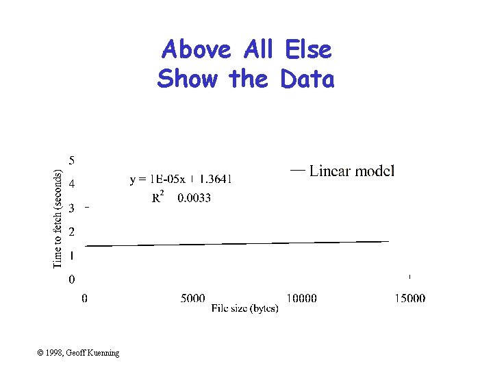
Above All Else Show the Data © 1998, Geoff Kuenning
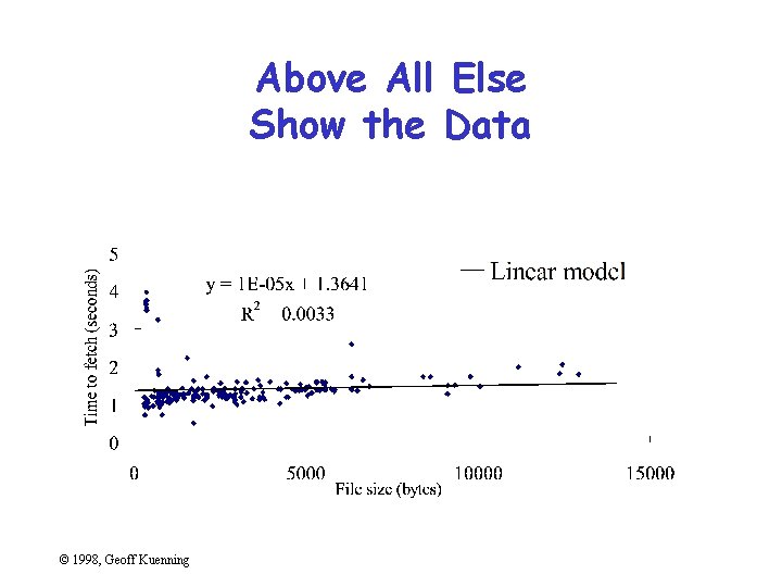
Above All Else Show the Data © 1998, Geoff Kuenning
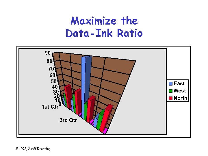
Maximize the Data-Ink Ratio © 1998, Geoff Kuenning
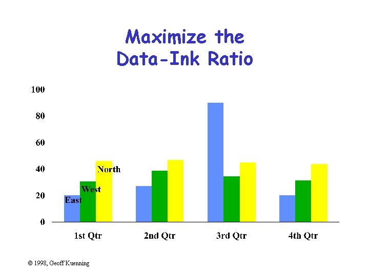
Maximize the Data-Ink Ratio © 1998, Geoff Kuenning
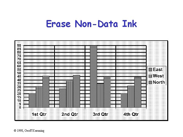
Erase Non-Data Ink © 1998, Geoff Kuenning
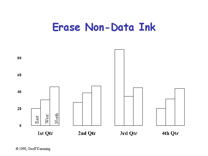
© 1998, Geoff Kuenning North West East Erase Non-Data Ink
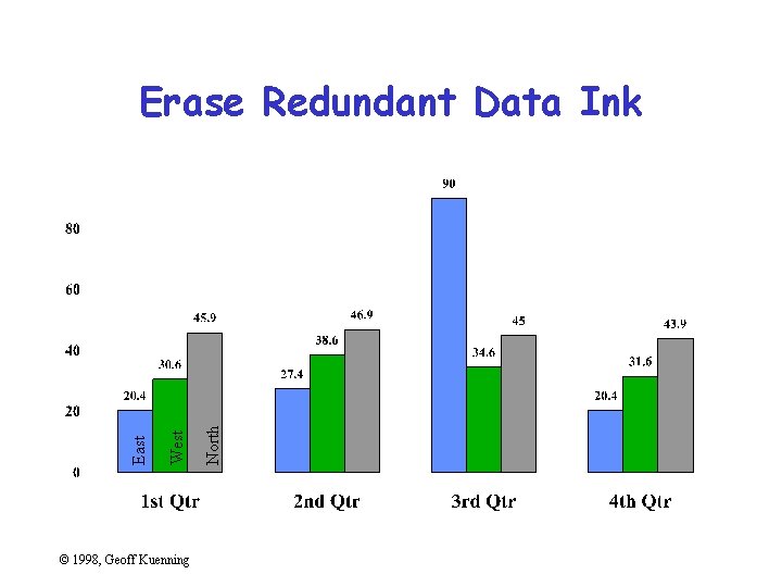
© 1998, Geoff Kuenning North West East Erase Redundant Data Ink
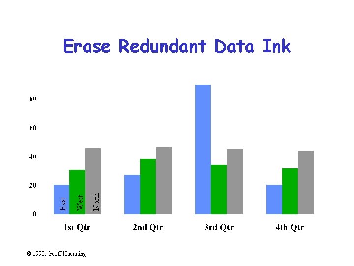
© 1998, Geoff Kuenning North West East Erase Redundant Data Ink
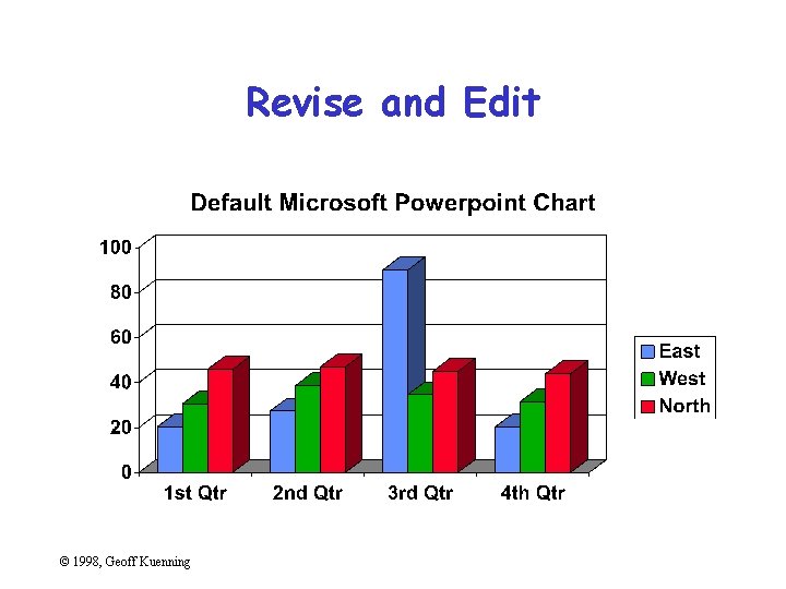
Revise and Edit © 1998, Geoff Kuenning

Revise and Edit © 1998, Geoff Kuenning
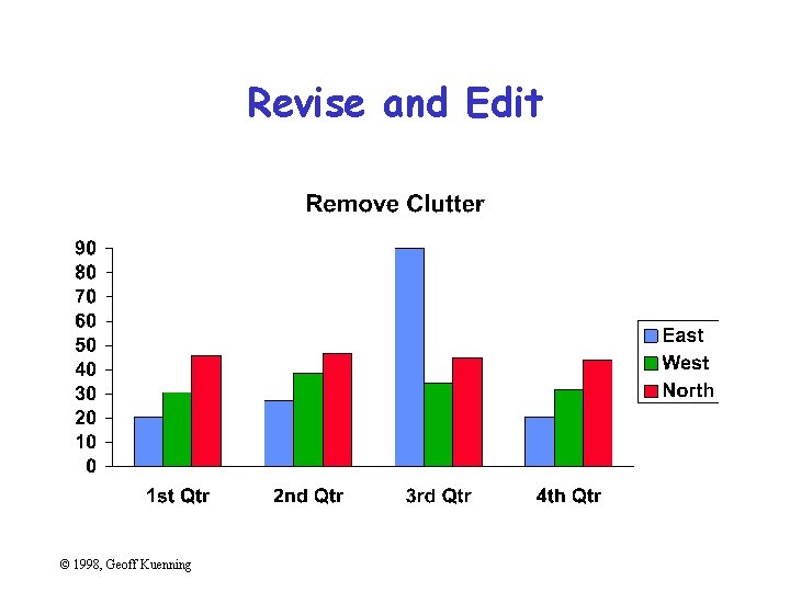
Revise and Edit © 1998, Geoff Kuenning
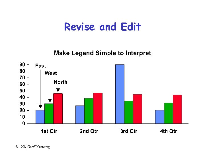
Revise and Edit © 1998, Geoff Kuenning
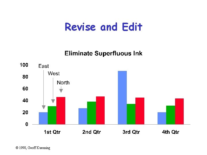
Revise and Edit © 1998, Geoff Kuenning
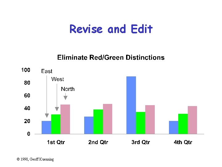
Revise and Edit © 1998, Geoff Kuenning
Specific Things to Do • • • Give information the reader needs Limit complexity and confusion Have a point Show statistics graphically Don’t always use graphics Discuss it in the text © 1998, Geoff Kuenning
Give Information the Reader Needs • Show informative axes – Use axes to indicate range • Label things fully and intelligently • Highlight important points on the graph © 1998, Geoff Kuenning
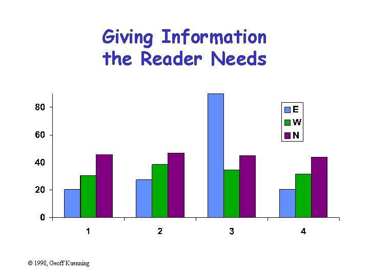
Giving Information the Reader Needs © 1998, Geoff Kuenning
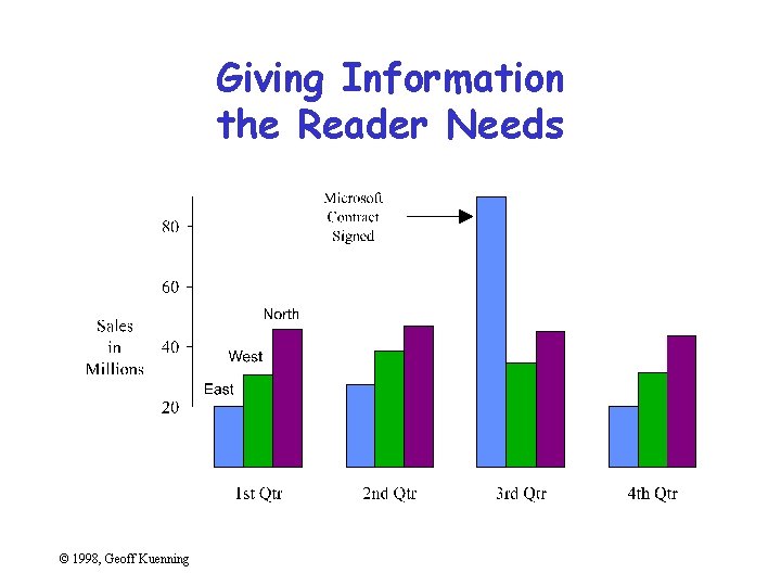
Giving Information the Reader Needs © 1998, Geoff Kuenning
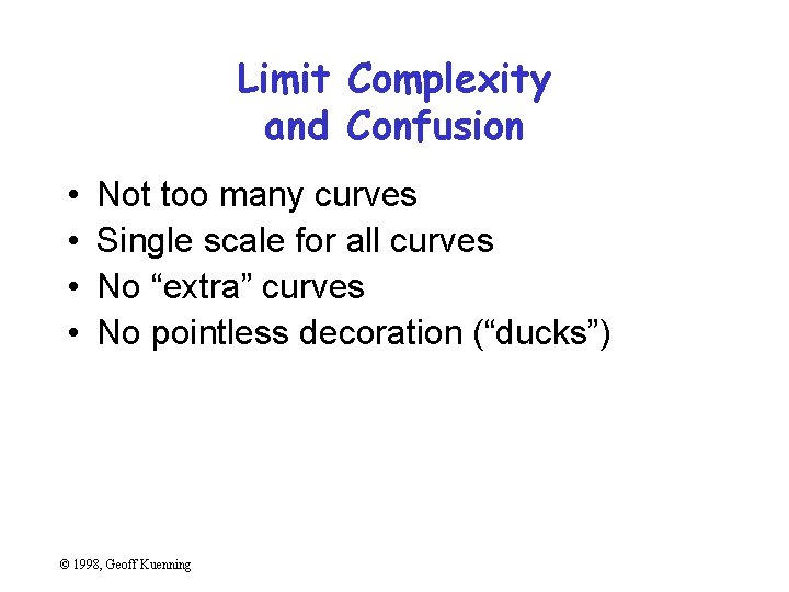
Limit Complexity and Confusion • • Not too many curves Single scale for all curves No “extra” curves No pointless decoration (“ducks”) © 1998, Geoff Kuenning
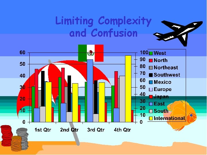
Limiting Complexity and Confusion © 1998, Geoff Kuenning
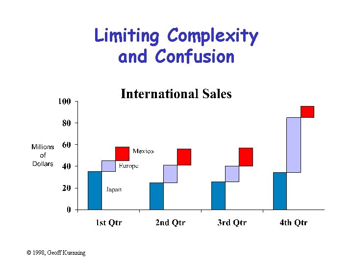
Limiting Complexity and Confusion © 1998, Geoff Kuenning
Have a Point • Graphs should add information not otherwise available to reader • Don’t plot data just because you collected it • Know what you’re trying to show, and make sure the graph shows it © 1998, Geoff Kuenning
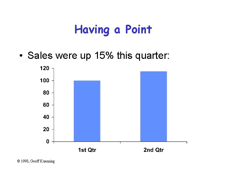
Having a Point • Sales were up 15% this quarter: © 1998, Geoff Kuenning
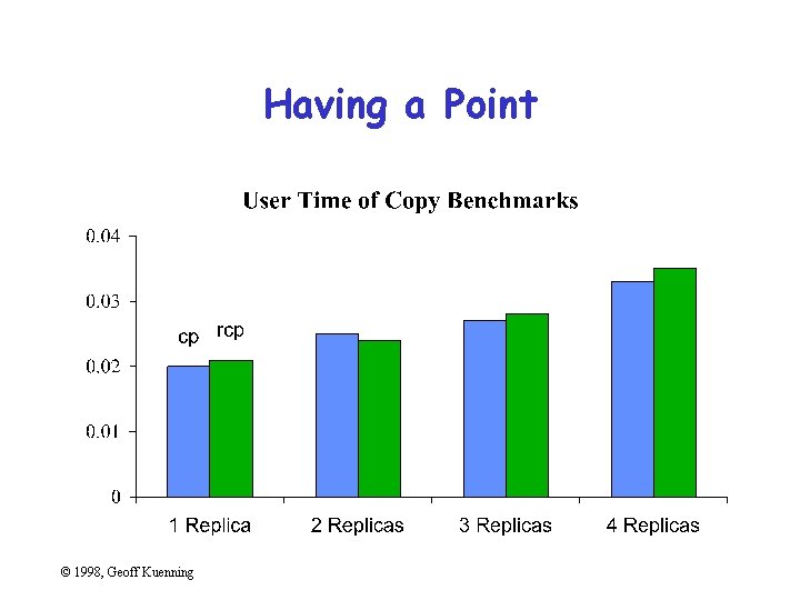
Having a Point © 1998, Geoff Kuenning
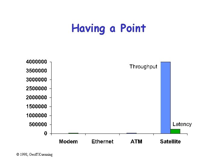
Having a Point © 1998, Geoff Kuenning
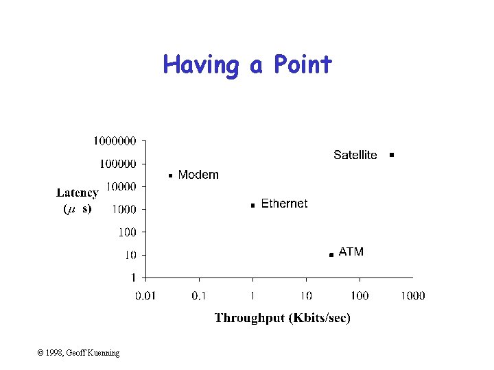
Having a Point © 1998, Geoff Kuenning
Show Statistics Graphically • Put bars in a reasonable order – Geographical – Best to worst – Even alphabetic • Make bar widths reflect interval widths – Hard to do with most graphing software • Show confidence intervals on the graph – Examples will be shown later © 1998, Geoff Kuenning
Don’t Always Use Graphics • Tables are best for small sets of numbers – e. g. , 20 or fewer • Also best for certain arrangements of data – e. g. , 10 graphs of 3 points each • Sometimes a simple sentence will do • Always ask whether the chart is the best way to present the information – And whether it brings out your message © 1998, Geoff Kuenning
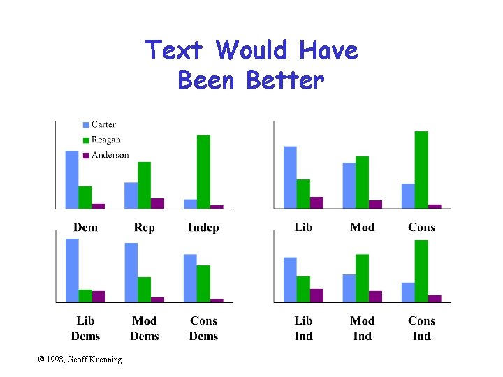
Text Would Have Been Better © 1998, Geoff Kuenning
Discuss It in the Text • Figures should be self-explanatory – Many people scan papers, just look at graphs – Good graphs build interest, “hook” readers • But text should highlight and aid figures – Tell readers when to look at figures – Point out what figure is telling them – Expand on what figure has to say © 1998, Geoff Kuenning
Aesthetics • Not everyone is an artist – But figures should be visually pleasing • Elegance is found in – Simplicity of design – Complexity of data © 1998, Geoff Kuenning
Principles of Aesthetics • • Use appropriate format and design Use words, numbers, drawings together Reflect balance, proportion, relevant scale Keep detail and complexity accessible Have a story about the data (narrative quality) Do a professional job of drawing Avoid decoration and chartjunk © 1998, Geoff Kuenning
Use Words, Numbers, Drawings Together • Put graphics near or in text that discusses them – Even if you have to murder your word processor • Integrate text into graphics • Tufte: “Data graphics are paragraphs about data and should be treated as such” © 1998, Geoff Kuenning
Reflect Balance, Proportion, Relevant Scale • Much of this boils down to “artistic sense” • Make sure things are big enough to read – Tiny type is OK only for young people! • Keep lines thin – But use heavier lines to indicate important information • Keep horizontal larger than vertical – About 50% larger works well © 1998, Geoff Kuenning
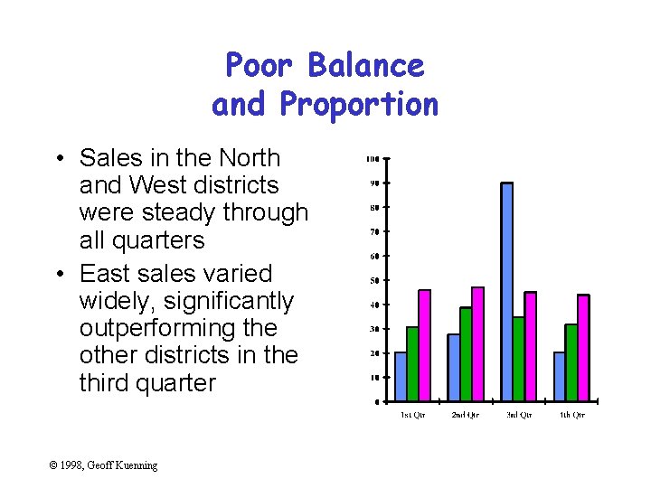
Poor Balance and Proportion • Sales in the North and West districts were steady through all quarters • East sales varied widely, significantly outperforming the other districts in the third quarter © 1998, Geoff Kuenning
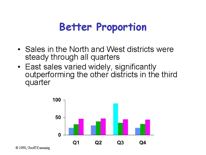
Better Proportion • Sales in the North and West districts were steady through all quarters • East sales varied widely, significantly outperforming the other districts in the third quarter © 1998, Geoff Kuenning
Keep Detail and Complexity Accessible Make your graphics friendly: – Avoid abbreviations and encodings – Run words left-to-right – Explain data with little messages – Label graphic, don’t use elaborate shadings and a complex legend – Avoid red/green distinctions – Use clean, serif fonts in mixed case © 1998, Geoff Kuenning
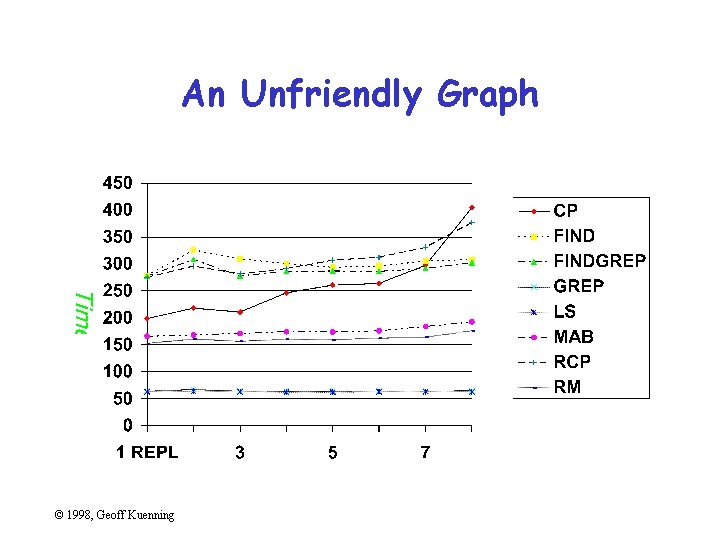
An Unfriendly Graph © 1998, Geoff Kuenning
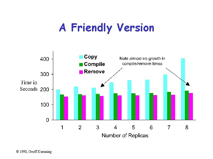
A Friendly Version © 1998, Geoff Kuenning
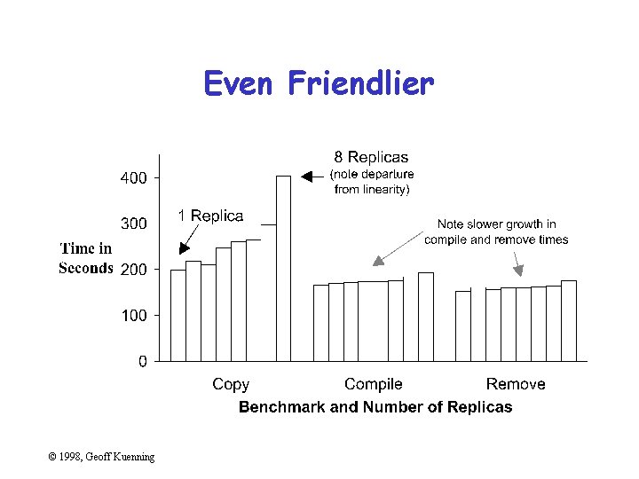
Even Friendlier © 1998, Geoff Kuenning
Have a Story About the Data (Narrative Quality) • May be difficult in technical papers • But think about why you are drawing graph • Example: – Performance is controlled by network speed – But it tops out at the high end – And that’s because we hit a CPU bottleneck © 1998, Geoff Kuenning
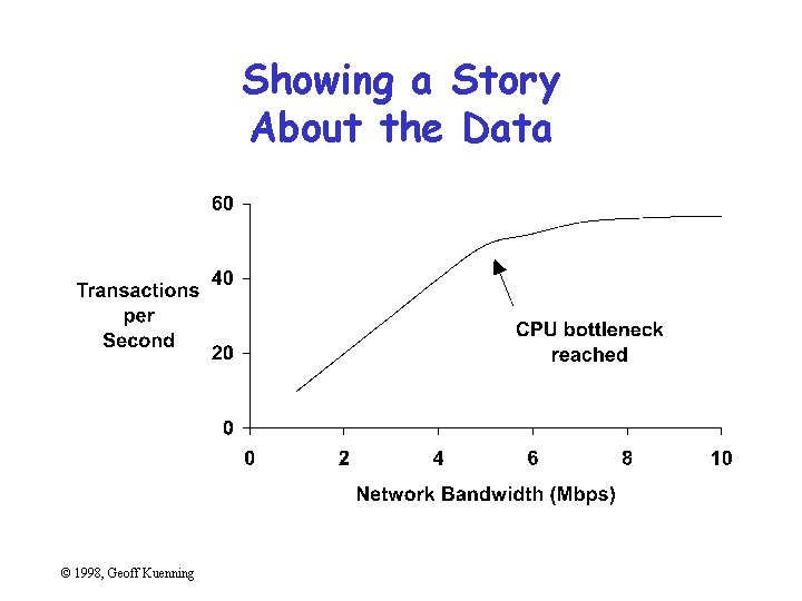
Showing a Story About the Data © 1998, Geoff Kuenning
Do a Professional Job of Drawing • This is easy with modern tools – But take the time to do it right • Align things carefully • Check the final version in the format you will use – I. e. , print the Postscript one last time before submission – Or look at your slides on the projection screen © 1998, Geoff Kuenning
Avoid Decoration and Chartjunk • Powerpoint, etc. make chartjunk easy • Avoid clip art, automatic backgrounds, etc. • Remember: the data is the story – Statistics aren’t boring – Uninterested readers aren’t drawn by cartoons – Interested readers are distracted • Does removing it change the message? – If not, leave it out © 1998, Geoff Kuenning
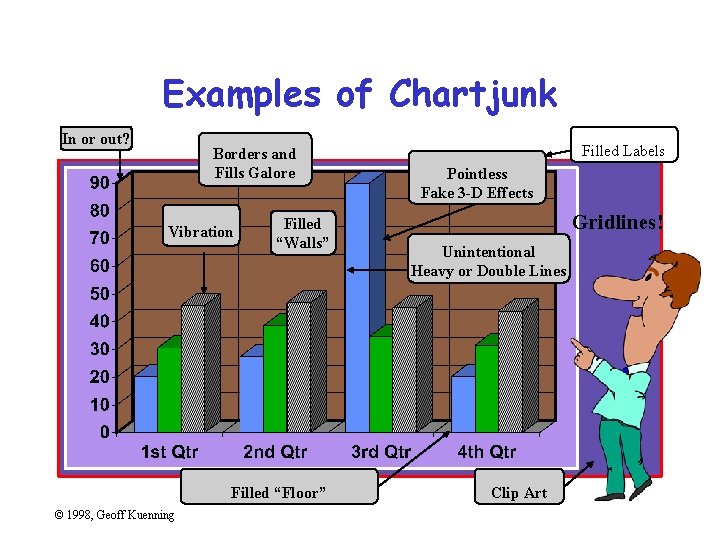
Examples of Chartjunk In or out? Borders and Fills Galore Vibration Filled “Walls” Filled “Floor” © 1998, Geoff Kuenning Filled Labels Pointless Fake 3 -D Effects Gridlines! Unintentional Heavy or Double Lines Clip Art
Common Mistakes in Graphics • • • Excess information Multiple scales Using symbols in place of text Poor scales Using lines incorrectly © 1998, Geoff Kuenning
Excess Information • Sneaky trick to meet length limits • Rules of thumb: – 6 curves on line chart – 10 bars on bar chart – 8 slices on pie chart • Extract essence, don’t cram things in © 1998, Geoff Kuenning
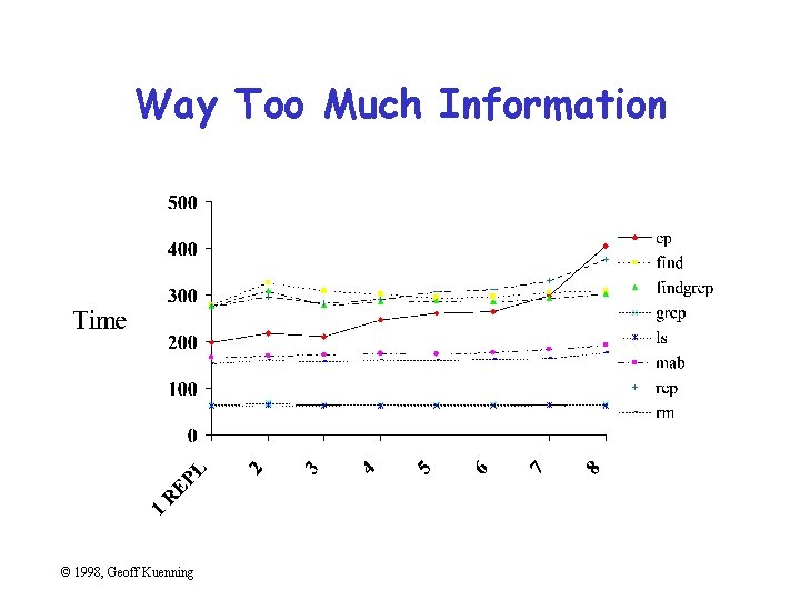
Way Too Much Information © 1998, Geoff Kuenning
What’s Important About That Chart? • Times for cp and rcp rise with number of replicas • Most other benchmarks are near constant • Exactly constant for rm © 1998, Geoff Kuenning
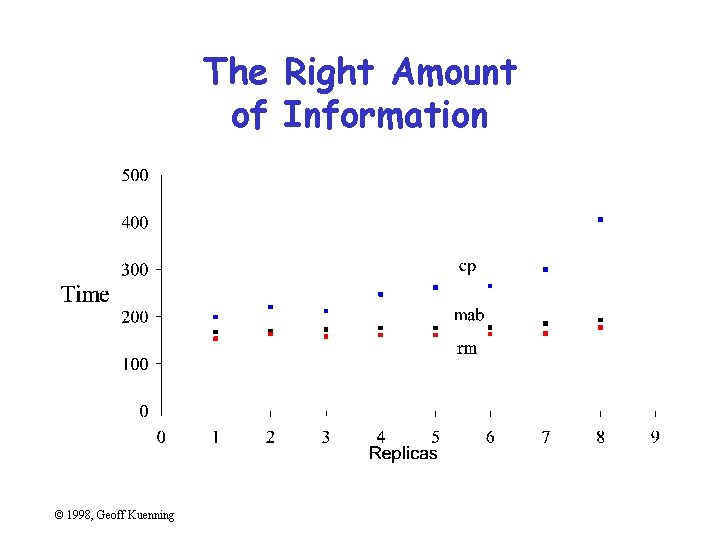
The Right Amount of Information © 1998, Geoff Kuenning
Multiple Scales • Another way to meet length limits • Basically, two graphs overlaid on each other • Confuses reader (which line goes with which scale? ) • Misstates relationships – Implies equality of magnitude that doesn’t exist © 1998, Geoff Kuenning
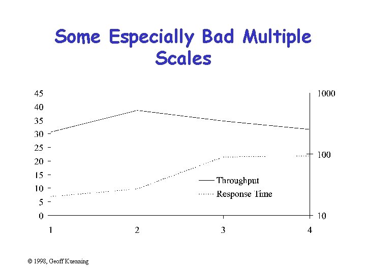
Some Especially Bad Multiple Scales © 1998, Geoff Kuenning
Using Symbols in Place of Text • Graphics should be self-explanatory – Remember that the graphs often draw the reader in • So use explanatory text, not symbols • This means no Greek letters! – Unless your conference is in Athens. . . © 1998, Geoff Kuenning
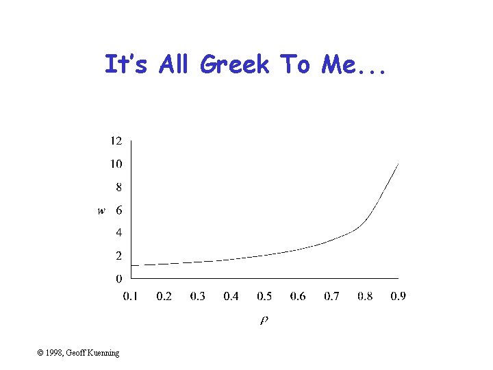
It’s All Greek To Me. . . © 1998, Geoff Kuenning
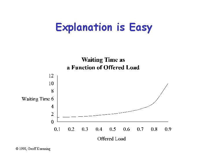
Explanation is Easy © 1998, Geoff Kuenning
Poor Scales • Plotting programs love non-zero origins – But people are used to zero • Fiddle with axis ranges (and logarithms) to get your message across – But don’t lie or cheat • Sometimes trimming off high ends makes things clearer – Brings out low-end detail © 1998, Geoff Kuenning
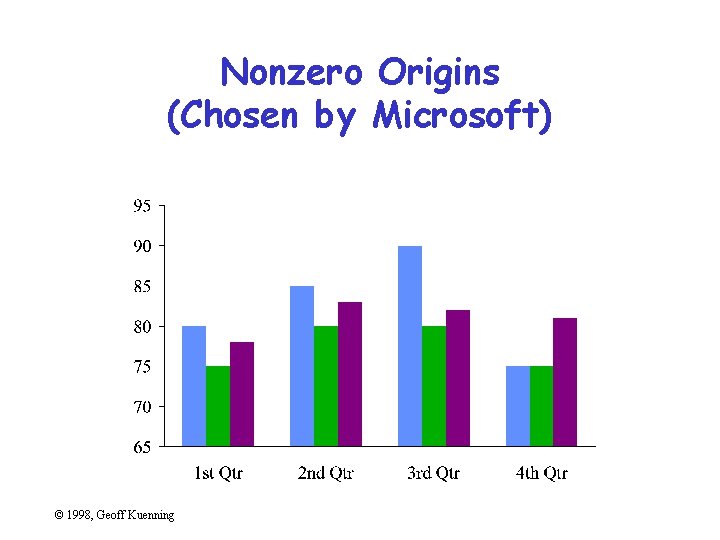
Nonzero Origins (Chosen by Microsoft) © 1998, Geoff Kuenning
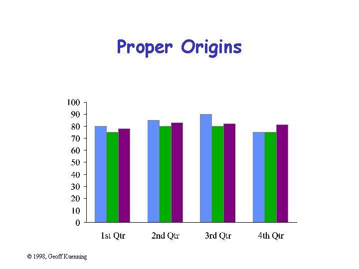
Proper Origins © 1998, Geoff Kuenning
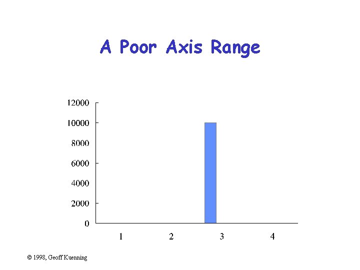
A Poor Axis Range © 1998, Geoff Kuenning
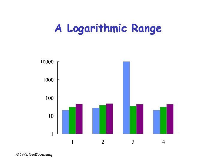
A Logarithmic Range © 1998, Geoff Kuenning
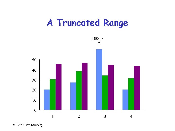
A Truncated Range © 1998, Geoff Kuenning
Using Lines Incorrectly • Don’t connect points unless interpolation is meaningful • Don’t smooth lines that are based on samples – Exception: fitted non-linear curves © 1998, Geoff Kuenning
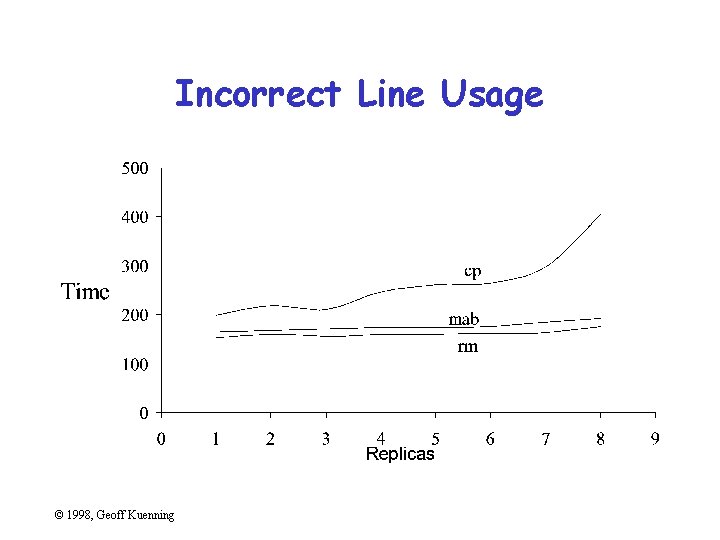
Incorrect Line Usage © 1998, Geoff Kuenning
Pictorial Games • • • Non-zero origins and broken scales Double-whammy graphs Omitting confidence intervals Scaling by height, not area Poor histogram cell size © 1998, Geoff Kuenning
Non-Zero Origins and Broken Scales • People expect (0, 0) origins – Subconsciously • So non-zero origins are a great way to lie • More common than not in popular press • Also very common to cheat by omitting part of scale – “Really, Your Honor, I included (0, 0)” © 1998, Geoff Kuenning
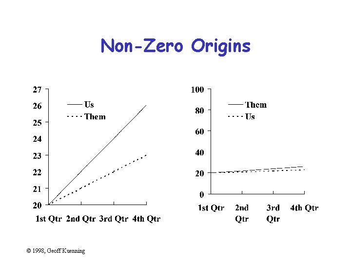
Non-Zero Origins © 1998, Geoff Kuenning
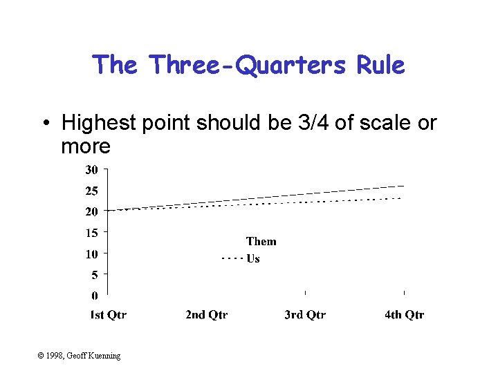
The Three-Quarters Rule • Highest point should be 3/4 of scale or more © 1998, Geoff Kuenning
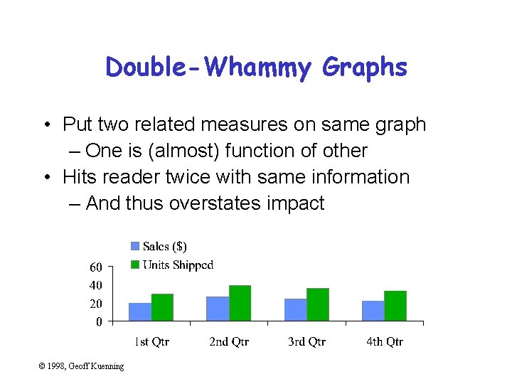
Double-Whammy Graphs • Put two related measures on same graph – One is (almost) function of other • Hits reader twice with same information – And thus overstates impact © 1998, Geoff Kuenning
Omitting Confidence Intervals • Statistical data is inherently fuzzy • But means appear precise • Giving confidence intervals can make it clear there’s no real difference – So liars and fools leave them out © 1998, Geoff Kuenning
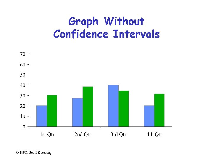
Graph Without Confidence Intervals © 1998, Geoff Kuenning
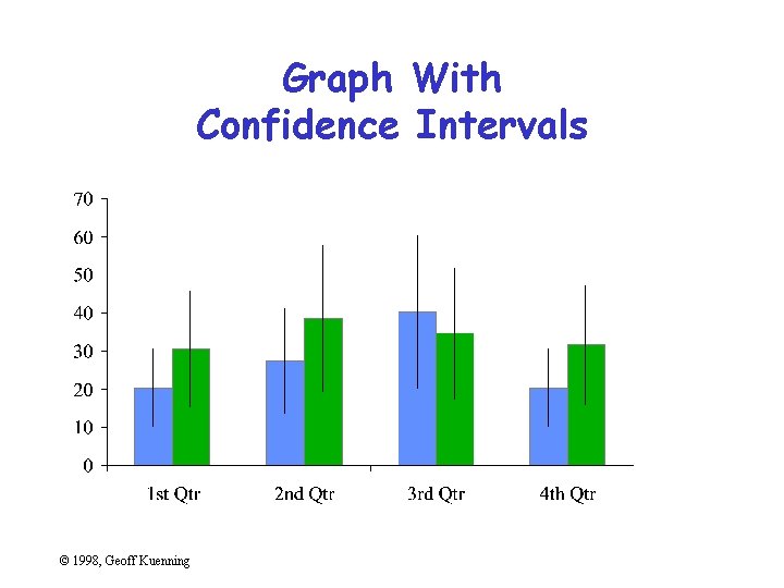
Graph With Confidence Intervals © 1998, Geoff Kuenning
Confidence Intervals • Sample mean value is only an estimate of the true population mean • Bounds c 1 and c 2 such that there is a high probability, 1 -a, that the population mean is in the interval (c 1, c 2): Prob{ c 1 < m < c 2} =1 -a where a is the significance level and 100(1 -a) is the confidence level • Overlapping confidence intervals is interpreted as “not statistically different” © 1998, Geoff Kuenning

Graph With Confidence Intervals © 1998, Geoff Kuenning
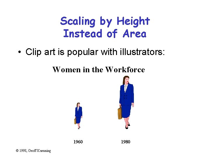
Scaling by Height Instead of Area • Clip art is popular with illustrators: Women in the Workforce 1960 © 1998, Geoff Kuenning 1980
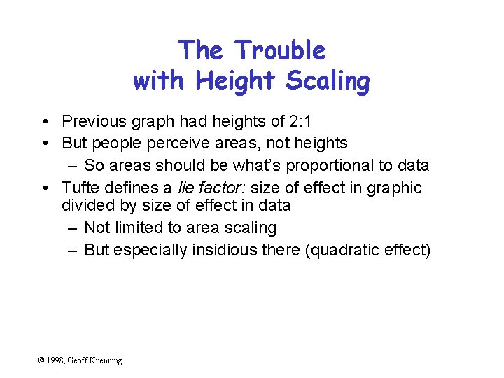
The Trouble with Height Scaling • Previous graph had heights of 2: 1 • But people perceive areas, not heights – So areas should be what’s proportional to data • Tufte defines a lie factor: size of effect in graphic divided by size of effect in data – Not limited to area scaling – But especially insidious there (quadratic effect) © 1998, Geoff Kuenning
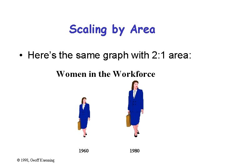
Scaling by Area • Here’s the same graph with 2: 1 area: Women in the Workforce 1960 © 1998, Geoff Kuenning 1980
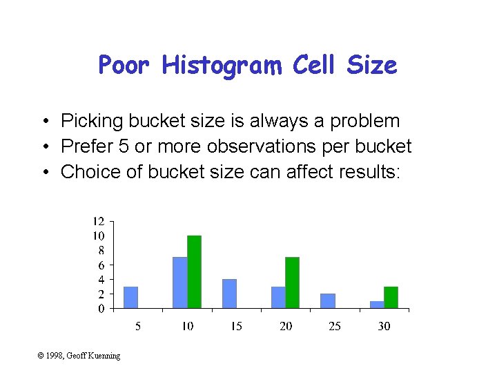
Poor Histogram Cell Size • Picking bucket size is always a problem • Prefer 5 or more observations per bucket • Choice of bucket size can affect results: © 1998, Geoff Kuenning
Special-Purpose Charts • • Histograms Scatter plots Gantt charts Kiviat graphs © 1998, Geoff Kuenning
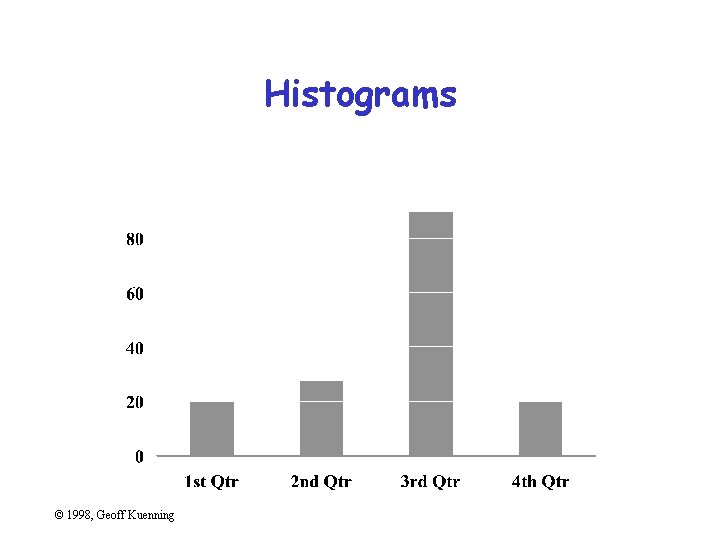
Histograms © 1998, Geoff Kuenning
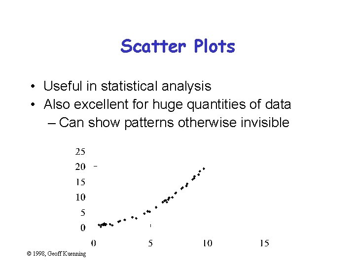
Scatter Plots • Useful in statistical analysis • Also excellent for huge quantities of data – Can show patterns otherwise invisible © 1998, Geoff Kuenning
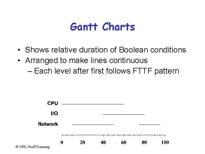
Gantt Charts • Shows relative duration of Boolean conditions • Arranged to make lines continuous – Each level after first follows FTTF pattern © 1998, Geoff Kuenning
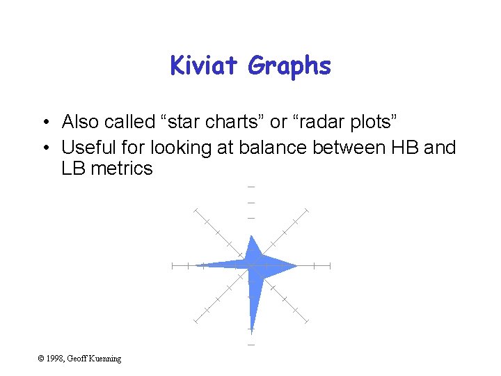
Kiviat Graphs • Also called “star charts” or “radar plots” • Useful for looking at balance between HB and LB metrics © 1998, Geoff Kuenning
Useful Reference Works • Edward R. Tufte, The Visual Display of Quantitative Information, Graphics Press, Cheshire, Connecticut, 1983. • Edward R. Tufte, Envisioning Information, Graphics Press, Cheshire, Connecticut, 1990. • Edward R. Tufte, Visual Explanations, Graphics Press, Cheshire, Connecticut, 1997. • Darrell Huff, How to Lie With Statistics, W. W. Norton & Co. , New York, 1954 © 1998, Geoff Kuenning
- Slides: 92