TH 8 GRADE Charlene Neville Linda Harrison GRADE
- Slides: 7

TH 8 GRADE Charlene Neville Linda Harrison

GRADE 8 » EXPRESSIONS & EQUATIONS UNDERSTAND THE CONNECTIONS BETWEEN PROPORTIONAL RELATIONSHIPS, LINES, AND LINEAR EQUATIONS. » 5 Graph proportional relationships, interpreting the unit rate as the slope of the graph. Compare two different proportional relationships represented in different ways. For example, compare a distancetime graph to a distance-time equation to determine which of two moving objects has greater speed.

STANDARD EXPLAINED https: //www. youtube. com/watch? v=5 m. JIYIc. K 6 y. M

DISTANCE TIME EXAMPLE https: //www. youtube. com/watch? v=o. O_1 u. H 8 H 2 Vg

DISTANCE VS TIME RESOURCES http: //www. mathwarehouse. com/classroom/worksheets/ distance-vs-time/distance-vs-time-graph-worksheet. pdf

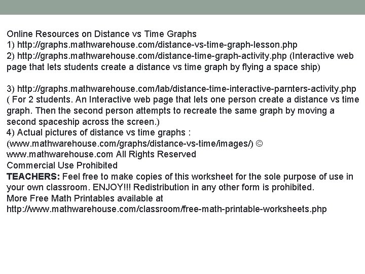
Online Resources on Distance vs Time Graphs 1) http: //graphs. mathwarehouse. com/distance-vs-time-graph-lesson. php 2) http: //graphs. mathwarehouse. com/distance-time-graph-activity. php (Interactive web page that lets students create a distance vs time graph by flying a space ship) 3) http: //graphs. mathwarehouse. com/lab/distance-time-interactive-parnters-activity. php ( For 2 students. An Interactive web page that lets one person create a distance vs time graph. Then the second person attempts to recreate the same graph by moving a second spaceship across the screen. ) 4) Actual pictures of distance vs time graphs : (www. mathwarehouse. com/graphs/distance-vs-time/images/) © www. mathwarehouse. com All Rights Reserved Commercial Use Prohibited TEACHERS: Feel free to make copies of this worksheet for the sole purpose of use in your own classroom. ENJOY!!! Redistribution in any other form is prohibited. More Free Math Printables available at http: //www. mathwarehouse. com/classroom/free-math-printable-worksheets. php

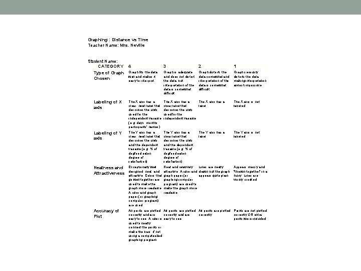
Graphing : Distance vs Time Teacher Name: Mrs. Neville Student Name: ____________________ CATEGORY 4 3 2 1 Graph fits the data Graph is adequate Graph distorts the Graph seriously Type of Graph well and makes it and does not distort data somewhat and distorts the data Chosen easy to interpret. the data, but interpretation of the making interpretation of the data is somewhat difficult. almost impossible. Labeling of X axis The X axis has a clear, neat label that describes the units used for the independent variable (e. g, days, months, participants' names). The X axis has a clear label that label. describes the units used for the independent variable. The X axis is not labeled. Labeling of Y axis The Y axis has a clear, neat label that describes the units and the dependent variable (e. g, % of dogfood eaten; degree of satisfaction). The Y axis has a clear label that describes the units and the dependent variable (e. g, % of dogfood eaten; degree of satisfaction). The Y axis is not labeled. Neatness and Attractiveness Exceptionally well Neat and relatively Lines are neatly designed, neat, and attractive. A ruler and drawn but the graph attractive. Colors that graph paper (or appears quite plain. go well together are graphing computer used to make the program) are used to graph more readable. make the graph more A ruler and graph readable. paper (or graphing computer program) are used. Accuracy of Plot All points are plotted Points are not plotted correctly and are correctly OR extra easy to see. A ruler is easy to see. points were included. used to neatly connect the points or make the bars, if not using a computerized graphing program. The Y axis has a label. Appears messy and "thrown together" in a hurry. Lines are visibly crooked.