Terrible Presentations Common mistakes and how to avoid
Terrible Presentations Common mistakes and how to avoid them
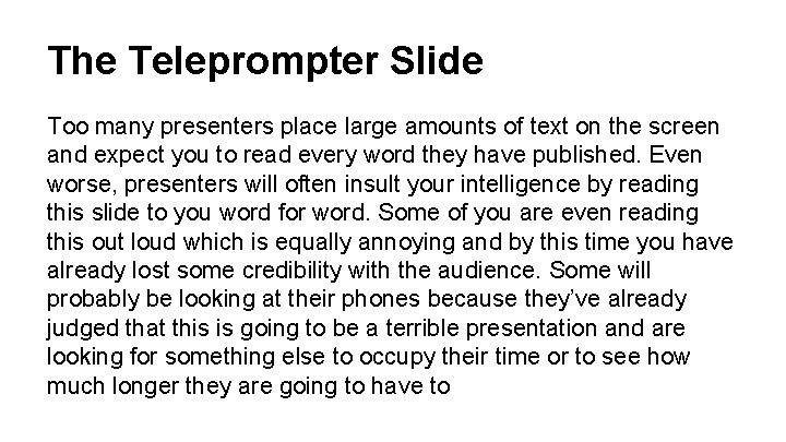
The Teleprompter Slide Too many presenters place large amounts of text on the screen and expect you to read every word they have published. Even worse, presenters will often insult your intelligence by reading this slide to you word for word. Some of you are even reading this out loud which is equally annoying and by this time you have already lost some credibility with the audience. Some will probably be looking at their phones because they’ve already judged that this is going to be a terrible presentation and are looking for something else to occupy their time or to see how much longer they are going to have to
The Teleprompter Slide suffer through your presentation.
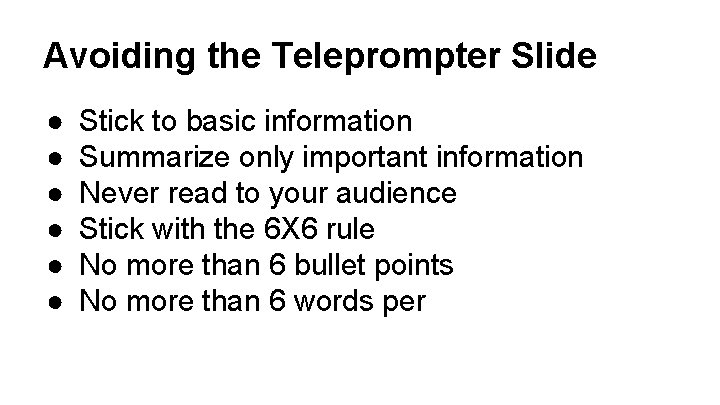
Avoiding the Teleprompter Slide ● ● ● Stick to basic information Summarize only important information Never read to your audience Stick with the 6 X 6 rule No more than 6 bullet points No more than 6 words per
What About Spell Check? Eye halve a spelling chequer It came with my pea sea It plainly marques four my revue Miss steaks eye kin knot sea As soon as a mist ache is maid It nose bee fore two long Its rare lea ever wrong
Bad Color Combinations Contrasting colors make it difficult to concentrate on a slide, causing ● Confusion ● Headaches ● Nausea ● Vomiting ● Anger at presenter
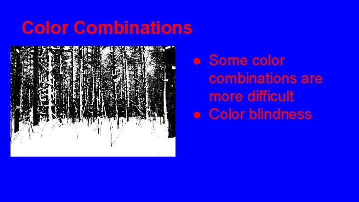
Color Combinations ● Some color combinations are more difficult ● Color blindness
Best color combinations ● Use dark text on light background ● Light gray often works well ● Avoid color-blind combinations o o Read & green Blue & yellow ● Some text fades into background

VISUAL OVERLOAD
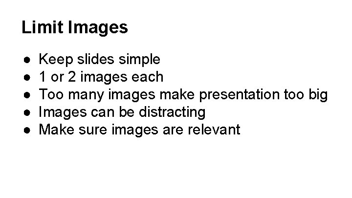
Limit Images ● ● ● Keep slides simple 1 or 2 images each Too many images make presentation too big Images can be distracting Make sure images are relevant
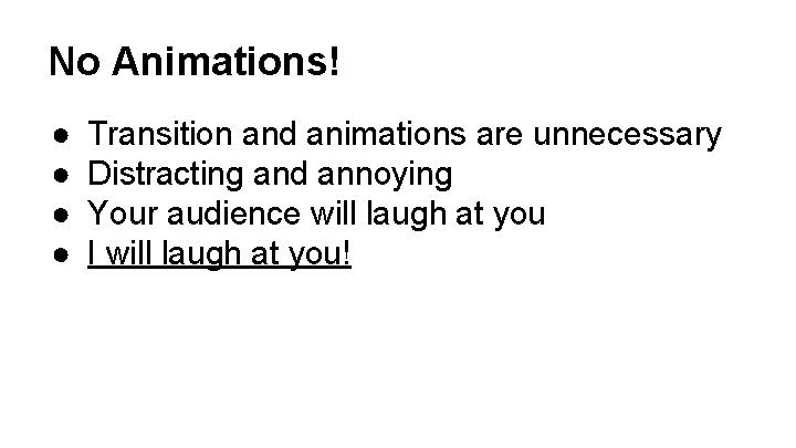
No Animations! ● ● Transition and animations are unnecessary Distracting and annoying Your audience will laugh at you I will laugh at you!

Embedded Video
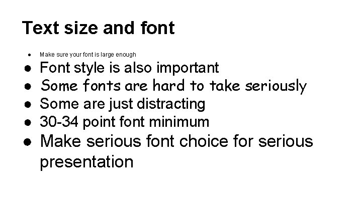
Text size and font ● ● ● Make sure your font is large enough Font style is also important Some fonts are hard to take seriously Some are just distracting 30 -34 point font minimum ● Make serious font choice for serious presentation
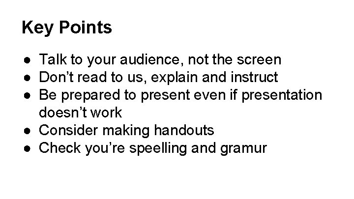
Key Points ● Talk to your audience, not the screen ● Don’t read to us, explain and instruct ● Be prepared to present even if presentation doesn’t work ● Consider making handouts ● Check you’re speelling and gramur
Key Points ● ● Fewer slides = better Avoid “slide rush” if you run short on time Always cite your sources Avoid large blocks of text, this is meant to be a visual aid ● Keep it simple
- Slides: 15