TECHNICAL WRITING UWB 20302 Findings Mdm Siti Aisyah
![TECHNICAL WRITING [UWB 20302] Findings Mdm Siti Aisyah binti](https://slidetodoc.com/presentation_image_h2/3f7d9bc85cd8238c4066f7ab1449bf98/image-1.jpg "TECHNICAL WRITING [UWB 20302] Findings Mdm Siti Aisyah binti")
TECHNICAL WRITING [UWB 20302] Findings Mdm Siti Aisyah binti
 Processing Data (2) Writing Findings (3) Writing Discussion (4) Presenting Data")
Findings (1) Processing Data (2) Writing Findings (3) Writing Discussion (4) Presenting Data
 into meaningful statements • WHEN: After")
• WHAT: Converting raw data (collected information) into meaningful statements • WHEN: After the data collection has been completed • WHY The raw data that have been organised could provide answers to the research questions • HOW: - Manually (using data sheets) - Using computer (using a spreadsheet in Microsoft Excel or database file of a statistical package e. g. SPSS) * For big number of respondents, it is advisable to give codes for responses to quantitative-type questions • TYPES OF DATA: – Quantitative (e. g. numbers, statistics) – Qualitative (e. g. descriptions, explanations)
 • Record • Categorise Organis e Illustrate • Tables • Graphs")
Data Processing (Con’t) • Record • Categorise Organis e Illustrate • Tables • Graphs • Charts

Organising Data – Record & Categorise Table 4. 1: Sample Data Sheet Done Manually Note: HP = hand phone
 Table 4. 2: Sample Database File Using")
Organising Data – Record & Categorise (Con’t) Table 4. 2: Sample Database File Using Microsoft Excel
 Table 4. 3: Sample Datasheet Using Coding")
Organising Data – Record & Categorise (Con’t) Table 4. 3: Sample Datasheet Using Coding System

Illustrating Data – Using Table 4. 4: Gender versus HP Service Providers Note: HP = hand phone HP Service Provider Gender Total Talktime Aircom Lemon. Ring Male 2 3 0 5 Female 2 1 2 5 Total 4 4 2 10

Illustrating Data – Using Graph Figure 4. 1: HP Service Providers versus Gender
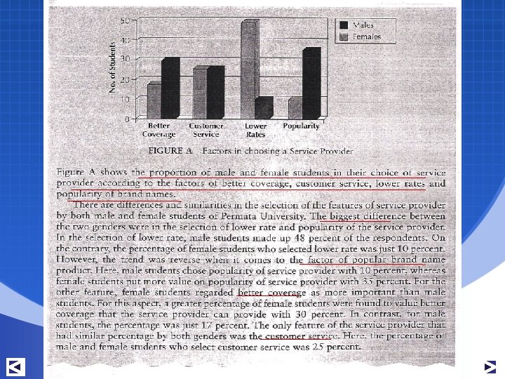
 Figure 4. 2: Gender versus Types of HP")
Illustrating Data – Using Graph (Con’t) Figure 4. 2: Gender versus Types of HP Service Provider

Illustrating Data – Using Chart

Writing Findings Section • One of the most important sections of your report • Discoveries based on facts, data or responses from the respondents • Interpretation of frequencies in the illustrations that describe the data • The most common statistics used to present the quantitative data are percentages, frequency counts, and averages • Example:

Organising Findings Type A Findings / Results Topic 1 Topic 2 Topic 3 Topic 4 Discussion Topic 1 Topic 2 Topic 3 Topic 4 Type B Topic 1 Findings / Results Discussion Topic 2 Findings / Results Discussion Topic 3 Findings / Results Discussion Topic 4 Findings / Results Discussion

Strategies in Writing Discussion Section 1. 2. 3. 4. Explain the findings Compare the findings Evaluate the findings Infer from the findings

Explain the findings – give reasons for the result Example: Based on Figure 3, the results clearly show that most of the students who took part in the survey preferred the prepaid plan. Only a small fraction of the students used the post-paid plan as opposed to those who used the prepaid plan. The result were predictable as the respondents were all students, and the prepaid plan seemed to be the most suitable plan to cater for the needs of the students as they paid for what they used only. While there were a handful of students from wealthy families, the majority of the students simply could not afford the post-paid plan.

Compare the findings – with other research within the same field Example: It can be summarised that SMS was the most popular means of communication among students of higher learning institutions. This trend was very much expected as students live on a strict budget. This was similar to the findings of another study conducted by Param et. al. (2003) at Universiti Barat Malaysia which found that SMS was the primary reason why students owned a handset.

Evaluate the findings – provide an assessment of the findings Example: Better coverage of certain service providers means that service is available over a wider coverage. One of the service providers claimed that its cellular network offered a more stable and wider coverage in most parts of Peninsular Malaysia, Sabah and Sarawak compared to the other service providers. This claim seemed to have found credibility among the students in most institutions of higher learning. However, there was no way of verifying this claim as there had been no studies conducted on the network coverage of all service providers in the country. As such, the responses by the students on the better coverage of one service provider seemed to be based on hearsay.

Infer from the findings – develop your viewpoints and ideas based on the facts and results Example: The traffic information was the least attractive peripheral service provided by the hand phone service provider among the respondents. This was expected as the university was situated far from the busy metropolitan area. Apart from that, many of the students lived in the campus and did not need traffic information to go to their classes. As such, traffic information may not be useful to them.
- Slides: 19