Teach A Level Statistics Maths 1 Histograms Christine

- Slides: 19

“Teach A Level Statistics Maths” 1 Histograms © Christine Crisp

Histograms Statistics 1 AQA EDEXCEL MEI/OCR "Certain images and/or photos on this presentation are the copyrighted property of Jupiter. Images and are being used with permission under license. These images and/or photos may not be copied or downloaded without permission from Jupiter. Images"

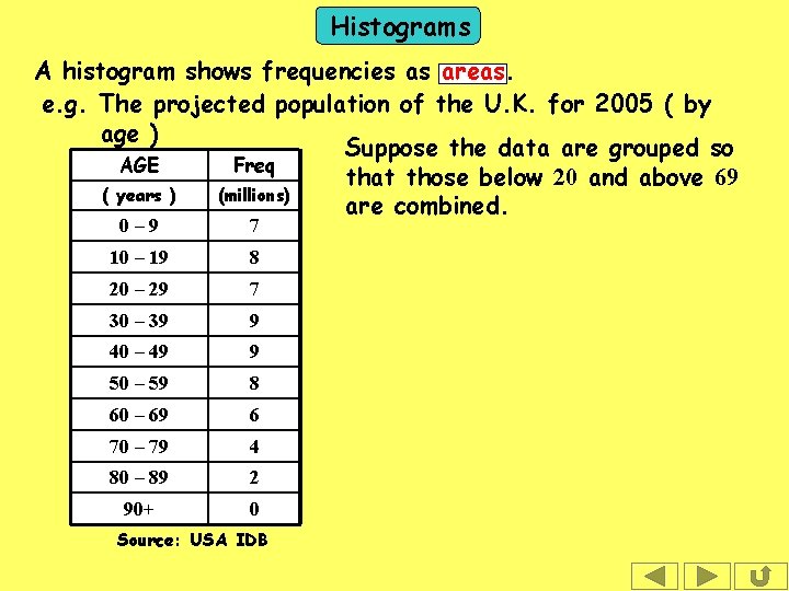
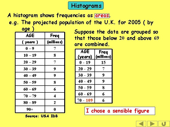
Histograms A histogram shows frequencies as areas. e. g. The projected population of the U. K. for 2005 ( by age ) Suppose the data are grouped so AGE Freq that those below 20 and above 69 ( years ) (millions) are combined. 0– 9 7 10 – 19 8 20 – 29 7 30 – 39 9 40 – 49 9 50 – 59 8 60 – 69 6 70 – 79 4 80 – 89 2 90+ 0 Source: USA IDB

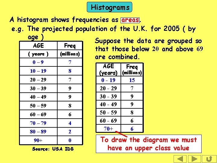
Histograms A histogram shows frequencies as areas. e. g. The projected population of the U. K. for 2005 ( by age ) Suppose the data are grouped so AGE Freq that those below 20 and above 69 ( years ) (millions) are combined. 0– 9 7 10 – 19 8 20 – 29 7 30 – 39 9 40 – 49 9 50 – 59 8 60 – 69 6 70 – 79 4 80 – 89 2 90+ 0 Source: USA IDB AGE Freq (years) (millions) 0 - 19 20 - 29 30 - 39 40 - 49 50 - 59 60 - 69 70+ 15 7 9 9 8 6 6 To draw the diagram we must have an upper class value

Histograms A histogram shows frequencies as areas. e. g. The projected population of the U. K. for 2005 ( by age ) Suppose the data are grouped so AGE Freq that those below 20 and above 69 ( years ) (millions) are combined. 0– 9 7 10 – 19 8 20 – 29 7 30 – 39 9 40 – 49 9 50 – 59 8 60 – 69 6 70 – 79 4 80 – 89 2 90+ 0 Source: USA IDB AGE Freq (years) (millions) 0 - 19 20 - 29 30 - 39 40 - 49 50 - 59 60 - 69 70 - 109 15 7 9 9 8 6 6 I chose a sensible figure

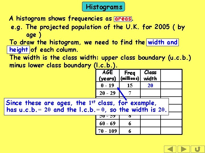
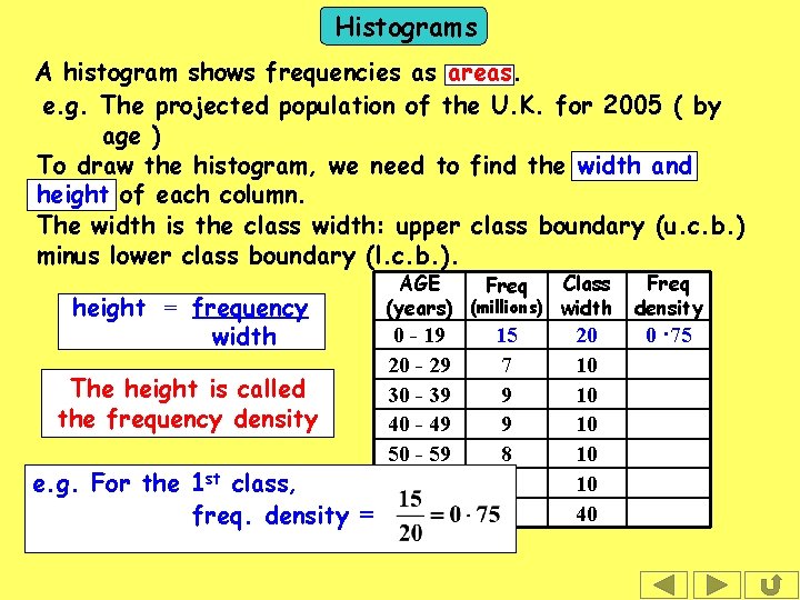
Histograms A histogram shows frequencies as areas. e. g. The projected population of the U. K. for 2005 ( by age ) To draw the histogram, we need to find the width and height of each column. The width is the class width: upper class boundary (u. c. b. ) minus lower class boundary (l. c. b. ). AGE Class Freq (years) (millions) width 0 - 19 15 20 20 - 29 7 30 - 39 for 9 example, Since these are ages, the 1 st class, has u. c. b. = 20 and the l. c. b. =40 0, - 49 so the 9 width is 20. 50 - 59 8 60 - 69 6 70 - 109 6

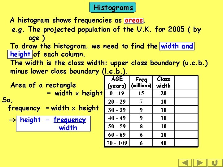
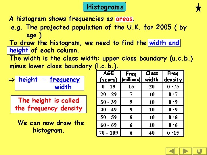
Histograms A histogram shows frequencies as areas. e. g. The projected population of the U. K. for 2005 ( by age ) To draw the histogram, we need to find the width and height of each column. The width is the class width: upper class boundary (u. c. b. ) minus lower class boundary (l. c. b. ). AGE Class Freq (years) (millions) width Area of a rectangle = width height 0 - 19 So, 20 - 29 frequency = width height 30 - 39 40 - 49 height = frequency 50 - 59 width 60 - 69 70 - 109 15 7 9 9 8 6 6 20 10 10 10 40

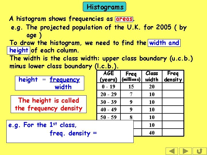
Histograms A histogram shows frequencies as areas. e. g. The projected population of the U. K. for 2005 ( by age ) To draw the histogram, we need to find the width and height of each column. The width is the class width: upper class boundary (u. c. b. ) minus lower class boundary (l. c. b. ). height = frequency width The height is called the frequency density e. g. For the 1 st class, freq. density = AGE Class Freq (years) (millions) width 0 - 19 20 - 29 30 - 39 40 - 49 50 - 59 60 - 69 70 - 109 15 7 9 9 8 6 6 20 10 10 10 40 Freq density

Histograms A histogram shows frequencies as areas. e. g. The projected population of the U. K. for 2005 ( by age ) To draw the histogram, we need to find the width and height of each column. The width is the class width: upper class boundary (u. c. b. ) minus lower class boundary (l. c. b. ). height = frequency width The height is called the frequency density e. g. For the 1 st class, freq. density = AGE Class Freq (years) (millions) width 0 - 19 20 - 29 30 - 39 40 - 49 50 - 59 60 - 69 70 - 109 15 7 9 9 8 6 6 20 10 10 10 40 Freq density 0 · 75

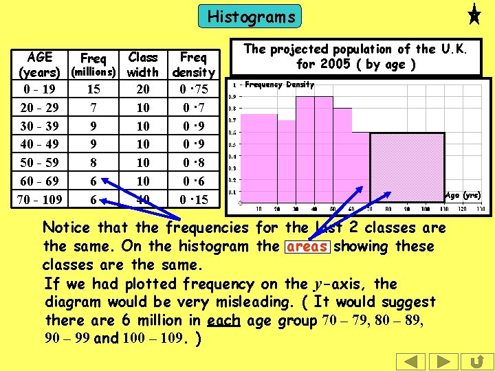
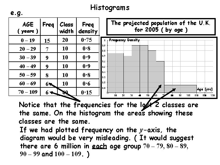
Histograms A histogram shows frequencies as areas. e. g. The projected population of the U. K. for 2005 ( by age ) To draw the histogram, we need to find the width and height of each column. The width is the class width: upper class boundary (u. c. b. ) minus lower class boundary (l. c. b. ). height = frequency width The height is called the frequency density We can now draw the histogram. AGE Class Freq (years) (millions) width 0 - 19 20 - 29 30 - 39 40 - 49 50 - 59 60 - 69 70 - 109 15 7 9 9 8 6 6 20 10 10 10 40 Freq density 0 · 75 0 · 7 0 · 9 0 · 8 0 · 6 0 · 15

Histograms AGE Class Freq (years) (millions) width 0 - 19 20 - 29 30 - 39 40 - 49 50 - 59 60 - 69 70 - 109 15 7 9 9 8 6 6 20 10 10 10 40 Freq density The projected population of the U. K. for 2005 ( by age ) 0 · 75 0 · 7 0 · 9 0 · 8 0 · 6 0 · 15 Notice that the frequencies for the last 2 classes are the same. On the histogram the areas showing these classes are the same. If we had plotted frequency on the y-axis, the diagram would be very misleading. ( It would suggest there are 6 million in each age group 70 – 79, 80 – 89, 90 – 99 and 100 – 109. )

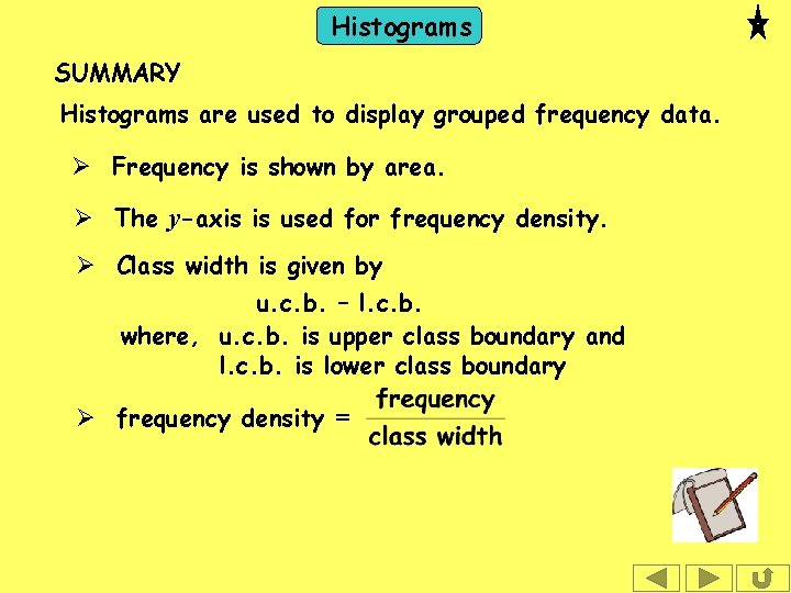
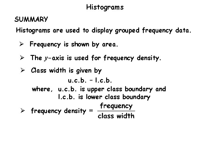
Histograms SUMMARY Histograms are used to display grouped frequency data. Ø Frequency is shown by area. Ø The y-axis is used for frequency density. Ø Class width is given by u. c. b. – l. c. b. where, u. c. b. is upper class boundary and l. c. b. is lower class boundary Ø frequency density =

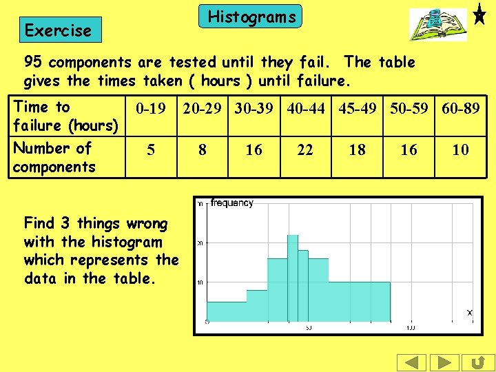
Histograms Exercise 95 components are tested until they fail. The table gives the times taken ( hours ) until failure. Time to failure (hours) Number of components 0 -19 5 Find 3 things wrong with the histogram which represents the data in the table. 20 -29 30 -39 40 -44 45 -49 50 -59 60 -89 8 16 22 18 16 10

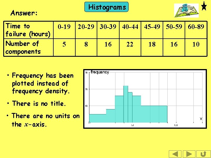
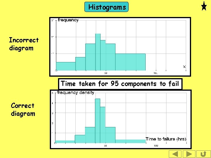
Histograms Answer: Time to failure (hours) Number of components 0 -19 20 -29 30 -39 40 -44 45 -49 50 -59 60 -89 5 • Frequency has been plotted instead of frequency density. • There is no title. • There are no units on the x-axis. 8 16 22 18 16 10

Histograms Incorrect diagram Time taken for 95 components to fail Correct diagram


The following slides contain repeats of information on earlier slides, shown without colour, so that they can be printed and photocopied. For most purposes the slides can be printed as “Handouts” with up to 6 slides per sheet.

Histograms SUMMARY Histograms are used to display grouped frequency data. Ø Frequency is shown by area. Ø The y-axis is used for frequency density. Ø Class width is given by u. c. b. – l. c. b. where, u. c. b. is upper class boundary and l. c. b. is lower class boundary Ø frequency density =

Histograms e. g. AGE Freq 0 – 19 15 7 9 9 8 6 6 ( years ) 20 – 29 30 – 39 40 – 49 50 – 59 60 – 69 70 – 109 Class Freq width density 20 10 10 10 40 The projected population of the U. K. for 2005 ( by age ) 0· 75 0· 8 0· 9 0· 8 0· 6 0· 15 Notice that the frequencies for the last 2 classes are the same. On the histogram the areas showing these classes are the same. If we had plotted frequency on the y-axis, the diagram would be very misleading. ( It would suggest there are 6 million in each age group 70 – 79, 80 – 89, 90 – 99 and 100 – 109. )