Task 2 codes and conventions of film posters


- Slides: 19
Task 2 – codes and conventions of film posters JAYDA SEMMEDI
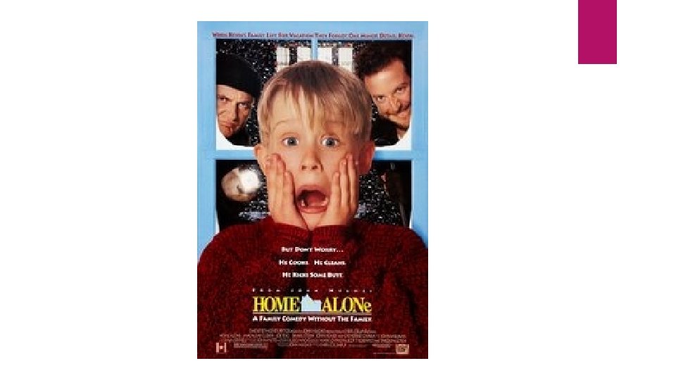
Content Looking at the poster I can tell that the movie is about a child left home alone. The viewer can tell this from the title of the movie 'home alone'. I can also tell from the poster that the two grown men behind the child are there to cause a dangerous crime. The child's facial expression hints to the viewer that he is not meant to be home alone.
Written language On the poster there are 2 slogans which also hints to the viewer about the movie. The one at the top "when Kevin's family left for vacation they forgot one minor detail: Kevin". This also gives away to the viewers that his family went for a vacation, which suggests they would be gone for a while (until they notice Kevin's missing). The second slogan: "But don’t worry. . . he cooks. He cleans. He kicks some butt". This shows the viewer that the child is quite independent for his age because he knows how to cook and clean. The 3 rd line of the slogan suggests to me that Kevin is in danger from the two men standing behind him and some comedy/violence will occur. This shows that the target audience is aimed at males and females 11 -30. This is beause its an appropriate movie for the younger generation and the older generation would find the movie quite appealing.
Typography The artist would have to consider the facial expressions of the characters and slogans on the poster to represent theme of the move. From the facial expressions on all three characters suggests to me that its not a serious movie (more of a comedy) the line 'Kicks some butt' suggests that the movie is a comedy/action movie specifically made for the younger generation. The artist done this because the term butt is used more by children.
Photographs and illustrations The facial expressions of the main character Kevin suggests to the audience that the movie has a comedy theme. The facial expressions on the two characters behind the main also suggest the movie theme is comedy however also hints to us that violence will also be featured in the movie. The snow in the background suggests to the audience that the movie is set in December which suggests that the movie is based on the christmas holiday.
Representations The child Kevin is seen as the main character due to the mid-close up of him. The two characters behind Kevin (main character) are seen as the semi main characters, this is because they are featured in the poster which indicates that they're important in the movie, however both the character are standing behind the main character which shows that they're both not the star of the movie.
Colour schemes The colour's shown in this posters are bright colours such as red, blue, white etc. These colour's suggest happiness. This indictes that the movie wouldn’t cause distress to others. The red jumper that is worn by the main character also represents christmas because colours such as red, green, and yellow represents the christmas holiday'
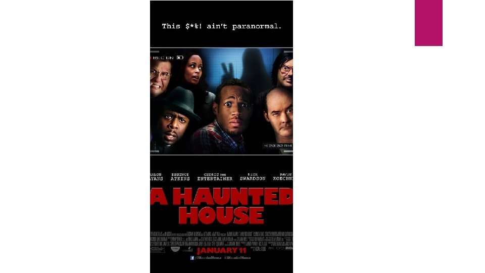
Content Looking at the 'A haunted house' poster, I can tell that this movie is also a comedy movie. This is because of the ghost in the background holding a peace sign. I can also tell that everyone in the poster have an important roll in the movie.
Written language There is a slogan at the top of the poster which says "this sh*t ain't paranormal" The use of the swear word and use of the word 'aint' suggests to the audience that the movie is targeted at males and females aged 15+. This is because an older audience wouldn’t find the movie funny due to their maturity levels.
Typography The artist who created this poster would have had to consider the facial expressions of the character and their surroundings. This is because the facial expressions gives away theme of the move, in this case all the characters all look scared however it still shoes the movie is a comedy based on the way their face is shown in the poster. The artist would also need to chose the right colours to represent the comedy/horror theme. For example, to use darker colours to represent horror and brighter colours to represent comedy.
Photographs and illustrations We can tell from this poster who the main character is and who the semi main character are. This is because the main character is standing at the very front and in the centre of the camera whilst the semi-main characters are standing next to and behind the main character. The photograph is taken as a webcam, this suggests that some vlogging in the vidoes may be included from the characters. This also suggest to the audience that this is a comedy remake of 'the paranormal activity' because the characters in the original movie would vlog in the movie and notice strange things happening in their home.
Representation The representation of the main character is shown by a mid camera shot and is also standing in the centre of the photo. The ghost is also presented as immature therefor it fits well with theme of the movie. The ghost itslef represents the horror of the movie and the hang sign its posing represents the comedy them of the movie.
Colour schemes The colours involved with this poster are more darker colours such as dark blue, black etc. However these colours doesn’t suggest to the audience when and here the movie is set, for example what season? What holiday (christmas, easter etc)
Comparing 20 th and 21 st century posters Looking at both of the posters I can see a huge difference in the design and how movies are now made. The 20 th century's poster is more specific about what to expect in the movie and possibly gives away too much of the story already. However the 21 st century looks more appealing and gives an idea to the audience about the movie but doesn’t give away too much. What's interesting about the 21 st century poster is that dark colours where used but still represented the comedy theme of the moive.
Alternate posters The second poster for 'home alone' is different and hint that the movie is set in the Christmas holiday due to the colours (green & red) and the Christmas lights that are tied around the other two charatcters. In this poster the main character Kevin is holding the same pose however is standing on the side of the poster instead of the middle but he is in the very front as the semi-main characters are in the far end behind him. This poster doesn’t have any slogans but its more simple and doesn’t give away too much of the story as the last one did.
Alternate posters This poster is much more different from the last because it focuses more on the main character of the movie as he is the only person in the shot. The slogan is different from the other 'the very last exorcism'. This somehow is mocking the fact that there has been many exorcism movies. This poster also suggests to theme of the movie which is horror and comedy, the horror is shown by the background of the poster and the position of the main character, and the comedy is shown through the facial expressions of the main character.
Conclusion In conclusion I have noticed that the 20 th and 21 st century are very different however theme of movies are presented most by facial expressions, backgrounds and the surroundings. There are different language being used (in terms of slang) and the 21 st century posters are effecting but doesn’t give away too much of the story.