Tables Charts and Graphs with Examples from History
Tables, Charts, and Graphs with Examples from History, Economics, Education, Psychology, Urban Affairs and Everyday Life BY: ERNESTO GARCIA AND REBECCA BLITZER
Tables, Charts, and Graphs Basics
We use charts and graphs to visualize data. This data can either be generated data, data gathered from an experiment, or data collected from some source. A picture tells a thousand words, so it is not a surprise that many people use charts and graphs when explaining data.

Types of Visual Representations of Data
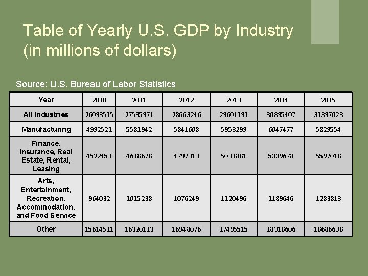
Table of Yearly U. S. GDP by Industry (in millions of dollars) Source: U. S. Bureau of Labor Statistics Year 2010 2011 2012 2013 2014 2015 All Industries 26093515 27535971 28663246 29601191 30895407 31397023 Manufacturing 4992521 5581942 5841608 5953299 6047477 5829554 Finance, Insurance, Real Estate, Rental, Leasing 4522451 4618678 4797313 5031881 5339678 5597018 Arts, Entertainment, Recreation, Accommodation, and Food Service 964032 1015238 1076249 1120496 1189646 1283813 Other 15614511 16320113 16948076 17495515 18318606 18686638
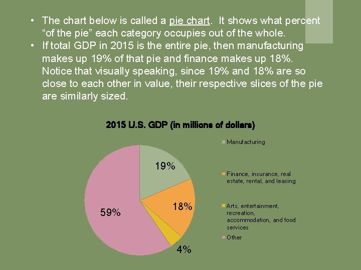
• The chart below is called a pie chart. It shows what percent “of the pie” each category occupies out of the whole. • If total GDP in 2015 is the entire pie, then manufacturing makes up 19% of that pie and finance makes up 18%. Notice that visually speaking, since 19% and 18% are so close to each other in value, their respective slices of the pie are similarly sized. 2015 U. S. GDP (in millions of dollars) Manufacturing 19% 59% Finance, insurance, real estate, rental, and leasing 18% Arts, entertainment, recreation, accommodation, and food services Other 4%
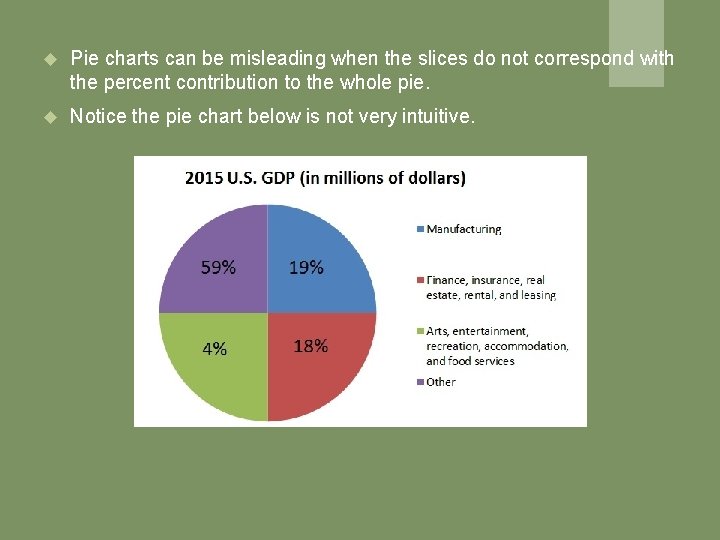
Pie charts can be misleading when the slices do not correspond with the percent contribution to the whole pie. Notice the pie chart below is not very intuitive.
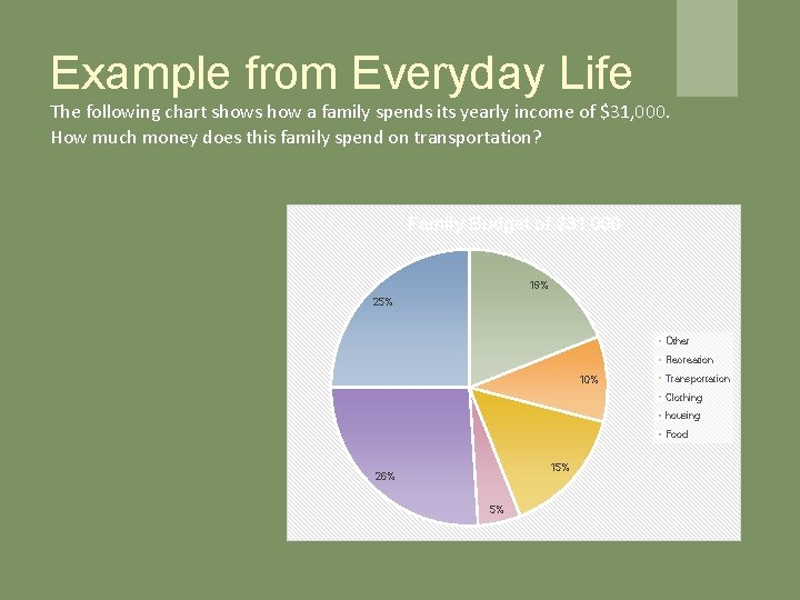
Example from Everyday Life The following chart shows how a family spends its yearly income of $31, 000. How much money does this family spend on transportation? Family Budget of $31, 000 19% 25% Other Recreation 10% Transportation Clothing housing Food 15% 26% 5%
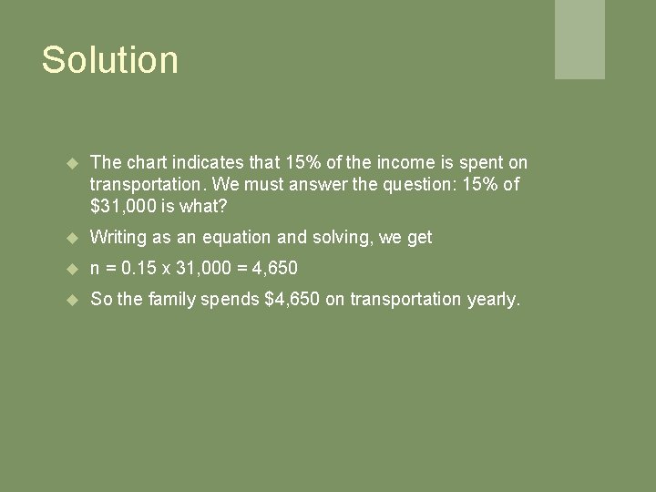
Solution The chart indicates that 15% of the income is spent on transportation. We must answer the question: 15% of $31, 000 is what? Writing as an equation and solving, we get n = 0. 15 x 31, 000 = 4, 650 So the family spends $4, 650 on transportation yearly.
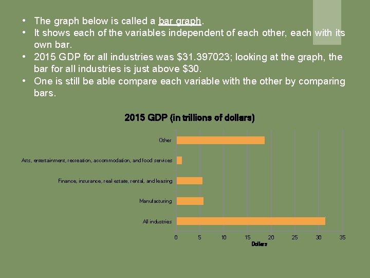
• The graph below is called a bar graph. • It shows each of the variables independent of each other, each with its own bar. • 2015 GDP for all industries was $31. 397023; looking at the graph, the bar for all industries is just above $30. • One is still be able compare each variable with the other by comparing bars. 2015 GDP (in trillions of dollars) Other Arts, entertainment, recreation, accommodation, and food services Finance, insurance, real estate, rental, and leasing Manufacturing All industries 0 5 10 15 20 Dollars 25 30 35
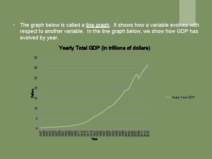
• The graph below is called a line graph. It shows how a variable evolves with respect to another variable. In the line graph below, we show GDP has evolved by year. Yearly Total GDP (in trillions of dollars) 35 30 20 Yearly Total GDP 15 10 5 0 1947 1949 1951 1953 1955 1957 1959 1961 1963 1965 1967 1969 1971 1973 1975 1977 1979 1981 1983 1985 1987 1989 1991 1993 1995 1997 1999 2001 2003 2005 2007 2009 2011 2013 2015 Dollars 25 Year
When to use a Line Graph, Pie Chart, or Bar Graph? We use the pie chart here to compare parts of a whole. In our example, we compared components of US GDP. The line chart is useful when you want to show a variable changes over time. For our purposes, we used it show GDP changed over time. Bar graphs are good for comparing different groups of variables. We used it to compare different components of US GDP. We did the same with the pie chart; depending on your purposes you may choose to use a pie chart or a bar graph.
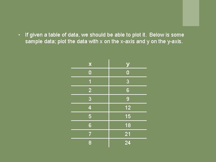
• If given a table of data, we should be able to plot it. Below is some sample data; plot the data with x on the x-axis and y on the y-axis. x y 0 0 1 3 2 6 3 9 4 12 5 15 6 18 7 21 8 24
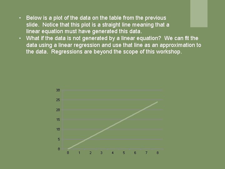
• Below is a plot of the data on the table from the previous slide. Notice that this plot is a straight line meaning that a linear equation must have generated this data. • What if the data is not generated by a linear equation? We can fit the data using a linear regression and use that line as an approximation to the data. Regressions are beyond the scope of this workshop. 30 25 20 15 10 5 0 0 1 2 3 4 5 6 7 8
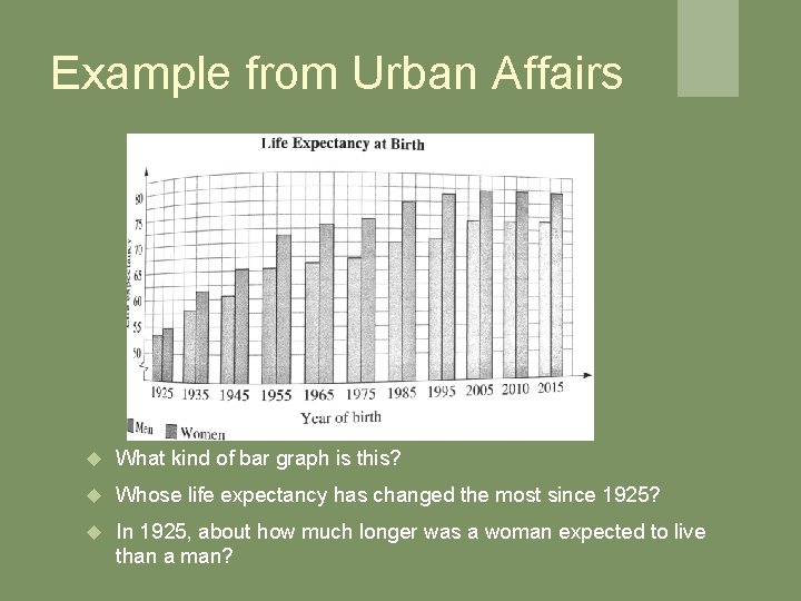
Example from Urban Affairs What kind of bar graph is this? Whose life expectancy has changed the most since 1925? In 1925, about how much longer was a woman expected to live than a man?
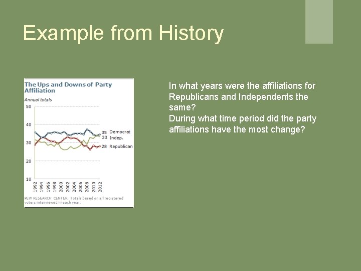
Example from History In what years were the affiliations for Republicans and Independents the same? During what time period did the party affiliations have the most change?
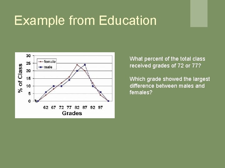
Example from Education What percent of the total class received grades of 72 or 77? Which grade showed the largest difference between males and females?
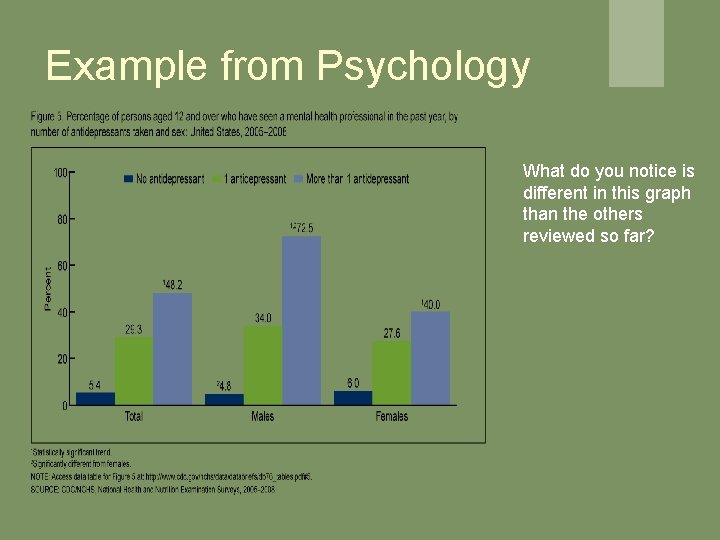
Example from Psychology What do you notice is different in this graph than the others reviewed so far?
- Slides: 19