Sunspot Measurements Jennifer Jones Sunspot Raw Data Collected


- Slides: 8
Sunspot Measurements Jennifer Jones
Sunspot Raw Data Collected sunspot raw data was accessed from http: //solarscience. msfc. na sa. gov/greenwch/spot_nu m. txtand was visually interpreted by creating the following graphs. ● YEAR MON SSN DEV 1749 1 58. 0 24. 1 1749 2 62. 6 25. 1 1749 3 70. 0 26. 6 1749 4 55. 7 23. 6 1749 5 85. 0 29. 4 1749 6 83. 5 29. 2 1749 7 94. 8 31. 1
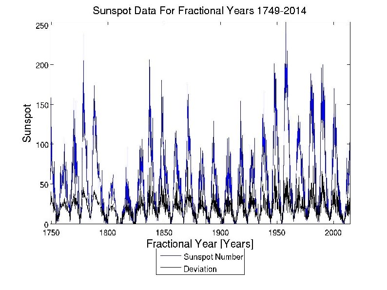
Sunspot Data For Fractional Years 1749 -2014 Data was collected 12 times a year - once each month – giving us fractional years from 1749 -2014. Months are in cycles of 1 -12: data was collected 12 times a year, once each month. The number of sunspots every 12 months for years of 1749 to 2014 are listed. The sunspot number data seems to have a trend of low sunspot numbers in the first few months and begin to rise over the next few months with their peak at the 11 th month. After the 11 th month, the sunspot number begins to decrease and the pattern is repeated. The deviation is used to show if there is a change in standard deviation is changing over time. There are shifts in the variation. The magnitude of the shifts are of a consistent pattern. There is a distinct pattern in the shifts in variation As the number in sunspots increase, the deviation also increases As the number of sunspots decrease, the deviation also decreases. The highest number of sunspots recorded was from 1749 -2014 was in year 1957 in the 8 th month with 254 sunspots. The second highest number of sunspots recorded was from 1779 with 240 sunspots. The blue line represents sunspot number while the black line represents deviation. ● ● ● ● I wonder what would happen if I broke down the data into every 10 years and compared the graphs. This current graph is very busy and there is a lot going on. What would be the best type of line to use? I tried using dashes, asterisks, x's, dots, circles, but it made it look even busier. ● ● ●
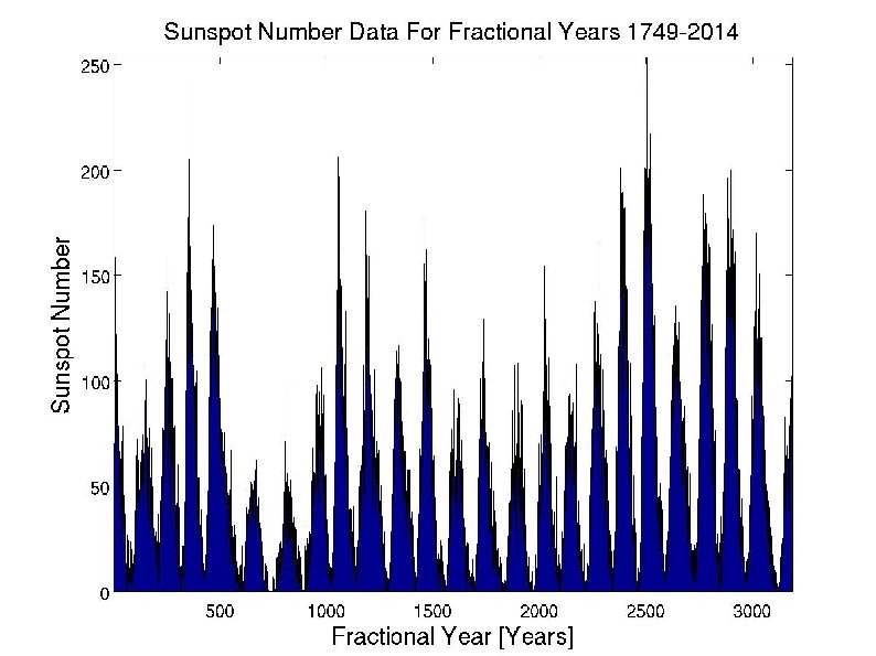
Sunspot Number Data For Fractional Years 1749 -2014 ● This is an area graph, much like the previous slide, yet I believe this graph conveys the message more clearly than the previous slide. Here we are only looking at sunspot number; deviation is not included. Sunspot number is plotted against fractional years. The sunspot number data seems to have a trend of low sunspot numbers in the first few months and begin to rise over the next few months with their peak at the 11 th month. ● ● ● After the 11 th month, the sunspot number begins to decrease and the pattern is repeated. I wonder what would happen if I broke down the data into every 10 years and compared the graphs. This current graph is very crowded and it would be nice to see the individual peaks closer within a shorter time period. I wanted to try and learn how to do a contour map to convey the information, but I am unsure of how to do it/ when I tried, it did not turn out right. Because the image is zoomed out so far, it looks like there is both black and blue on this image, but there is actually only blue when you zoom in – how can I fix this? I honestly like this graph better than the first graph because there is less (not by much) going on than the previous slide. ● ● ●
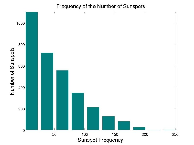
Frequency of the Number of Sunspots The bars on the graph had a trend: There is a greater frequency in low sunspot numbers There is a lower frequency in high sunspot numbers This corresponds with the data and the other two graphs. There a fewer number of high sunspot numbers (Peaks) on the previous graphs There are many more low sunspot numbers (more dense near the bottom of the graph) from the previous graphs ● ● ● I would like to change the scales of both the x and y axes. As of right now, the scale is not very helpful with interpreting the message. I would also maybe want to consider adding a legend into the white space, or some type of logo or something!! There is too much white space! I think that this histogram is helpful, but is it actually useful to an audience? I need an outside perspective. ● ● ●