Styled Component Visual primitives for the component age

- Slides: 19

Styled Component. Visual primitives for the component age. Use the best bits of ES 6 and CSS to style your apps without stress. Phurunbit Tech. LTD

Overview Utilising tagged template literals (a recent addition to Java. Script) and the power of CSS, styledcomponents allows you to write actual CSS code to style your components. It also removes the mapping between components and styles – using components as a low-level styling construct could not be easier!

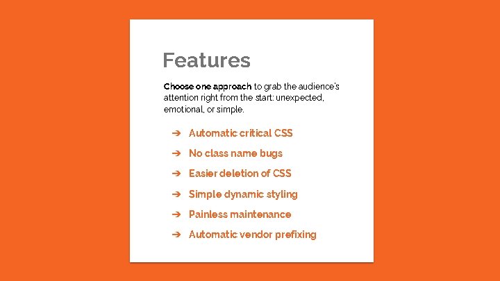
Features Choose one approach to grab the audience’s attention right from the start: unexpected, emotional, or simple. ➔ Automatic critical CSS ➔ No class name bugs ➔ Easier deletion of CSS ➔ Simple dynamic styling ➔ Painless maintenance ➔ Automatic vendor prefixing

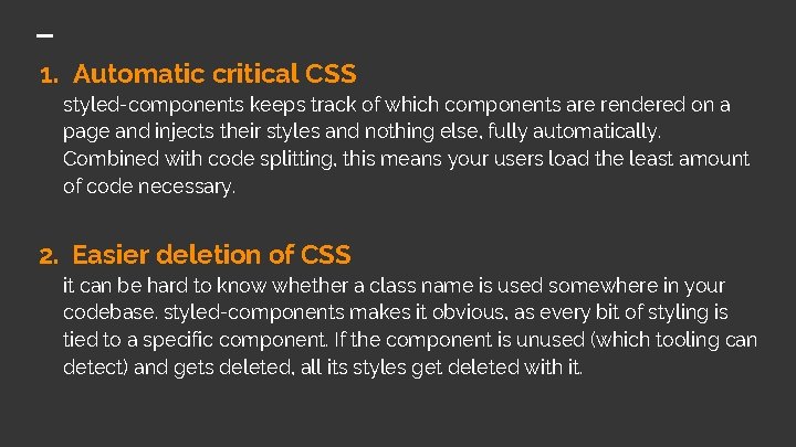
1. Automatic critical CSS styled-components keeps track of which components are rendered on a page and injects their styles and nothing else, fully automatically. Combined with code splitting, this means your users load the least amount of code necessary. 2. Easier deletion of CSS it can be hard to know whether a class name is used somewhere in your codebase. styled-components makes it obvious, as every bit of styling is tied to a specific component. If the component is unused (which tooling can detect) and gets deleted, all its styles get deleted with it.

3. No class name bugs styled-components generates unique class names for your styles. You never have to worry about duplication, overlap or misspellings. 4. Simple dynamic styling adapting the styling of a component based on its props or a global theme is simple and intuitive without having to manually manage dozens of classes.

5. Painless maintenance you never have to hunt across different files to find the styling affecting your component, so maintenance is a piece of cake no matter how big your codebase is. 6. Automatic vendor prefixing write your CSS to the current standard and let styled-components handle the rest. You get all of these benefits while still writing the CSS you know and love, just bound to individual components.

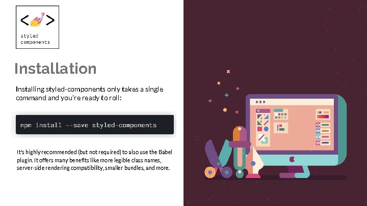
Installation Installing styled-components only takes a single command you're ready to roll: It's highly recommended (but not required) to also use the Babel plugin. It offers many benefits like more legible class names, server-side rendering compatibility, smaller bundles, and more.

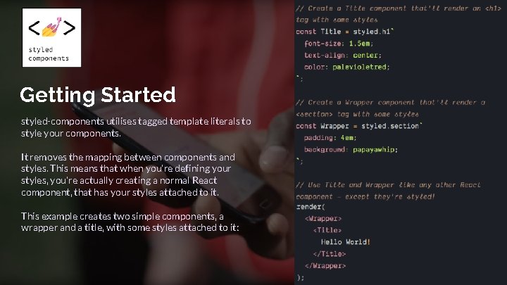
Getting Started styled-components utilises tagged template literals to style your components. It removes the mapping between components and styles. This means that when you're defining your styles, you're actually creating a normal React component, that has your styles attached to it. This example creates two simple components, a wrapper and a title, with some styles attached to it:

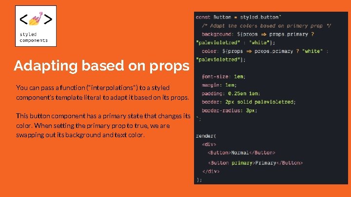
Adapting based on props You can pass a function ("interpolations") to a styled component's template literal to adapt it based on its props. This button component has a primary state that changes its color. When setting the primary prop to true, we are swapping out its background and text color.

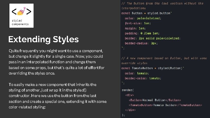
Extending Styles Quite frequently you might want to use a component, but change it slightly for a single case. Now, you could pass in an interpolated function and change them based on some props, but that's quite a lot of effort for overriding the styles once. To easily make a new component that inherits the styling of another, just wrap it in the styled() constructor. Here we use the button from the last section and create a special one, extending it with some color-related styling:

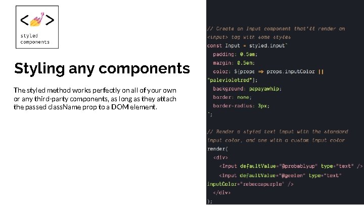
Styling any components The styled method works perfectly on all of your own or any third-party components, as long as they attach the passed class. Name prop to a DOM element.

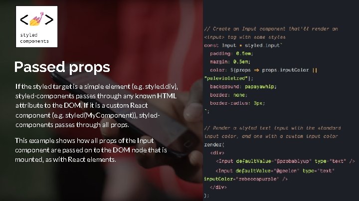
Passed props If the styled target is a simple element (e. g. styled. div), styled-components passes through any known HTML attribute to the DOM. If it is a custom React component (e. g. styled(My. Component)), styledcomponents passes through all props. This example shows how all props of the Input component are passed on to the DOM node that is mounted, as with React elements.

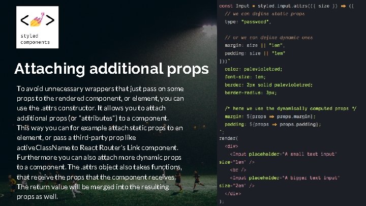
Attaching additional props To avoid unnecessary wrappers that just pass on some props to the rendered component, or element, you can use the. attrs constructor. It allows you to attach additional props (or "attributes") to a component. This way you can for example attach static props to an element, or pass a third-party prop like active. Class. Name to React Router's Link component. Furthermore you can also attach more dynamic props to a component. The. attrs object also takes functions, that receive the props that the component receives. The return value will be merged into the resulting props as well.

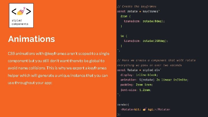
Animations CSS animations with @keyframes aren't scoped to a single component but you still don't want them to be global to avoid name collisions. This is why we export a keyframes helper which will generate a unique instance that you can use throughout your app:

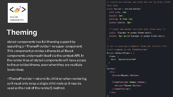
Theming styled-components has full theming support by exporting a <Theme. Provider> wrapper component. This component provides a theme to all React components underneath itself via the context API. In the render tree all styled-components will have access to the provided theme, even when they are multiple levels deep. <Theme. Provider> returns its children when rendering, so it must only wrap a single child node as it may be used as the root of the render() method.

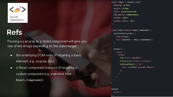
Refs Passing a ref prop to a styled component will give you one of two things depending on the styled target: ● the underlying DOM node (if targeting a basic element, e. g. styled. div ) ● a React component instance (if targeting a custom component e. g. extended from React. Component )

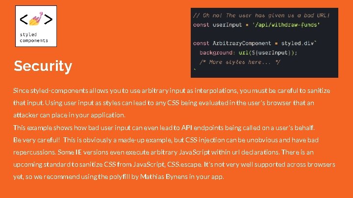
Security Since styled-components allows you to use arbitrary input as interpolations, you must be careful to sanitize that input. Using user input as styles can lead to any CSS being evaluated in the user's browser that an attacker can place in your application. This example shows how bad user input can even lead to API endpoints being called on a user's behalf. Be very careful! This is obviously a made-up example, but CSS injection can be unobvious and have bad repercussions. Some IE versions even execute arbitrary Java. Script within url declarations. There is an upcoming standard to sanitize CSS from Java. Script, CSS. escape. It's not very well supported across browsers yet, so we recommend using the polyfill by Mathias Bynens in your app.

https: //drive. google. com/file/d/1 DELTu. QL 7 v 7 X 56 UF YHWRu 8 RGo 31 w 2 JXVf/view

Good luck! Visual primitives for the component age. Thank you.