STATS 330 Lecture 4 1192020 330 Lecture 4




- Slides: 43

STATS 330: Lecture 4 11/9/2020 330 Lecture 4 1

Housekeeping My contact details…. Plus much else on course web page www. stat. auckland. ac. nz/~lee/330/ Or via Cecil 11/9/2020 330 Lecture 4 2

11/9/2020 330 Lecture 4 3

Today’s lecture: R for graphics Aim of the lecture: To show you how to use R to produce the plots shown in the last few lectures 11/9/2020 330 Lecture 4 4

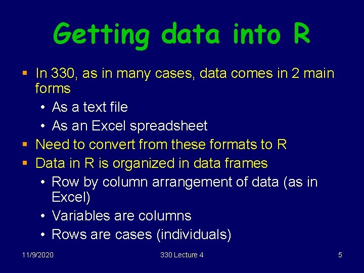
Getting data into R § In 330, as in many cases, data comes in 2 main forms • As a text file • As an Excel spreadsheet § Need to convert from these formats to R § Data in R is organized in data frames • Row by column arrangement of data (as in Excel) • Variables are columns • Rows are cases (individuals) 11/9/2020 330 Lecture 4 5

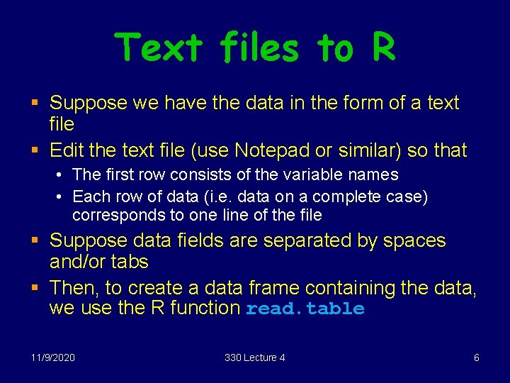
Text files to R § Suppose we have the data in the form of a text file § Edit the text file (use Notepad or similar) so that • The first row consists of the variable names • Each row of data (i. e. data on a complete case) corresponds to one line of the file § Suppose data fields are separated by spaces and/or tabs § Then, to create a data frame containing the data, we use the R function read. table 11/9/2020 330 Lecture 4 6

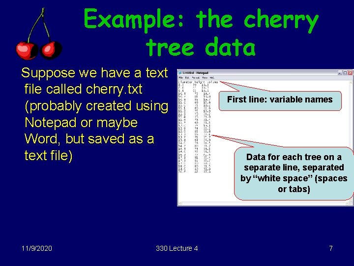
Example: the cherry tree data Suppose we have a text file called cherry. txt (probably created using Notepad or maybe Word, but saved as a text file) 11/9/2020 330 Lecture 4 First line: variable names Data for each tree on a separate line, separated by “white space” (spaces or tabs) 7

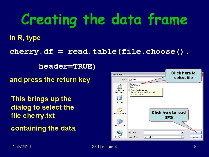
Creating the data frame In R, type cherry. df = read. table(file. choose(), header=TRUE) and press the return key This brings up the dialog to select the file cherry. txt Click here to select file Click here to load data containing the data. 11/9/2020 330 Lecture 4 8

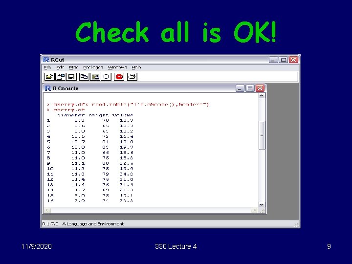
Check all is OK! 11/9/2020 330 Lecture 4 9

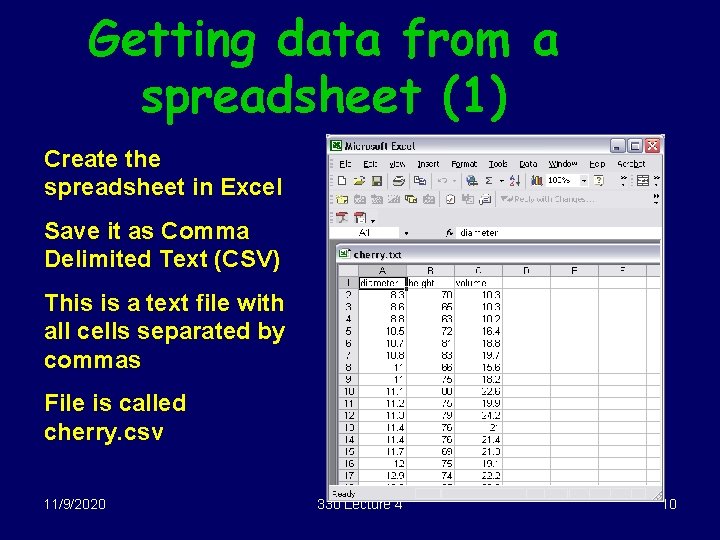
Getting data from a spreadsheet (1) Create the spreadsheet in Excel Save it as Comma Delimited Text (CSV) This is a text file with all cells separated by commas File is called cherry. csv 11/9/2020 330 Lecture 4 10

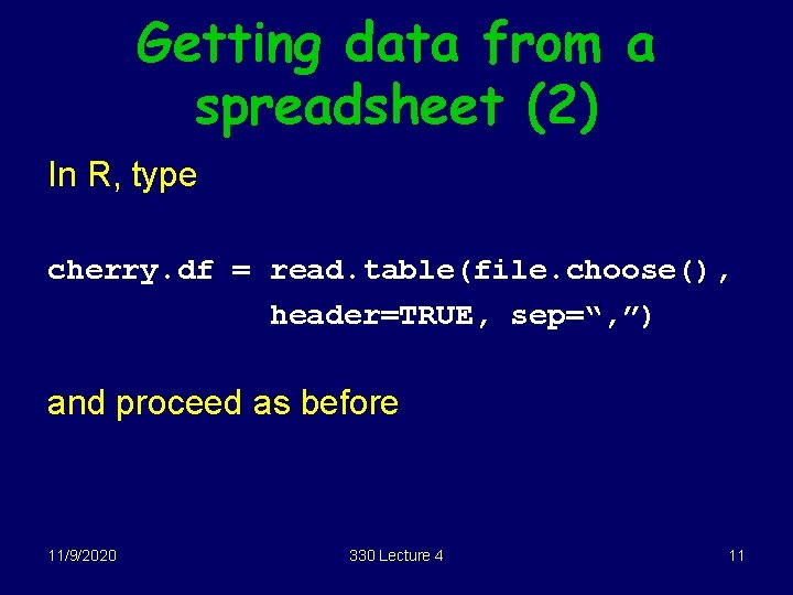
Getting data from a spreadsheet (2) In R, type cherry. df = read. table(file. choose(), header=TRUE, sep=“, ”) and proceed as before 11/9/2020 330 Lecture 4 11

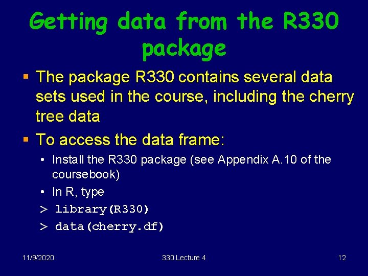
Getting data from the R 330 package § The package R 330 contains several data sets used in the course, including the cherry tree data § To access the data frame: • Install the R 330 package (see Appendix A. 10 of the coursebook) • In R, type > library(R 330) > data(cherry. df) 11/9/2020 330 Lecture 4 12

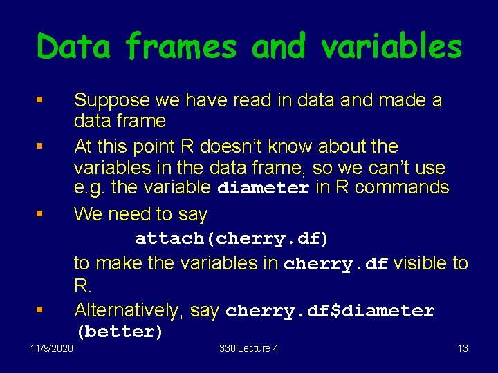
Data frames and variables § § 11/9/2020 Suppose we have read in data and made a data frame At this point R doesn’t know about the variables in the data frame, so we can’t use e. g. the variable diameter in R commands We need to say attach(cherry. df) to make the variables in cherry. df visible to R. Alternatively, say cherry. df$diameter (better) 330 Lecture 4 13

Scatterplots In R, there are 2 distinct sets of functions for graphics, one for ordinary graphics, one for trellis. Eg for scatterplots, we use either plot (ordinary R) or xyplot (Trellis) In the next few slides, we discuss plot. 11/9/2020 330 Lecture 4 14

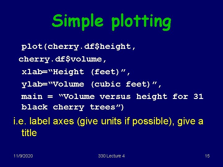
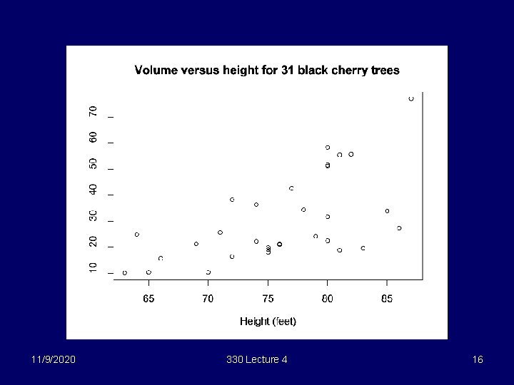
Simple plotting plot(cherry. df$height, cherry. df$volume, xlab=“Height (feet)”, ylab=“Volume (cubic feet)”, main = “Volume versus height for 31 black cherry trees”) i. e. label axes (give units if possible), give a title 11/9/2020 330 Lecture 4 15

11/9/2020 330 Lecture 4 16

Alternative form of plot(volume ~ height, xlab=“Height (feet)”, ylab=“Volume (cubic feet)”, main = “Volume versus height for 31 black cherry trees”, data = cherry. df) Don’t need use the $ notation with this form, note reversal of x, y 11/9/2020 330 Lecture 4 17

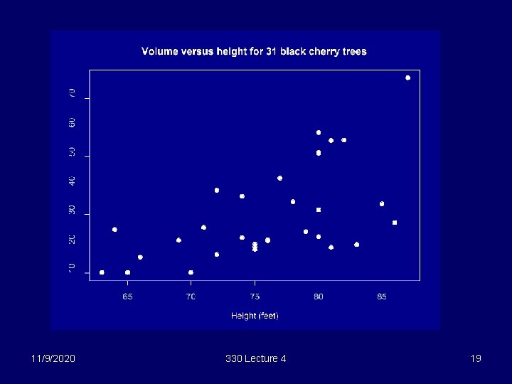
Colours, points, etc Type par(bg="darkblue") ? par plot(cherry. df$height, for more info cherry. df$volume, xlab="Height (feet)", ylab="Volume (cubic feet)", main = "Volume versus height for 31 black cherry trees", pch=19, fg="white", col. axis=“lightblue", col. main="white", col. lab=“white", col="white", cex=1. 3) 11/9/2020 330 Lecture 4 18

11/9/2020 330 Lecture 4 19

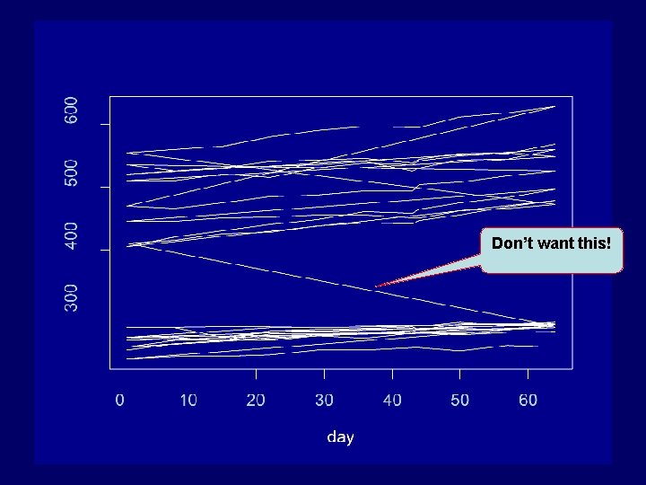
Lines § Suppose we want to join up the rats on the rats plot. (see data next slide) § We could try plot(rats. df$day, rats. df$growth, type=“l”) but this won’t work § Points are plotted in order they appear in the data frame and each point is joined to the next 11/9/2020 330 Lecture 4 20

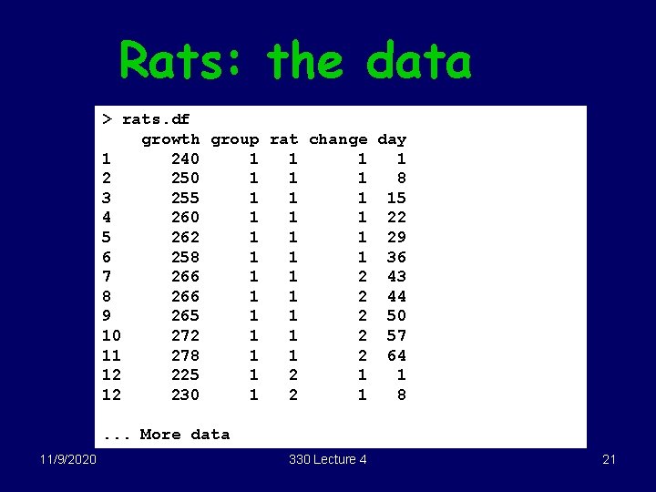
Rats: the data > rats. df growth group rat change day 1 240 1 1 2 250 1 1 1 8 3 255 1 15 4 260 1 1 1 22 5 262 1 1 1 29 6 258 1 1 1 36 7 266 1 1 2 43 8 266 1 1 2 44 9 265 1 1 2 50 10 272 1 1 2 57 11 278 1 1 2 64 12 225 1 2 1 1 12 230 1 2 1 8. . . More data 11/9/2020 330 Lecture 4 21

Don’t want this! 11/9/2020 330 Lecture 4 22

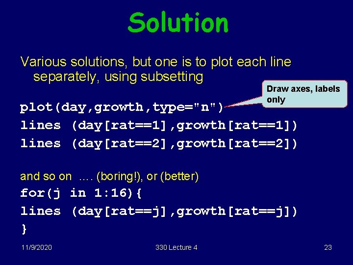
Solution Various solutions, but one is to plot each line separately, using subsetting Draw axes, labels only plot(day, growth, type="n") lines (day[rat==1], growth[rat==1]) lines (day[rat==2], growth[rat==2]) and so on …. (boring!), or (better) for(j in 1: 16){ lines (day[rat==j], growth[rat==j]) } 11/9/2020 330 Lecture 4 23

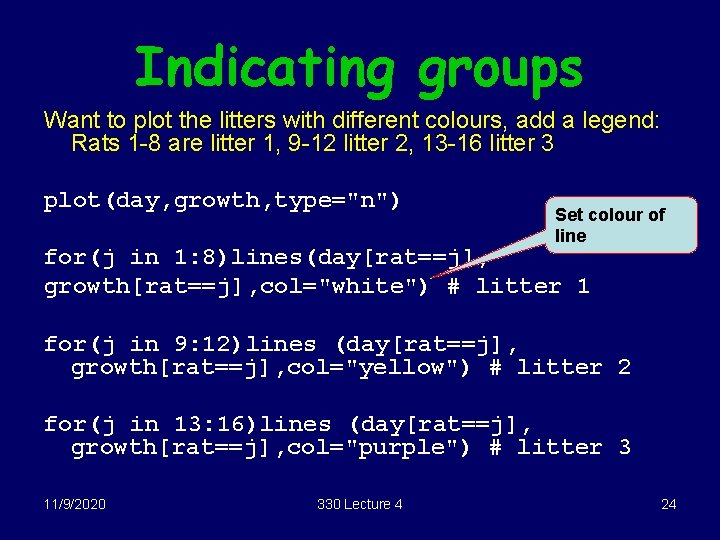
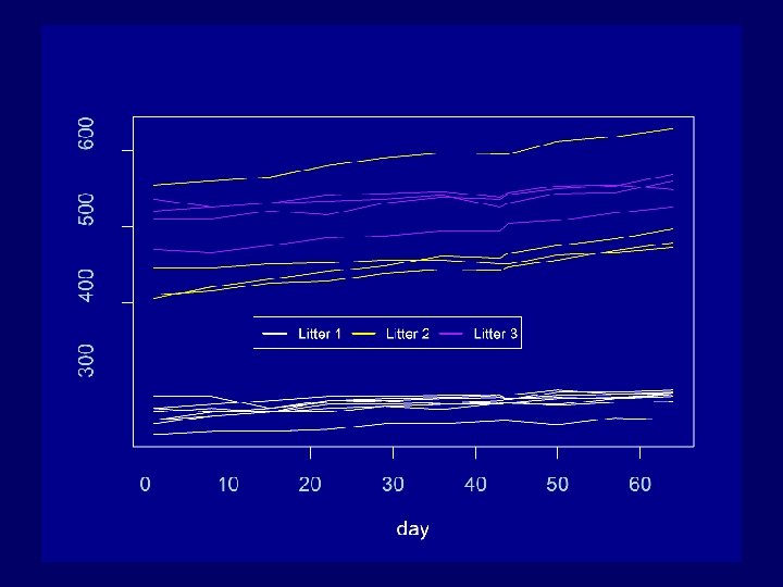
Indicating groups Want to plot the litters with different colours, add a legend: Rats 1 -8 are litter 1, 9 -12 litter 2, 13 -16 litter 3 plot(day, growth, type="n") Set colour of line for(j in 1: 8)lines(day[rat==j], growth[rat==j], col="white") # litter 1 for(j in 9: 12)lines (day[rat==j], growth[rat==j], col="yellow") # litter 2 for(j in 13: 16)lines (day[rat==j], growth[rat==j], col="purple") # litter 3 11/9/2020 330 Lecture 4 24

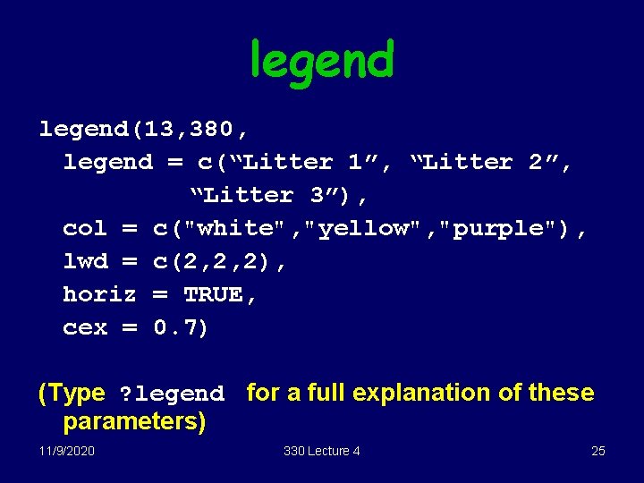
legend(13, 380, legend = c(“Litter 1”, “Litter 2”, “Litter 3”), col = c("white", "yellow", "purple"), lwd = c(2, 2, 2), horiz = TRUE, cex = 0. 7) (Type ? legend for a full explanation of these parameters) 11/9/2020 330 Lecture 4 25

11/9/2020 330 Lecture 4 26

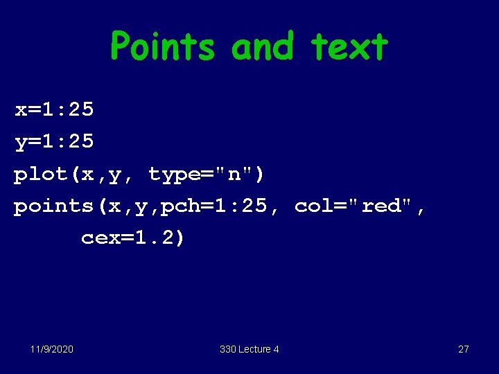
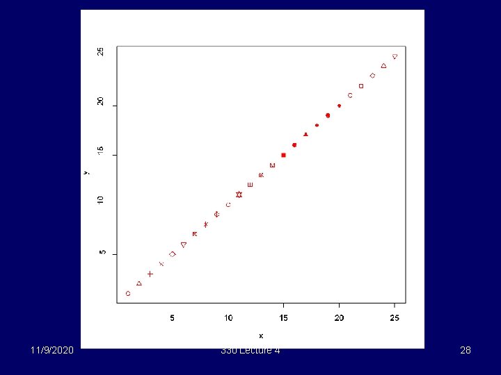
Points and text x=1: 25 y=1: 25 plot(x, y, type="n") points(x, y, pch=1: 25, col="red", cex=1. 2) 11/9/2020 330 Lecture 4 27

11/9/2020 330 Lecture 4 28

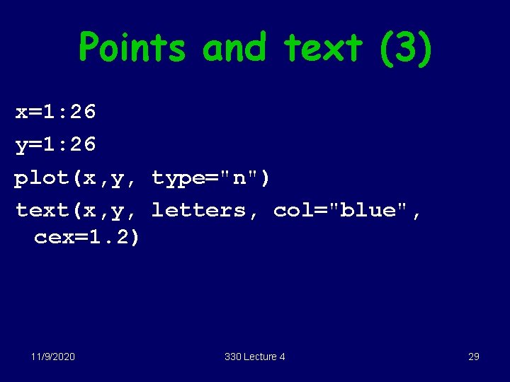
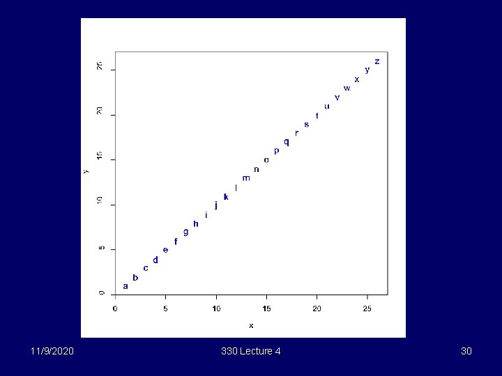
Points and text (3) x=1: 26 y=1: 26 plot(x, y, type="n") text(x, y, letters, col="blue", cex=1. 2) 11/9/2020 330 Lecture 4 29

11/9/2020 330 Lecture 4 30

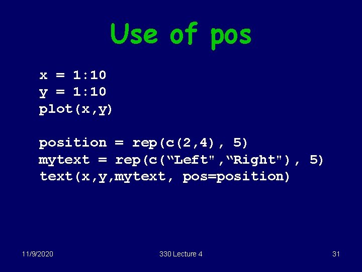
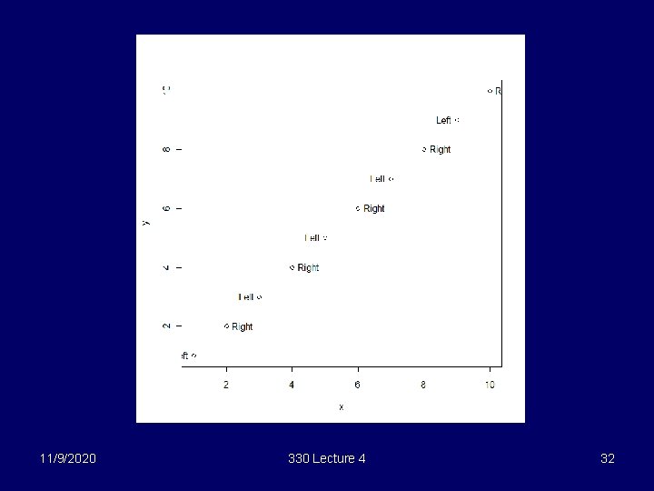
Use of pos x = 1: 10 y = 1: 10 plot(x, y) position = rep(c(2, 4), 5) mytext = rep(c(“Left", “Right"), 5) text(x, y, mytext, pos=position) 11/9/2020 330 Lecture 4 31

11/9/2020 330 Lecture 4 32

Trellis § Must load trellis library first library(lattice) § General form of trellis plots xyplot(y~x|W*Z, data=some. df) § Don’t need to use the $ form, , trellis functions can pick out the variables, given the data frame 11/9/2020 330 Lecture 4 33

Main trellis functions § dotplot for dotplots, use when X is categorical, Y is continuous § bwplot for boxplots, use when X is categorical, Y is continuous § xyplot for scatter plots, use when both x and y are continuous § equal. count use to turn continuous conditioning variable into groups 11/9/2020 330 Lecture 4 34

Changing background colour To change trellis background to white trellis. par. set(background = list(col="white")) To change plotting symbols trellis. par. set(plot. symbol = list(pch=16, col="red", cex=1)) 11/9/2020 330 Lecture 4 35

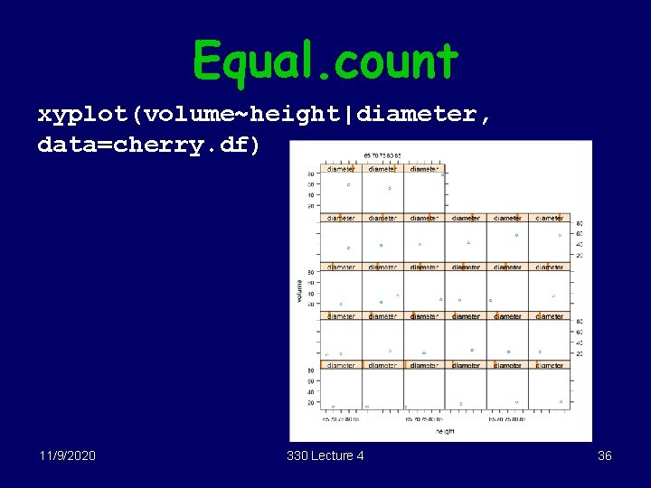
Equal. count xyplot(volume~height|diameter, data=cherry. df) 11/9/2020 330 Lecture 4 36

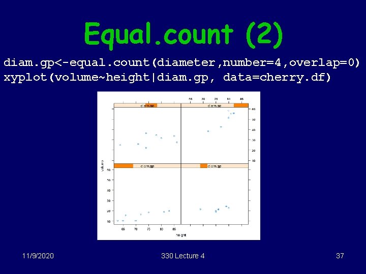
Equal. count (2) diam. gp<-equal. count(diameter, number=4, overlap=0) xyplot(volume~height|diam. gp, data=cherry. df) 11/9/2020 330 Lecture 4 37

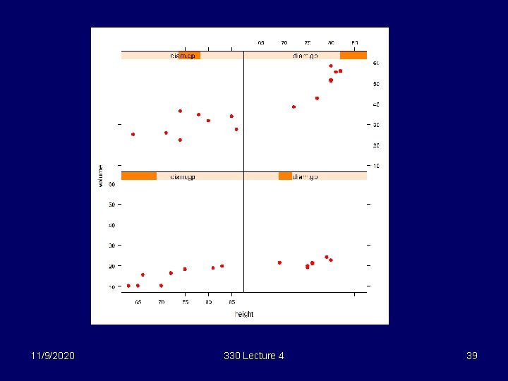
Changing plotting symbols To change plotting symbols trellis. par. set(plot. symbol = list(pch=16, col="red", cex=1)) 11/9/2020 330 Lecture 4 38

11/9/2020 330 Lecture 4 39

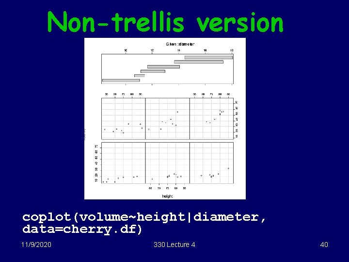
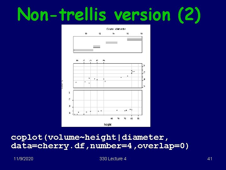
Non-trellis version coplot(volume~height|diameter, data=cherry. df) 11/9/2020 330 Lecture 4 40

Non-trellis version (2) coplot(volume~height|diameter, data=cherry. df, number=4, overlap=0) 11/9/2020 330 Lecture 4 41

Other useful functions § Regular R • scatterplot 3 d (3 d scatter plot, load library scatterplot 3 d) • contour, persp (draws contour plots, surfaces) • pairs § Trellis • cloud (3 d scatter plot) 11/9/2020 330 Lecture 4 42

Rotating plots § You need to install the R 330 package Create a data frame e. g. called data. df with the response in the first column § Then, type reg 3 d(data. df) 11/9/2020 330 Lecture 4 43