Statistics Statistics are extremely important They help us


- Slides: 28
Statistics
Statistics are extremely important • They help us predict future trends based on past trends • They allow us to determine whether data is significant (the basis of science)
However… • Statistics can also be a powerful weapon to deceive people • Often, we communicate data trends using graphs. Graphs can be informative when designed properly but extremely misleading when they aren’t • Three main ways graphs can be misleading • Displaced Axis: the numbers on the axis do not start at zero • Irregular Scale: the spacing between the numbers on the axis is not consistent • Exaggerated use of area and volume: the heights and/or widths are exaggerated
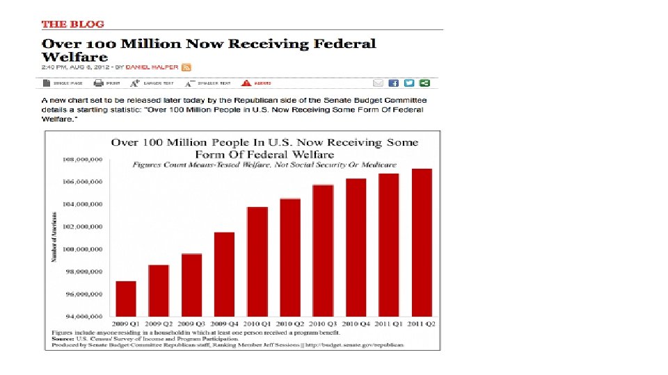
What is wrong with this graph?
What is wrong with this graph? • The y-axis scale does not start at zero • It looks like the amount of welfare given out has increased by about 400% • In reality, it has only gone up by 11%
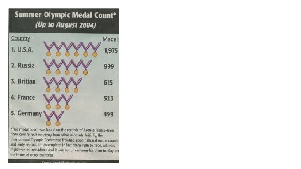
What’s wrong with this graph?
What’s wrong with this graph? • Uneven scale • Looking at Germany, it seems that each picture of a metal corresponds to about 250 medals won • France has one more picture than Germany, but only earned 24 more medals • USA has won almost twice the medals that Russia has won but only has 20% more medal pictures
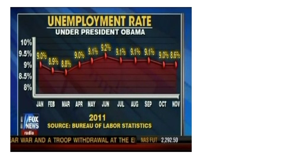
What is wrong with this graph?
What is wrong with this graph? • Y-axis scale does not start at 0 • From March to June it looks like unemployment has doubled • In reality, it only went up 0. 4%
What is wrong with this graph? • Y-axis scale does not start at 0 • From March to June it looks like unemployment has doubled • In reality, it only went up 0. 4% • The final data point is plotted incorrectly • Looks like unemployment hasn’t change from Jan-Nov • In reality, in November it is 0. 4% percent lower than January
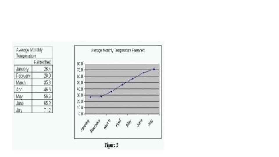
This graph was meant to show the effects of climate change
This graph was meant to show the effects of climate change What’s wrong with this graph?
This graph was meant to show the effects of climate change What’s wrong with this graph? • The data is taken from winter (January) to summer (July), of course the temperature increased!!
This graph was meant to show the percentage of voters that supported each Republican candidate.
This graph was meant to show the percentage of voters that supported each Republican candidate. What’s wrong with this graph?
This graph was meant to show the percentage of voters that supported each Republican candidate. What’s wrong with this graph? • Pie graphs should add up to 100% • The area doesn’t match up with the percentages • There seems to be more green than red although the red percentage is greater than the green
What’s wrong with this graph?
What’s wrong with this graph? • Exaggerated use of area • It looks like there are four times as many people on welfare as there are working • In reality, it is only a 7% difference
What’s wrong with this graph? • Exaggerated use of area • It looks like there are four times as many people on welfare as there are working • In reality, it is only a 7% difference • Misleading data collection • Welfare statistics included all dependents on Welfare • Working statistics do not included dependents, only the individual working
What makes a good graph? • Scale is always proportional • If it appears as though a value doubled, it corresponds to the actual increase in the measured quantity • The scale starts at zero
What makes a good graph? • Scale is always proportional • If it appears as though a value doubled, it corresponds to the actual increase in the measured quantity • The scale starts at zero • Graph is easy to interpret • There is not a lot of extra colour, drawings, information that makes it more challenging to understand what the graph is communicating • Colour is used to differentiate data sets, not to distract
What makes a good graph? • Scale is always proportional • If it appears as though a value doubled, it corresponds to the actual increase in the measured quantity • The scale starts at zero • Graph is easy to interpret • There is not a lot of extra colour, drawings, information that makes it more challenging to understand what the graph is communicating • Colour is used to differentiate data sets, not to distract • Title makes it clear what the data is representing • The graph can be understood without a lot of background reading
Assignment • Find a newspaper article with a graph and paste the graph into a google doc (screenshot if necessary) • Feel free to explore resources that are not ‘academic’ • On the same google doc: • • Give the graph context, explain what it is depicting Discuss what is effective about the graph Discuss what is misleading about the graph Discuss what changes (if any) could make the graph more effective • Put the google doc in your math 8 google folder