Statistics Probability Mathematics Term 3 Learning Intentions Statistics
Statistics & Probability Mathematics Term 3

Learning Intentions Statistics & Probability Chance/ Data Representation & interpretations • I am learning to compared observed and expected frequencies. • I am learning to interpret and compare a variety of data displays including those displays for two categorical variables. • I am learning to interpret secondary data displayed in the media.

Success Criteria I know I am successful when I… Statistics & Probability Chance • I can describe probabilities using fractions, decimals and percentages. • I can conduct chance experiments with both small and large numbers of trials using appropriate digital technologies. • I can compare observed frequencies across experiments with expected frequencies. Data representation and interpretation • I can interpret and compare a range of data displays, including side-by-side column graphs for two categorical variables. • I can interpret secondary data presented in digital media and elsewhere.

Learning Intentions Chance/ Data Representation & interpretations • I am learning to interpret and compare a variety of data displays including those displays for two categorical variables. • I am learning to interpret secondary data displayed in the media. Success Criteria Data representation and interpretation • I can interpret and compare a range of data displays, including side-by -side column graphs for two categorical variables.

Two Way Tables It is important to be able to represent two set of data/information for the same situation. For example: Meal eaten by two sets of people or two towns’ sets of rainfall. Information needs to be simple and straightforward and easy to divide into two categories.

Two Way Tables • Explore the table on page 44 (Targeting Math). • First table 1. What do you note about kids being on time for breakfast? 2. Lunch? 3. Dinner?

Two Way Tables Meals Table • What do you notice from the information provided about ØChicken ØPasta ØSalad

Two Way Tables • Task • What do we notice about the Task table? ØBed making ØTables ØWashing-up

Two Way Tables Drink • What do we notice about ØWater ØJuice ØMilk
Two Way Tables • Look at the statements in questions 1, 2 & 3. • Tick the statements are most correct. • D – The teachers said that they red team and yellow team were equally wellbehaved. Can you tell that from the tables? Why?

Two Way Column Graphs • Use the data provided on page 44 to match it to the correct data set in the column graphs. • Explore the data to answer questions 2, 3, 4. • 5 – Make a horizontal side-byside column graph from the two-way table.
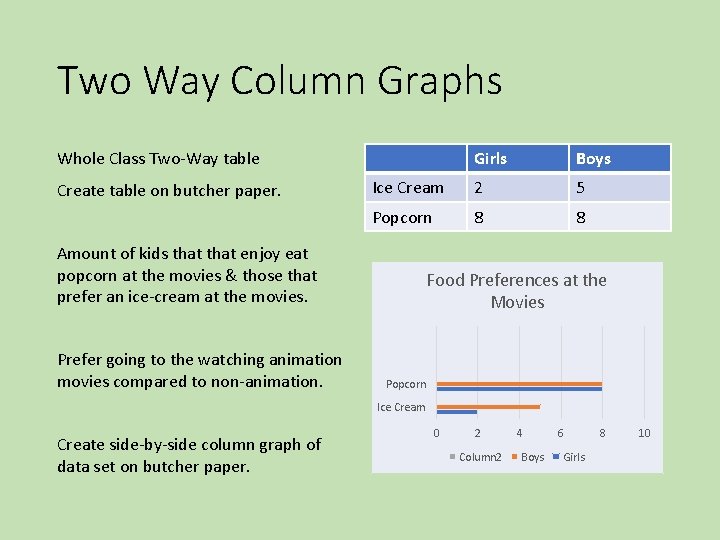
Two Way Column Graphs Whole Class Two-Way table Create table on butcher paper. Girls Boys Ice Cream 2 5 Popcorn 8 8 Amount of kids that enjoy eat popcorn at the movies & those that prefer an ice-cream at the movies. Prefer going to the watching animation movies compared to non-animation. Food Preferences at the Movies Popcorn Ice Cream Create side-by-side column graph of data set on butcher paper. 0 2 Column 2 4 Boys 6 Girls 8 10

Learning Intentions Data Representation & interpretations • I am learning to interpret and compare a variety of data displays including those displays for two categorical variables. • I am learning to interpret secondary data displayed in the media. Success Criteria Data representation and interpretation • I can interpret and compare a range of data displays, including side-by -side column graphs for two categorical variables. • I can interpret secondary data presented in digital media and elsewhere.
Misleading Graphs What does this graph tell you? Is it misleading? How? • Average car price jump

Misleading Graphs in the Media

Misleading Graphs • Heat Wave Graph • What does it tell you?

Misleading Graphs • Pets in Year 6 • Why it it misleading?

Misleading Graphs • Redraw the graphs. • What do you need to have to ensure your graph is not misleading and is clear?

Learning Intentions Success Criteria Data Representation & interpretations • I am learning to interpret and compare a variety of data displays including those displays for two categorical variables. Data representation and interpretation • I can interpret and compare a range of data displays, including side-by -side column graphs for two categorical variables. • I am learning to interpret secondary data displayed in the media. • I can interpret secondary data presented in digital media and elsewhere.

Misleading Graphs – Media Claims & Graphs Explore the graph – How children Spend Their Time. Targeting Math page 47 Media Claims and Graphs What does it tell you? What does it not tell you?

Misleading Graphs – Media Claims & Graphs Researches have issued a report stating that children are spending more time in front of a computer. This is reducing the amount of sleep time they have, which affects their school work. Why do you think they use evaluative language and broad descriptions when specific information is required in relation to the data?

Misleading Graphs – Media Claims & Graphs Research into dental health shows that children in younger groups have better teeth than children in older age groups. • How has to media claim mislead the public. Use your know of dental health. Extra: Locate misleading graphs on the internet and in newspapers. Cut out and pin up on Math Board.

Learning Intentions Success Criteria Chance • I am learning to compared observed and expected frequencies. • I can conduct chance experiments with both small and large numbers of trials using appropriate digital technologies. • I can compare observed frequencies across experiments with expected frequencies.
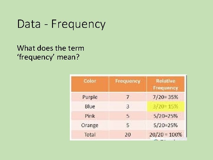
Data - Frequency What does the term ‘frequency’ mean?
Data - Frequency Look a the data in in Question 1 (targeting math page 99). From this data, can you predict what will be rolled next? Repeat rolling of 6 sided dice. Challenge – number 1, 2 & 3 – red; 4, 5 – blue; 6 – yellow.

Learning Intentions Chance/ Data Representation & interpretations • I am learning to compared observed and expected frequencies. Success Criteria Chance • I can describe probabilities using fractions, decimals and percentages. • I can conduct chance experiments with both small and large numbers of trials using appropriate digital technologies. • I can compare observed frequencies across experiments with expected frequencies.

Chance Experiments • Counters – 8 colours. 25 turns. • What colour will be pick the most often? • What colour will be picked least often? Whole class experiment. • Butcher paper tally results – student to tally own data on sheet.

Chance Experiments Do you think these rules will be the same if we changed the items. Use coins to complete question 2. PREDICT FIRST!!!

Learning Intentions Chance • I am learning to compared observed and expected frequencies. Success Criteria Chance • I can describe probabilities using fractions, decimals and percentages. • I can conduct chance experiments with both small and large numbers of trials using appropriate digital technologies. • I can compare observed frequencies across experiments with expected frequencies.

Probability can be measured in a variety of ways. How would you describe the probability of flipping a coin?
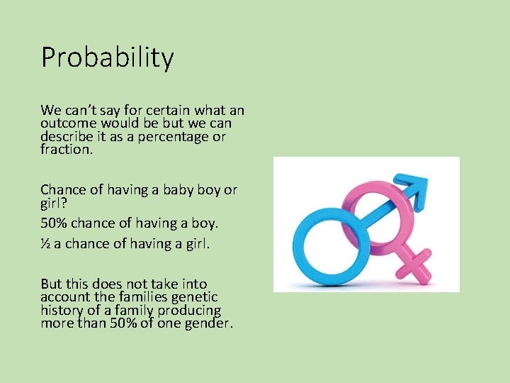
Probability We can’t say for certain what an outcome would be but we can describe it as a percentage or fraction. Chance of having a baby boy or girl? 50% chance of having a boy. ½ a chance of having a girl. But this does not take into account the families genetic history of a family producing more than 50% of one gender.
Probability Look at the spinner at the bottom of page 101. There are 8 sections (8 sides). What would the percentage if each section is a different colour?

Probability 12. 5% 1/8 Would this spinner be fair is we had two sections the same colour? Not all spinners are fair therefore their chances may be higher or lower according colour or number allocations. Complete page 101 Targeting Math.

Learning Intentions Data Representation & interpretations • I am learning to interpret and compare a variety of data displays including those displays for two categorical variables. • I am learning to interpret secondary data displayed in the media. Success Criteria Data representation and interpretation • I can interpret and compare a range of data displays, including side-by -side column graphs for two categorical variables. • I can interpret secondary data presented in digital media and elsewhere.
Data – Line Graphs To show our data we need clear and precise methods. Table and graphs are clear for our audience.
Data – Line Graphs How do you read this graph? Floodwaters – Byron River Bridge 15 -16 th June 2013 Targeting Math page 102.

Data – Line Graphs Axis – X & Y 1. Time – not all hours are marked. Why? 2. Height – not all points are marked with height. Why? 3. What happens are 10 pm-11 pm when the line is straight across? 4. Where are the gradual rises? How do we know? 5. Where are the sharp rises? How do we know?

Data – Line Graphs Read the news report on page 102. It’s a narrative which is not specific enough for a news report. What information could they have included to ensure the news report was informative for the audience? Its important to give facts without emotion. Why is it important to not give emotion in a news report? Complete page 102.

Learning Intentions Data Representation & interpretations Success Criteria Data representation and interpretation • I can interpret and • I am learning to compare a range of interpret and compare data displays, including a variety of data side-by-side column displays including those graphs for two displays for two categorical variables.
Making Comparisons. • Two sets of information is given in this graph. • What is the comparison being made? • What do each category mean on the X axis?

Making Comparisons. Explore Question 3. Why do you think a school may want to keep records like this and compare them in two grades? Are there other categories that could be used to usefully compare two grads in a school? Complete page 103 Targeting Math.
A variety of graphs for a variety of purposes. Do all graphs meet the same purpose? Can all graphs be used in all situation when giving information or data?
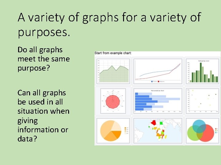
A variety of graphs for a variety of purposes. Explore Malley’s Intersection. What does the Pedestrians column graph show? Why is a column graph good for this data?

A variety of graphs for a variety of purposes. Pedestrians Column graphs are best used when showing accurate numbers, highest and lowest.
A variety of graphs for a variety of purposes. Pie Graph. Why is the pie or sector graph best to show vehicles on the road? The proportions of each vehicles to the total are easy to read.

A variety of graphs for a variety of purposes. Traffic Light Pie / Sector Graph 1. 2. 3. Why is this graph best to show the traffic light formation? The relative time of each colour light is shown clearly. Could other types of graphs be used for this? Explain? Column? Complete page 148.

Learning Intentions Data Representation & interpretations Success Criteria Data representation and interpretation • I am learning to • I can interpret and compare a range of a variety of data displays, including displays including those side-by-side column displays for two graphs for two categorical variables.
A variety of graphs for a variety of purposes – Choosing graphs. Explain why graphs are used to portray particular information. Full sentences must be used. Whole Class – Question 1. a - What data was show on the column graph? 2. a - Why was this a good choice? Complete page 149 Targeting Math.

Learning Intentions Data Representation & interpretations • I am learning to interpret secondary data displayed in the media. Success Criteria Data representation and interpretation • I can interpret secondary data presented in digital media and elsewhere.
Graphs reporting the news • What kind of reports might have a graph to give specific information? • Who see that these reports are published? • What interest may they have in regard to the topic of the graph? E. g. rainfall, flu illness, etc.
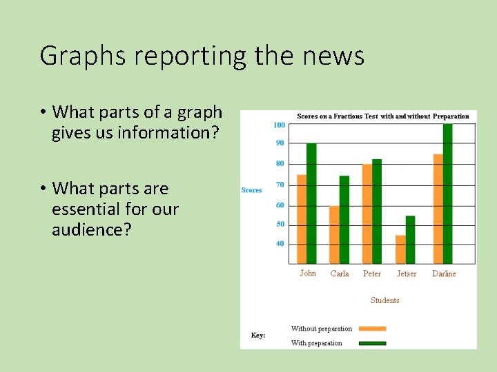
Graphs reporting the news • What parts of a graph gives us information? • What parts are essential for our audience?

Graphs reporting the news Why is it important to relay fact and not opinion in news reports? How do we know that the facts are true? We must always analyse and check for truthfulness in news reports and its data. Complete page 150 Targeting Math.

Graphs reporting the news – Sea Ice The same information have been portrayed in a line graph showing information from March to September. It shows a serious fall in the level of ice. How will this straight line make the data appear more dramatic?

Graphs reporting the news – Sea Ice • What contributes to the dramatics way this information is portrayed?

Graphs reporting the news – Sea Ice Misleading Graphs What is the misleading labels on the axes of the graphs in Q 4 – a & b? In what area of the media are we mostly to get misleading graphs? In what areas of life are we likely to hear and see misleading information? How do we make sure our graphs are not misleading? Take care to be accurate in scale, labels and lay out.
- Slides: 55