
STATISTICS Lecturer Dr Veronika Alhanaqtah Topic 3 Bivariate
STATISTICS Lecturer Dr. Veronika Alhanaqtah
Topic 3. Bivariate analysis 1. 1. Relationship between two categorical variables Mosaic Plots 1. 2. Relationship between two categorical variables Contingency Tables 1. 3. Relationship between one categorical and one numeric variable – Side-by-side box plots
Relationship between two variables Goal: study relationship between two variables: between two categorical variables; between one numeric and one categorical variable.
1. 1. Relationship between two categorical variables – Mosaic Plot � We use a mosaic plot to study relationship between two or more categorical variables. � It was introduced by Hartigan and Kleiner in 1981. � Mosaic plot is just a Venn diagram. * A Venn diagram (a set diagram or logic diagram) is a diagram that shows all possible logical relations between a finite collection of different sets. Venn diagrams were conceived around 1880 by John Venn. They are used to teach elementary set theory, as well as illustrate simple set relationships in probability, logic, statistics, linguistics and compute science.
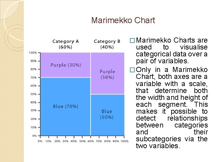
Marimekko Chart � Marimekko Charts are used to visualise categorical data over a pair of variables. � Only in a Marimekko Chart, both axes are a variable with a scale, that determine both the width and height of each segment. This makes it possible to detect relationships between categories and their subcategories via the two variables.
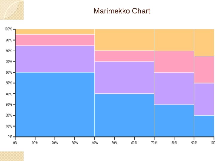
Marimekko Chart
Marimekko Chart (Mosaic plot) Disadvantages: �Marimekko Charts can be hard to read, especially with a large amount of segments. �It's hard to accurately make comparisons between each segment, as they are not arranged next to each other along a common baseline. Application: �Marimekko Charts are more ideal for giving an overview of the data.

Mosaic Plot. Example
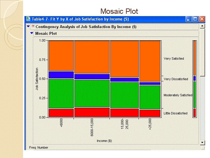
Mosaic Plot
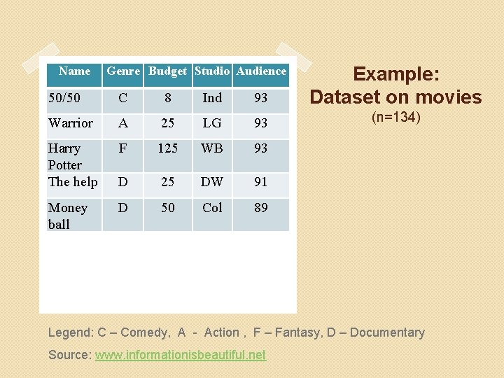
50/50 C 8 Ind 93 Example: Dataset on movies Warrior A 25 LG 93 (n=134) Harry Potter The help F 125 WB 93 D 25 DW 91 D 50 Col 89 Name Money ball Genre Budget Studio Audience Legend: C – Comedy, A - Action , F – Fantasy, D – Documentary Source: www. informationisbeautiful. net
Example. Data set on movies What do we study here? � We want to look at the relationship between whether a film was produced either by an Independent or a Major studio. � And how that relates to whether the production budget fell into the 1 st, 2 nd, 3 rd or 4 th quartile. What do we know? � Of our 134 movies, 24% were independent and 76% were made by a Major studio. � The quartiles are split so that 25% of the movies fall into each quartile. The question of interest is: � Is the distribution of production budget into the quartiles the same for Independent movies versus Major studios?
Question of interest �Is the distribution of production budget into the quartiles the same for Independent studio movies versus Major studios movies? Construction of a mosaic plot is in the lecture Answer: �Independent movies are much more likely to be in the 1 st quartile than Major studio movies are. �The Major studio movies are much more likely to be in the 4 th quartile than Independent studio movies are.
1. 2. Relationship between two categorical variables - Contingency Tables Use the information in the mosaic plot to come up with number summaries for the relationship between two categorical variable - contingency table.
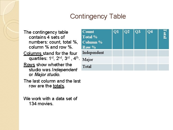
Contingency Table We work with a data set of 134 movies. Count Total % Column % Row % Independent Major Total Q 1 Q 2 Q 3 Q 4 Total The contingency table contains 4 sets of numbers: count, total %, column % and row %. Columns stand for the four quartiles: 1 st, 2 nd, 3 rd , 4 th. Rows show whether the studio was Independent or Major studio. The last column and the last row are the totals.
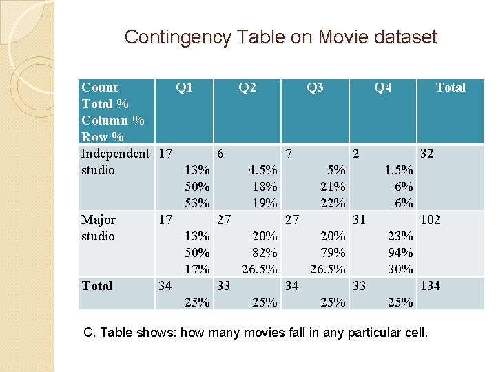
Contingency Table on Movie dataset Count Q 1 Q 2 Q 3 Q 4 Total % Column % Row % Independent 17 6 7 2 32 studio 13% 4. 5% 5% 1. 5% 50% 18% 21% 6% 53% 19% 22% 6% Major 17 27 27 31 102 studio 13% 20% 23% 50% 82% 79% 94% 17% 26. 5% 30% Total 34 33 134 25% 25% C. Table shows: how many movies fall in any particular cell.
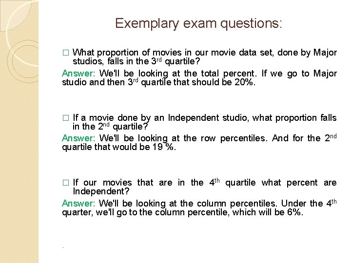
Exemplary exam questions: What proportion of movies in our movie data set, done by Major studios, falls in the 3 rd quartile? Answer: We'll be looking at the total percent. If we go to Major studio and then 3 rd quartile that should be 20%. � If a movie done by an Independent studio, what proportion falls in the 2 nd quartile? Answer: We'll be looking at the row percentiles. And for the 2 nd quartile that would be 19 %. � If our movies that are in the 4 th quartile what percent are Independent? Answer: We'll be looking at the column percentiles. Under the 4 th quarter, we'll go to the column percentile, which will be 6%. � .
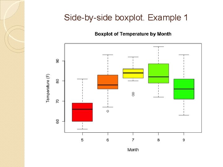
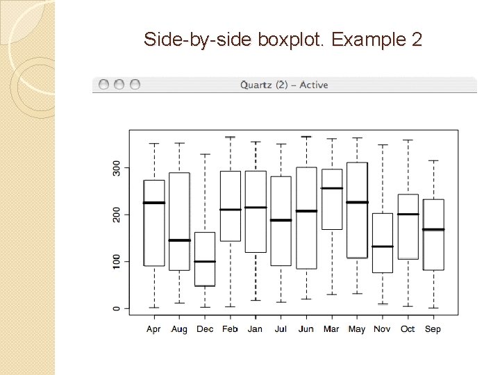
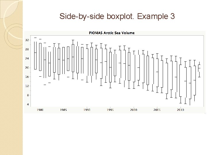
1. 3. Relationship between one categorical and one numeric variables – Side-by-side boxplots Side-by-side boxplot shows relationship between two variables, where one of those is numeric and the other is categorical. Remember the box represents the middle 50% (from the 25 th to the 75 th). Whiskers reach out to the max and the min as long as there's no outliers.
Side-by-side boxplot. Example 1
Side-by-side boxplot. Example 2
Side-by-side boxplot. Example 3
Example. Movie data set Action Comedy Drama Horror Max 93 93 91 78 75 % 78 71 85 61 50 % 51 58 72 52 25 % 45 48 59 34 Min 32 31 46 25 n 32 27 21 17 Mean 59 59 72 49 SD 18 16 15 16
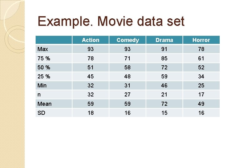
Exemplary exam questions: � Which variable has the smallest median? Answer: Action (median is 51) � Which variable has the largest median? Answer: Drama (median is 72) � Which of the boxes had the largest interquartile range? Answer: Action movies � Which variable has the highest standard deviation? Answer: Action (SD is 18)
Homework � Visit instructor’s web-page on Statistics. www. alveronika. wordpress. com � Optional but useful: Practice with applet (mosaic plot): http: //mih 5. github. io/statapps/
- Slides: 23