Statistics for Business and Economics Chapter 2 Methods
Statistics for Business and Economics Chapter 2 Methods for Describing Sets of Data
Learning Objectives 1. 2. 3. 4. Describe Qualitative Data Graphically Describe Quantitative Data Graphically Explain Numerical Data Properties Describe Summary Measures 5. Analyze Numerical Data Using Summary Measures
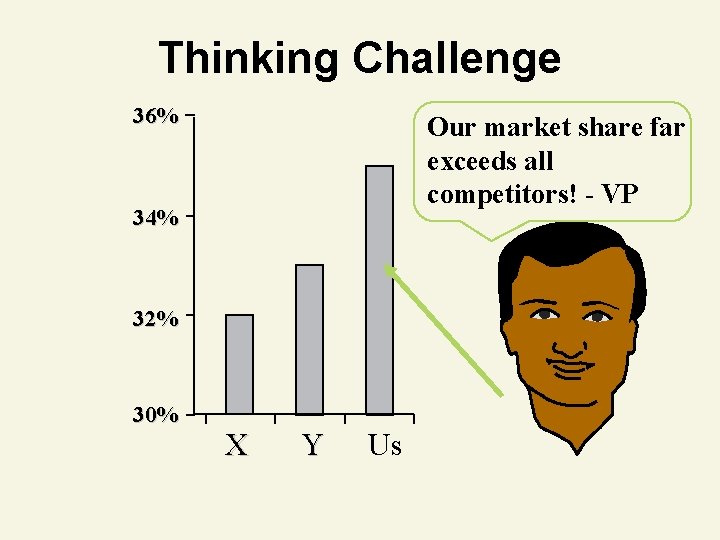
Thinking Challenge 36% Our market share far exceeds all competitors! - VP 34% 32% 30% X Y Us
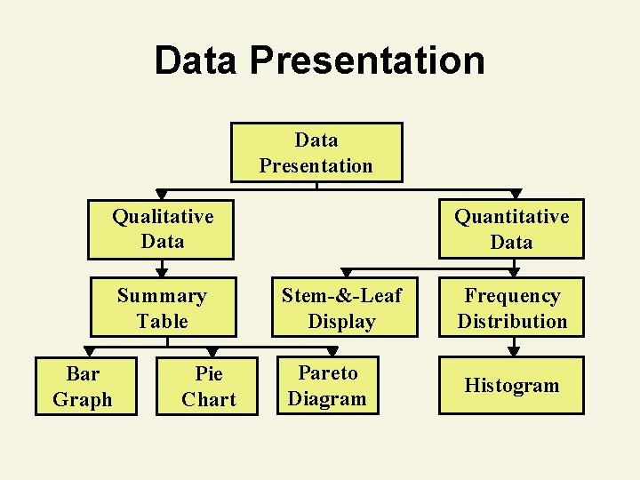
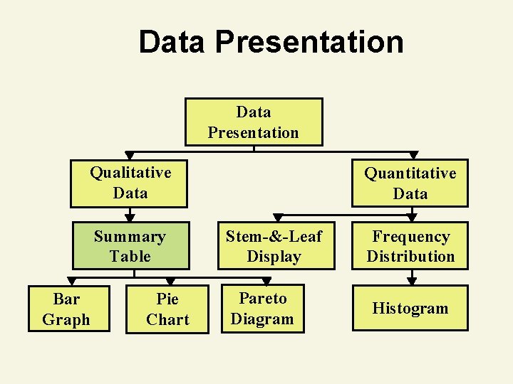
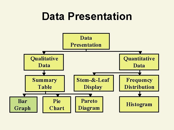
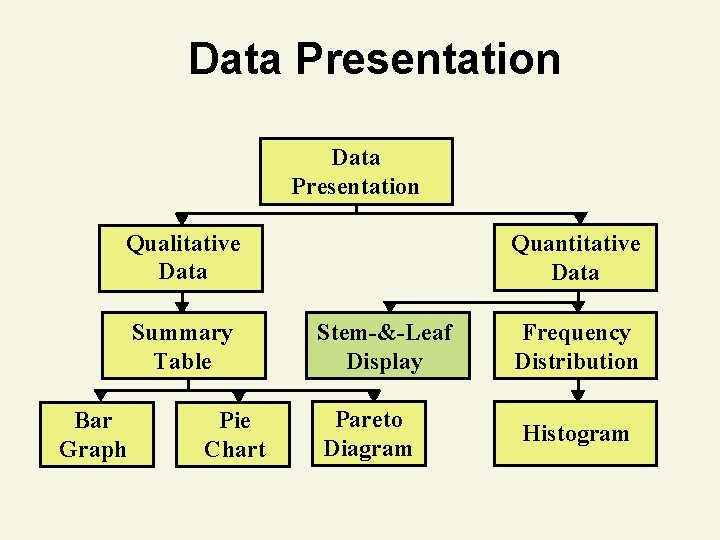
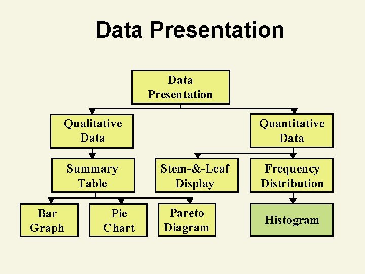
Data Presentation Qualitative Data Summary Table Bar Graph Pie Chart Quantitative Data Stem-&-Leaf Display Pareto Diagram Frequency Distribution Histogram
Presenting Qualitative Data
Data Presentation Qualitative Data Summary Table Bar Graph Pie Chart Quantitative Data Stem-&-Leaf Display Pareto Diagram Frequency Distribution Histogram
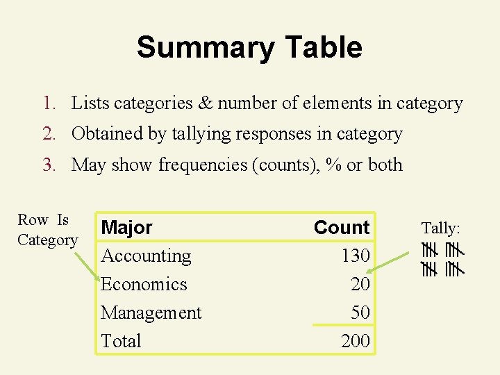
Summary Table 1. Lists categories & number of elements in category 2. Obtained by tallying responses in category 3. May show frequencies (counts), % or both Row Is Category Major Accounting Economics Management Total Count 130 20 50 200 Tally: ||||
Data Presentation Qualitative Data Summary Table Bar Graph Pie Chart Quantitative Data Stem-&-Leaf Display Pareto Diagram Frequency Distribution Histogram
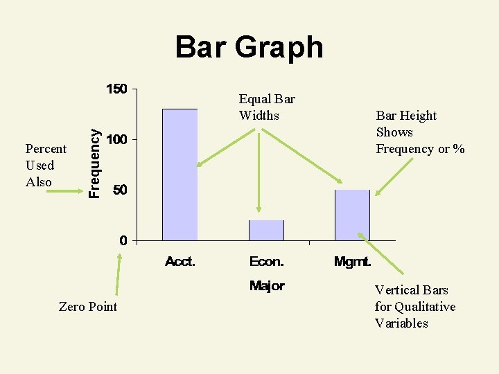
Bar Graph Percent Used Also Frequency Equal Bar Widths Zero Point Bar Height Shows Frequency or % Vertical Bars for Qualitative Variables
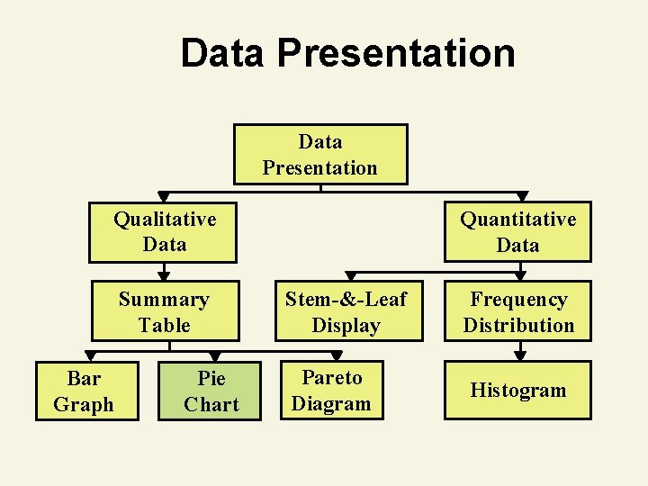
Data Presentation Qualitative Data Summary Table Bar Graph Pie Chart Quantitative Data Stem-&-Leaf Display Pareto Diagram Frequency Distribution Histogram
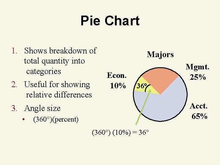
Pie Chart 1. Shows breakdown of total quantity into categories 2. Useful for showing relative differences Majors Econ. 10% Mgmt. 25% 36° Acct. 65% 3. Angle size • (360°)(percent) (360°) (10%) = 36°
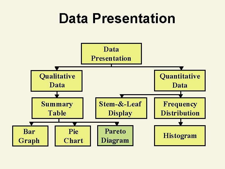
Data Presentation Qualitative Data Summary Table Bar Graph Pie Chart Quantitative Data Stem-&-Leaf Display Pareto Diagram Frequency Distribution Histogram
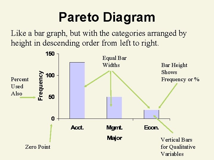
Pareto Diagram Like a bar graph, but with the categories arranged by height in descending order from left to right. Percent Used Also Frequency Equal Bar Widths Zero Point Bar Height Shows Frequency or % Vertical Bars for Qualitative Variables
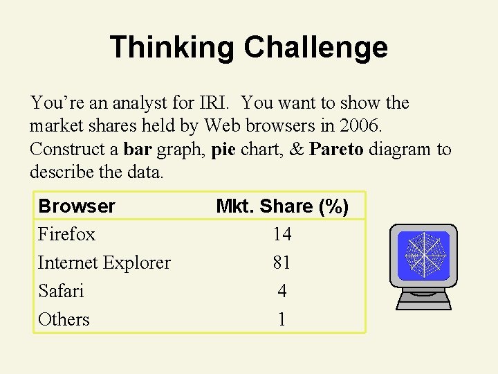
Thinking Challenge You’re an analyst for IRI. You want to show the market shares held by Web browsers in 2006. Construct a bar graph, pie chart, & Pareto diagram to describe the data. Browser Firefox Internet Explorer Safari Others Mkt. Share (%) 14 81 4 1
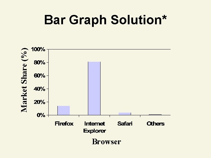
Market Share (%) Bar Graph Solution* Browser
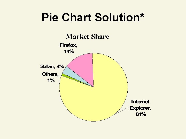
Pie Chart Solution* Market Share
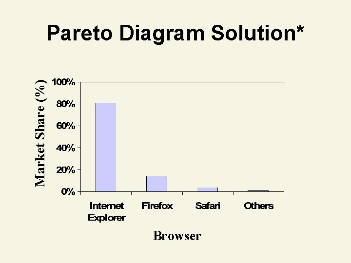
Market Share (%) Pareto Diagram Solution* Browser
Presenting Quantitative Data
Data Presentation Qualitative Data Summary Table Bar Graph Pie Chart Quantitative Data Stem-&-Leaf Display Pareto Diagram Frequency Distribution Histogram
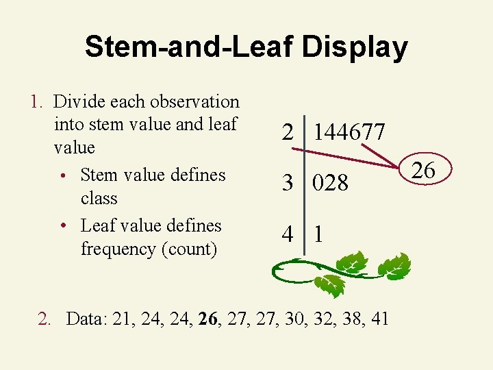
Stem-and-Leaf Display 1. Divide each observation into stem value and leaf value • Stem value defines class • Leaf value defines frequency (count) 2 144677 3 028 4 1 2. Data: 21, 24, 26, 27, 30, 32, 38, 41 26
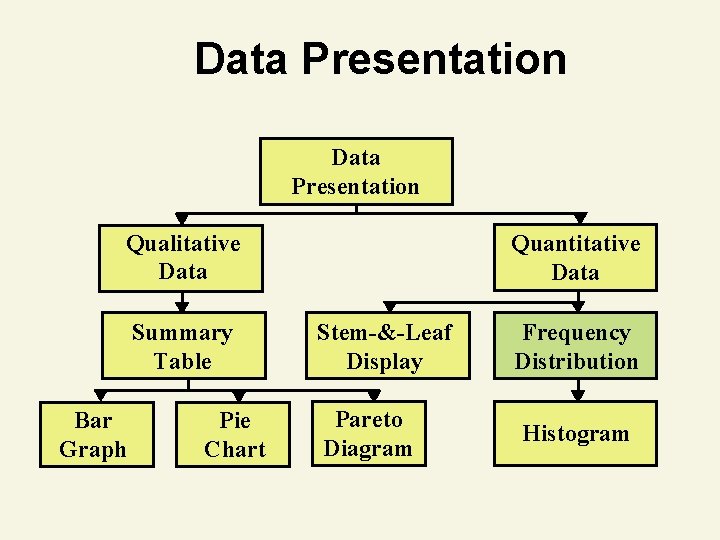
Data Presentation Qualitative Data Summary Table Bar Graph Pie Chart Quantitative Data Stem-&-Leaf Display Pareto Diagram Frequency Distribution Histogram
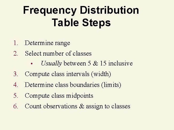
Frequency Distribution Table Steps 1. Determine range 2. Select number of classes • Usually between 5 & 15 inclusive 3. Compute class intervals (width) 4. Determine class boundaries (limits) 5. Compute class midpoints 6. Count observations & assign to classes
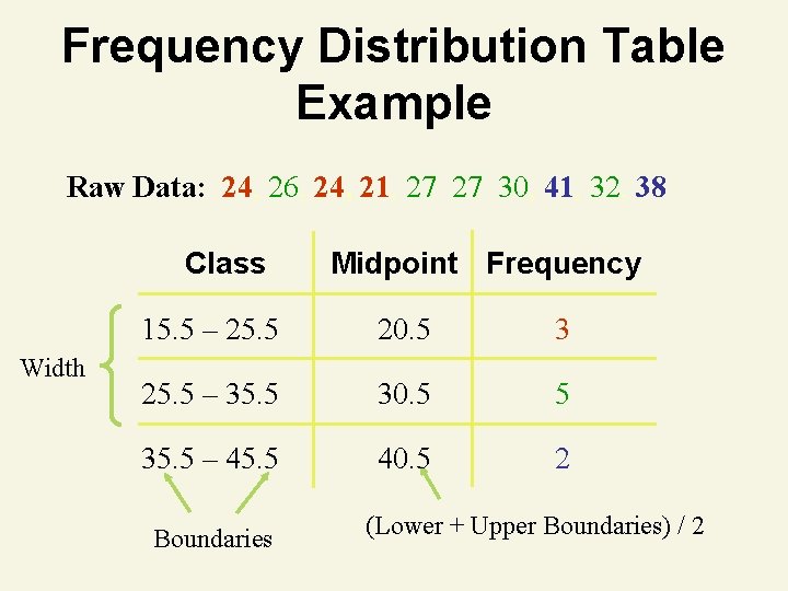
Frequency Distribution Table Example Raw Data: 24, 26, 24, 21, 27 27 30, 41, 32, 38 Class Width Midpoint Frequency 15. 5 – 25. 5 20. 5 3 25. 5 – 35. 5 30. 5 5 35. 5 – 45. 5 40. 5 2 Boundaries (Lower + Upper Boundaries) / 2
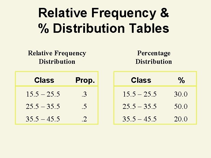
Relative Frequency & % Distribution Tables Relative Frequency Distribution Percentage Distribution Class Prop. Class % 15. 5 – 25. 5 . 3 15. 5 – 25. 5 30. 0 25. 5 – 35. 5 50. 0 35. 5 – 45. 5 . 2 35. 5 – 45. 5 20. 0
Data Presentation Qualitative Data Summary Table Bar Graph Pie Chart Quantitative Data Stem-&-Leaf Display Pareto Diagram Frequency Distribution Histogram
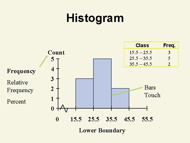
Histogram Class 15. 5 – 25. 5 – 35. 5 – 45. 5 Count 5 Frequency Relative Frequency Percent 4 3 Bars Touch 2 1 0 0 15. 5 25. 5 35. 5 45. 5 Lower Boundary 55. 5 Freq. 3 5 2
Numerical Data Properties
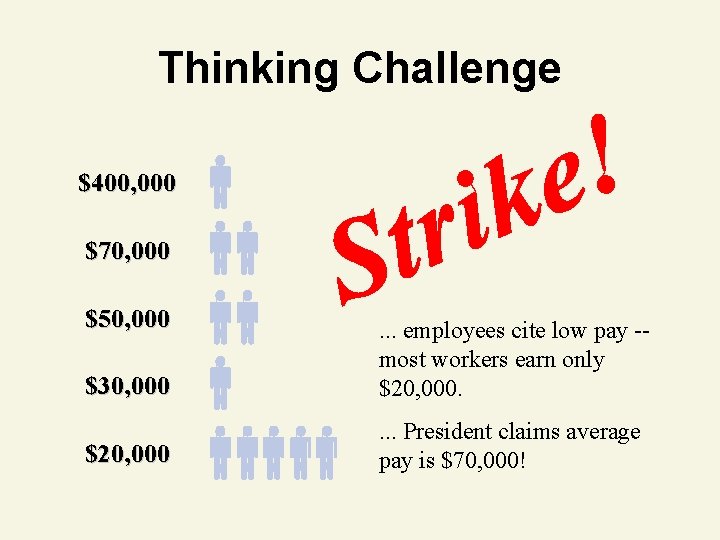
Thinking Challenge $400, 000 $70, 000 $50, 000 $30, 000 . . . employees cite low pay -most workers earn only $20, 000 . . . President claims average pay is $70, 000!
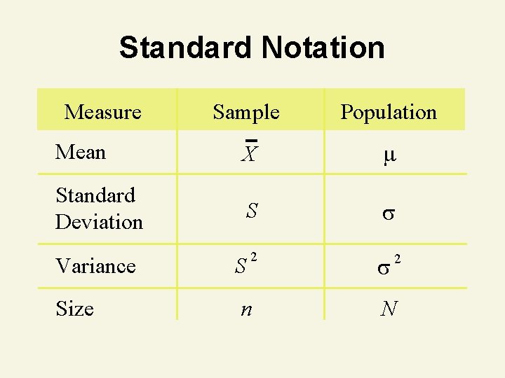
Standard Notation Measure Mean Standard Deviation Sample Population X S 2 Variance S Size n 2 N
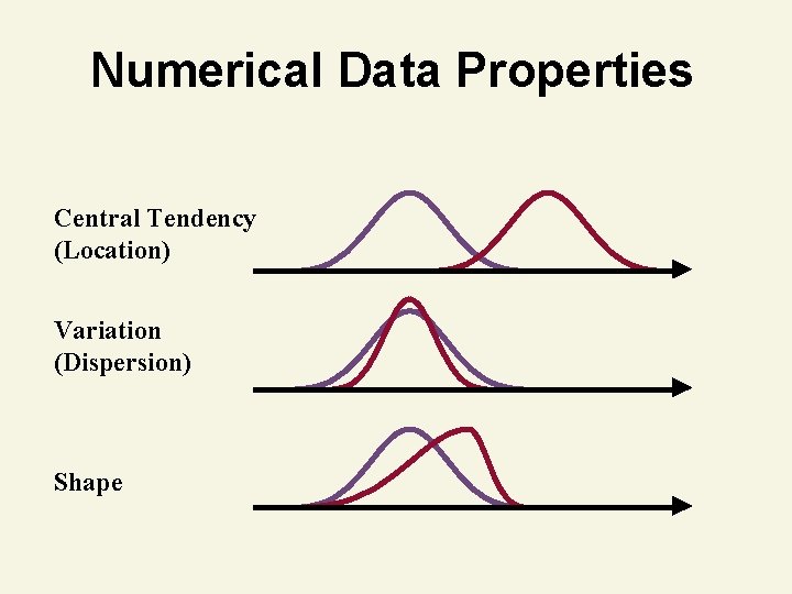
Numerical Data Properties Central Tendency (Location) Variation (Dispersion) Shape
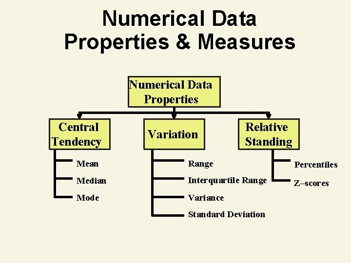
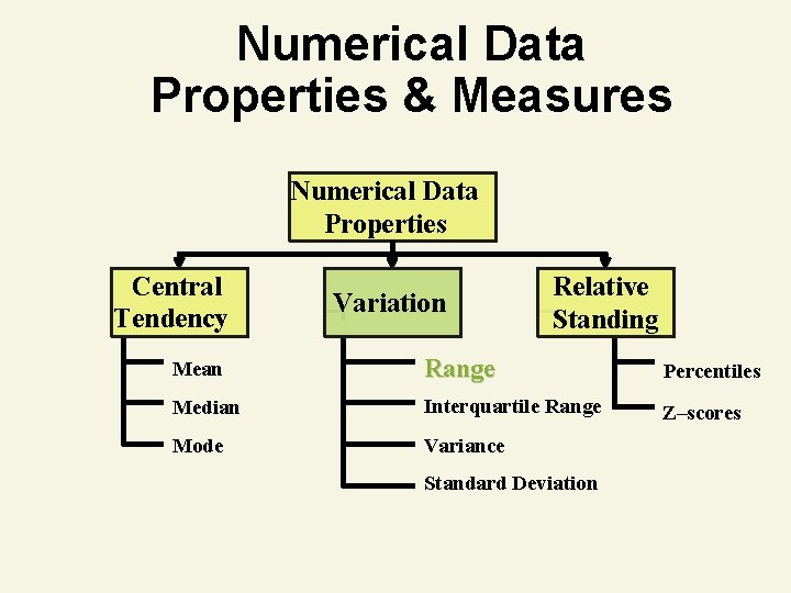
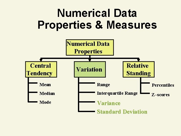
Numerical Data Properties & Measures Numerical Data Properties Central Tendency Variation Relative Standing Mean Range Percentiles Median Interquartile Range Z–scores Mode Variance Standard Deviation
Central Tendency
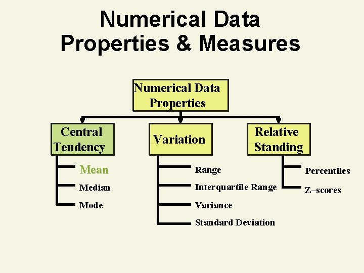
Numerical Data Properties & Measures Numerical Data Properties Central Tendency Variation Relative Standing Mean Range Percentiles Median Interquartile Range Z–scores Mode Variance Standard Deviation
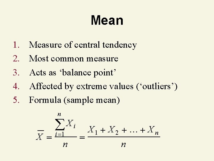
Mean 1. 2. 3. 4. 5. Measure of central tendency Most common measure Acts as ‘balance point’ Affected by extreme values (‘outliers’) Formula (sample mean) n X Xi i 1 n X 1 X 2 … X n n
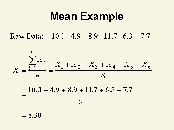
Mean Example Raw Data: 10. 3 4. 9 8. 9 11. 7 6. 3 7. 7 n X Xi i 1 n X 1 X 2 X 3 X 4 X 5 X 6 6 10. 3 4. 9 8. 9 11. 7 6. 3 7. 7 8. 30 6
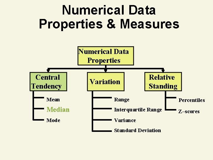
Numerical Data Properties & Measures Numerical Data Properties Central Tendency Variation Relative Standing Mean Range Percentiles Median Interquartile Range Z–scores Mode Variance Standard Deviation
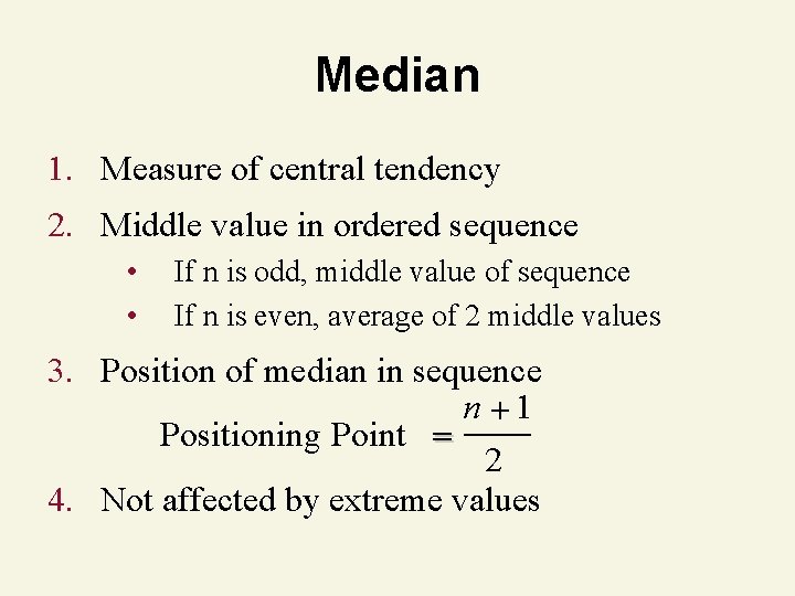
Median 1. Measure of central tendency 2. Middle value in ordered sequence • • If n is odd, middle value of sequence If n is even, average of 2 middle values 3. Position of median in sequence n 1 Positioning Point 2 4. Not affected by extreme values
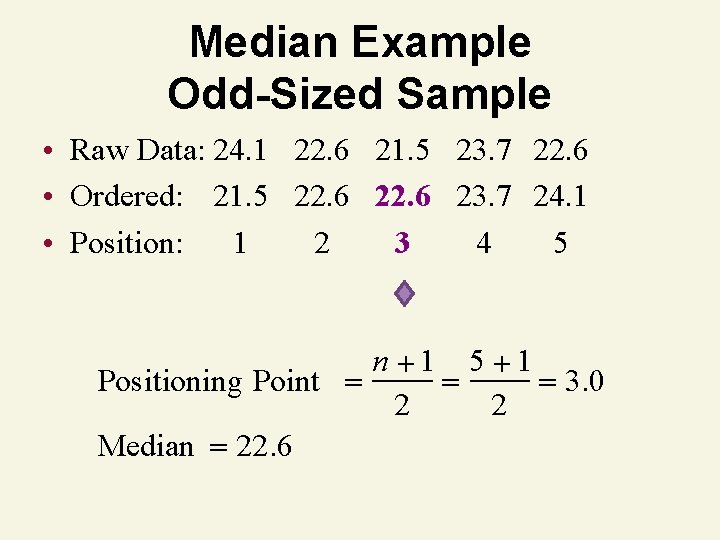
Median Example Odd-Sized Sample • Raw Data: 24. 1 22. 6 21. 5 23. 7 22. 6 • Ordered: 21. 5 22. 6 23. 7 24. 1 • Position: 1 2 3 4 5 n 1 5 1 Positioning Point 3. 0 2 2 Median 22. 6
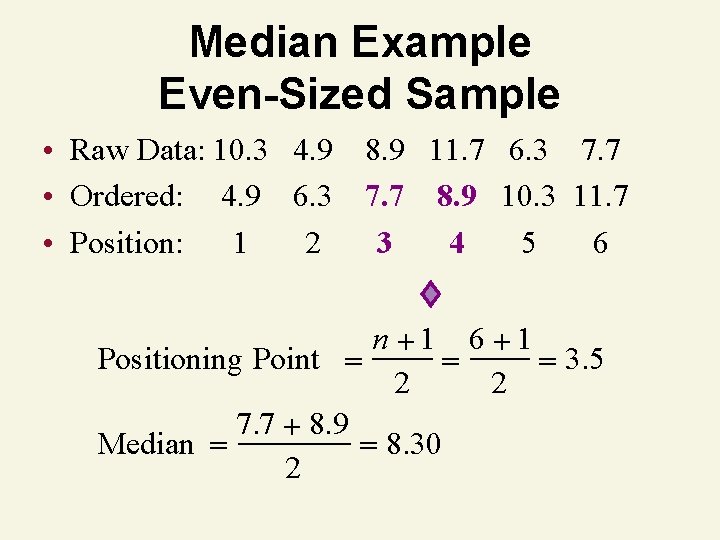
Median Example Even-Sized Sample • Raw Data: 10. 3 4. 9 8. 9 11. 7 6. 3 7. 7 • Ordered: 4. 9 6. 3 7. 7 8. 9 10. 3 11. 7 • Position: 1 2 3 4 5 6 n 1 6 1 Positioning Point 3. 5 2 2 7. 7 8. 9 Median 8. 30 2
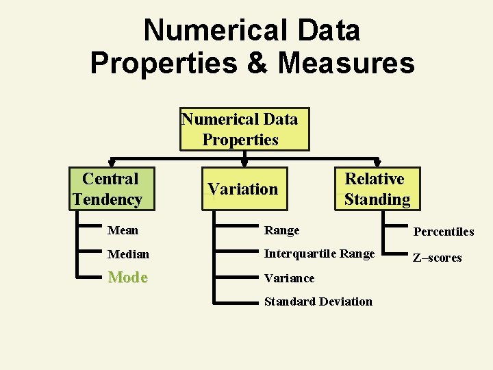
Numerical Data Properties & Measures Numerical Data Properties Central Tendency Variation Relative Standing Mean Range Percentiles Median Interquartile Range Z–scores Mode Variance Standard Deviation
Mode 1. Measure of central tendency 2. Value that occurs most often 3. Not affected by extreme values 4. May be no mode or several modes 5. May be used for quantitative or qualitative data
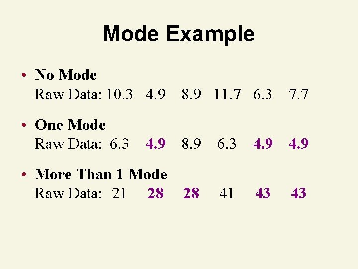
Mode Example • No Mode Raw Data: 10. 3 4. 9 8. 9 11. 7 6. 3 7. 7 • One Mode Raw Data: 6. 3 4. 9 8. 9 6. 3 4. 9 • More Than 1 Mode Raw Data: 21 28 28 41 43 43

Thinking Challenge You’re a financial analyst for Prudential-Bache Securities. You have collected the following closing stock prices of new stock issues: 17, 16, 21, 18, 13, 16, 12, 11. Describe the stock prices in terms of central tendency.
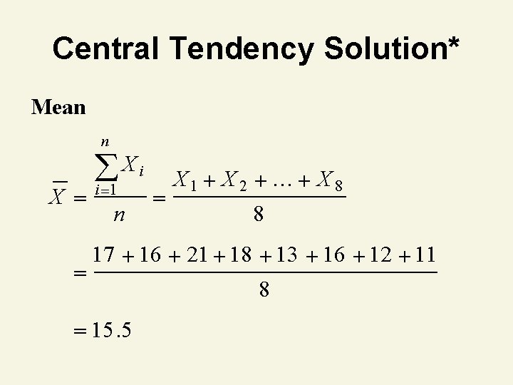
Central Tendency Solution* Mean n X Xi i 1 n X 1 X 2 … X 8 8 17 16 21 18 13 16 12 11 15. 5 8
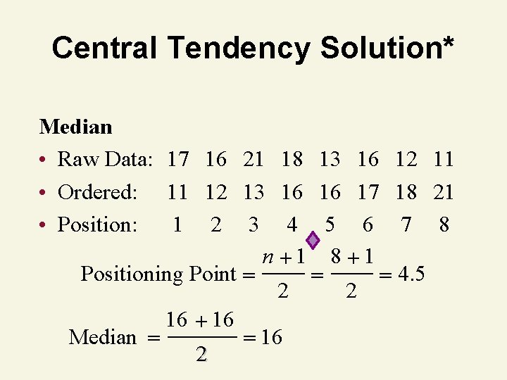
Central Tendency Solution* Median • Raw Data: 17 16 21 • Ordered: 11 12 13 • Position: 1 2 3 n Positioning Point Median 16 2 18 13 16 12 11 16 16 17 18 21 4 5 6 7 8 1 4. 5 2 2 16
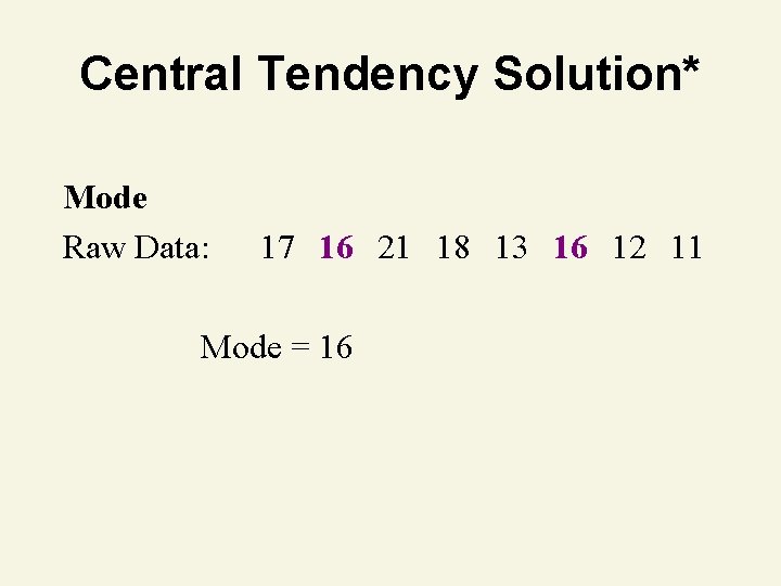
Central Tendency Solution* Mode Raw Data: 17 16 21 18 13 16 12 11 Mode = 16
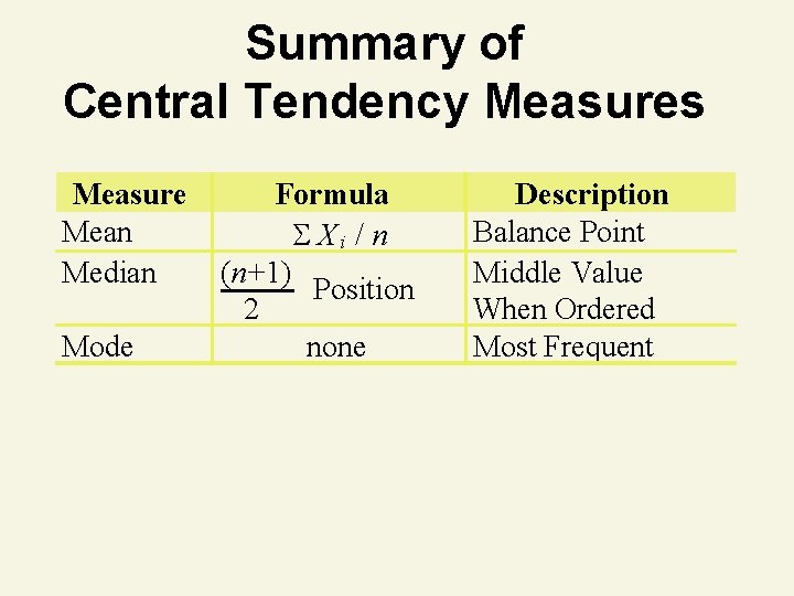
Summary of Central Tendency Measures Measure Mean Median Mode Formula X i / n (n+1) Position 2 none Description Balance Point Middle Value When Ordered Most Frequent
Shape
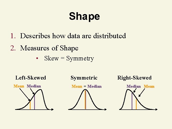
Shape 1. Describes how data are distributed 2. Measures of Shape • Skew = Symmetry Left-Skewed Mean Median Symmetric Mean = Median Right-Skewed Median Mean
Variation
Numerical Data Properties & Measures Numerical Data Properties Central Tendency Variation Relative Standing Mean Range Percentiles Median Interquartile Range Z–scores Mode Variance Standard Deviation
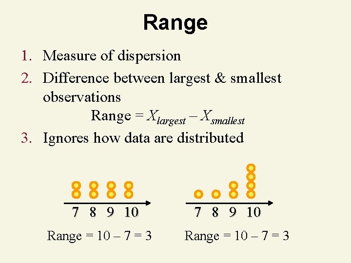
Range 1. Measure of dispersion 2. Difference between largest & smallest observations Range = Xlargest – Xsmallest 3. Ignores how data are distributed 7 8 9 10 Range = 10 – 7 = 3
Numerical Data Properties & Measures Numerical Data Properties Central Tendency Variation Relative Standing Mean Range Percentiles Median Interquartile Range Z–scores Mode Variance Standard Deviation
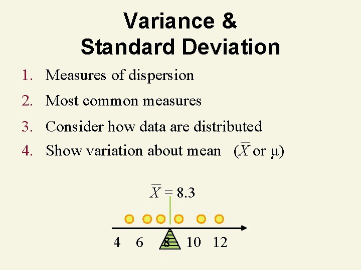
Variance & Standard Deviation 1. Measures of dispersion 2. Most common measures 3. Consider how data are distributed 4. Show variation about mean (X or μ) X = 8. 3 4 6 8 10 12
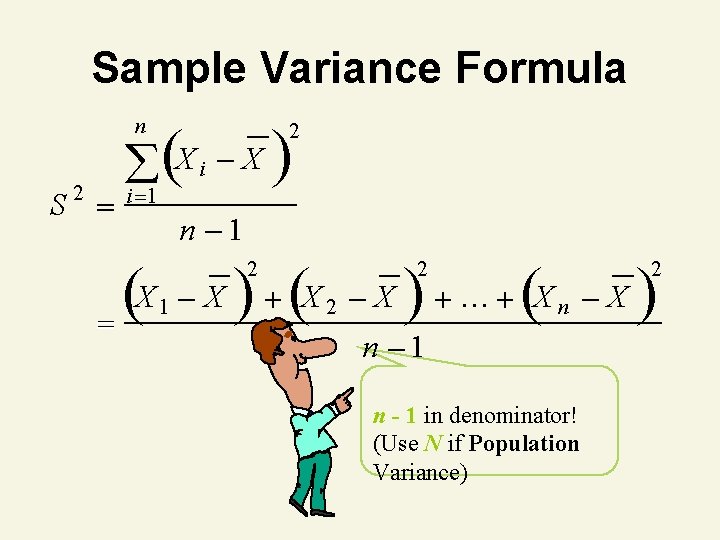
Sample Variance Formula n S 2 (X i X ) 2 i 1 X ( = n 1 1 X ) (X 2 2 X ) … (X 2 n n 1 n - 1 in denominator! (Use N if Population Variance) X ) 2
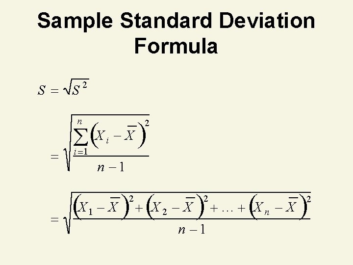
Sample Standard Deviation Formula S S 2 n (X i X ) 2 i 1 (X n 1 1 X ) (X 2 2 X ) … (X 2 n 1 n X ) 2
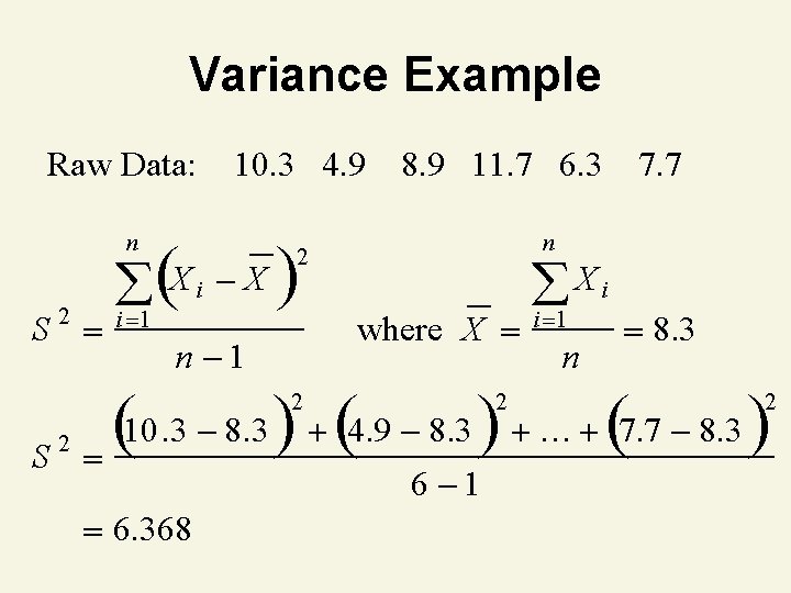
Variance Example Raw Data: 10. 3 4. 9 n 2 S (X i X ) i 1 8. 9 11. 7 6. 3 n 2 n 1 where X S Xi i 1 n 8. 3 10. 3 8. 3 ) (4. 9 8. 3 ) … (7. 7 8. 3 ) ( 2 2 7. 7 2 6 1 6. 368 2

Thinking Challenge • You’re a financial analyst for Prudential-Bache Securities. You have collected the following closing stock prices of new stock issues: 17, 16, 21, 18, 13, 16, 12, 11. • What are the variance and standard deviation of the stock prices?
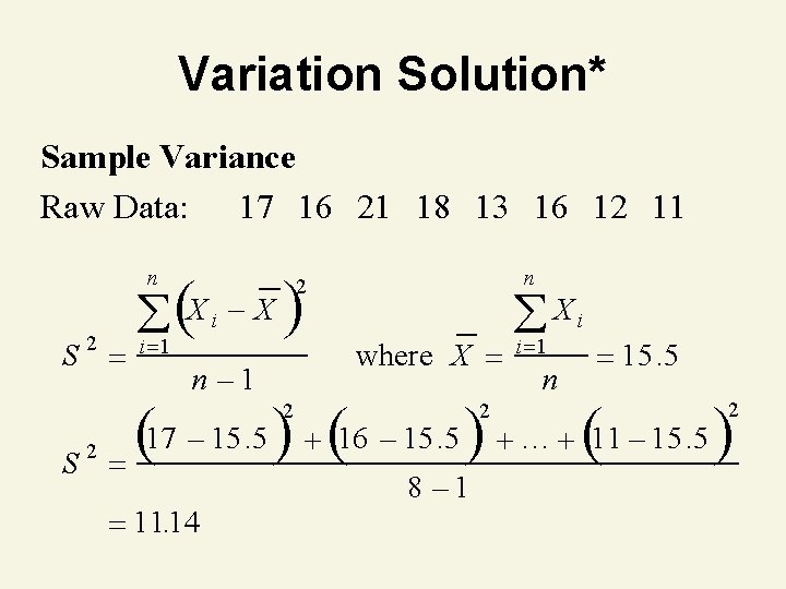
Variation Solution* Sample Variance Raw Data: 17 16 21 18 13 16 12 11 n S 2 (X i X ) i 1 n 2 n 1 where X S i 1 n 15. 5 17 15. 5 ) (16 15. 5 ) … (11 15. 5 ) ( 2 2 Xi 11. 14 2 8 1 2
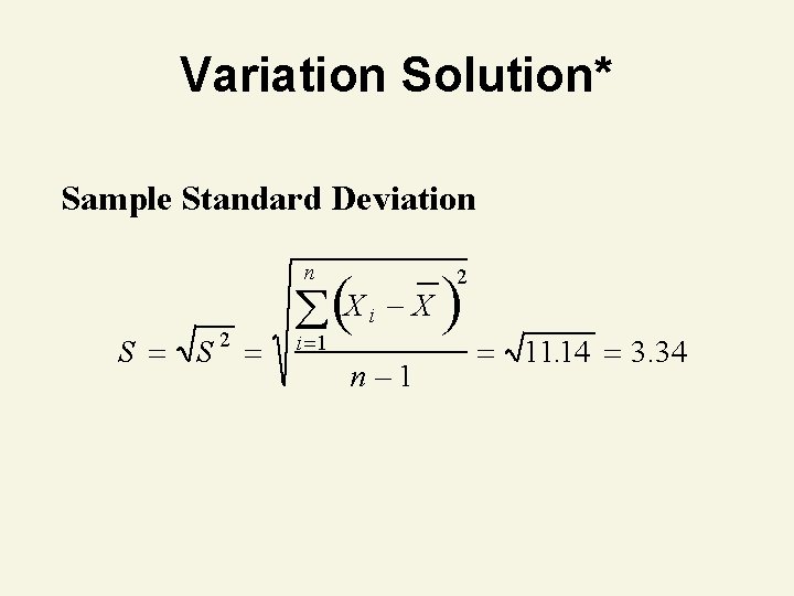
Variation Solution* Sample Standard Deviation n S S 2 (X i X ) 2 i 1 n 1 11. 14 3. 34
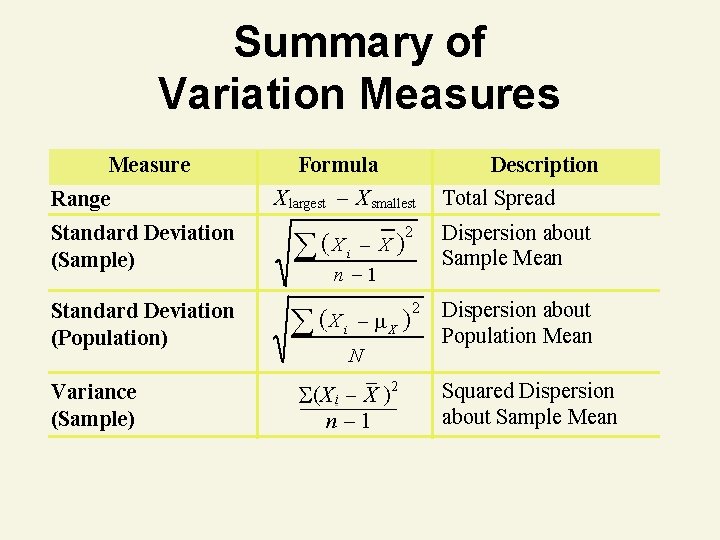
Summary of Variation Measures Measure Range Formula Description X largest – X smallest Standard Deviation (Sample) X i 2 Standard Deviation (Population) X i X Variance (Sample) X n 1 N (X i X )2 n– 1 2 Total Spread Dispersion about Sample Mean Dispersion about Population Mean Squared Dispersion about Sample Mean
Interpreting Standard Deviation
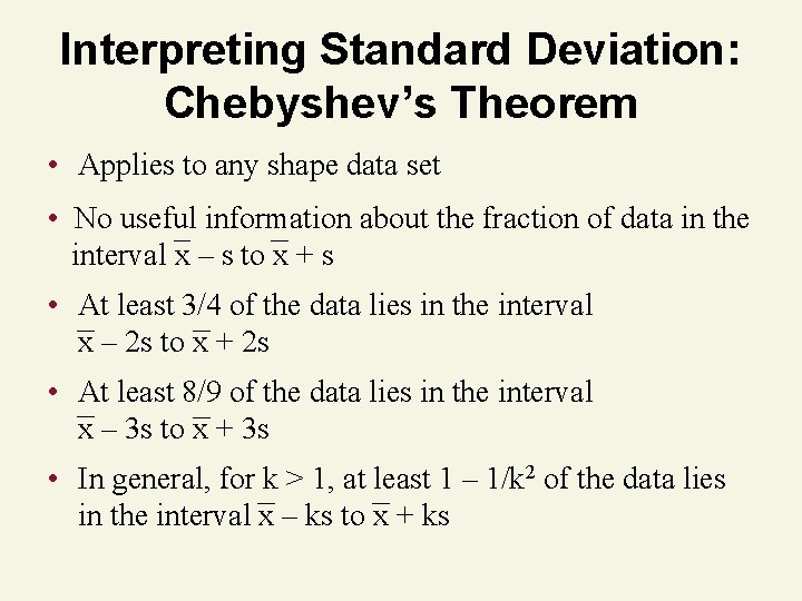
Interpreting Standard Deviation: Chebyshev’s Theorem • Applies to any shape data set • No useful information about the fraction of data in the interval x – s to x + s • At least 3/4 of the data lies in the interval x – 2 s to x + 2 s • At least 8/9 of the data lies in the interval x – 3 s to x + 3 s • In general, for k > 1, at least 1 – 1/k 2 of the data lies in the interval x – ks to x + ks
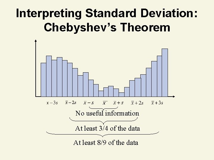
Interpreting Standard Deviation: Chebyshev’s Theorem No useful information At least 3/4 of the data At least 8/9 of the data
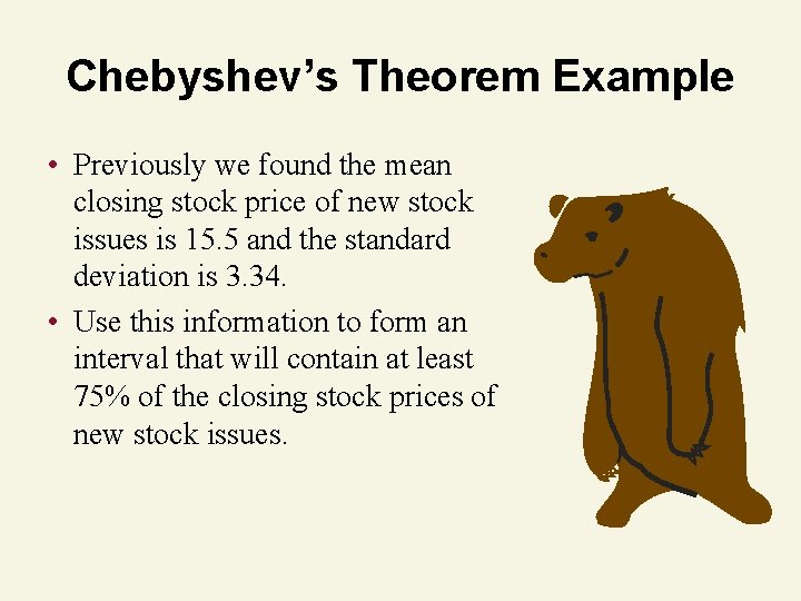
Chebyshev’s Theorem Example • Previously we found the mean closing stock price of new stock issues is 15. 5 and the standard deviation is 3. 34. • Use this information to form an interval that will contain at least 75% of the closing stock prices of new stock issues.
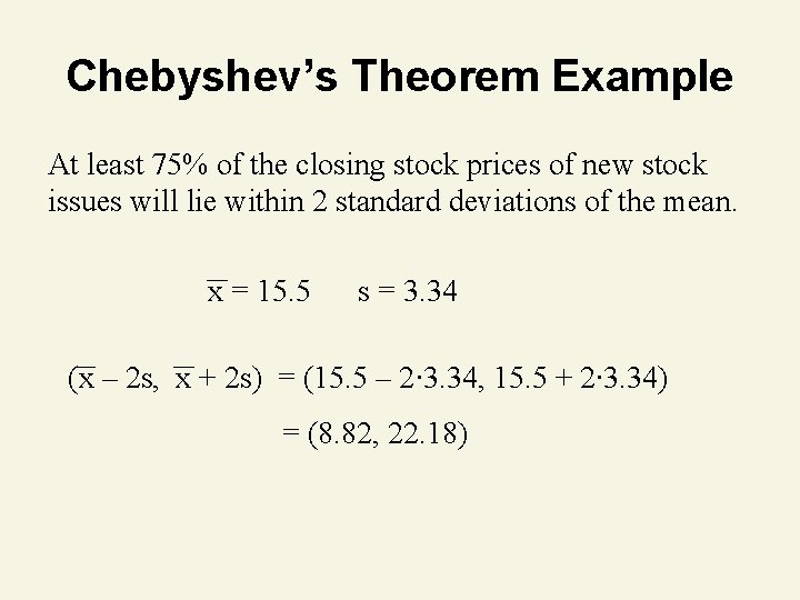
Chebyshev’s Theorem Example At least 75% of the closing stock prices of new stock issues will lie within 2 standard deviations of the mean. x = 15. 5 s = 3. 34 (x – 2 s, x + 2 s) = (15. 5 – 2∙ 3. 34, 15. 5 + 2∙ 3. 34) = (8. 82, 22. 18)
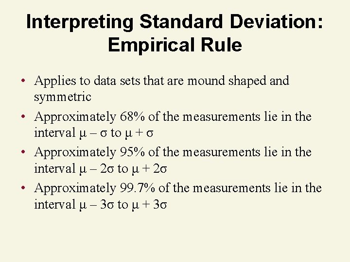
Interpreting Standard Deviation: Empirical Rule • Applies to data sets that are mound shaped and symmetric • Approximately 68% of the measurements lie in the interval μ – σ to μ + σ • Approximately 95% of the measurements lie in the interval μ – 2σ to μ + 2σ • Approximately 99. 7% of the measurements lie in the interval μ – 3σ to μ + 3σ
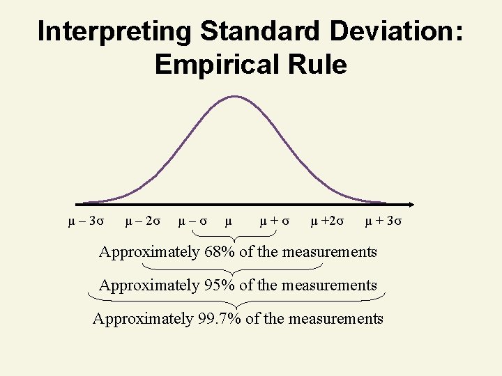
Interpreting Standard Deviation: Empirical Rule μ – 3σ μ – 2σ μ–σ μ μ+σ μ +2σ μ + 3σ Approximately 68% of the measurements Approximately 95% of the measurements Approximately 99. 7% of the measurements
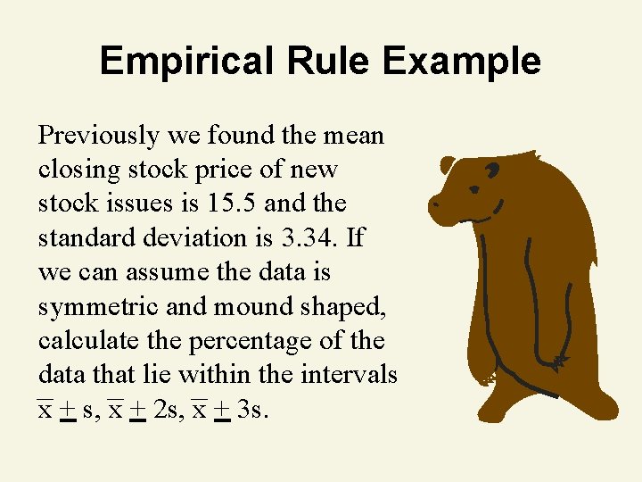
Empirical Rule Example Previously we found the mean closing stock price of new stock issues is 15. 5 and the standard deviation is 3. 34. If we can assume the data is symmetric and mound shaped, calculate the percentage of the data that lie within the intervals x + s, x + 2 s, x + 3 s.
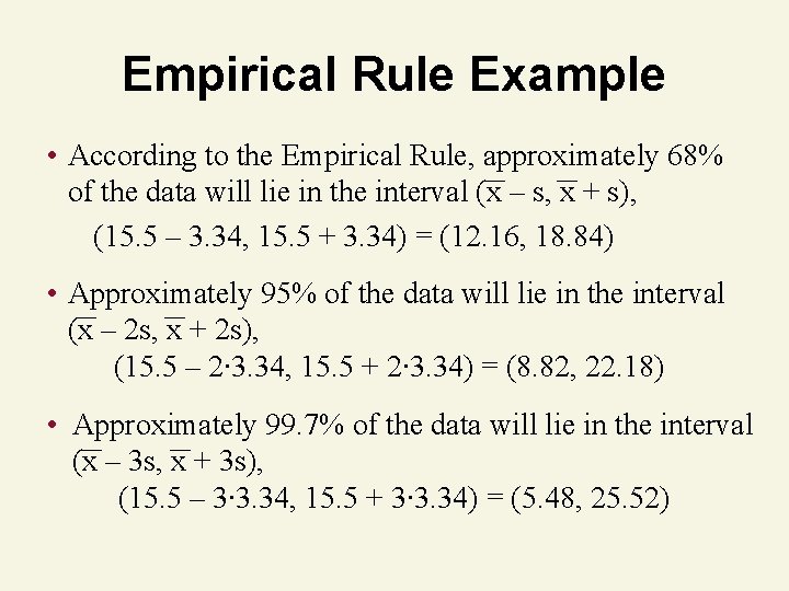
Empirical Rule Example • According to the Empirical Rule, approximately 68% of the data will lie in the interval (x – s, x + s), (15. 5 – 3. 34, 15. 5 + 3. 34) = (12. 16, 18. 84) • Approximately 95% of the data will lie in the interval (x – 2 s, x + 2 s), (15. 5 – 2∙ 3. 34, 15. 5 + 2∙ 3. 34) = (8. 82, 22. 18) • Approximately 99. 7% of the data will lie in the interval (x – 3 s, x + 3 s), (15. 5 – 3∙ 3. 34, 15. 5 + 3∙ 3. 34) = (5. 48, 25. 52)
Numerical Measures of Relative Standing
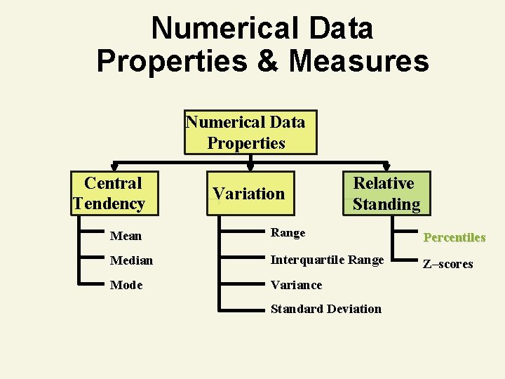
Numerical Data Properties & Measures Numerical Data Properties Central Tendency Variation Relative Standing Mean Range Percentiles Median Interquartile Range Z–scores Mode Variance Standard Deviation
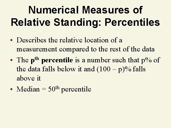
Numerical Measures of Relative Standing: Percentiles • Describes the relative location of a measurement compared to the rest of the data • The pth percentile is a number such that p% of the data falls below it and (100 – p)% falls above it • Median = 50 th percentile
Percentile Example • You scored 560 on the GMAT exam. This score puts you in the 58 th percentile. • What percentage of test takers scored lower than you did? • What percentage of test takers scored higher than you did?
Percentile Example • What percentage of test takers scored lower than you did? 58% of test takers scored lower than 560. • What percentage of test takers scored higher than you did? (100 – 58)% = 42% of test takers scored higher than 560.
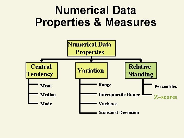
Numerical Data Properties & Measures Numerical Data Properties Central Tendency Variation Relative Standing Mean Range Percentiles Median Interquartile Range Z–scores Mode Variance Standard Deviation
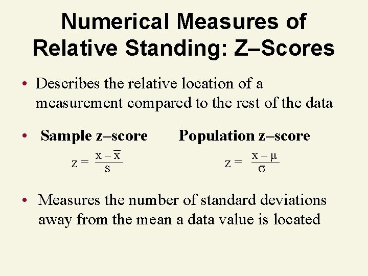
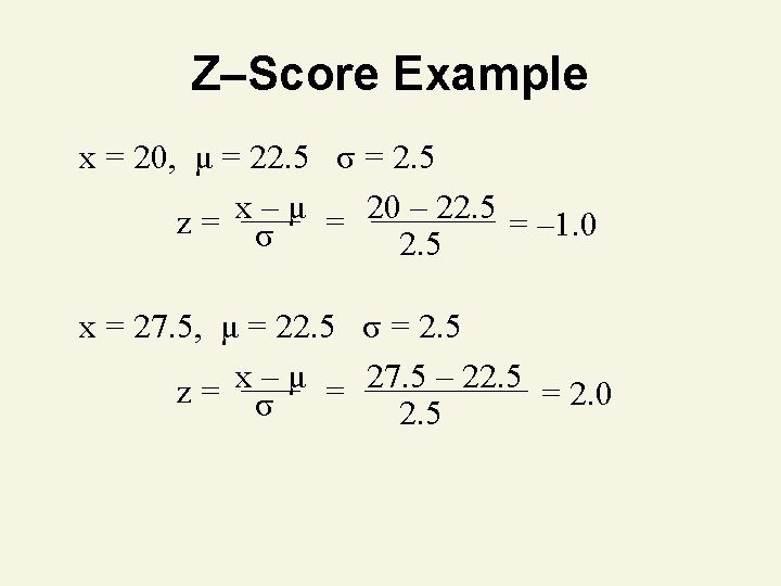
Numerical Measures of Relative Standing: Z–Scores • Describes the relative location of a measurement compared to the rest of the data • Sample z–score z= x–x s Population z–score z= x–μ σ • Measures the number of standard deviations away from the mean a data value is located
Z–Score Example • The mean time to assemble a product is 22. 5 minutes with a standard deviation of 2. 5 minutes. • Find the z–score for an item that took 20 minutes to assemble. • Find the z–score for an item that took 27. 5 minutes to assemble.
Quartiles & Box Plots
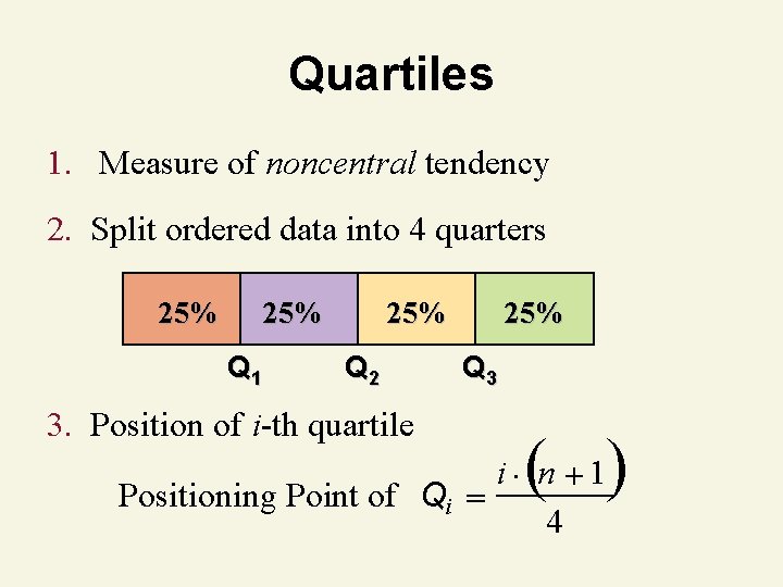
Quartiles 1. Measure of noncentral tendency 2. Split ordered data into 4 quarters 25% Q 1 25% Q 2 3. Position of i-th quartile 25% Q 3 ( ) i n 1 Positioning Point of Qi 4
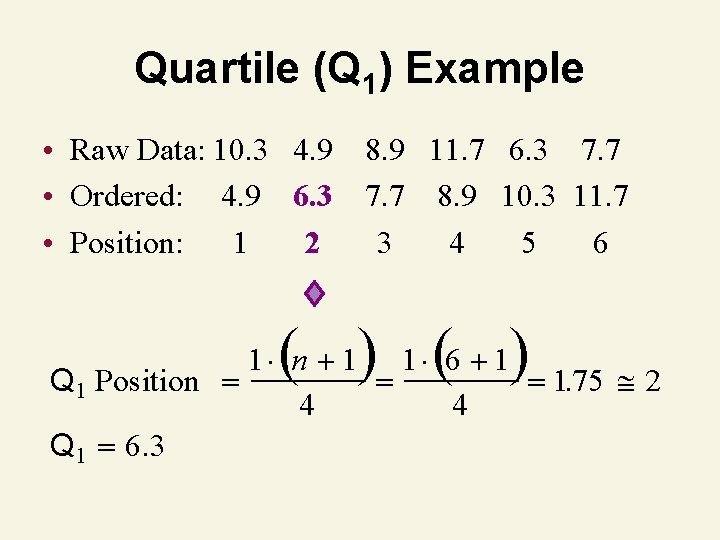
Quartile (Q 1) Example • Raw Data: 10. 3 4. 9 8. 9 11. 7 6. 3 7. 7 • Ordered: 4. 9 6. 3 7. 7 8. 9 10. 3 11. 7 • Position: 1 2 3 4 5 6 ( ) 1 n 1 1 6 1. 2 Q 1 Position 175 4 4 Q 1 6. 3
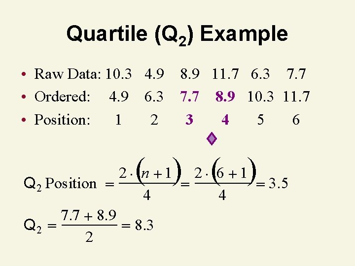
Quartile (Q 2) Example • Raw Data: 10. 3 4. 9 8. 9 11. 7 6. 3 7. 7 • Ordered: 4. 9 6. 3 7. 7 8. 9 10. 3 11. 7 • Position: 1 2 3 4 5 6 ( ) 2 n 1 2 6 1 Q 2 Position 3. 5 4 4 7. 7 8. 9 Q 2 8. 3 2
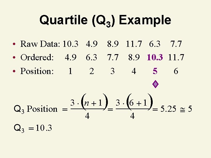
Quartile (Q 3) Example • Raw Data: 10. 3 4. 9 8. 9 11. 7 6. 3 7. 7 • Ordered: 4. 9 6. 3 7. 7 8. 9 10. 3 11. 7 • Position: 1 2 3 4 5 6 ( ) 3 n 1 3 6 1 Q 3 Position 5. 25 5 4 4 Q 3 10. 3
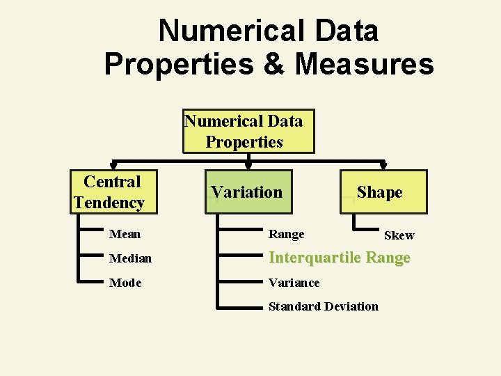
Numerical Data Properties & Measures Numerical Data Properties Central Tendency Variation Shape Mean Range Median Interquartile Range Mode Variance Standard Deviation Skew
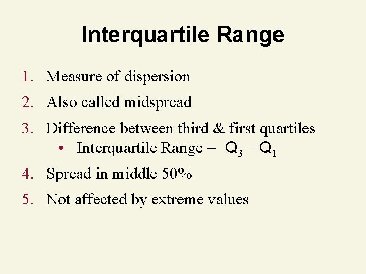
Interquartile Range 1. Measure of dispersion 2. Also called midspread 3. Difference between third & first quartiles • Interquartile Range = Q 3 – Q 1 4. Spread in middle 50% 5. Not affected by extreme values
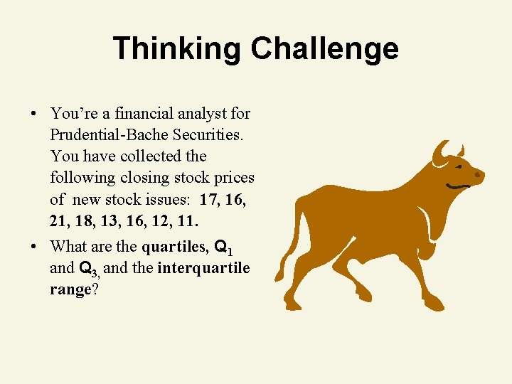
Thinking Challenge • You’re a financial analyst for Prudential-Bache Securities. You have collected the following closing stock prices of new stock issues: 17, 16, 21, 18, 13, 16, 12, 11. • What are the quartiles, Q 1 and Q 3, and the interquartile range?
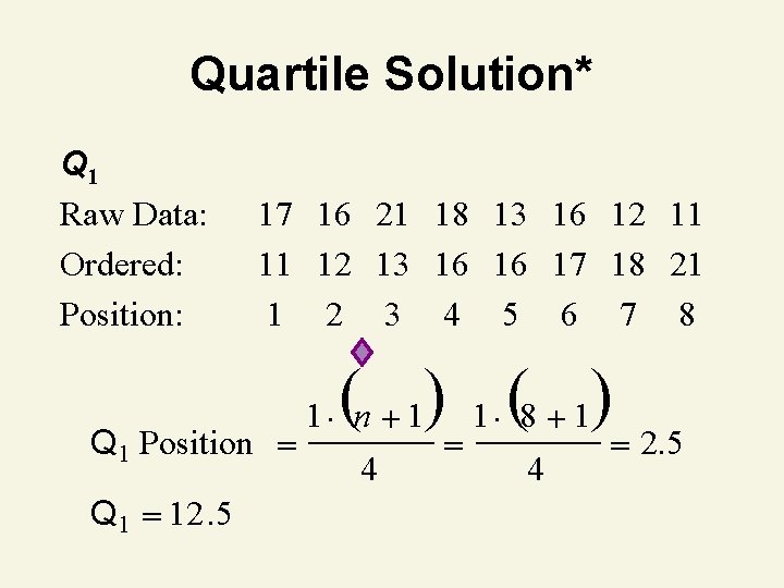
Quartile Solution* Q 1 Raw Data: Ordered: Position: 17 16 21 18 13 16 12 11 11 12 13 16 16 17 18 21 1 2 3 4 5 6 7 8 Q 1 Position Q 1 12. 5 ( ) 1 (8 1) 1 n 1 4 4 2. 5
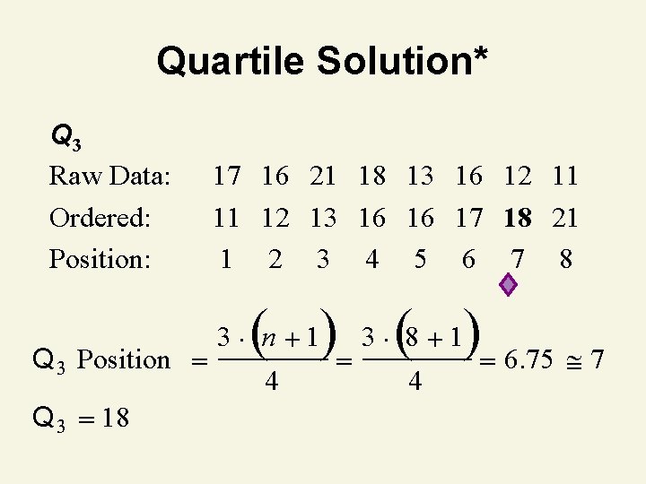
Quartile Solution* Q 3 Raw Data: Ordered: Position: Q 3 Position Q 3 18 17 16 21 18 13 16 12 11 11 12 13 16 16 17 18 21 1 2 3 4 5 6 7 8 ( ) 3 (8 1) 6. 75 7 3 n 1 4 4
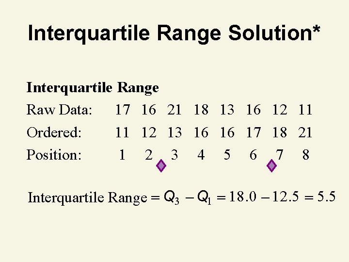
Interquartile Range Solution* Interquartile Range Raw Data: 17 16 21 18 13 16 12 11 Ordered: 11 12 13 16 16 17 18 21 Position: 1 2 3 4 5 6 7 8 Interquartile Range Q 3 Q 1 18. 0 12. 5 5. 5
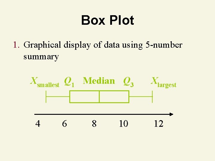
Box Plot 1. Graphical display of data using 5 -number summary Xsmallest Q 1 Median Q 3 4 6 8 10 Xlargest 12
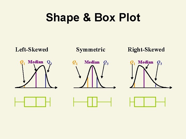
Shape & Box Plot Left-Skewed Q 1 Median Q 3 Symmetric Q 1 Median Q 3 Right-Skewed Q 1 Median Q 3
Graphing Bivariate Relationships
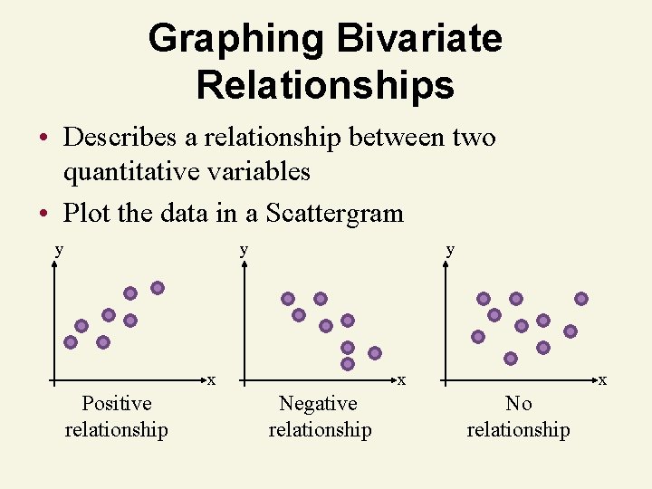
Graphing Bivariate Relationships • Describes a relationship between two quantitative variables • Plot the data in a Scattergram y y y x Positive relationship x Negative relationship x No relationship
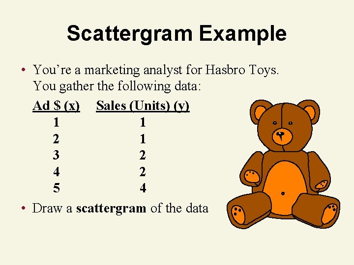
Scattergram Example • You’re a marketing analyst for Hasbro Toys. You gather the following data: Ad $ (x) Sales (Units) (y) 1 1 2 1 3 2 4 2 5 4 • Draw a scattergram of the data
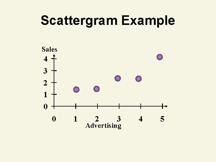
Scattergram Example Sales 4 3 2 1 0 0 1 2 3 Advertising 4 5

Time Series Plot
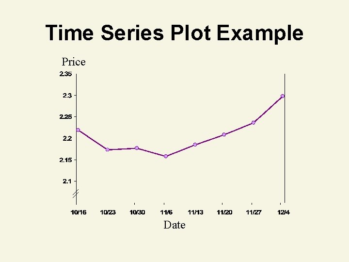
Time Series Plot • Used to graphically display data produced over time • Shows trends and changes in the data over time • Time recorded on the horizontal axis • Measurements recorded on the vertical axis • Points connected by straight lines
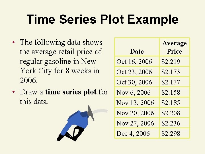
Time Series Plot Example • The following data shows the average retail price of regular gasoline in New York City for 8 weeks in 2006. • Draw a time series plot for this data. Date Average Price Oct 16, 2006 Oct 23, 2006 $2. 219 $2. 173 Oct 30, 2006 Nov 6, 2006 Nov 13, 2006 Nov 20, 2006 Nov 27, 2006 Dec 4, 2006 $2. 177 $2. 158 $2. 185 $2. 208 $2. 236 $2. 298
Time Series Plot Example Price Date

Distorting the Truth with Descriptive Techniques
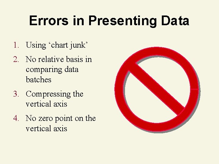
Errors in Presenting Data 1. Using ‘chart junk’ 2. No relative basis in comparing data batches 3. Compressing the vertical axis 4. No zero point on the vertical axis
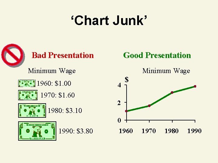
‘Chart Junk’ Bad Presentation Good Presentation Minimum Wage 1960: $1. 00 1970: $1. 60 Minimum Wage 4 $ 2 1980: $3. 10 0 1990: $3. 80 1960 1970 1980 1990
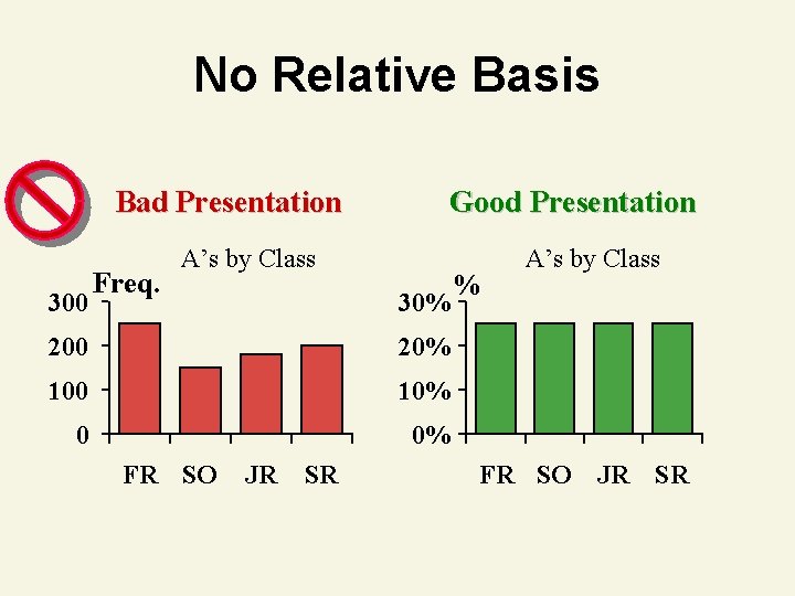
No Relative Basis Bad Presentation 300 Freq. Good Presentation A’s by Class 30% 200 20% 100 10% 0 0% FR SO JR SR % A’s by Class FR SO JR SR
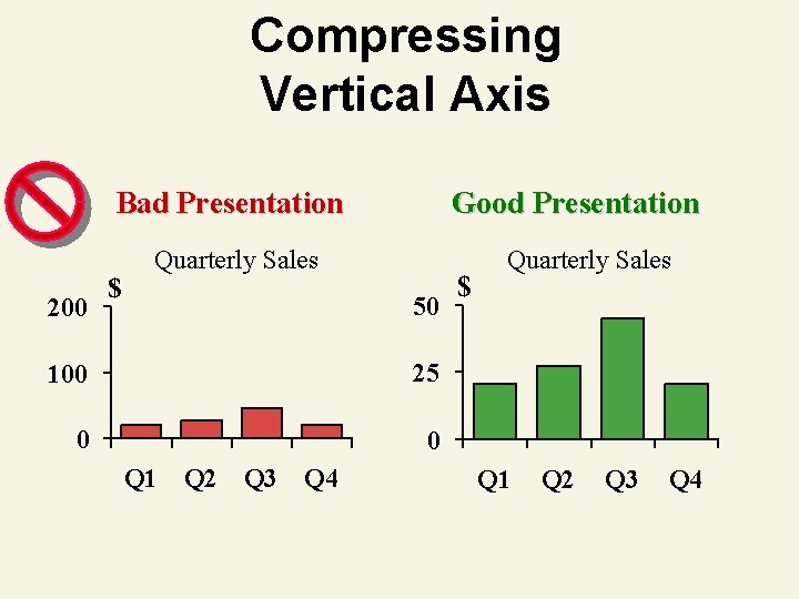
Compressing Vertical Axis Bad Presentation 200 $ Good Presentation Quarterly Sales 50 100 25 0 0 Q 1 Q 2 Q 3 Q 4 $ Quarterly Sales Q 1 Q 2 Q 3 Q 4
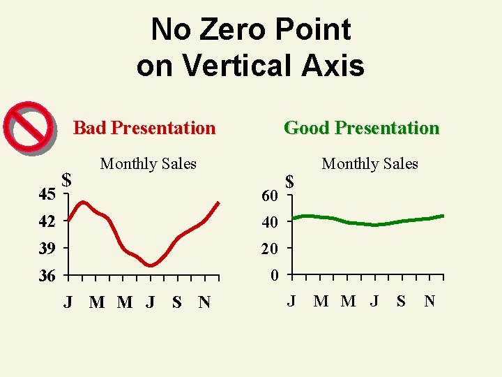
No Zero Point on Vertical Axis Bad Presentation 45 $ Good Presentation Monthly Sales 60 42 40 39 20 36 0 J M M J S N $ J Monthly Sales M M J S N
Conclusion 1. 2. 3. 4. Described Qualitative Data Graphically Described Numerical Data Graphically Explained Numerical Data Properties Described Summary Measures 5. Analyzed Numerical Data Using Summary Measures
- Slides: 107