Statistics Chapter 2 Frequency Distributions How do we

Statistics Chapter 2 Frequency Distributions 次數分配

資料整理 How do we turn “a bunch of numbers” into something meaningful? l整理資料的第一步驟 – – 統計表 統計圖

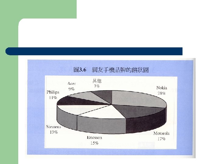
 餅圖 (pie chart) 直方圖 (histogram)")
統計圖 l 種類 – – – 條圖 (bar chart) 餅圖 (pie chart) 直方圖 (histogram) 多邊圖 (polygon) 枝葉圖 (stem-and-leaf display)
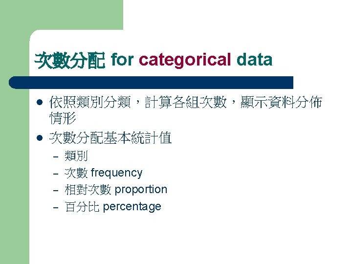
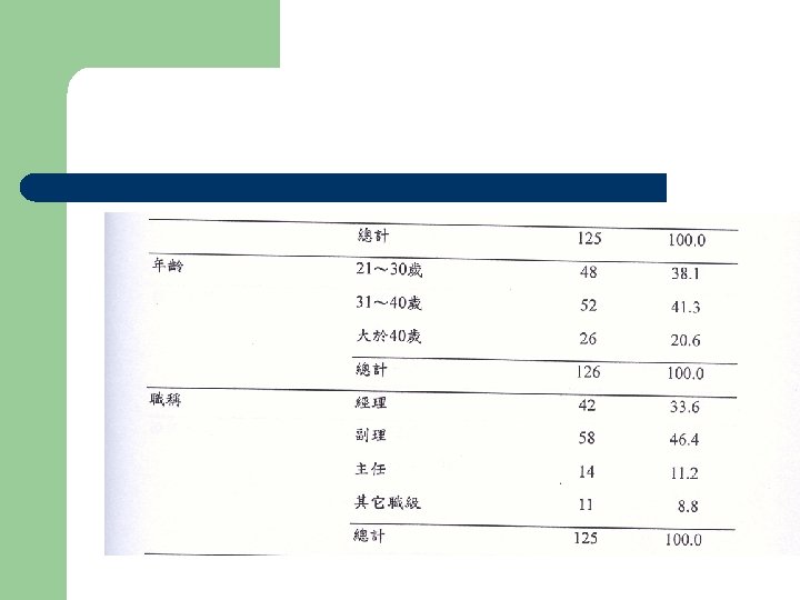
 Table 1 Frequency distribution of the Pilot Study Sample (N=117)")
Frequency distribution table (cont’) Table 1 Frequency distribution of the Pilot Study Sample (N=117) Frequency (f) Percentage % Cumulative Percentage(%) Gender Male Female Sub total 57 60 117 48. 7 51. 3 100 48. 7 100 Industry experience Yes No Sub total 07 10 117 91. 5 8. 5 100 91. 5 100 24 35 38 10 107 22. 3 32. 8 35. 5 9. 3 100 22. 3 55. 1 90. 6 100 Category If yes, length of industry experience (n=107) Less than one year 1~ less than 2 years 2~ less than 3 years more than 3 years Sub total
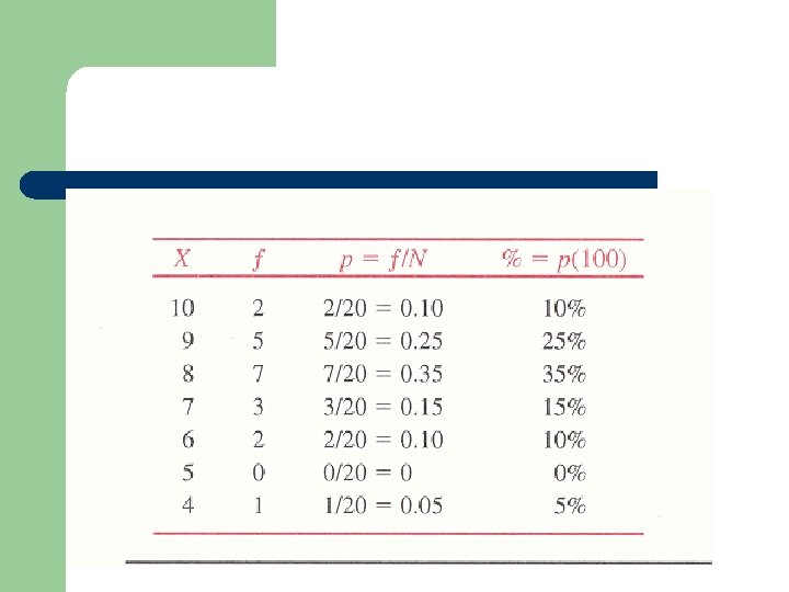
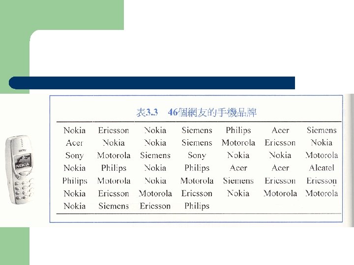
 考試成績 (滿分10分) 8 9 8 7 10 9 6")
l Raw data 20 個學生(N=20) 考試成績 (滿分10分) 8 9 8 7 10 9 6 4 9 8 7 8 10 9 8 6 9 7 8 8
 決定組數 (# of interval) 組距 (interval width) =")
l l l 排序 全距 (range) 決定組數 (# of interval) 組距 (interval width) = 全距/組數 決定組限(real limit)
 82 75 88 93 53 84 87 58")
Example 2. 3 l 25位學生成績 (N=25) 82 75 88 93 53 84 87 58 72 94 69 84 61 91 64 87 84 70 76 89 75 80 73 78 60
 決定組數 (# of interval) 組距 (interval")
1. 2. 3. 4. 5. 排序 全距 (range) 決定組數 (# of interval) 組距 (interval width) = 全距/組數 決定區間組限(real limit) 1. 2. 3. 4. 5. 最低 53 最高 94 全距= 94 -53=41 組數= =5 組距=41/5=8. 2 10 區間組限 X f 50 -60 3 61 -70 4 71 -80 7 81 -90 8 91 -100 3 Total 25 % 12 16 28 32 12 100

Real limits vs. Apparent limits l Continuous variable creates continuous data – l Real limits 區間組限 – – – l Infinite numbers 界定出continuous data的上下界 Upper real limit Lower real limit Real limits vs. Apparent limits

Apparent limit Lower real limit Upper real limit

Exercise 30位學生體重 33 62 47 54 40 51 66 55 48 42 64 71 69 38 61 59 48 55 44 69 35 43 53 46 68 56 54 52 69 73 N=30

組別 組限 組界 組中點 f % c. p 1 30 -34 29. 4 -34. 5 32 1 3 3 2 35 -39 34. 5 -39. 5 37 2 7 10 3 40 -44 39. 5 -44. 5 42 4 13 23 4 45 -49 44. 5 -49. 5 47 3 10 33 5 50 -54 49. 5 -54. 5 52 5 17 50 6 55 -59 54. 4 -59. 5 57 4 13 63 7 60 -64 59. 4 -64. 5 62 3 10 73 8 65 -69 64. 5 -69. 5 67 6 20 93 9 70 -74 69. 5 -74. 5 72 2 7 100 30 100

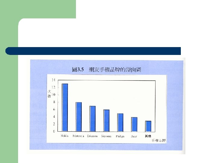
Histogram 直方圖 l l 適用於 continuous data 以呈現出連續資料的 特質 Difference between a bar chart and a histogram: – – – Bar chart: distances between each bar. Histogram: no distance among bars. Bar chart is for categorical data

Histogram

多邊圖 polygon

Stem-and-Leaf Displays l An alternative to histograms l Display distributions using actual data values l Advantage is that no information is lost since all values are shown Stem-first digit of each number Leaf-second digit l l

Stem-and-leaf example English test scores: 78 66 98 93 72 83 67 32 77 92 47 79 83 76 74 82 53 89 30 82

3 4 5 6 7 8 9 20 7 3 67 897624 32392 832 重將leaves 按照次序排 好 3 4 5 6 7 8 9 02 7 3 67 246789 22339 238 OK!

02 7 3 67 246789 22339 238 3 4 5 6 7 8 9

Exercise 53 92 67 84 90 71 76 65 58 82 84 79 60 58 61 89 98 75 64 59 55 71 93 86 68 76 54 62 69 80

Example of Histogram

資料的圖形分佈 Data distribution l l 資料分佈的三種特質 Shape 資料分佈形狀 – Symmetrical distribution – Skewed distribution l Central tendency 資料集中趨勢 – l 峰度 Variability資料散佈狀態

資料形狀 l Symmetric distributions 對稱分佈 – are similar on both sides of the center l Skewed distributions 不對稱分佈 – – – do not look the same on both sides of the center Positive skew 右偏 Negative skew 左偏

Degree of skewness displayed by a histogram
 – – l Unimodal distributions 單峰 Multimodal distributions 多峰")
資料集中趨勢 l 當次數分配有集中的趨勢: 峰度 (Modality) – – l Unimodal distributions 單峰 Multimodal distributions 多峰 峰度高低平坦 – – Distributions can be described as flat (platykurtic), peaked (leptokurtic), or normal (mesokurtic) 常態峰度 mesokurtosis 高狹峰 leptokurtosis 低闊峰 platykurtosis

Modality displayed by a histogram

Distributional Spread l Any distribution of scores can be described in terms of its spread or dispersion l Kurtosis is another term associated with the spread or peakedness of the data

Illustration of degree of spread
- Slides: 39