Statistical Process Control Manufacturing Service Sectors Statistical Process


 UPPER CONTROL LIMIT")


 = _")


 sample means")
 are")

 Mean Factor ( A 2 ) Upper Range")
 Mean Factor ( A 2 ) Upper Range")
 Mean Factor ( A 2 ) Upper Range")

 Mean Factor ( A 2 ) Upper Range")


")
 Mean Factor ( A 2 ) Upper Range")
 Mean Factor ( A 2 ) Upper Range ( D 4")


 n WHERE n =")


 = 6 complaints per")


 is insignificant We desire to")


")


")


(0. 357771) = 16. 92887 LCL = 15. 85556")

 _ UCL = ( D 4")

 (. 02 ) =. 10 LCLp =.")


- Slides: 113
Statistical Process Control Manufacturing & Service Sectors
Statistical Process Control v Setting standards for the process. v Measuring key elements of the process. v Plotting the measurements on a chart(s) v Interpreting the above measurements. v Correcting the process , if necessary , in real time as the product or service is being generated.
Statistical Process Control Ø Random samples of process output are drawn and analyzed. SPECIFICS Ø If the sample statistics fall within acceptable limits, the process is allowed to continue. Ø If the sample statistics fall outside acceptable limits, the process is stopped. Ø The assignable cause or causes is / are identified and eliminated.
Walter A. Shewhart 1891 - 1967 § Ph. D in Physics , University of California § Considered the “grandfather” of modern quality control § Worked on improving the reliability of underground transmission systems at Western Electric Company (subsidiary of Bell Telephone) from 1918 until his retirement in 1956 § Developed the SPC control chart in 1924
Walter A. Shewhart 1891 - 1967 § Editor of the Wiley Series in mathematical statistics for 20 years § His SPC charts improved the quality of ordnance during WW II § Taught W. Edward Deming who championed his research § During the 1990 s, his genius was re-discovered by a 3 rd generation of managers, naming it the Six Sigma approach
Control Charts Graphs show acceptable upper and lower control limits for the process Samples expressed in those terms are taken and their averages are plotted at Control limits can regular be stated in terms intervals of weight, temperature, length, percentage of defects, number of errors, pressure, etc. If the sample averages fall within the control limits, the process is assumed to be in control !
Control Chart NORMAL BEHAVIOR UPPER CONTROL LIMIT PROCESS AVERAGE LOWER CONTROL LIMIT SAMPLE AVERAGES PLOTTED OVER TIME
Control Chart UNHEALTHY TREND NEEDING INVESTIGATION UPPER CONTROL LIMIT PROCESS AVERAGE LOWER CONTROL LIMIT SAMPLE AVERAGES PLOTTED OVER TIME
Control Chart UNHEALTHY TREND NEEDING INVESTIGATION UPPER CONTROL LIMIT PROCESS AVERAGE LOWER CONTROL LIMIT SAMPLE AVERAGES PLOTTED OVER TIME
TOO MANY PLOTS ABOVE THE CENTER LINE ( BEARS INVESTIGATION ) UPPER CONTROL LIMIT PROCESS AVERAGE LOWER CONTROL LIMIT SAMPLE AVERAGES PLOTTED OVER TIME
ERRATIC BEHAVIOR BEARS INVESTIGATION UPPER CONTROL LIMIT PROCESS AVERAGE LOWER CONTROL LIMIT SAMPLE AVERAGES PLOTTED OVER TIME
OUT-OF-CONTROL PROCESS. STOP, INVESTIGATE, CORRECT! UPPER CONTROL LIMIT PROCESS AVERAGE LOWER CONTROL LIMIT SAMPLE AVERAGES PLOTTED OVER TIME
TWO PLOTS NEAR “UCL” - INVESTIGATE UPPER CONTROL LIMIT PROCESS AVERAGE LOWER CONTROL LIMIT SAMPLE AVERAGES PLOTTED OVER TIME
Control Chart TWO PLOTS NEAR “LCL” - INVESTIGATE UPPER CONTROL LIMIT PROCESS AVERAGE LOWER CONTROL LIMIT SAMPLE AVERAGES PLOTTED OVER TIME
Process Variability – Two Types All processes, both service and manufacturing, exhibit some variability The trick is to be able to distinguish natural variability from assignable cause variability Assignable causes of variability can then quickly be identified and removed Control charts are designed to provide a statistical signal when assignable causes of variability are present in the process
Natural Process Variability Random and uncontrollable, yet expected and normal Sample means taken from a normal process are all different However, these sample means form a pattern This pattern or probability distribution is predictable ! An example are the miniscule changes in product output caused by alternating electric current flow to manufacturing equipment
Natural Process Variability The predictable pattern is a normal curve ! A predictable pattern allows us to establish upper and lower control limits around the pattern Thus a “normal” process can be in control in spite of modest variability ! UPPER CONTROL LIMIT PROCESS AVERAGE LOWER CONTROL LIMIT SAMPLE MEANS PLOTTED OVER TIME
Assignable Cause Variability poorly trained workers defective raw materials poorly calibrated machines excessive machine vibration tired or indifferent workers worn or loose parts Not random, but controllable, that is, the cause or causes can be identified and eliminated
Control Charts Four Versions I. X – bar chart II. R – chart III. p – chart IV. c - chart
X – Bar Chart v Measures the central tendency of a process, that is, the variability or dispersion around the normal process average. v The process average itself can be the desired, historical, or the originally-designed average of the process.
If a sample of four items had weights of: 2 ounces 10 ounces 4 ounces 7 ounces the range would be 8 ounces R-Chart v Measures the range ( R ) between the largest and smallest or the heaviest and lightest items within each randomly selected sample. v In other words, it measures the gain or loss in uniformity within the process. UNIFORMITY IS AFFECTED BY LOOSE OR WORN PARTS, OPERATOR SLOPPINESS, ERRATIC FLOW OF LUBRICANTS TO A MACHINE, AND SO ON If four samples had ranges of: 6 ounces 8 ounces 9 ounces 2 ounces The average range would be 6. 25 ounces
The Central Limit Theorem _ X = is the mean of X the sample means = The distribution of sample means x is called the Regardless of the particular probability distribution sampling of a product or service characteristic, the distribution of its sample averages will follow a normal distribution even if the number of observations in each sample is as small as four !
The Process or Target Mean A MAJOR ELEMENT OF THE CONTROL CHART The normal distribution of the sample averages ( sample means ) is called the sampling distribution the mean of the sampling distribution is the mean of the means = X also the mean of all possible sampling distributions for a given sample size ( n ) Both are often estimated by averaging sample means drawn from a normal process = x is the process mean or average for a “healthy” process !
The Standard Deviation A MEASURE OF DISPERSION AROUND THE MEAN USED TO ESTABLISH THE UPPER AND LOWER CONTROL LIMITS THE STANDARD DEVIATION OF THE SAMPLING DISTRIBUTION ( THE STANDARD ERROR ) POPULATION STANDARD DEVIATION ( KNOWN ) σ σ_ = X The standard error is the measure of dispersion around the mean of the sampling distribution √n X SAMPLE SIZE
X – Bar Chart THE NUMBER OF NORMAL STANDARD DEVIATIONS UPPER CONTROL LIMIT ( UCL ) The Template = X + zσ x THE STANDARD ERROR LOWER CONTROL LIMIT ( LCL ) THE MEAN OF THE SAMPLE MEANS (process average) = X - zσ x- +/- 1 z +/-2 z +/-3 z LCL = X UCL
THE NUMBER OF NORMAL STANDARD DEVIATIONS ( Widest Control Limits ! Z) = _ X +/- 3σx 99. 7% of the time, the sample means will fall within the above control limits if the process has only random variations* = _ +/- 2σx X 95. 5% of the time, the sample means will fall within the above control limits if the process has only random variations* _ = +/- 1σx X Narrowest Control Limits ! 68% of the time, the sample means will fall within the above control limits if the process has only random variations* * NATURAL VARIABILITY “z” values are used when the process standard deviation (σ) is known
Setting Control Chart Limits depends on the nature of the process or industry norms narrowest control limits middle control limits widest control limits -3 z -2 z -1 z = x +1 z +2 z +3 z THE NUMBER OF NORMAL STANDARD DEVIATIONS ( Z ) Narrow control limits could produce multiple “false alarms” whereas wide control limits could allow serious process changes to go undetected
The Significance of “Z” _ X THE IDEA BEHIND CONTROL CHARTS ! 3 z = 99. 7 % 2 z = 95. 5 % 1 z = 68. 3 % If the mean of a randomly selected sample were to fall outside of the 1 z, 2 z, or 3 z control limits, we would be 68. 3%, 95. 5%, or 99. 7% sure, respectively, that the process had changed !
X-Bar Chart Example SOLUTION The mean of all twelve ( 12 ) sample means is easily calculated to be exactly 16. 0 ounces and the population standard deviation is calculated to be exactly one ( 1 ) ounce. We therefore have: = X = 16. 0 oz. the process mean σx = 1. 0 oz. n=9 z=3 population standard deviation sample size wide control limits THE CONTROL LIMITS ARE: = UCL = X + zσ _ = 16 + 3 ( 1/√ 9 ) = 16 + 3 ( 1/3 ) = 17. 0 oz. X LCL = = + zσ _ = 16 - 3 ( 1/√ 9 ) = 16 - 3 ( 1/3 ) = 15. 0 oz. X X
X-Bar Chart Based on Average Range Values Process standard deviations ( σx ) are either not available or difficult to compute. Consequently, we usually calculate _ control limits based on the average range values ( R s ) rather than on standard deviations. RANGE is defined as the difference between the largest and smallest items in each sample. For example, if the heaviest box of Oat Flakes in the 1 st hour weighed 19 ounces and the lightest box weighed 14 ounces, the range for that hour would be 5 ounces.
X-Bar Chart Control Limits BASED ON AVERAGE RANGE VALUES = _ UCL = X + A 2 R = _ LCL = X - A 2 R where: where the process standard deviation (σ) is unknown _ R = average range of all the samples A 2 = value found in the Table = X = mean of the sample means
The Factor Table Sample Size (n) Mean Factor ( A 2 ) Upper Range ( D 4 ) Lower Range ( D 3 ) 2 3 4 5 6 7 1. 880 1. 023. 729. 577. 483. 419 3. 268 2. 574 2. 282 2. 114 2. 004 1. 924 0 0 0. 076 these values approximate the values of the unknown standard errors, and also reflect the “t” values for small samples, since the “z” values cannot be used
The Factor Table Sample Size (n) Mean Factor ( A 2 ) Upper Range ( D 4 ) Lower Range ( D 3 ) 8 9 10 12 14 16 0. 373 0. 337 0. 308 0. 266 0. 235 0. 212 1. 864 1. 816 1. 777 1. 716 1. 671 1. 636 0. 184 0. 223 0. 284 0. 329 0. 364
The Factor Table Sample Size (n) Mean Factor ( A 2 ) Upper Range ( D 4 ) Lower Range ( D 3 ) 18 20 25 0. 194 0. 180 0. 153 1. 608 1. 586 1. 541 0. 392 0. 414 0. 459
X-Bar Chart Control Limits AVERAGE RANGE VALUE EXAMPLE Super Cola bottles soft drinks labeled “net weight 16 ounces”. An overall process average of 16. 01 ounces has been found by taking several batches of samples in which each sample contained five ( 5 ) bottles. The average range of the process is. 25 ounces. Determine the upper and lower control limits for averages in this process. Solution Looking in the Table for a sample size of 5 ( n = 5 ) , in the “mean factor A 2” column, we find the number “. 577 “ Thus, the upper and lower control chart limits are:
The Factor Table Sample Size (n) Mean Factor ( A 2 ) Upper Range ( D 4 ) Lower Range ( D 3 ) 2 3 4 5 6 7 1. 880 1. 023. 729. 577. 483. 419 3. 268 2. 574 2. 282 2. 114 2. 004 1. 924 0 0 0. 076
X – Bar Chart UCL and LCL UCL = 16. 01 + (. 577 )(. 25 ) = 16. 01 +. 144 = 16. 154 ounces SOLUTION LCL = 16. 01 - (. 577 )(. 25 ) = 16. 01 -. 144 = 15. 866 ounces
R - Charts q We are also interested in the process dispersion or variability. q Even though the process average is under control, the process variability ( uniformity ) may not be. q For example, something may have worked itself loose in a piece of equipment. As a result, the sample means may remain the same but the variation within the samples could be entirely too large. q The theory behind Range Charts is the same as for the process average control charts.
R-Chart Formulas Limits are established that contain + / - three ( 3 ) standard deviations of the distribution for the average range “ R “ : _ UCLR = D 4 R _ LCLR = D 3 R where : UCLR = upper control chart limit for the range LCLR = lower control chart limit for the range D 4 and D 3 are values from the Table
The Factor Table Sample Size (n) Mean Factor ( A 2 ) Upper Range ( D 4 ) Lower Range ( D 3 ) 2 3 4 5 6 7 1. 880 1. 023. 729. 577. 483. 419 3. 268 2. 574 2. 282 2. 114 2. 004 1. 924 0 0 0. 076
Sample Size (n) Mean Factor ( A 2 ) Upper Range ( D 4 ) Lower Range ( D 3 ) 2 3 4 5 6 7 1. 880 1. 023. 729. 577. 483. 419 3. 268 2. 574 2. 282 2. 114 2. 004 1. 924 0 0 0. 076 for n = 5
R-Chart The average range of a process is 5. 3 pounds. If the sample size is five ( 5 ) , determine the upper and lower control chart limits. SOLUTION Looking in the Table for a sample size of “ 5 “ , we find that D 4 = 2. 114 and D 3 = 0 EXAMPLE _ UCLR = D 4 R = ( 2. 114 )( 5. 3 pounds ) = 11. 2 pounds _ LCLR = D 3 R = ( 0 )( 5. 3 pounds ) = 0 pounds
Attribute Control Charts c – Charts p – Charts Measure the “percent” defective in a sample Count the number of defects in a sample
p - Charts § The chief way to control attributes § The normal distribution can be used to calculate p - charts when sample sizes are large enough* § The procedure resembles the x - bar chart approach which was based on the central limit theorem. * ATTRIBUTES NORMALLY FOLLOW THE BINOMIAL PROBABILITY DISTRIBUTION
p-Chart UCL and LCL Formulae _ UCLp = p + z σ p^ _ ^ LCLp = p – z σ p where: _ p = mean fraction defective in the sample z = the number of standard deviations ( z = 2 for 95. 5% limits ; z = 3 for 99. 7% limits ) σ^ p = standard deviation of the sampling distribution
The Standard Deviation of the Sampling Distribution σ^p = p(1–p) n WHERE n = THE SIZE OF EACH SAMPLE ESTIMATED BY THE FORMULA SHOWN HERE
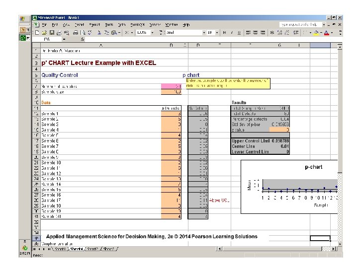
p-Chart Data entry clerks key in thousands of insurance records each day. 100 records entered by each clerk were carefully examined to make sure they contained no errors. Twenty ( 20 ) clerks were examined. The number of errors for each of the 20 clerks were computed and shown below: Clerk Number Errors EXAMPLE Basically, we have 20 samples containing 100 items each 1 2 3 4 5 6 7 8 9 10 6 5 0 1 4 2 5 3 3 2 11 12 13 14 15 16 17 18 19 20 6 1 8 7 5 4 11 3 0 4
p - Chart _ p= EXAMPLE total number of errors total number of records examined 80 = =. 04 (100)(20) ^= σp (. 04)(1 -. 04) 100 =. 02 NOTE: “ 100” IS THE SIZE OF EACH SAMPLE ( n )
p-Chart EXAMPLE _ UCLp = p + z σ^p =. 04 + 3 (. 02) =. 10 _ LCLp = p – z σp^ =. 04 – 3 (. 02) = 0 BECAUSE WE CANNOT HAVE A NEGATIVE PERCENT DEFECTIVE Setting the control limits to include 99. 7% of the random variation in the data entry process when it is in control ( z = 3 )
p-Chart Structure & Elements FRACTION DEFECTIVE DATA ENTRY EXAMPLE . 11. 10. 09. 08. 07. 06. 05. 04. 03. 02. 01. 00 UCLp =. 10 p =. 04 LCLp =. 00 1 2 3 4 5 6 7 8 9 10 11 12 13 14 15 16 17 18 19 20 SAMPLE NUMBER
p-Chart Data entry clerks key in thousands of insurance records each day. 100 records entered by each clerk were carefully examined to make sure they contained no errors. Twenty ( 20 ) clerks were examined. The number of errors for each of the 20 clerks were computed and shown below: Clerk % Number Errors We can then convert the number of errors to the percentage of errors 1 2 3 4 5 6 7 8 9 10 . 06. 05. 00. 01. 04. 02. 05. 03. 02 11 12 13 14 15 16 17 18 19 20 . 06. 01. 08. 07. 05. 04. 11. 03. 00. 04
p-Chart Structure & Elements. . and plot FRACTION DEFECTIVE them on the newly constructed control chart . 11. 10. 09. 08. 07. 06. 05. 04. 03. 02. 01. 00 DATA ENTRY EXAMPLE UCLp =. 10 X p =. 04 LCLp =. 00 1 2 3 4 5 6 7 8 9 10 11 12 13 14 15 16 17 18 19 20 SAMPLE NUMBER
c-Charts § Used to control the number of defects per unit of output. § Used to monitor processes where a large number of potential errors can occur but the actual number that do occur is relatively small. § Defects may be bad circuits in a micro-chip, burrs on cloth or metal, blemishes on furniture, etc.
c-Chart Variables _ c = the mean number of defects per unit as well as the variance. _ √ c = the standard deviation of defects per unit. THE POISSON PROBABILITY DISTRIBUTION IS THE BASIS FOR c - CHARTS
c-Chart Control Limits _ _ UCL = c + 3 √ c _ _ LCL = c - 3 √ c _ TO COMPUTE 99. 7% CONTROL LIMITS FOR c
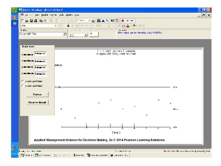
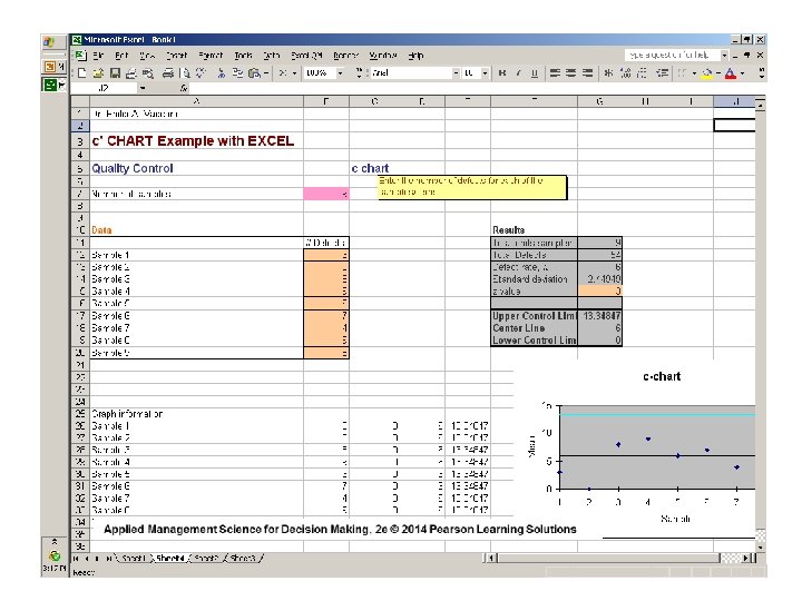
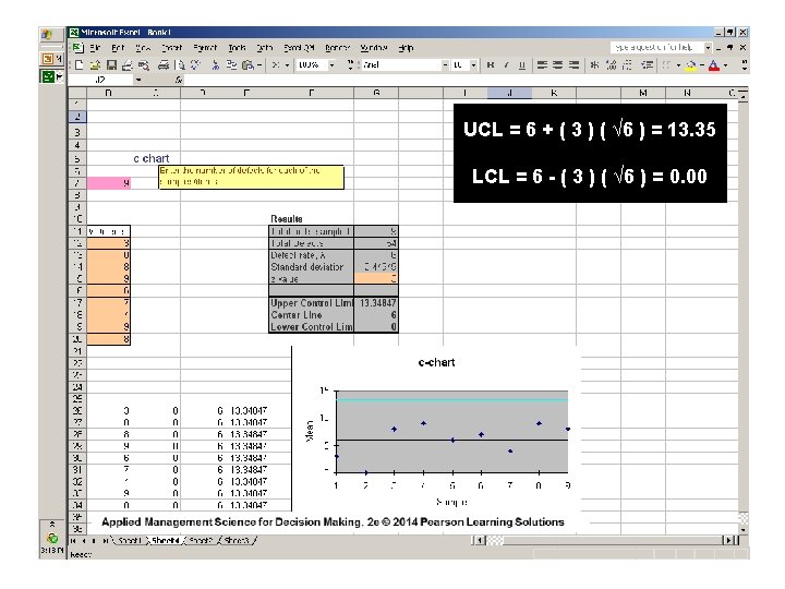
C-Chart EXAMPLE Red Top Cab Company receives several complaints per day about the behavior of its drivers. Over a 9 -day period ( where days are the units of measure ) the owner received the following numbers of calls from irate passengers: 3, 0, 8, 9, 6, 7, 4, 9, 8 for a total of 54 complaints. COMPUTE 99. 7% CONTROL LIMITS
c-Chart EXAMPLE _ c = ( 54 / 9 ) = 6 complaints per day therefore: UCLc = 6 + 3√ 6 = 6 + 3 (2. 45) = 13. 35 LCLc = 6 - 3√ 6 = 6 - 3 (2. 45) = 0. 00 After the owner plotted a control chart summarizing these data and posted it prominently in the drivers’ locker room, the number of calls received dropped to an average of three calls per day. Can you explain why this occurred?
NUMBER OF COMPLAINTS c-Chart Example 15 14 13 12 11 10 9 8 7 6 5 4 3 2 1 0 It doubles as a Behavior Modification Chart ! UCLc = 13. 35 c = 6. 00 LCLc = 0. 00 1 2 3 4 5 DAY 6 7 8 9
Deciding Which Chart To Use X-bar Chart p. Chart RChart c. Chart
X-Bar and R-Charts I. The observations are usually products which are measured for size and weight * II. We collect 20 to 25 samples of n = 4, n = 5, or more, each from a stable process, and compute the mean for an x-Bar Chart and the range for an R-Chart. III. We then track samples comprised of “n” observations per sample. * WEIGHT OF A CAN OF SOUP OR LENGTH OF A WIRE BEING CUT
p-Chart I. Observations are attributes that can be categorized as good or bad, pass or fail, functional or broken, i. e. two states. II. We deal with fraction, proportion, or percent defectives. III. There are several samples with many observations in each * FOR EXAMPLE, TWENTY SAMPLES OF n = 100 OBSERVATIONS EACH
c-Chart I. Observations are attributes whose defects per unit of output can be counted. II. We deal with the number counted, which is a small part of the possible occurrences. Defects may be the number of blemishes on a desk, crimes in a year, flaws in a bolt of cloth, or typos in a newspaper.
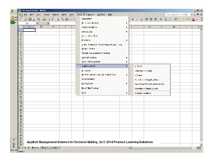
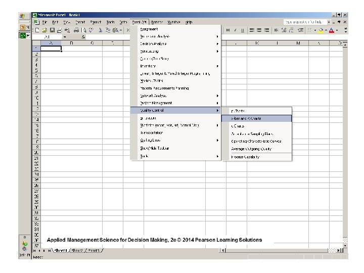
Statistical Process Control Via QM for WINDOWS
Scroll To “ Quality Control “ Applied Management Science for Decision Making, 2 e © 2014 Pearson Learning Solutions
Click “New” to solve a new problem
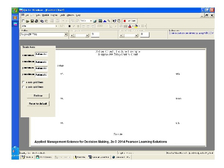
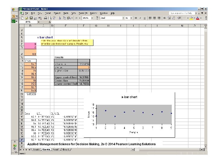
We want to work with an ‘ x - bar ‘ control chart
We already know the mean of the sample means = X and the standard deviation σ
In this application, the sample size of nine (9) is insignificant We desire to set the control limits at “ 99. 7 % “ The ‘Data Input Table’ provides for the insertion of the process mean = X and the standard deviation σ
The UCL = 17. 0 The LCL = 15. 0 The CL = 16. 0 if = X and σ are known
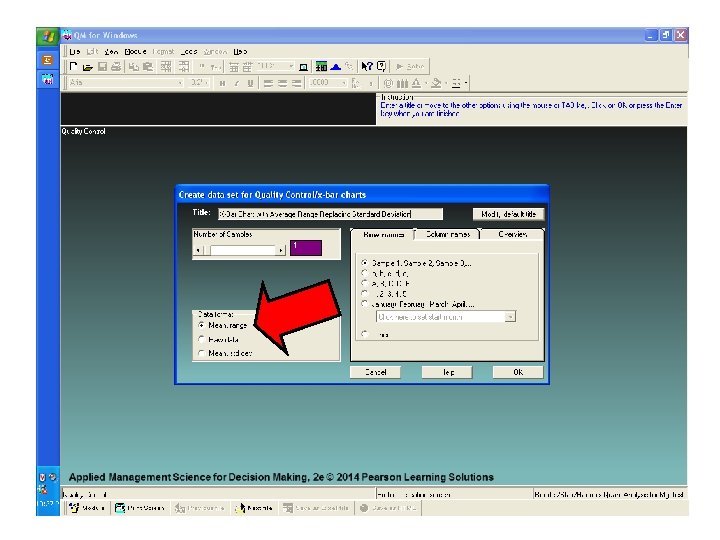
If the process mean equals 16. 01 ounces and the average range equals. 25 ounces, and the sample size equals ‘ 5’, we can find the UCL and LCL for the x-Bar chart
The Data Input Table makes provisions for the process mean ( 16. 01 ) and the average range (. 25 ) and the sample size ( n = 5 ) and for 3 - sigma control limits
For the X-bar Chart: UCL = 16. 1543 oz. LCL = 15. 8658 oz. For the Range Chart: UCL =. 5288 oz. LCL = 0 oz. CL =. 25 oz.
The x- Bar Chart
The Range Chart
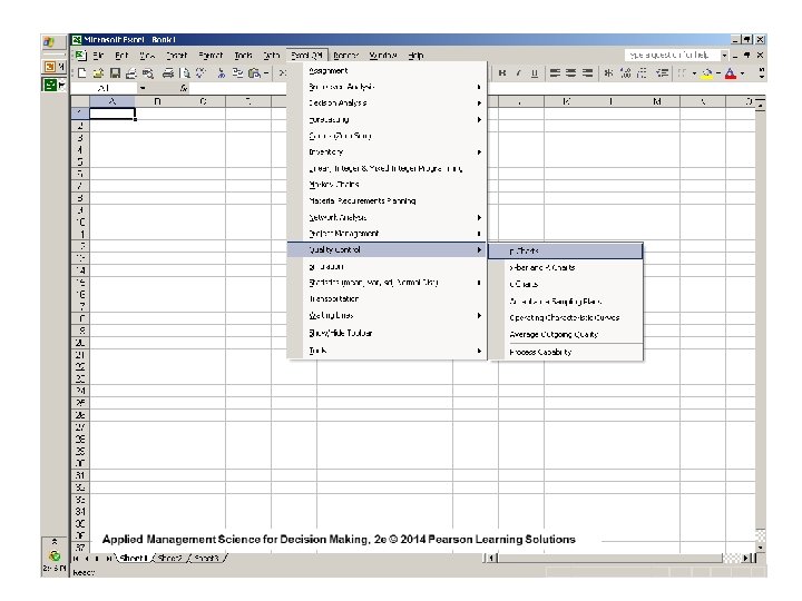
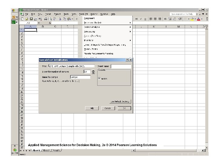
Click on “ p-charts” to build a ‘p’ control chart
Insurance records of 20 clerks were Examined
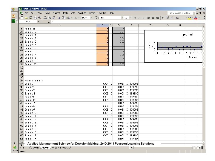
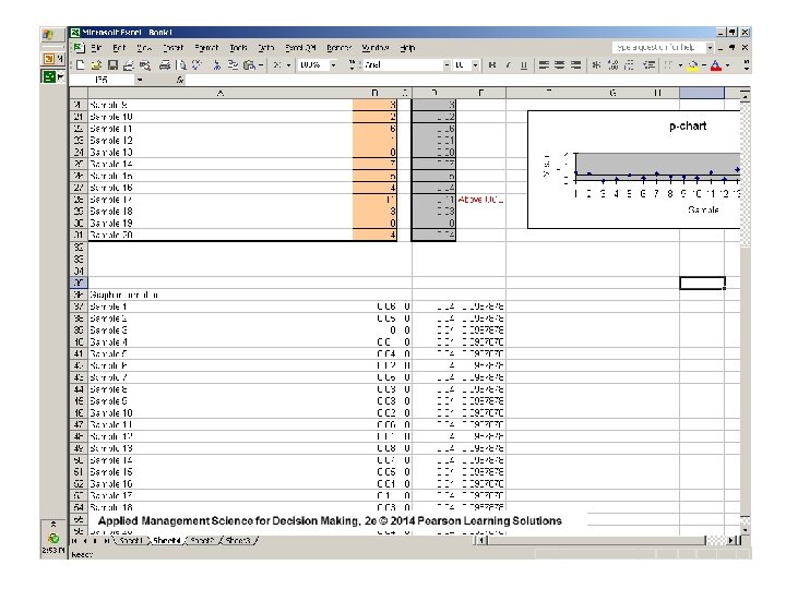
Each sample contains 100 records The number of errors in each sample are listed We want 99. 7% control limits on this p-chart ( 3 sigma )
The Control Limits and Center Line ( 3 sigma )
One Sample Violated The Upper Control Limit
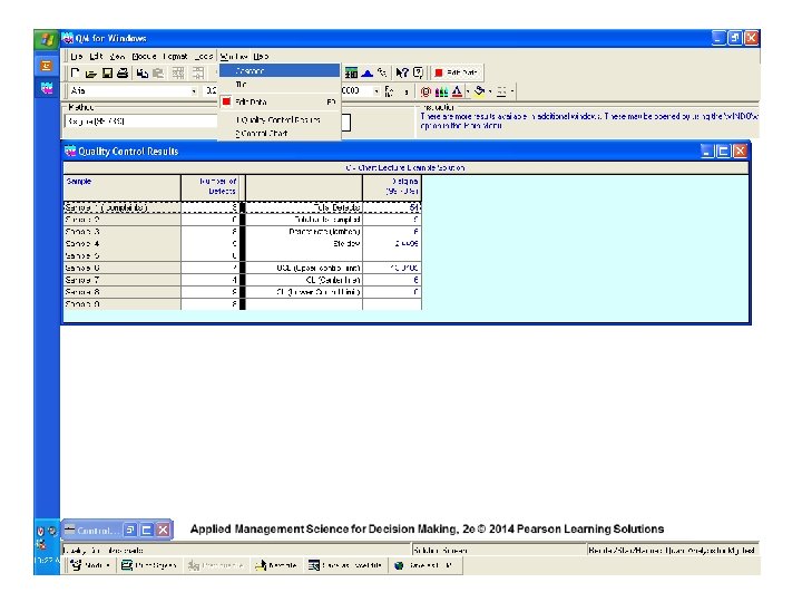
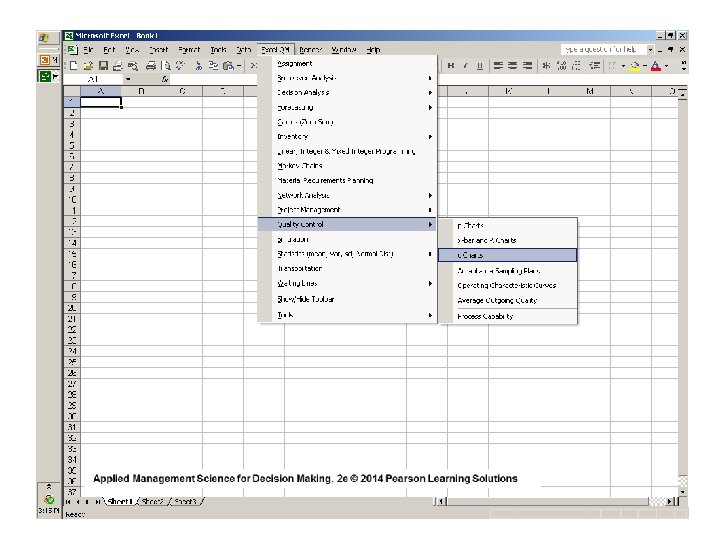
Click on “c-charts” to build a c - Chart
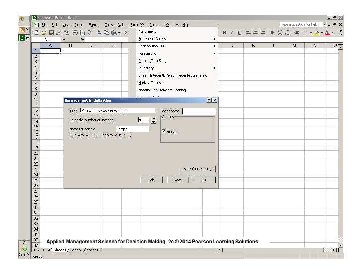
Complaints were accumulated daily over 9 days
We want to build a c - Chart with 99. 7% control limits ( 3 sigma )
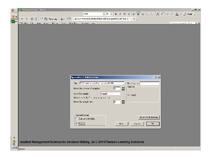
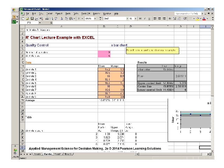
Statistical Quality Control Using
Template and Sample Data
UCL = 15. 85556 + (3)(0. 357771) = 16. 92887 LCL = 15. 85556 - (3)(0. 357771) = 14. 78224
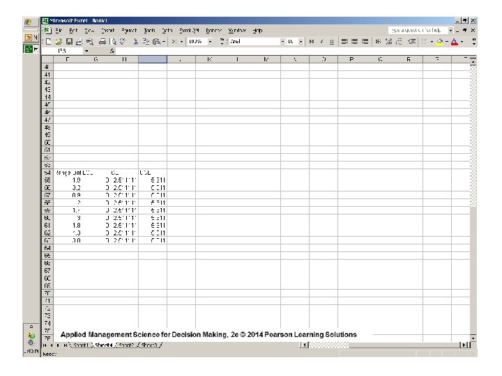
Template and Sample Data
For sample size ( n = 5 ) _ UCL = ( D 4 ) ( R ) _ LCL = ( D 3 ) ( R ) UCL = 2. 115 ( 2. 511111 ) = 5. 311 LCL = 0 ( 2. 511111 ) = 0
Template and Sample Data
UCLp =. 04 + ( 3 ) (. 02 ) =. 10 LCLp =. 04 - ( 3 ) (. 02 ) = 0
Applied Management Science for Decision Making, 2 e © 2014 Pearson Learning Solutions
Template and Sample Data
Statistical Process Control Manufacturing & Service Sectors Applied Management Science for Decision Making, 1 e © 2013 Pearson Prentice-Hall, Inc. Philip A. Vaccaro , Ph. D