Standard Engineering Lettering Lettering in Engineering Drawing Lettering
- Slides: 12

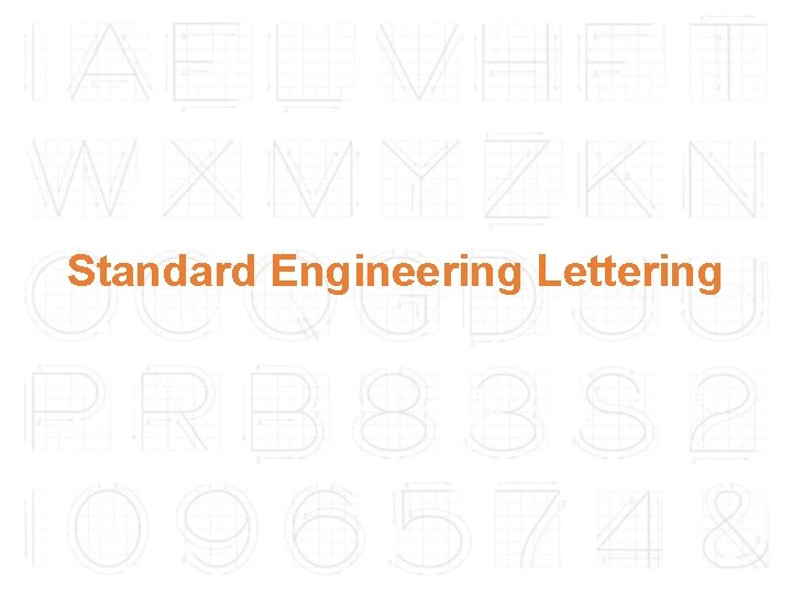
Standard Engineering Lettering

Lettering in Engineering Drawing Lettering is used to provide easy to read and understand information to supplement a drawing in the form of notes and annotations. Lettering is an essential element in both traditional drawing and Computer Aided Design (CAD) drawing Thus, it must be written with: Legibility – shape & space between letters and words. Uniformity – size & line thickness.

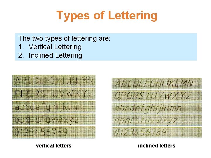
Types of Lettering The two types of lettering are: 1. Vertical Lettering 2. Inclined Lettering vertical letters inclined letters

Conventions for Lettering • Use all CAPITAL LETTERS. • Use even pressure to draw precise, clean lines. • Use one stroke per line. • Use kerning to eliminate excessive space between letters. – [kerning refers to adjusting the space between characters, especially by placing two characters closer together than normal. Kerning makes certain combinations of letters, such as WA, MW, TA, and VA, look better. ]

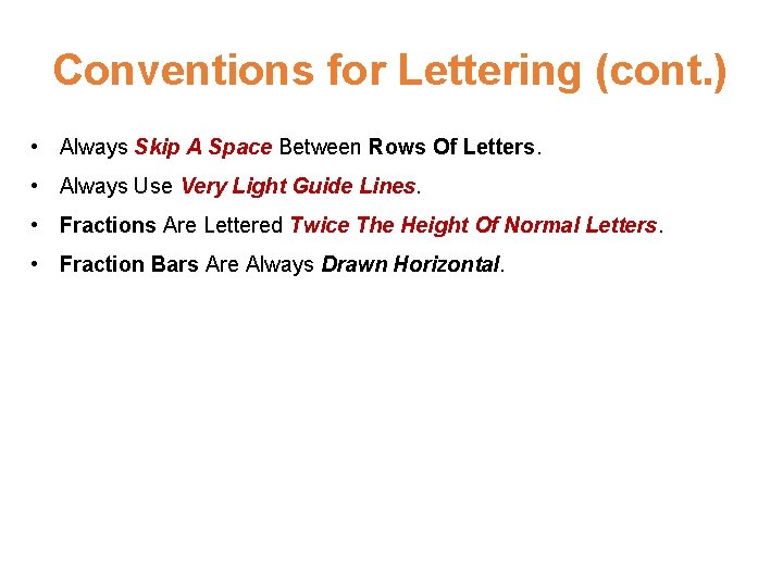
Conventions for Lettering (cont. ) • Always Skip A Space Between Rows Of Letters. • Always Use Very Light Guide Lines. • Fractions Are Lettered Twice The Height Of Normal Letters. • Fraction Bars Are Always Drawn Horizontal.

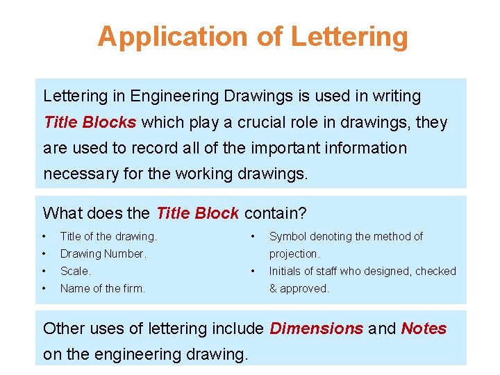
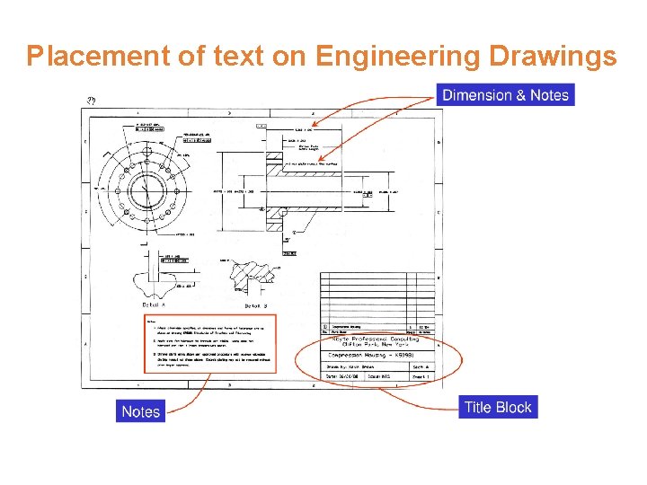
Application of Lettering in Engineering Drawings is used in writing Title Blocks which play a crucial role in drawings, they are used to record all of the important information necessary for the working drawings. What does the Title Block contain? • Title of the drawing. • Drawing Number. • Scale. • Name of the firm. • Symbol denoting the method of projection. • Initials of staff who designed, checked & approved. Other uses of lettering include Dimensions and Notes on the engineering drawing.

Placement of text on Engineering Drawings

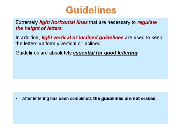
Guidelines Extremely light horizontal lines that are necessary to regulate the height of letters. In addition, light vertical or inclined guidelines are used to keep the letters uniformly vertical or inclined. Guidelines are absolutely essential for good lettering. • After lettering has been completed, the guidelines are not erased.

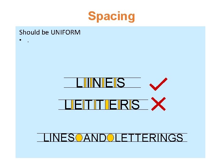
Spacing Should be UNIFORM • . L IN E S LET T ERS LINES AND LETTERINGS

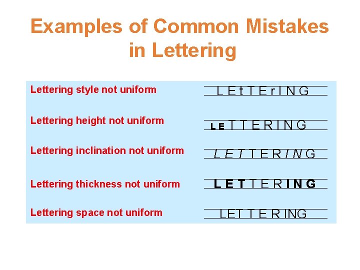
Examples of Common Mistakes in Lettering style not uniform Lettering height not uniform LEt. TEr. ING LE TTERING Lettering inclination not uniform LETTERING Lettering thickness not uniform LETTERING Lettering space not uniform LET T E R ING

References French, T. E. , (1918). A MANUAL OF ENGINEERING DRAWING FOR STUDENTS AND DRAFTSMEN. London: Hill Publishing Co. , Ltd. Engineering Drawing Fundamentals: Introduction to Engineering Drawing. Retrieved from http: //pioneer. netserv. chula. ac. th/~kjirapon/lecturenote. html. Madsen D. A. , Madsen D. P. , (2011). ENGINEERING DRAWING & DESIGN, Fifth Edition. New York: Cengage Learning. Reddy K. V. , (2008). TEXTBOOK OF ENGINEERING DRAWING. Hyderabad: BS Publications.

THE END