
Sort the graphs Match the type of graph
- Slides: 45
Sort the graphs. Match the type of graph to it’s name.
Science Graphs S 1 C 4 PO 1 If a picture is worth a thousand words, a graph is worth a thousand pictures.
Today’s Objectives (1) Communicate data through tables and graphs. (2) Create appropriate graphs based on data. • Think like scientists!
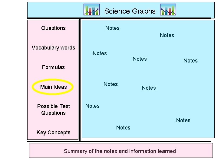
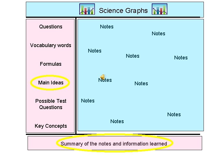
Science Graphs Notes Questions Notes Vocabulary words Notes Formulas Notes Main Ideas Possible Test Questions Notes Key Concepts Notes Summary of the notes and information learned
Graphing and Analyzing Science Data • In science we collect a lot of data. For that data to be useful we must analyze it. . . • What does this mean? How can I use this? What does this show me? Does this seem logical? Does it prove my hypothesis?
Graphing • Graphs are a useful tool in science. • The visual characteristics of a graph make trends in data easy to see. • One of the most valuable uses for graphs is to show data collected during an experiment. The graph shows your results.
Why Do We Use Graphs? • Graphs help us visualize numerical data. • There are 3 different types of graphs: –Bar graphs –Pie graphs –Line graphs
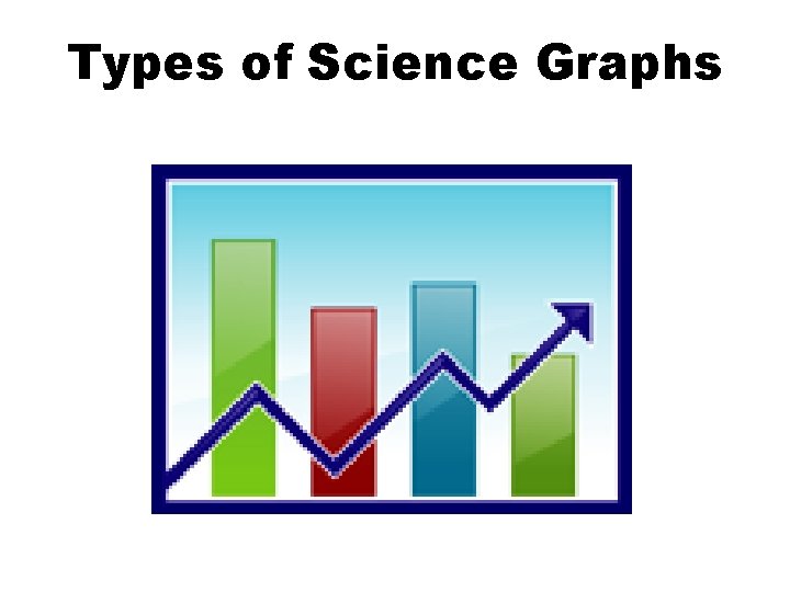
Types of Science Graphs
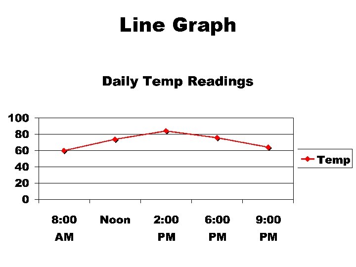
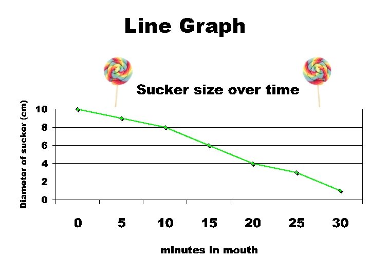
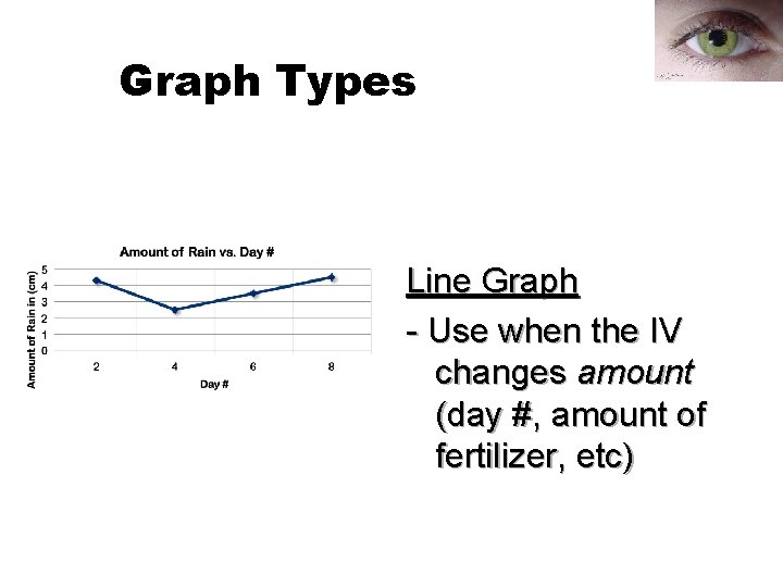
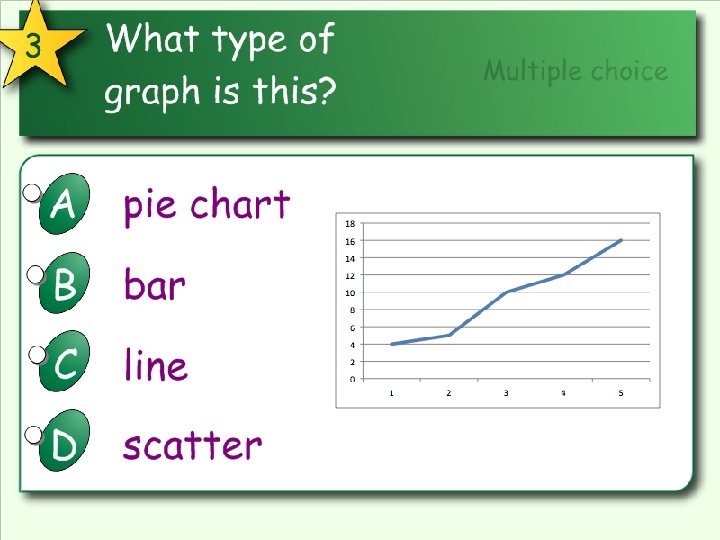
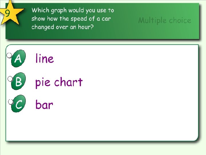
Line graph • A line graph is used to show continuing data; how one thing is affected by another. • It's clear to see how things are going by the rises and falls a line graph shows. This kind of graph is needed to show the effect of an independent variable on a dependent variable. • Used to show change over time.
Line Graph
Line Graph
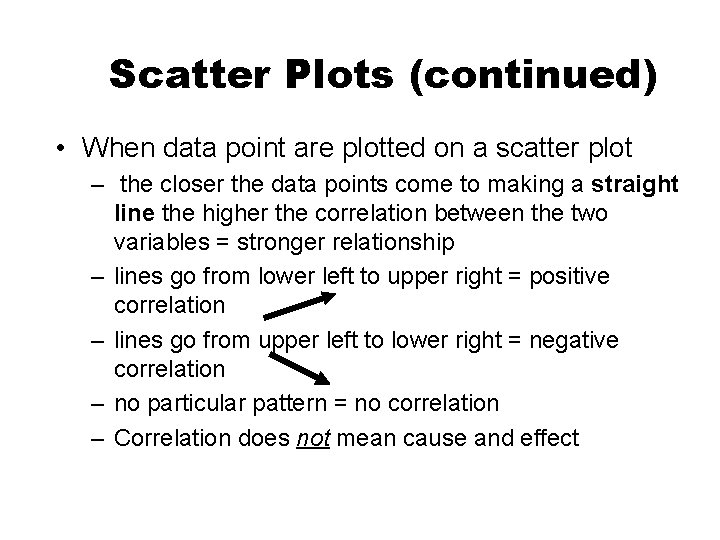
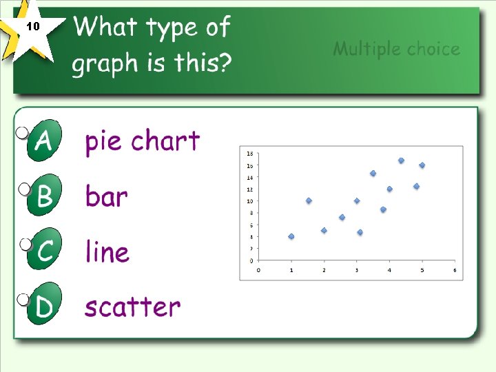
Scatter Plots • 1. Similar to line graphs • 2. Used to represent trends and relationship between two variables • 3. Data points are NOT connected • 4. Can be used with line of best fit • 5. Shows how much one thing is affected by another (this relationship is called a correlation)
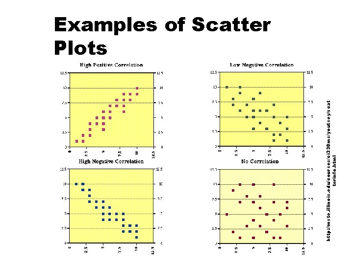
Scatter Plots (continued) • When data point are plotted on a scatter plot – the closer the data points come to making a straight line the higher the correlation between the two variables = stronger relationship – lines go from lower left to upper right = positive correlation – lines go from upper left to lower right = negative correlation – no particular pattern = no correlation – Correlation does not mean cause and effect
http: //mste. illinois. edu/courses/ci 330 ms/youtsey/scat terinfo. html Examples of Scatter Plots
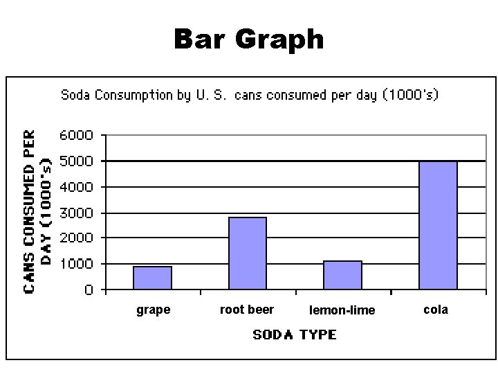
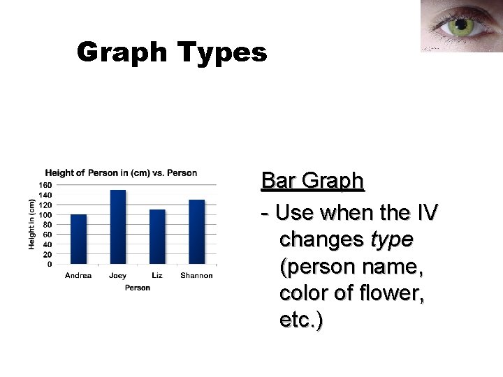
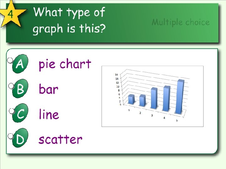
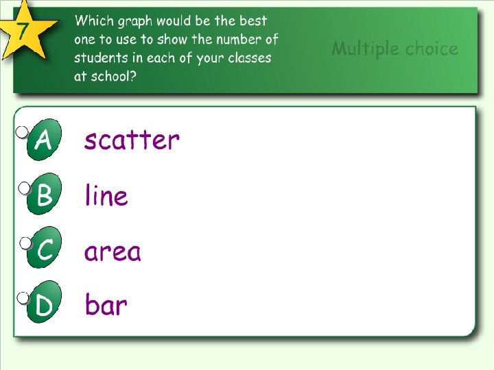
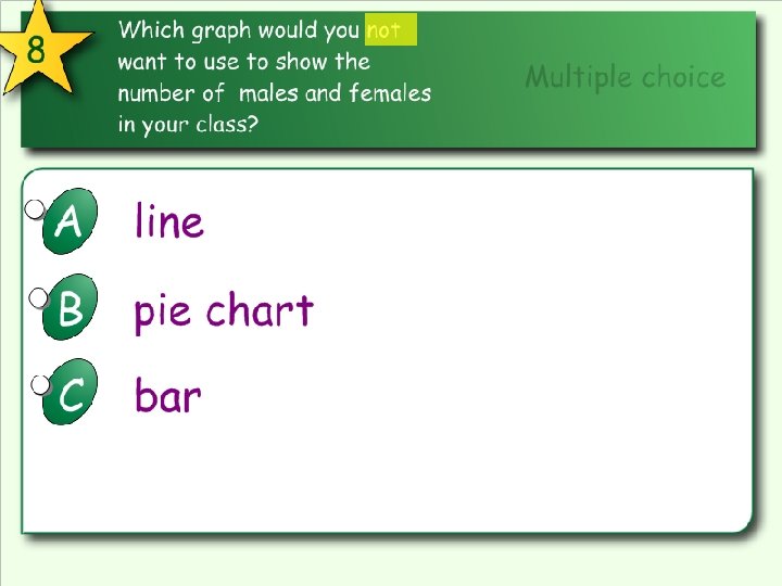
Bar graph • A bar graph is used to show relationships between groups. • The items being compared do not need to affect each other. • It's a fast way to show big differences.
Bar Graph grape root beer lemon-lime cola
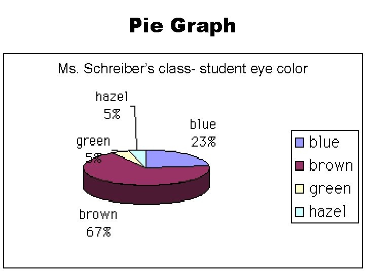
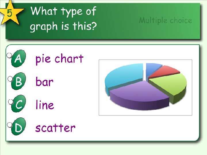
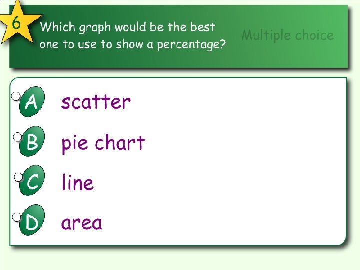
Pie graph • A pie graph is used to show a part of something relates to the whole. • This kind of graph is needed to show percentages effectively. • Doesn’t deal with time
Pie Graph Ms. Schreiber’s class- student eye color
Choosing the Right Graph • Use a bar graph if you are not looking for trends (or patterns) over time; and the items (or categories) are not parts of a whole. • Use a pie chart if you need to compare different parts of a whole, there is no time involved and there are not too many items (or categories). • Use a line graph if you need to see how a quantity has changed over time. Line graphs enable us to find trends (or patterns) over time.
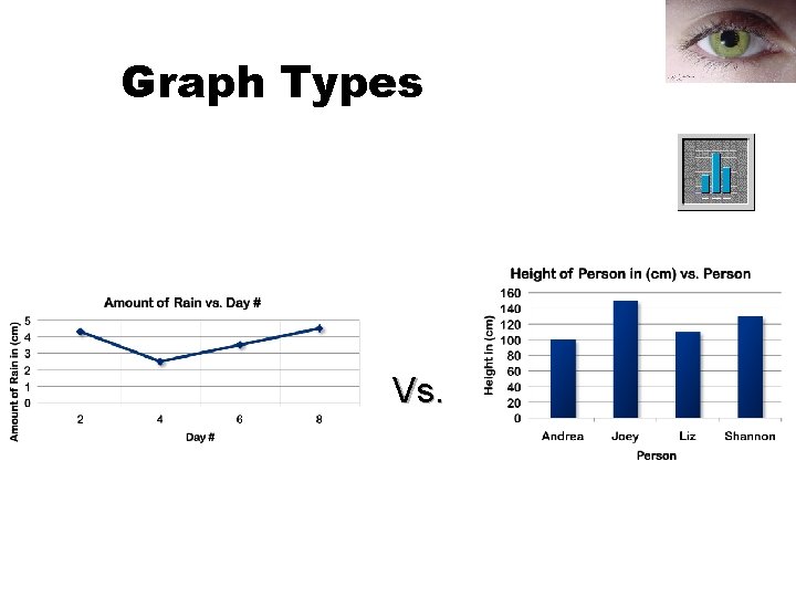
Graph Types Vs.
Graph Types Line Graph - Use when the IV changes amount (day #, amount of fertilizer, etc)
Graphing in Science 09. 2011 Graph Types - Line Graph - Use when the IV changes amount (day #, amount of fertilizer, etc)
Graph Types Bar Graph - Use when the IV changes type (person name, color of flower, etc. )
Graphing in Science 09. 2011 Graph Types -Line Graph - Use when the IV changes amount (day #, amount of fertilizer, etc) -Bar Graph - Use when the IV changes type (person name, color of flower, etc. )
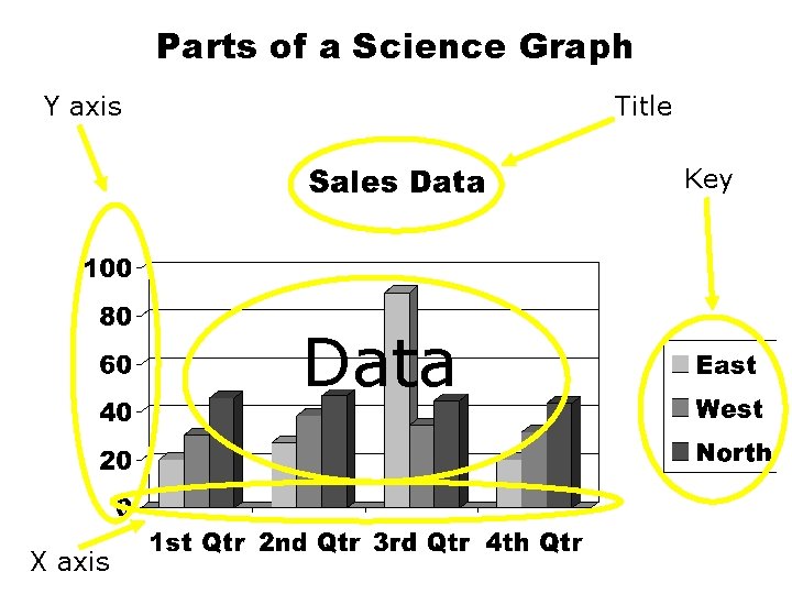
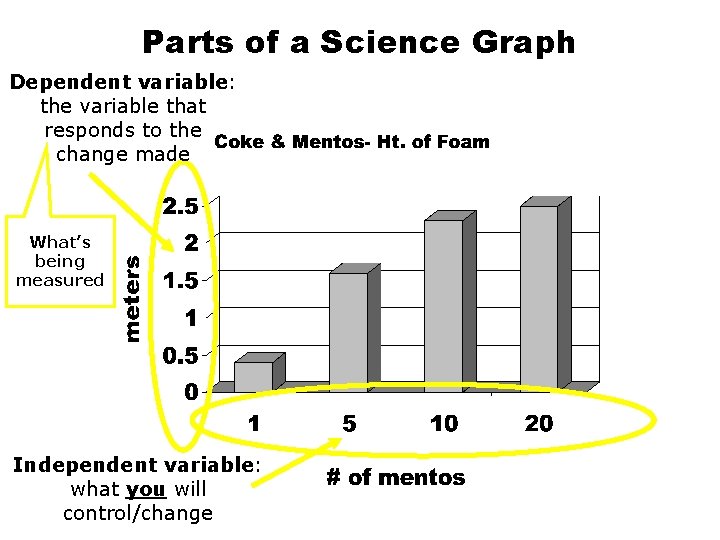
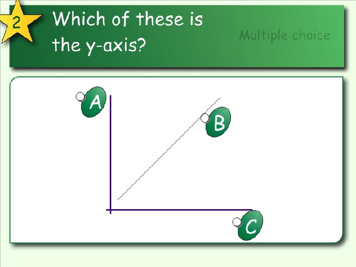
Parts of a Science Graph Y axis Title Key Data X axis
Graphing your science data • All graphs should have a title and a key or legend. • The title should adequately explain what the graph is representing. • The key should explain how to read the graph.
Graphing your science data • Both the X and Y axis should be properly labeled. Do not just put the numbers; state what the numbers mean and use units when necessary (5 miles, 5 minutes, 5 dollars or 5 degrees? ) • The scale should be drawn so that the graph takes up as much of the paper as possible. This makes the graph easier to draw and easier to read.
Graphing your science data • The scale should also be consistent. Increase each increment by the same amount (by 1 s, 5 s, 10 s, etc. ). • Make sure the increment is significant to the data (if the data is measured in 100 s, do not make increments of 5). • Last, but not least, when appropriate- use COLOR in your graphs!
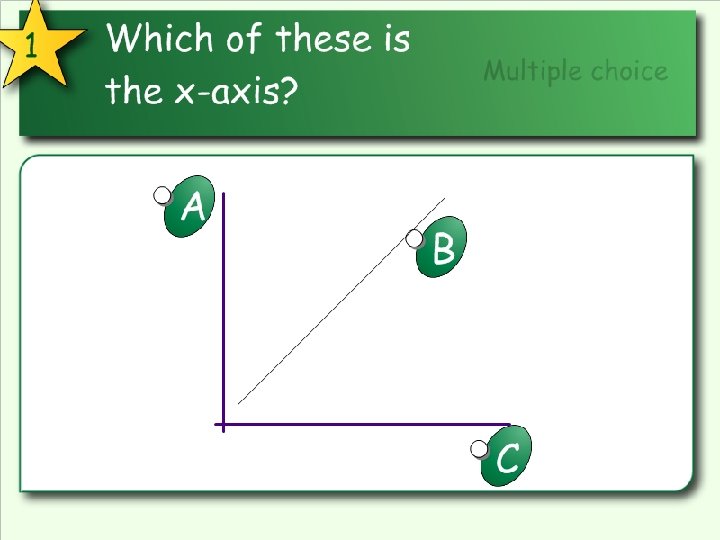
Variables • Independent variable- the variable you, the scientist, control and change (goes on the horizontal “X” axis) • Dependent variable- the variable changed by the independent variable; the variable you are measuring (goes on the vertical “Y” axis) • Control- a test object in which the independent variable is not changed (used for comparison)
Parts of a Science Graph Dependent variable: the variable that responds to the change made What’s being measured Independent variable: what you will control/change
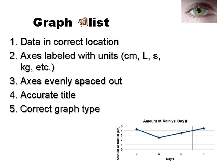
Graph list 1. Data in correct location 2. Axes labeled with units (cm, L, s, kg, etc. ) 3. Axes evenly spaced out 4. Accurate title 5. Correct graph type
Graphing in Science 09. 2011 Graph ✔ List 1. Data in correct location 2. Axes labeled with units (cm, L, s, kg, etc. ) 3. Axes evenly spaced out 4. Accurate title 5. Correct graph type
Science Graphs Notes Questions Notes Vocabulary words Notes Formulas Notes Main Ideas Possible Test Questions Notes Key Concepts Notes Summary of the notes and information learned
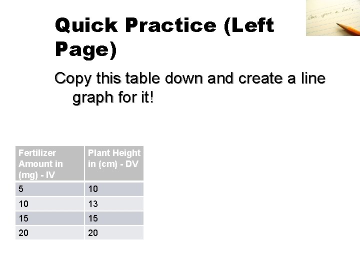
Quick Practice (Left Page) Copy this table down and create a line graph for it! Fertilizer Amount in (mg) - IV Plant Height in (cm) - DV 5 10 10 13 15 15 20 20
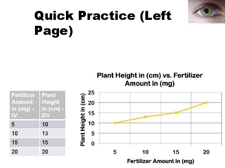
Quick Practice (Left Page) Fertilizer Amount in (mg) IV Plant Height in (cm) DV 5 10 10 13 15 15 20 20
10