Some Thoughts About Designing and Delivering Presentations Type

Some Thoughts About Designing and Delivering Presentations

Type

Type Fonts Times Helvetica Serif Sans Serif Palatino Screen Serif Monaco Monospace Apple Chancery Chalk Duster Script Display

Body Text This study examined the concurrent validity of assessments based on a prescribed set of preparation standards of teacher candidate competency. Participants were 94 candidates from a small, comprehensive liberal arts university in the northwest. Teacher candidate performance measures included a summary student teaching evaluation, an evaluation of a Teacher Work Sample (TWS), learning gain scores from P-12 students during a unit of instruction completed as part of the TWS, and State licensure content area tests.

Serif/Sans Serif The quick brown fox jumped over the lazy dog.

All Caps Readability NOW IS THE TIME FOR ALL GOOD PEOPLE TO COME TO THE AID OF THEIR COUNTRY. Now is the time for all good people to come to the aid of their country.

All Caps Readability Now is the time for all good people to come to the aid of their country. NOW IS THE TIME FOR ALL GOOD PEOPLE TO COME TO THE AID OF THEIR COUNTRY.

Line Spacing This study examined the concurrent validity of assessments based on a prescribed set of preparation standards of teacher candidate competency. Participants were 94 candidates from a small, comprehensive liberal arts university in the northwest. Teacher candidate performance measures included a summary student teaching evaluation, an evaluation of a Teacher Work Sample (TWS), learning gain scores from P-12 students during a unit of instruction completed as part of the TWS, and State licensure content area tests.

Justification This study examined the concurrent validity of assessments based on a prescribed set of preparation standards of teacher candidate competency. Participants were 94 candidates from a small, comprehensive liberal arts university in the northwest. Teacher candidate performance measures included a summary student teaching evaluation, an evaluation of a Teacher Work Sample (TWS), learning gain scores from P-12 students during a unit of instruction completed as part of the TWS, and State licensure content area tests.

Justification This study examined the concurrent included a summary student teaching validity of assessments based on a evaluation, an evaluation of a Teacher prescribed set of preparation standards Work Sample (TWS), learning gain of teacher candidate competency. scores from P-12 students during a unit Participants were 94 candidates from a of instruction completed as part of the small, comprehensive liberal arts TWS, and State licensure content area university in the northwest. Teacher tests. candidate performance measures

Widows and Orphans This study examined the concurrent validity of assessments based on a prescribed set of preparation standards of teacher candidate competency. Participants were 94 candidates from a small, comprehensive liberal arts university in the northwest. Teacher candidate performance measures included a summary student teaching evaluation, an evaluation of a Teacher Work Sample (TWS), learning gain scores from P-12 students during a unit of instruction completed as part of the TWS, and licensure content area tests. Teacher candidate performance measures included a summary student teaching evaluation, an evaluation of a Teacher Work Sample (TWS), learning gain scores from P-12 students during a unit of instruction completed as part of the TWS, State licensure content area tests.

Type Rules • Use serif type faces for body if there is a lot to read • Use display fonts cautiously • Do not use all caps • Lots of white space (line spacing) • You are not allowed ANY spelling, grammar, or punctuation errors

Designing Presentations

Type Size • 1/25 of the image height minimum • 14 point • 18 point • 24 point • 28 point • 32 point • 36 point • 40 point About 1/25

Type Size • 1/25 of the image height minimum • Readable at arm’s length • No one should sit more than 8 times the height of the image away from the screen • 25 words per slide maximum

Direct Instruction which has an academic focus, presents little choice of activity by the students, favors large group over small-group instruction, and focuses on factual questions and controlled classroom practice (Orlich, 1994) Positive characteristics of Direct Instruction - provides for delivery to the entire class - controls focus of attention - makes the most of the time available - assesses feedback quickly from the class to ensure understanding - allows the teacher to answer student questions that may be of interest to the class as a whole only once - provides the teacher with the option of using student reactions to modify a lesson or an activity - allows the teacher to use a student to explain directions or provide insight into the lesson or activity - requires less preparation time than many alternative instructional strategies - stresses the teacher’s ability to motivate - allows all students the same amount of time on task

Graphics

Working In a 300 DPI World

Graphics: Solution 1 Draw It Yourself

Graphics: Solution 2 Learn to Make Screenshots 1. Shoot Big 2. Differences Between PNG & JPG

Graphics: Solution 3 Using Power. Point • Produce a slide to be a unique graphic – Fill the space • Select All then Arrange/Group • Right click on the group/Save as Picture – Experiment with file format – I mostly use TIFF (print graphics) or PNG (web) • Photoshop or Illustrator

Graphics: Solution 3 Using Power. Point

Graphics: Solution 4 Get it off the web • • • Look for large file sizes Give credit when due Google search for images Use image databases (Picasa) Even though you got it off the web it may still need editing.

Mayer’s Multimedia Learning, 2001 Pictures/Text/Narration Multimedia Presentation Sensory Memory Written and Spoken Words Ears Working Memory Selecting Words Sounds Organizing Words Long-Term Memory Verbal Model Integrating Pictures Eyes Selecting Images Organizing Images Cognitive Overload Pictorial Model Prior Knowledge

Mayer’s Multimedia Learning, 2001 Pictures/Text/Narration Multimedia Presentation Sensory Memory Written and Spoken Words Ears Working Memory Selecting Words Sounds Organizing Words Long-Term Memory Verbal Model Integrating Pictures Eyes Selecting Images Organizing Images Cognitive Overload Pictorial Model Prior Knowledge

Mayer’s Multimedia Learning, 2001 Pictures/Text/Narration Multimedia Presentation Sensory Memory Written and Spoken Words Ears Working Memory Selecting Words Sounds Organizing Words Long-Term Memory Verbal Model Integrating Pictures Eyes Selecting Images Organizing Images Cognitive Overload Pictorial Model Prior Knowledge

Mayer’s Multimedia Learning, 2001 Pictures/Text/Narration Multimedia Presentation Sensory Memory Written and Spoken Words Ears Working Memory Selecting Words Sounds Organizing Words Long-Term Memory Verbal Model Integrating Pictures Eyes Selecting Images Organizing Images Cognitive Overload Pictorial Model Prior Knowledge
 • Coherence principle—remove extraneous material")
Reducing Extraneous Processing (Mayer) • Coherence principle—remove extraneous material

Ed 530 Dimensions of Education Slide content v. Add as much text as is necessary to present an idea clearly—then reduce that quantity. v. Consider carefully any information on the slide which is not related to the presentation content. University of Portland MAT

Slide content • Add as much text as is necessary to present an idea clearly—then reduce that quantity. • Consider carefully any information on the slide which is not related to the presentation content.
 • Coherence principle—remove extraneous material • Signaling principle—emphasize what is")
Reducing Extraneous Processing (Mayer) • Coherence principle—remove extraneous material • Signaling principle—emphasize what is most important. Works better with text than graphics.

Signaling • Main point – Lesser idea • Another main point – Another lesser idea Or this can be done with text emphasis

Signaling • Main point – Lesser idea Graphics do not do this as well as text emphasis • Another main point – Another lesser idea Or this can be done with text emphasis
 • Coherence principle—remove extraneous material • Signaling principle—emphasize what is")
Reducing Extraneous Processing (Mayer) • Coherence principle—remove extraneous material • Signaling principle—emphasize what is most important. Works better with text than graphics. • Redundancy principle—images, text, and narration is too much.

Redundancy • Multiple media are not necessarily additive • If it is important that viewers get information by reading the screen be sure it is easy for them to read. • If it may be more difficult for them to read then STOP TALKING!
 • Coherence principle—remove extraneous material • Signaling principle—emphasize what is")
Reducing Extraneous Processing (Mayer) • Coherence principle—remove extraneous material • Signaling principle—emphasize what is most important. Works better with text than graphics. • Redundancy principle—images, text, and narration is too much. • Spatial contiguity principle—put the words next to the relevant graphic. • Temporal contiguity principle—narration should be overlayed on graphics, not before or after.

What was the year computer-based instruction was first used? 1959 Programmed Logic for Automatic Teaching Operations (PLATO)
 • Coherence principle—remove extraneous material • Signaling principle—emphasize what is")
Reducing Extraneous Processing (Mayer) • Coherence principle—remove extraneous material • Signaling principle—emphasize what is most important. Works better with text than graphics. • Redundancy principle—images, text, and narration is too much. • Spatial contiguity principle—put the words next to the relevant graphic. • Temporal contiguity principle—narration should be overlayed on graphics, not before or after.

Before we leave Mayer… • Personalization Principle: Personalized language works better than formal • Voice Principle: Conversational voice works better than machine voice • This means you should never read a presentation (no matter how nervous you are about getting to everything).

Slide Design • Never do anything that detracts from your purpose. If the audience is thinking about the quality of your presentation instead of the content of your presentation, you have lost. • If you must make it pretty, do it consistently for all of the slides (themes).

Change Blindness • Occurs when similar slides are back to back and no visual transition is used. • Pick transitions carefully but use them particularly in longer presentations

A few other things • Power. Point allows lots of effects, many of which are extremely irritating. • All presentations suffer from unanticipated interruptions. The trick is to anticipate them. • Being a good presenter means being comfortable with what you are doing. That means practice.

Delivery of Instruction • Prepare • Practice • Anticipate Problems – The most frequent problems arise when you do not know the environment in which you are presenting.

End With a Blank Slide • Make a slide with pertinent information— often the title slide • Make a black slide • Set the preferences to end with a black slide • Use the “b” key (“w” key to go white)
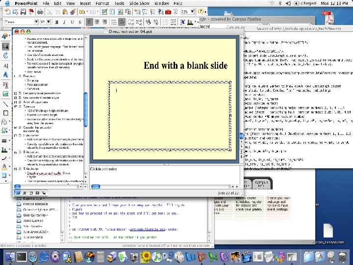

End With a Blank Slide • Make a slide with pertinent information— often the title slide • Make a black slide • Set the preferences to end with a black slide • Use the “b” key (“w” key to go white)
 • The computer going to")
Common Problems • Way too much text (extraneous material) • The computer going to sleep in the middle of a presentation • Presenters reading slides (machine voice) • Bad transitions between applications • Presenters not paying attention to the audience

Delivery of Instruction • • Practice presentation where you will present Prepare technology Talk to the audience If you can help it, do not look at the graphics Do things in the middle that require response Do not apologize Do not read your presentation Keep it simple

Proposal Defense

How should I present it? • You cannot assume that the audience is interested in what you have to say. You have to convince them. • Any distraction from the process of convincing the audience of why what you are saying is interesting risks loosing the audience.

How not to loose your audience • Determine the amount of time you have for the presentation. • Present content in small steps, in blindingly obvious logical order. • Support each step with a memory aid following Mayer’s principles. • DO NOT go over the allotted time.

If you do not plan and practice, you will run out of time. • You may be told to stop even if you are not done. • You will hurry to get everything in. • You will have to skip sections of the presentation breaking the logical order. • Nothing will happen except everyone quits listening.

Things that may help the presentation design. • Consider graphics as well as text but choose graphics carefully—clear, original, appropriate. • Use white space when you can. Think about density of information. • Think about change blindness. • Be cautious about using commercial themes but be consistent in design. • Lots of slides are not necessarily bad.

Things that may help the presentation delivery. • Talk to your audience. Rarely, if ever, read to them (Voice principle). • Slow down. • Use a remote if you can.

Things that almost always cause audience distraction • Grammar or spelling errors on the slides • Having a slide on the screen that does not relate to what you are saying (spatial and temporal proximity) • Cuteness • Poor speaking volume • Poor speaking style

Ok, this is personal but these are things that drive me crazy • • • Jiggling keys or change in your pocket Putting print-based materials on a slide Multiple presenters in a short presentation Presenters who do not get to the point Apologizing for not doing what you clearly should have done • The cursor in the middle of the screen • Getting in the way of the projected image.

How to deal with questions • Try to imagine questions in advance. • Make the screen go blank if what you are responding to is not on the slide. • Practice ways of saying “I don’t know. ” • Know how to defer a question if it is too much of a break in the logic of the presentation. • When questions are wanted, think about how to encourage specific questions. • Have pencil and paper to write down suggestions.

Positives • Dress well and appropriately. • Find ways to bring a small amount of lightheartedness into the presentation. • Be relaxed. • Know your presentation venue and practice there if you can.

- Slides: 59