Social Science Research Methodologies Hands on mapping using

- Slides: 28

Social Science Research Methodologies Hands on mapping using Arc. Map Martin Dodge (m. dodge@ucl. ac. uk) Practical 1, 10 th March 2004, 2. 30 -4 ishpm http: //www. casa. ucl. ac. uk/martin/ss_methods/

Goal of the practical • Login to the UCL computer system • explore some online mapping examples • download some spatial data for thematic mapping • start up Arc. Map, a module of Arc. GIS • exploring the map data • make some thematic maps

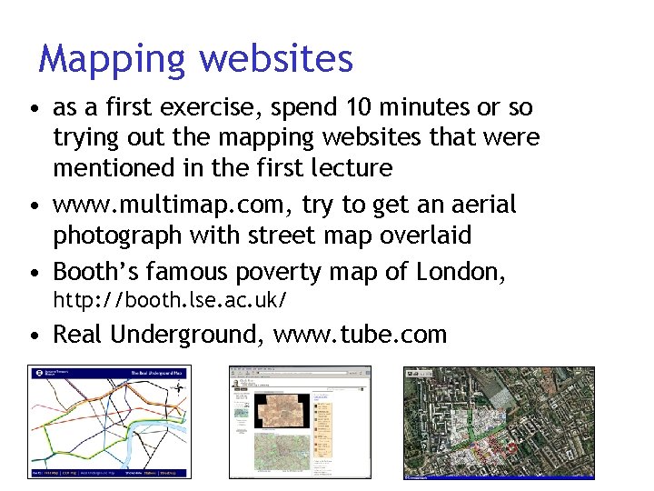
Mapping websites • as a first exercise, spend 10 minutes or so trying out the mapping websites that were mentioned in the first lecture • www. multimap. com, try to get an aerial photograph with street map overlaid • Booth’s famous poverty map of London, http: //booth. lse. ac. uk/ • Real Underground, www. tube. com

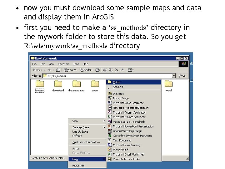
• now you must download some sample maps and data and display them in Arc. GIS • first you need to make a ‘ss_methods’ directory in the mywork folder to store this data. So you get R: wtsmyworkss_methods directory

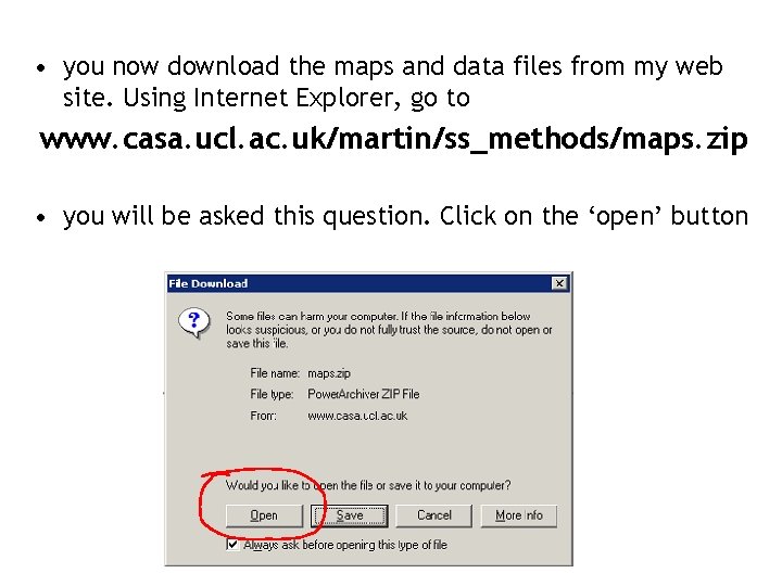
• you now download the maps and data files from my web site. Using Internet Explorer, go to www. casa. ucl. ac. uk/martin/ss_methods/maps. zip • you will be asked this question. Click on the ‘open’ button

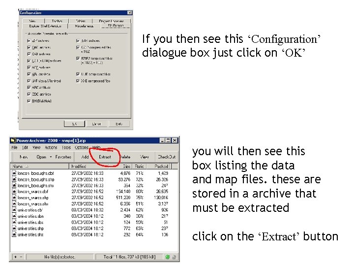
If you then see this ‘Configuration’ dialogue box just click on ‘OK’ you will then see this box listing the data and map files. these are stored in a archive that must be extracted click on the ‘Extract’ button

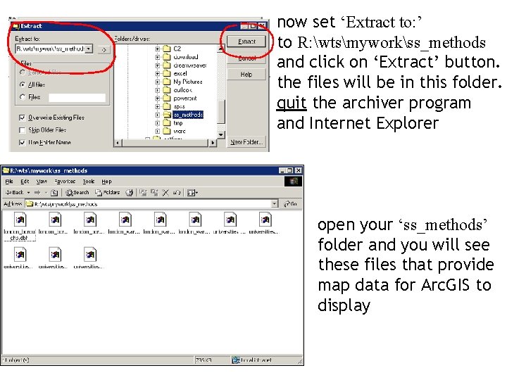
now set ‘Extract to: ’ to R: wtsmyworkss_methods and click on ‘Extract’ button. the files will be in this folder. quit the archiver program and Internet Explorer open your ‘ss_methods’ folder and you will see these files that provide map data for Arc. GIS to display

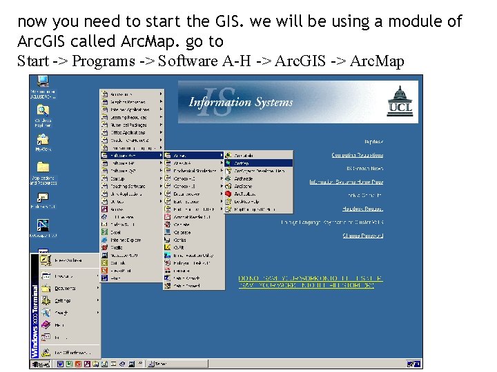
now you need to start the GIS. we will be using a module of Arc. GIS called Arc. Map. go to Start -> Programs -> Software A-H -> Arc. GIS -> Arc. Map

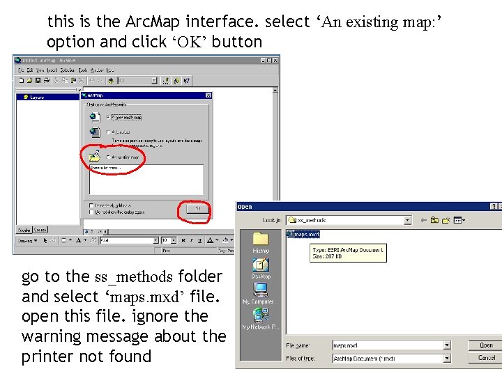
this is the Arc. Map interface. select ‘An existing map: ’ option and click ‘OK’ button go to the ss_methods folder and select ‘maps. mxd’ file. open this file. ignore the warning message about the printer not found

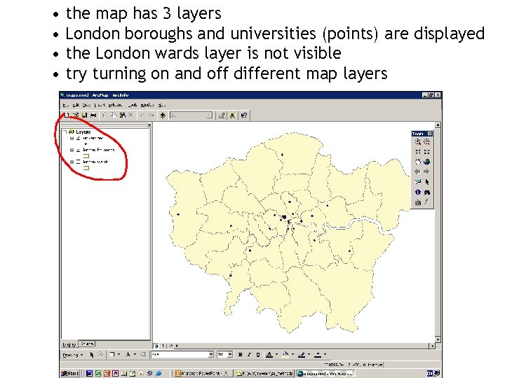
• the map has 3 layers • London boroughs and universities (points) are displayed • the London wards layer is not visible • try turning on and off different map layers

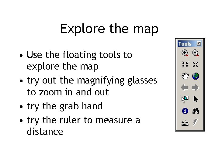
Explore the map • Use the floating tools to explore the map • try out the magnifying glasses to zoom in and out • try the grab hand • try the ruler to measure a distance

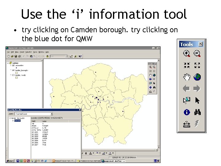
Use the ‘i’ information tool • try clicking on Camden borough. try clicking on the blue dot for QMW

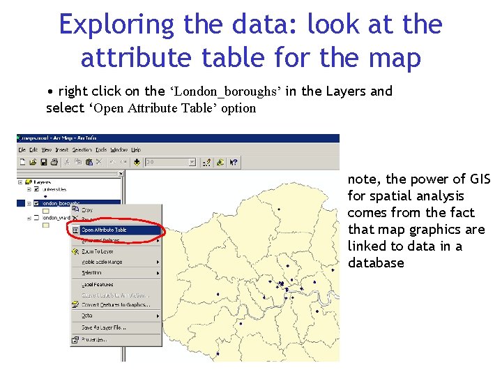
Exploring the data: look at the attribute table for the map • right click on the ‘London_boroughs’ in the Layers and select ‘Open Attribute Table’ option note, the power of GIS for spatial analysis comes from the fact that map graphics are linked to data in a database

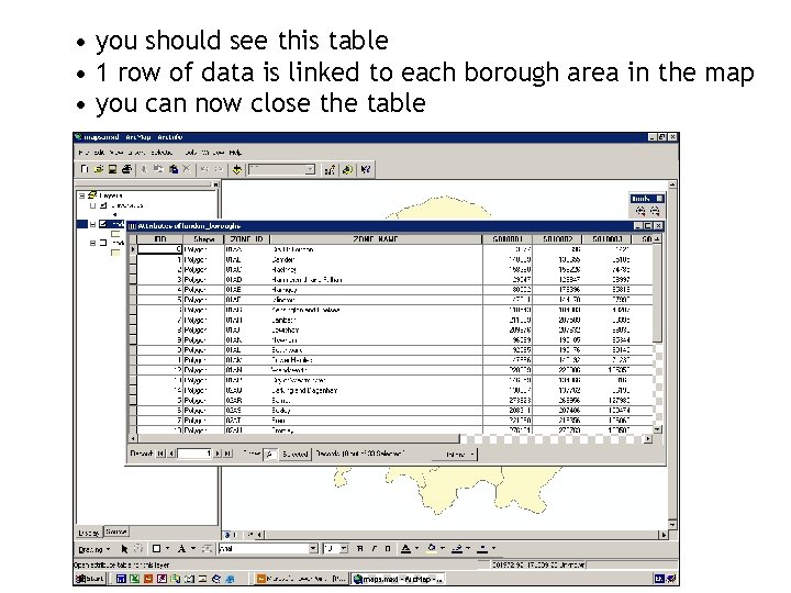
• you should see this table • 1 row of data is linked to each borough area in the map • you can now close the table

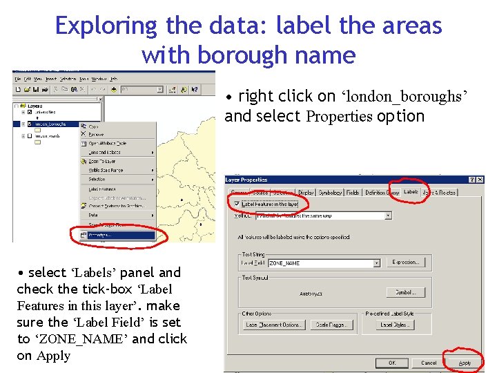
Exploring the data: label the areas with borough name • right click on ‘london_boroughs’ and select Properties option • select ‘Labels’ panel and check the tick-box ‘Label Features in this layer’. make sure the ‘Label Field’ is set to ‘ZONE_NAME’ and click on Apply

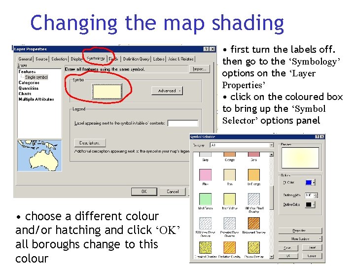
Changing the map shading • first turn the labels off. then go to the ‘Symbology’ options on the ‘Layer Properties’ • click on the coloured box to bring up the ‘Symbol Selector’ options panel • choose a different colour and/or hatching and click ‘OK’ all boroughs change to this colour

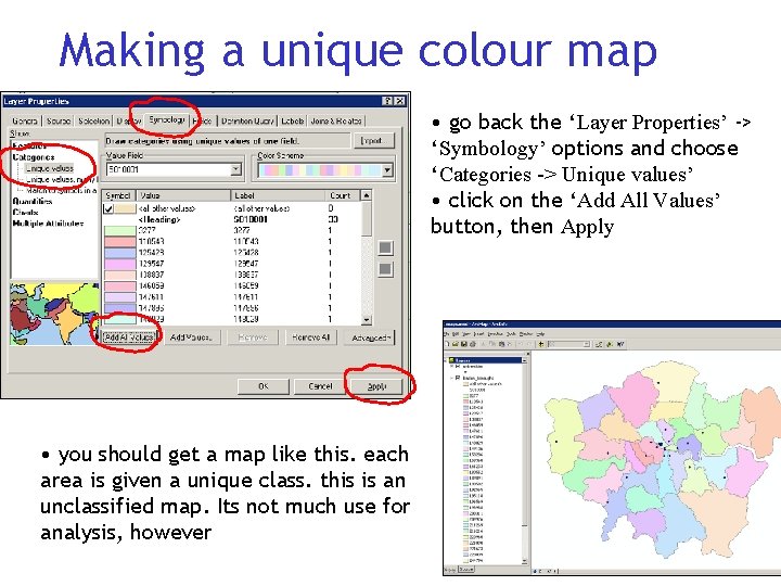
Making a unique colour map • go back the ‘Layer Properties’ -> ‘Symbology’ options and choose ‘Categories -> Unique values’ • click on the ‘Add All Values’ button, then Apply • you should get a map like this. each area is given a unique class. this is an unclassified map. Its not much use for analysis, however

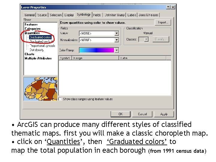
• Arc. GIS can produce many different styles of classified thematic maps. first you will make a classic choropleth map. • click on ‘Quantities’, then ‘Graduated colors’ to map the total population in each borough (from 1991 census data)

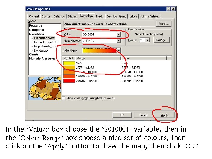
In the ‘Value: ’ box choose the ‘S 010001’ variable, then in the ‘Colour Ramp: ’ box choose a nice set of colours, then click on the ‘Apply’ button to draw the map, then click ‘OK’

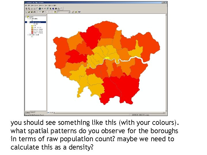
you should see something like this (with your colours). what spatial patterns do you observe for the boroughs in terms of raw population count? maybe we need to calculate this as a density?

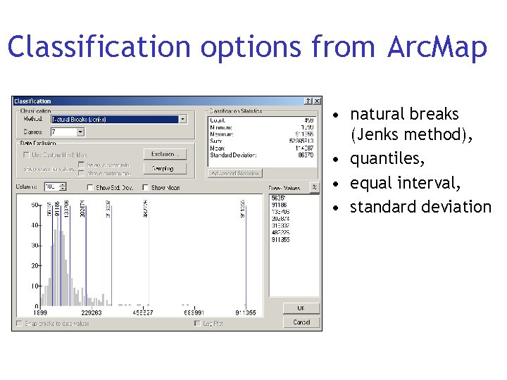
Classification options from Arc. Map • natural breaks (Jenks method), • quantiles, • equal interval, • standard deviation

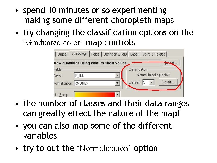
• spend 10 minutes or so experimenting making some different choropleth maps • try changing the classification options on the ‘Graduated color’ map controls • the number of classes and their data ranges can greatly effect the nature of the map! • you can also map some of the different variables • try to out the ‘Normalization’ option

Symbol mapping • In producing the choropleth maps for area data we have been using different colours to represent the data • now we want to map the point data. each one is a university in London, with data on the number of students • we could use different colours of points to show the number of students • however, we will be using different sizes of point symbols (graduated circles) to do this as it is a very effective means of visualising magnitude data

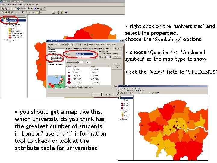
• right click on the ‘universities’ and select the properties. choose the ‘Symbology’ options • choose ‘Quantites’ -> ‘Graduated symbols’ as the map type to show • set the ‘Value’ field to ‘STUDENTS’ • you should get a map like this. which university do you think has the greatest number of students in London? use the ‘i’ information tool to check or look at the attribute table for universities

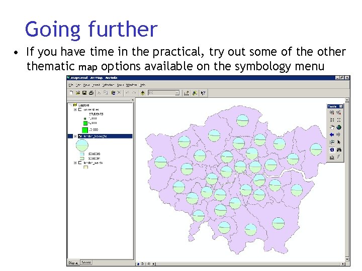
Going further • If you have time in the practical, try out some of the other thematic map options available on the symbology menu

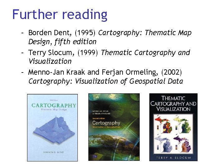
Further reading – Borden Dent, (1995) Cartography: Thematic Map Design, fifth edition – Terry Slocum, (1999) Thematic Cartography and Visualization – Menno-Jan Kraak and Ferjan Ormeling, (2002) Cartography: Visualization of Geospatial Data

Further reading • NCGIA Core Curriculum in GIScience, www. ncgia. ucsb. edu/giscc/cc_outline. html • www. GIS. com website

Course outline • 3 rd March – visualisation (lecture) – cartography (lecture) • 10 th march – GIS for thematic mapping and spatial data handling (lecture) – mapping London (computer practical) • 17 th March – library research for your assignment – no lecture or practical • 24 th March – GIS for spatial analysis (lecture) – computer practical