Simply Compelling Introduction for Better Visualization Design Miranda

Simply Compelling Introduction for Better Visualization Design Miranda Li Design & Data Visualization Lead Microsoft Consumer Data and Analytics Team
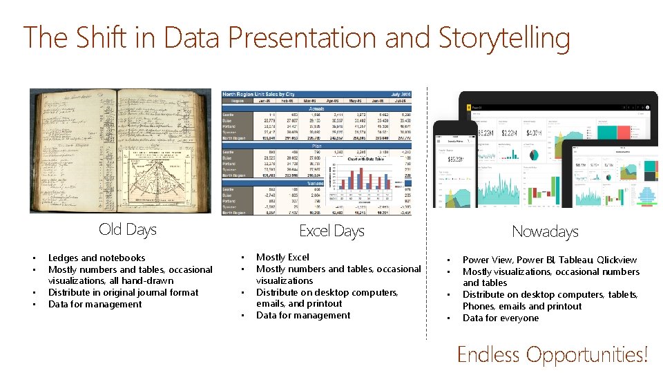
The Shift in Data Presentation and Storytelling Old Days • • Ledges and notebooks Mostly numbers and tables, occasional visualizations, all hand-drawn Distribute in original journal format Data for management Excel Days • • Mostly Excel Mostly numbers and tables, occasional visualizations Distribute on desktop computers, emails, and printout Data for management Nowadays • • Power View, Power BI, Tableau, Qlickview Mostly visualizations, occasional numbers and tables Distribute on desktop computers, tablets, Phones, emails and printout Data for everyone Endless Opportunities!
Challenges: Too Many Design Choices Reports or Dashboard? Tab navigation or layer navigation Default colors or that customized ones? When to use reference lines? Does this chart work or should I consider another one? More slicers or less slicers I got a small data set, but there are 20 different ways to visualize it. Which one should I choose? Can Power BI just label my charts? When to additional? What about view interactions? Filter, highlight, or none? I got 45 tabs, should I present them all? Default visuals or custom visuals?
Challenges: Too Easy to Confuse Customers Filters doesn’t work Color isn’t meaningful Interactions don’t make sense Ineffective Chart Types Hidden drill downs Hard to Navigate Lost Overwhelming Time Consuming What is MAD and DAD? Oh. . 30 tabs, what’s relevant to me? Nice charts, where is my actionable insights? Inconsistent naming Unclear metric definition

Challenges: Too Much Data Visualization Effectiveness Y Visualization Complexity and Volume Visualization Relevancy X
This is Why We are Here Today Explore ways to produce better and more effective data visualizations in the new era
What is Effective Data Visualization?
What Makes Data Visualizations Impactful?

John Snow Cholera Map 1854
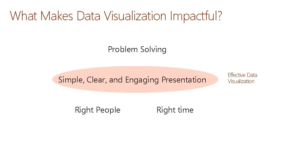
What Makes Data Visualization Impactful? Problem Solving Simple, Clear, and Engaging Presentation Right People Right time Effective Data Visualization
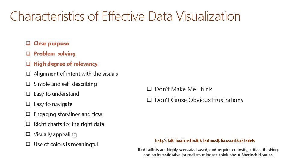
Characteristics of Effective Data Visualization q Clear purpose q Problem-solving q High degree of relevancy q Alignment of intent with the visuals q Simple and self-describing q Easy to understand q Easy to navigate q Don’t Make Me Think q Don’t Cause Obvious Frustrations q Engaging storylines and flow q Right charts for the right data q Visually appealing q Use of colors is meaningful Today’s Talk: Touch red bullets, but mostly focus on black bullets Red bullets are highly scenario-based, and require curiosity, critical thinking, and an investigative journalism mindset, think about Sherlock Homles.
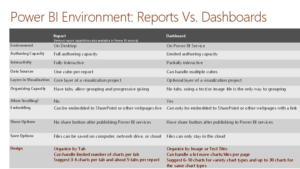
Power BI Environment: Reports Vs. Dashboards Report Dashboard (limited report capabilities also available in Power BI service) Environment On Desktop On Power BI Service Authoring Capacity Full authoring capacity Limited authoring capacity Interactivity Fully Interactive Partially interactive Data Sources One cube per report Can handle multiple cubes Layers in Visualization Core layer of a visualization project Optional layer of a visualization project Organizing Capacity Have tabs, allow grouping and progressive giving No tabs, using a text/or image tile is the only way to grouping Allow Scrolling? No Yes Embedding Can be embedded to Share. Point or other webpages live Can only be embedded to Share. Point or other webpages with a link Share Options No share button after publishing Power BI services Have share button after publishing to Power BI services Save Options Files can be saved on computer, network drive, or cloud Files can only stay in the cloud Design Organize by Tab Can handle limited number of charts per tab Suggest 3 -6 charts per tab and about 5 tabs per report Organize by Image or Text Tiles Can handle a lot more charts/tiles per page Suggest 6 -10 charts for variety chart types and up to 30 charts for the same chart types
Tips to Improve Data Visualization Effectiveness
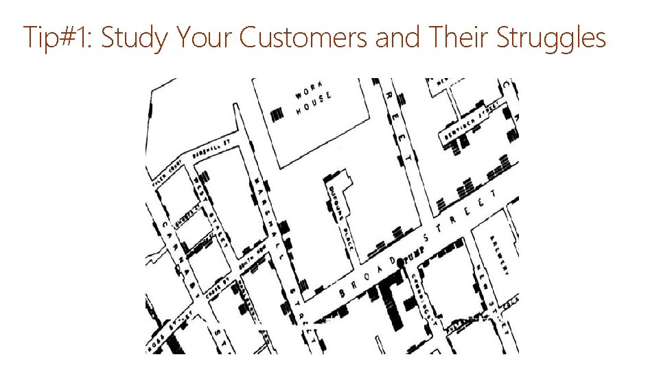
Tip#1: Study Your Customers and Their Struggles
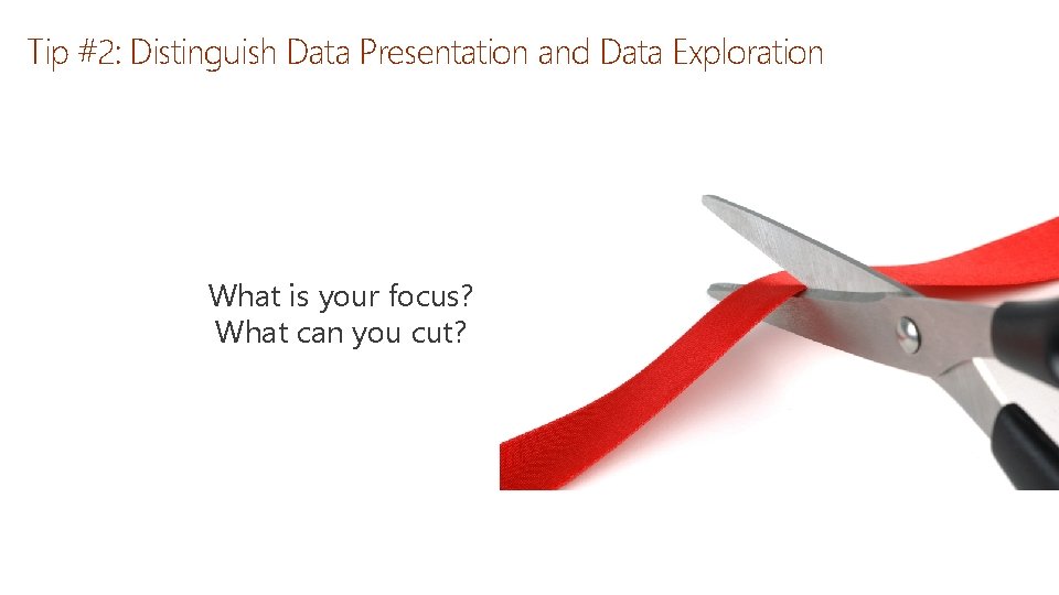
Tip #2: Distinguish Data Presentation and Data Exploration What is your focus? What can you cut?
Tip #3: Pinpoint Your Data Visualization Purpose, Type, and Style
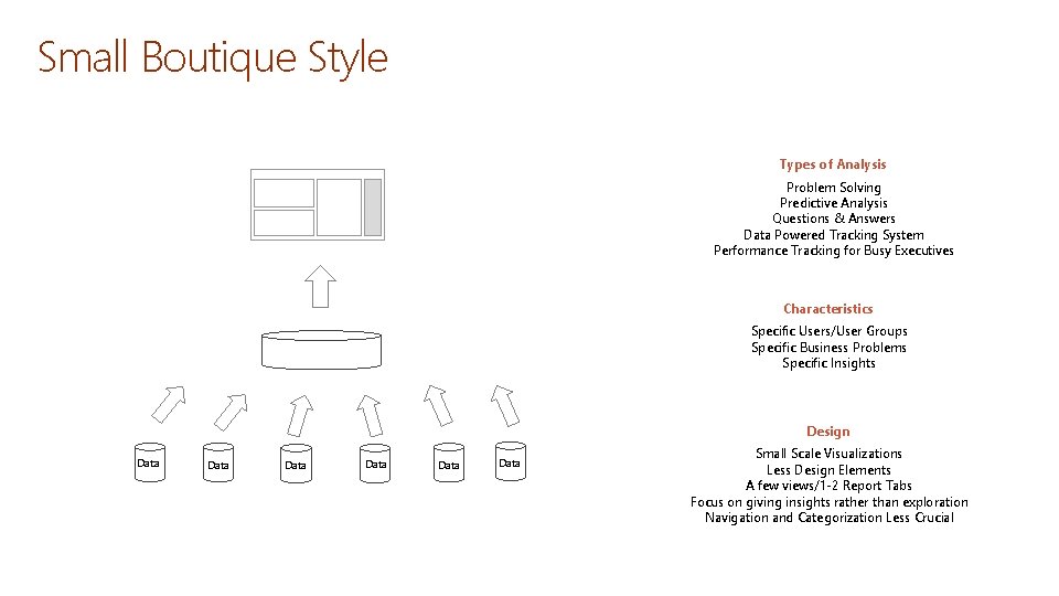
Small Boutique Style Types of Analysis Problem Solving Predictive Analysis Questions & Answers Data Powered Tracking System Performance Tracking for Busy Executives Characteristics Specific Users/User Groups Specific Business Problems Specific Insights Design Data Data Small Scale Visualizations Less Design Elements A few views/1 -2 Report Tabs Focus on giving insights rather than exploration Navigation and Categorization Less Crucial
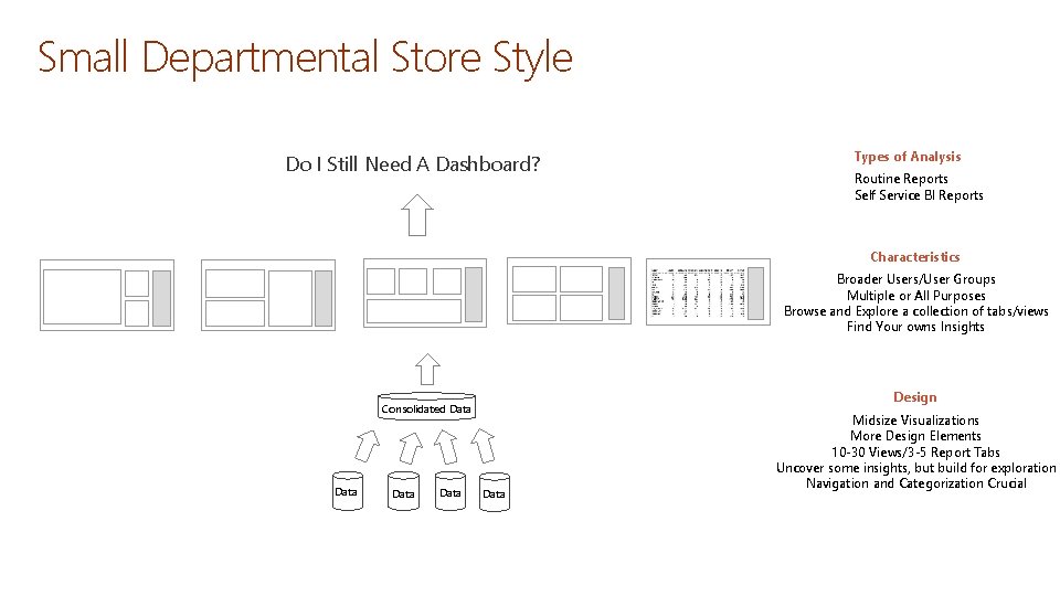
Small Departmental Store Style Do I Still Need A Dashboard? Types of Analysis Routine Reports Self Service BI Reports Characteristics Broader Users/User Groups Multiple or All Purposes Browse and Explore a collection of tabs/views Find Your owns Insights Design Consolidated Data Data Midsize Visualizations More Design Elements 10 -30 Views/3 -5 Report Tabs Uncover some insights, but build for exploration Navigation and Categorization Crucial
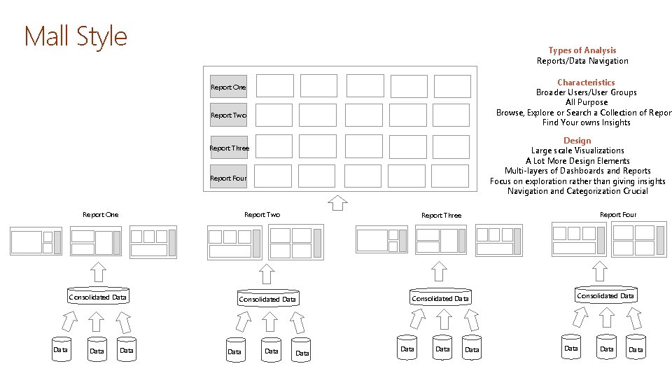
Mall Style Types of Analysis Reports/Data Navigation Characteristics Broader Users/User Groups All Purpose Browse, Explore or Search a Collection of Report Find Your owns Insights Report One Report Two Design Large scale Visualizations A Lot More Design Elements Multi-layers of Dashboards and Reports Focus on exploration rather than giving insights Navigation and Categorization Crucial Report Three Report Four Report One Report Two Consolidated Data Data Report Four Report Three Data Consolidated Data Data
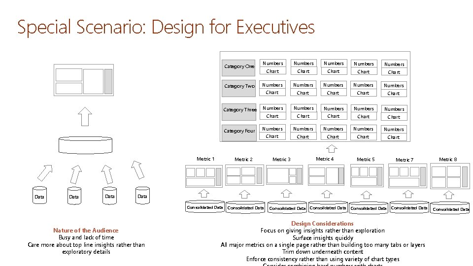
Special Scenario: Design for Executives Category One Category Two Category Three Category Four Metric 1 Data Numbers Numbers Numbers Numbers Numbers Chart Chart Chart Chart Chart Metric 2 Metric 3 Metric 4 Metric 5 Metric 7 Metric 8 Data Consolidated Data Nature of the Audience Busy and lack of time Care more about top line insights rather than exploratory details Consolidated Data Consolidated Data Design Considerations Focus on giving insights rather than exploration Surface insights quickly All major metrics on a single page rather than building too many tabs or layers Trim down underneath content Enforce consistency rather than using variety of chart types Consolidated Data
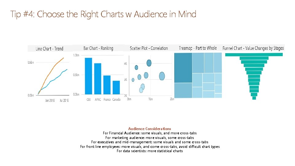
Tip #4: Choose the Right Charts w Audience in Mind Audience Considerations For Financial Audience: some visuals, and more cross-tabs For marketing audience: more visuals, some cross-tabs For executives and mid-management: some visuals and some cross-tabs For front line employees: more visuals, and come cross-tabs, avoid difficult chart types For data scientists: more statistical charts
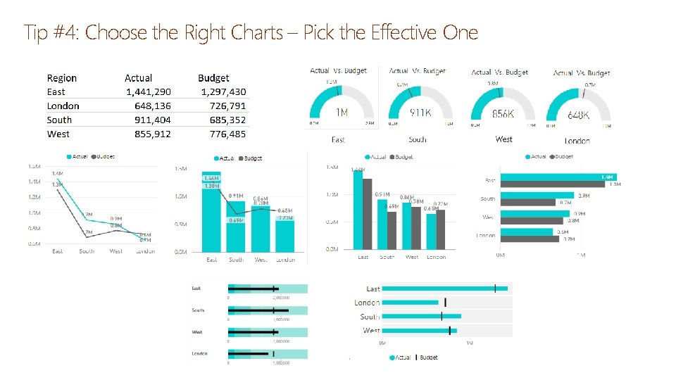
Tip #4: Choose the Right Charts – Pick the Effective One
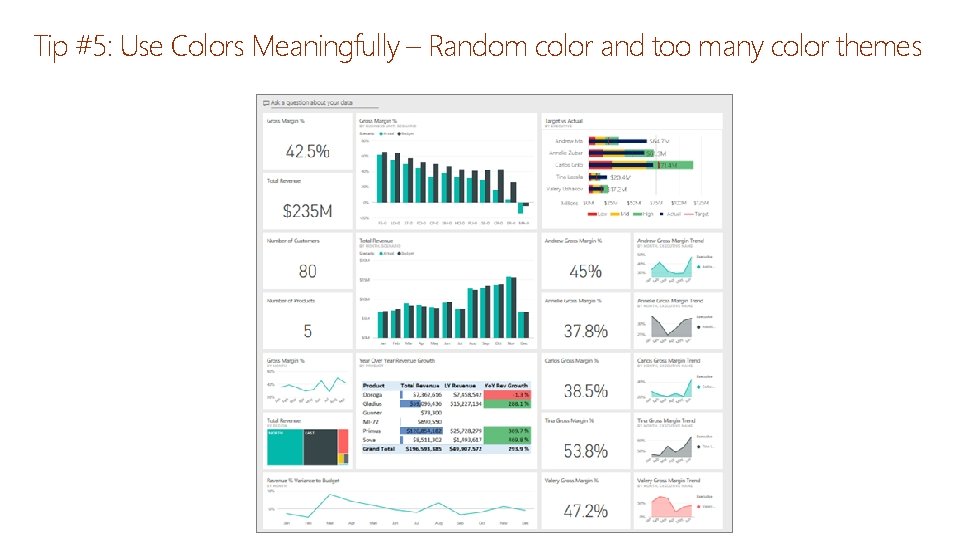
Tip #5: Use Colors Meaningfully – Random color and too many color themes
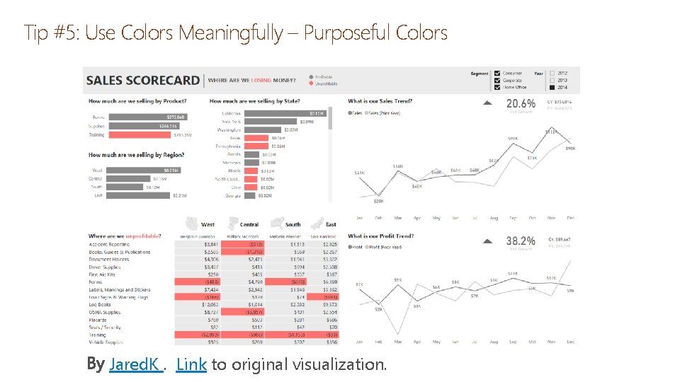
Tip #5: Use Colors Meaningfully – Purposeful Colors Jared. K. Link to original visualization.
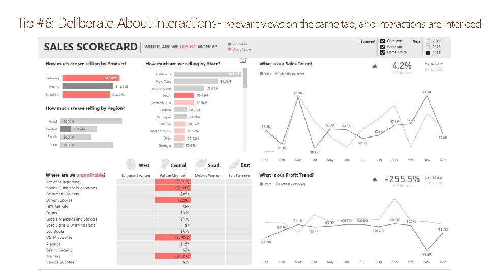
Tip #6: Deliberate About Interactions- relevant views on the same tab, and interactions are Intended
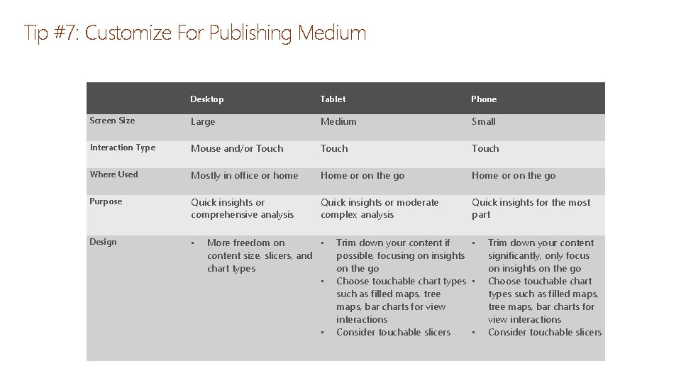
Tip #7: Customize For Publishing Medium Desktop Tablet Phone Screen Size Large Medium Small Interaction Type Mouse and/or Touch Where Used Mostly in office or home Home or on the go Purpose Quick insights or comprehensive analysis Quick insights or moderate complex analysis Quick insights for the most part Design • More freedom on • content size, slicers, and chart types • • Trim down your content if • possible, focusing on insights on the go Choose touchable chart types • such as filled maps, tree maps, bar charts for view interactions Consider touchable slicers • Trim down your content significantly, only focus on insights on the go Choose touchable chart types such as filled maps, tree maps, bar charts for view interactions Consider touchable slicers

Questions & Discussions
- Slides: 27