Seven Steps to Creating an Accessible Microsoft Word
Seven Steps to Creating an Accessible Microsoft Word Document http: //www. dor. ca. gov/disabilityaccessinfo/
Introduction • Estimated 4% Population relies on Assistive Technology • Accessibility to electronic documents is a right protected by Federal and State Law • Just good business when all can equally participate • These steps explained using Microsoft Word 2007, 2010, 2013
Presentation documentation • Login to i. Campus at https: //icampus. instructure. com • Click Resources tab • Click i. Campus Central link • In Professional Development box click Event Recordings • Click Presentation Materials for “Designing Word Documents & PDFs for Accessibility
Step 1: Use Appropriate Font Style & Size • Sans Serif Fonts work best (this is Calibri) – Sans Serif recommended fonts: • Arial • Verdana – Serif (not recommended) • Times New Roman • Century • Minimum font size 12 point
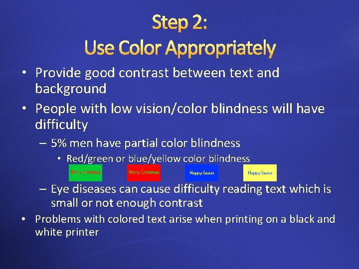
Step 2: Use Color Appropriately • Provide good contrast between text and background • People with low vision/color blindness will have difficulty – 5% men have partial color blindness • Red/green or blue/yellow color blindness – Eye diseases can cause difficulty reading text which is small or not enough contrast • Problems with colored text arise when printing on a black and white printer
Step 2: Use Color Appropriately (continued) • Tools available online for exact level of contrast • Color Contrast Analyser: http: //www. visionaustralia. org/digital-access-cca • To Check the Level of Contrast: www. paciellogroup. com/resources/contrast. Analyser
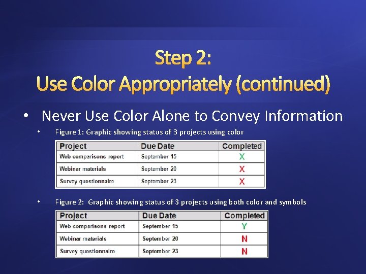
Step 2: Use Color Appropriately (continued) • Never Use Color Alone to Convey Information • Figure 1: Graphic showing status of 3 projects using color • Figure 2: Graphic showing status of 3 projects using both color and symbols
Step 3: Add Alternative (ALT) texts & captions • Images, graphics or tables should have ALT text and captions • ALT text and captions are read by screen readers allowing the content and functions to be accessible to those with visual or cognitive disabilities • Images/graphics should always have the wrapping style set to “In Line with Text”

Step 4: Specify Column Header Rows in Tables • • Construct simple tables Only use one row in the Header Never Merge or Split cells Do not leave cells, rows or columns blank
Step 5: Use Meaningful Hyperlink Text • Provide a clear description of the link destination • Do Not use phrases such as “Click Here” or “Visit”
Step 6: Use Built-In Formatting Styles • Always use Styles to format documents – Especially Headings and Lists • Use Heading Order – When headings are defined using Word’s built-in heading styles, Screen Reader users can navigate through the document easily skipping between headings – Headings should be applied to provide a sequential & relational understanding
Step 6: Use Built-In Formatting Styles (continued) • When Headers are used a Table of Contents can be added in 4 easy steps • Use Word’s Bulleted or Numbered List Formatting • Do not use Text Boxes (they are inaccessible) • Instead create borders around text and use high contrast colors for text and background

Step 7: Check Accessibility • If possible use a screen reader such as JAWS, NVDA, Window. Eyes, etc. to check the document’s accessibility. • Microsoft Word 2010 and later has a built accessibility feature – Best not to rely on ‘machine’ testing alone for testing accessibility
- Slides: 13