SESSION CODE WEB 101 Thomas Lewis Principal Technical


SESSION CODE: WEB 101 Thomas Lewis Principal Technical Evangelist Microsoft @tommylee | asimplepixel. tumblr. com RESPONSIVE WEB DESIGN: THE VIEW OF THE WORLD DEPENDS ON THE GLASSES I WEAR (c) 2011 Microsoft. All rights reserved.

How we viewed the web ► The Desktop Browser

How we view the web today ► The Desktop Browser ► Mobile Browsers ► Tablet form-factors ► Televisions ► Game Consoles ► More… Yeah, so what’s the problem?

demo THE ANTI-PATTERN

Responsive Web Design Thinking of the user’s needs instead of ours. Adapt to various device capabilities instead of configurations. Help future-proof our sites.

demo

Elements of Responsive Web Design A flexible, grid-based layout, Flexible images and media, and Media queries. Something else.

Flexible, Grid-based Layout

Ok, so what’s the problem? Non-responsive sites are no fun. Fixed-width sites are not the best experiences. Design tools tend to use pixels. Sometimes a pixel does not equal a pixel. So how do we turn pixels to their em counterparts?

The Solution

The Algorithm & Calculation target context result

The Algorithm & Calculation Responsive Web Design READ MORE >> em h 1 { font-size: 24 px; } % h 1 a { font-size: 24 px; } 1 24 / 16 = 1. 5 11 / 24 = 0. 458333333+ 2 target h 1 { font-size: 1. 5 em; } h 1 a { font: 0. 458333333+; } 3 context result

Didn’t You Say Something About a Grid? #page { margin: 36 px auto; width: 960 px; }. blog { margin: 0 auto 53 px; width: 900 px; }. blog. main { float: left; width: 566 px; }. blog. other { float: right; width: 331 px; } . blog { width: 900/960; }. blog. main { width: 566/900; }. blog. other { width: 331/900; } target #page { margin: 36 px auto; width: 90%; }. blog { margin: 0 auto 53 px; width: 93. 75%; }. blog. main { float: left; width: 62. 88+%; }. blog. other { float: right; width: 36. 77+%; } context result

Flexible Images and Media

A Simple Solution img { max-width: 100%; } Works on images, as well as other media like <video>.

Demo

Another possibility Filament Group – depends on cookies and Java. Script

Media Queries

In CSS 2. 1… ► We could define media types: screen and print. ► But not easily respond to the user’s display. ► Lots of grunt work. ► Didn’t spend much time thinking about mobile devices.

CSS 3 Media Queries ► The CSS 3 Media Queries Module specifies methods to enable web developers to scope a style sheet to a set of precise device capabilities.
 { body { font-size: 80%; }")
Simple Example @media screen and (max-width: 600 px) { body { font-size: 80%; } }
 and (max-width: 480 px) @media not")
Other Queries @media screen and (min-width: 320 px) and (max-width: 480 px) @media not print and (max-width: 600 px) @media screen (x) and (y), print (a) and (b)
")
Can Be Declared… ► In the Stylesheet ► Import Rule – @import url(mq. css) only screen and (maxwidth: 600 px) ► link Element – <link rel=“stylesheet” media=“only screen and (max-width: 800 px)” href=“mq. css”>

Supported Media Properties ► min/max-width ► min/max-height ► device-width ► device-height ► orientation ► aspect-ratio ► device-aspect-ratio ► color-index ► monochrome ► resolution

Let’s take a look… Demo

What about devices? ►viewport meta tag – <meta name=“viewport” content=“width=device -width”> ►device-width vs. width ►maximum-zoom

What about non-supportive browsers? ► css 3 -mediaqueries-js by Wouter van der Graaf ► Just include the script in your pages ► Parses the CSS and applies style for positive media tests

What else to think about? ► Adjust elements to make them more touchfriendly. ► Adjusting text for more readability. ► Show jump links to eliminate lengthy scrolling. ► Image swapping. ► Customized print styling.

Ummm, is there something I can already use? ► Yes! Andy Clarke did some of the work for you!

The Book – Stunning CSS 3 http: //stunningcss 3. com

Responsive Web Design Techniques, Tools and Design Strategies http: //www. smashingmagazine. com/2011/07/22/respon sive-web-design-techniques-tools-and-design-strategies/

The Enthusiast Site http: //mediaqueri. es

The Spec http: //www. w 3. org/TR/css 3 -mediaqueries/

Hey, what was that something else? Design. Do we start with mobile-first? Is it best that all sites are responsive? Do we need or want to do visual comps for every device? Don’t dismiss mobile as walking and looking something up. We are at the beginning, that’s what makes this interesting!

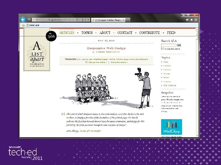
The Book – Responsive Web Design http: //abookapart. com

Thank You! ► Deck, demos, links are at: asimplepixel. tumblr. com ► Also, follow @tommylee if you like the HTML 5, CSS 3, Design, Brutality and Pets (c) 2011 Microsoft. All rights reserved.

Enrol in Microsoft Virtual Academy Today Why Enroll, other than it being free? The MVA helps improve your IT skill set and advance your career with a free, easy to access training portal that allows you to learn at your own pace, focusing on Microsoft technologies. What Do I get for enrolment? ► Free training to make you become the Cloud-Hero in my Organization ► Help mastering your Training Path and get the recognition ► Connect with other IT Pros and discuss The Cloud Where do I Enrol? www. microsoftvirtualacademy. com Then tell us what you think. Tell. The. Dean@microsoft. com

© 2010 Microsoft Corporation. All rights reserved. Microsoft, Windows Vista and other product names are or may be registered trademarks and/or trademarks in the U. S. and/or other countries. The information herein is for informational purposes only and represents the current view of Microsoft Corporation as of the date of this presentation. Because Microsoft must respond to changing market conditions, it should not be interpreted to be a commitment on the part of Microsoft, and Microsoft cannot guarantee the accuracy of any information provided after the date of this presentation. MICROSOFT MAKES NO WARRANTIES, EXPRESS, IMPLIED OR STATUTORY, AS TO THE INFORMATION IN THIS PRESENTATION. (c) 2011 Microsoft. All rights reserved.
- Slides: 40