Sections 2 1 2 2 Frequency Distributions Important
Sections 2 -1 & 2 -2 Frequency Distributions
Important Characteristics of Data When analyzing data, there are five characteristics that are important to look at. 1. Center: A representative or average value that indicates where the middle of the data set is located 2. Variation: A measure of the amount that the values vary among themselves 3. Distribution: The nature or shape of the distribution of data (such as bell-shaped, uniform, or skewed) 4. Outliers: Sample values that lie very far away from the vast majority of other sample values 5. Time: Changing characteristics of the data over time We will come back to each of these in more detail.
Analyzing Data In order to analyze data characteristics, you must first organize it in some way. In this chapter, we will talk about some different ways to organize and present data.
Frequency Distributions Frequency Distribution breaks data into categories, and tells how many times each category is represented frequency distributions allow us to organize data and look at trends
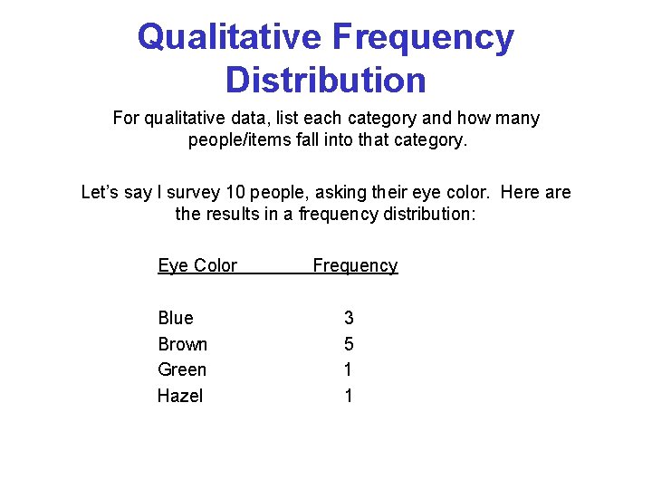
Qualitative Frequency Distribution For qualitative data, list each category and how many people/items fall into that category. Let’s say I survey 10 people, asking their eye color. Here are the results in a frequency distribution: Eye Color Blue Brown Green Hazel Frequency 3 5 1 1
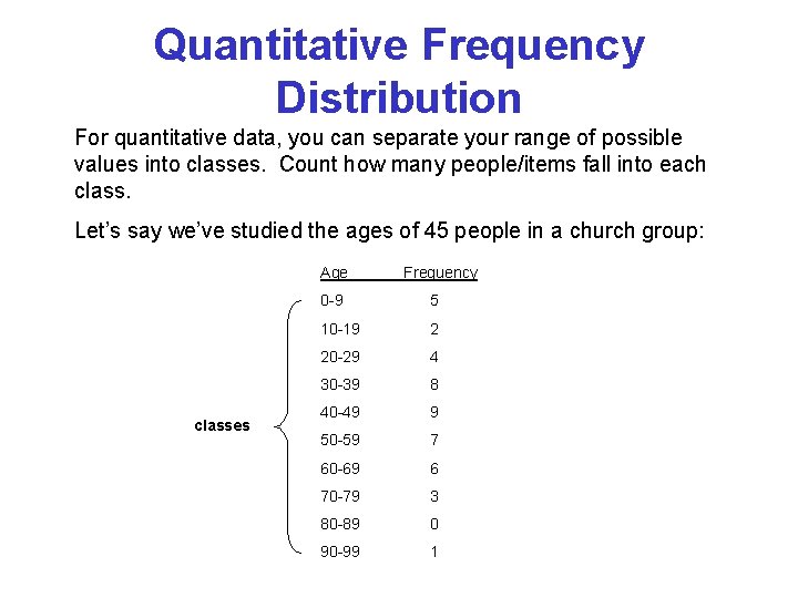
Quantitative Frequency Distribution For quantitative data, you can separate your range of possible values into classes. Count how many people/items fall into each class. Let’s say we’ve studied the ages of 45 people in a church group: Age classes Frequency 0 -9 5 10 -19 2 20 -29 4 30 -39 8 40 -49 9 50 -59 7 60 -69 6 70 -79 3 80 -89 0 90 -99 1
The following slides explain the different parts of the table in a quantitative frequency distribution.
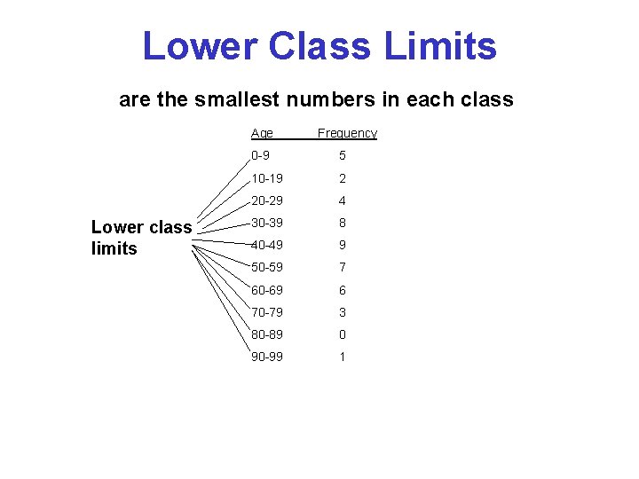
Lower Class Limits are the smallest numbers in each class Age Lower class limits Frequency 0 -9 5 10 -19 2 20 -29 4 30 -39 8 40 -49 9 50 -59 7 60 -69 6 70 -79 3 80 -89 0 90 -99 1
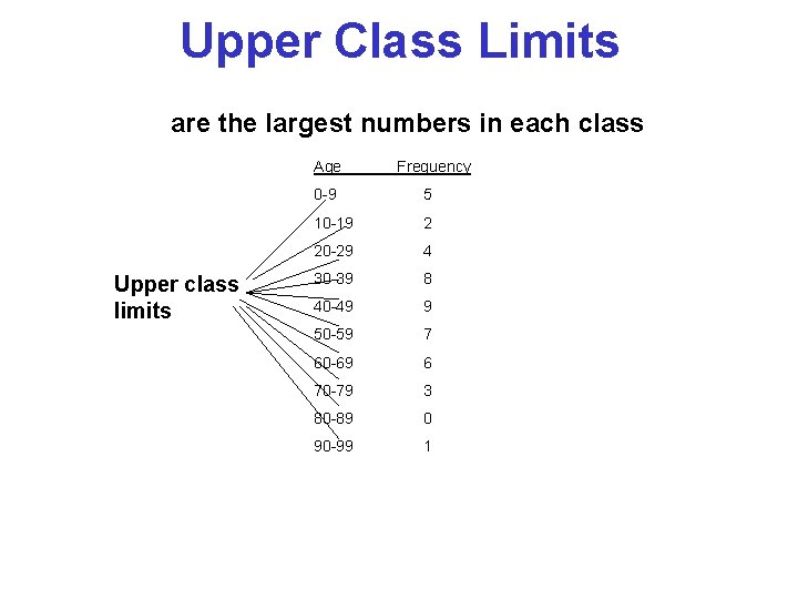
Upper Class Limits are the largest numbers in each class Age Upper class limits Frequency 0 -9 5 10 -19 2 20 -29 4 30 -39 8 40 -49 9 50 -59 7 60 -69 6 70 -79 3 80 -89 0 90 -99 1
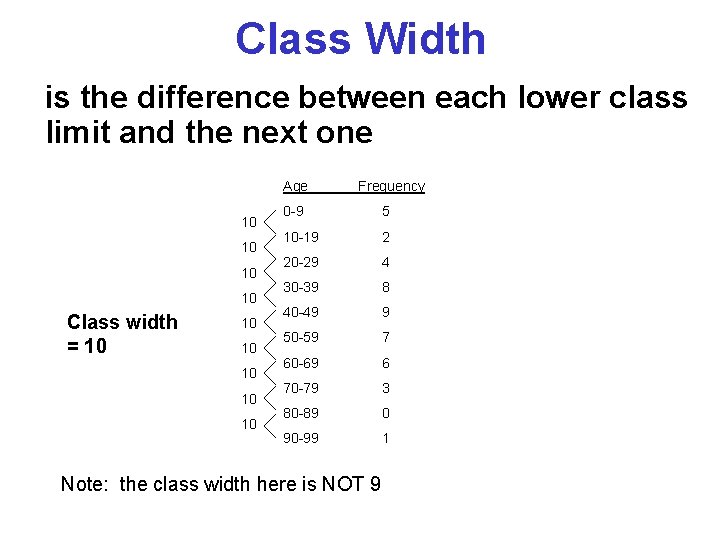
Class Width is the difference between each lower class limit and the next one Age 10 10 Class width = 10 10 10 Frequency 0 -9 5 10 -19 2 20 -29 4 30 -39 8 40 -49 9 50 -59 7 60 -69 6 70 -79 3 80 -89 0 90 -99 1 Note: the class width here is NOT 9
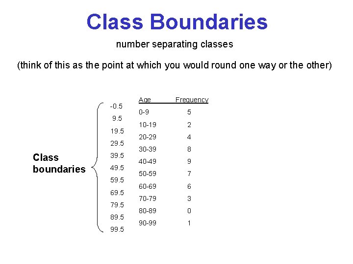
Class Boundaries number separating classes (think of this as the point at which you would round one way or the other) -0. 5 9. 5 19. 5 29. 5 Class boundaries 39. 5 49. 5 59. 5 69. 5 79. 5 89. 5 99. 5 Age Frequency 0 -9 5 10 -19 2 20 -29 4 30 -39 8 40 -49 9 50 -59 7 60 -69 6 70 -79 3 80 -89 0 90 -99 1
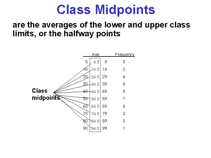
Class Midpoints are the averages of the lower and upper class limits, or the halfway points Age 0 Class midpoints Frequency 9 5 10 14. 5 19 2 20 24. 5 29 4 30 34. 5 39 8 40 44. 5 49 9 50 54. 5 59 7 60 64. 5 69 6 70 74. 5 79 3 80 84. 5 89 0 90 94. 5 99 1 4. 5
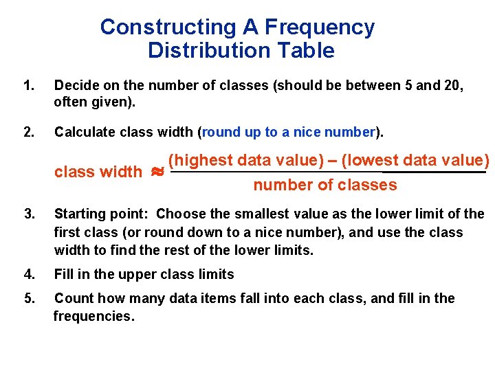
Constructing A Frequency Distribution Table 1. Decide on the number of classes (should be between 5 and 20, often given). 2. Calculate class width (round up to a nice number). class width (highest data value) – (lowest data value) number of classes 3. Starting point: Choose the smallest value as the lower limit of the first class (or round down to a nice number), and use the class width to find the rest of the lower limits. 4. Fill in the upper class limits 5. Count how many data items fall into each class, and fill in the frequencies.
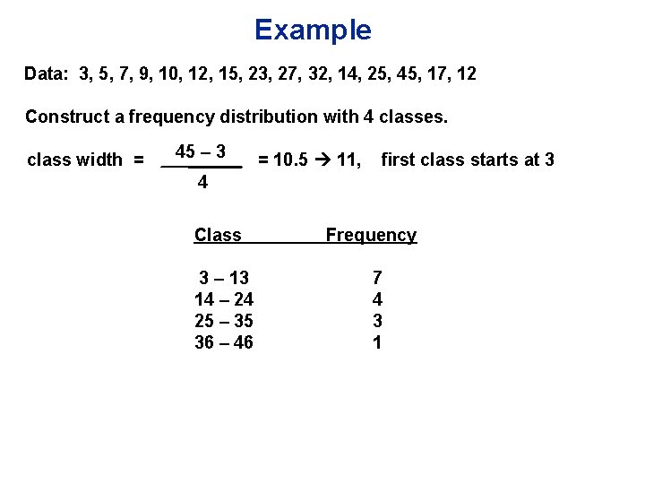
Example Data: 3, 5, 7, 9, 10, 12, 15, 23, 27, 32, 14, 25, 45, 17, 12 Construct a frequency distribution with 4 classes. class width = 45 – 3 = 10. 5 11, first class starts at 3 4 Class 3 – 13 14 – 24 25 – 35 36 – 46 Frequency 7 4 3 1
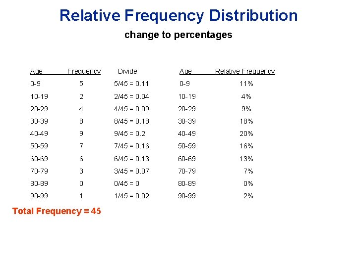
Relative Frequency Distribution change to percentages Age Frequency Divide Age Relative Frequency 0 -9 5 5/45 = 0. 11 0 -9 11% 10 -19 2 2/45 = 0. 04 10 -19 4% 20 -29 4 4/45 = 0. 09 20 -29 9% 30 -39 8 8/45 = 0. 18 30 -39 18% 40 -49 9 9/45 = 0. 2 40 -49 20% 50 -59 7 7/45 = 0. 16 50 -59 16% 60 -69 6 6/45 = 0. 13 60 -69 13% 70 -79 3 3/45 = 0. 07 70 -79 7% 80 -89 0 0/45 = 0 80 -89 0% 90 -99 1 1/45 = 0. 02 90 -99 2% Total Frequency = 45
Sections 2 -3 through 2 -5 Statistical Graphics
Visualizing Data We will be looking at different ways to visually represent frequency distributions. Visual representations can help in analyzing data. Objective: To use visual representations to analyze center, variation, distribution, and outliers.
Visualizing Qualitative Data • Bar graphs • Pie Charts
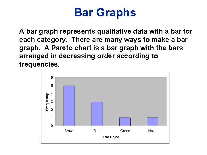
Bar Graphs A bar graph represents qualitative data with a bar for each category. There are many ways to make a bar graph. A Pareto chart is a bar graph with the bars arranged in decreasing order according to frequencies.
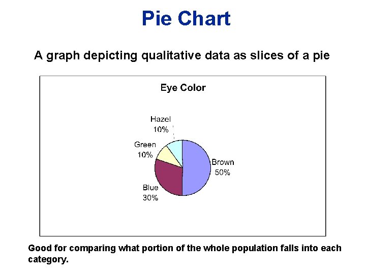
Pie Chart A graph depicting qualitative data as slices of a pie Good for comparing what portion of the whole population falls into each category.
Visualizing Quantitative Data • Histograms • Frequency Polygons • Stem-and-leaf Plots
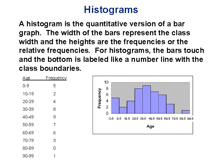
Histograms A histogram is the quantitative version of a bar graph. The width of the bars represent the class width and the heights are the frequencies or the relative frequencies. For histograms, the bars touch and the bottom is labeled like a number line with the class boundaries. Age Frequency 0 -9 5 10 -19 2 20 -29 4 30 -39 8 40 -49 9 50 -59 7 60 -69 6 70 -79 3 80 -89 0 90 -99 1 -0. 5 9. 5 19. 5 29. 5 39. 5 49. 5 59. 5 69. 5 79. 5 89. 5 99. 5
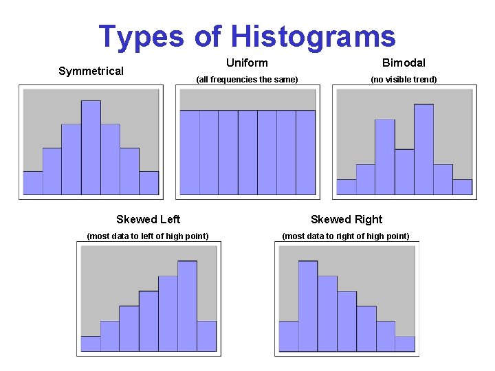
Types of Histograms Symmetrical Uniform Bimodal (all frequencies the same) (no visible trend) Skewed Left Skewed Right (most data to left of high point) (most data to right of high point)
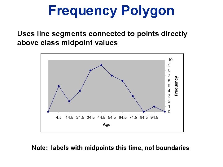
Frequency Polygon Uses line segments connected to points directly above class midpoint values Note: labels with midpoints this time, not boundaries
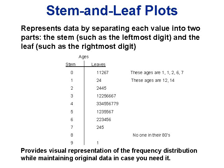
Stem-and-Leaf Plots Represents data by separating each value into two parts: the stem (such as the leftmost digit) and the leaf (such as the rightmost digit) Ages Stem Leaves 0 11267 These ages are 1, 1, 2, 6, 7 1 24 These ages are 12, 14 2 2445 3 12256667 4 334556779 5 1235567 6 223456 7 245 8 9 No one in their 80’s 1 Provides visual representation of the frequency distribution while maintaining original data in case you need it.
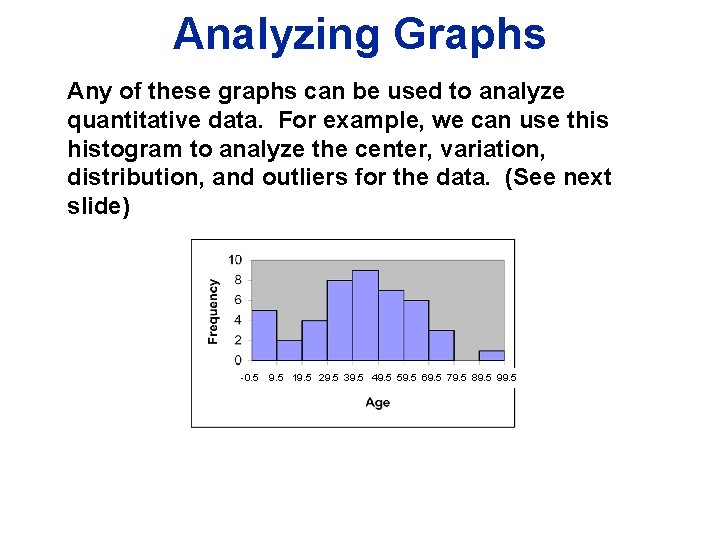
Analyzing Graphs Any of these graphs can be used to analyze quantitative data. For example, we can use this histogram to analyze the center, variation, distribution, and outliers for the data. (See next slide) -0. 5 9. 5 19. 5 29. 5 39. 5 49. 5 59. 5 69. 5 79. 5 89. 5 99. 5
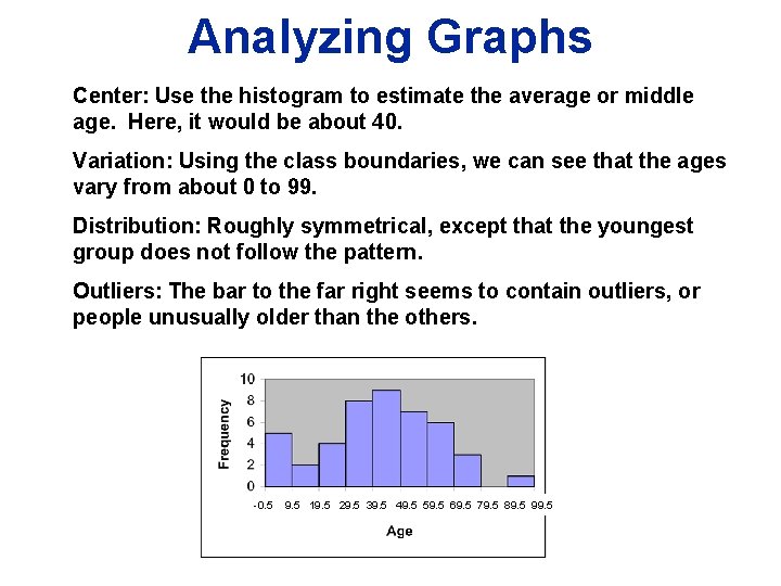
Analyzing Graphs Center: Use the histogram to estimate the average or middle age. Here, it would be about 40. Variation: Using the class boundaries, we can see that the ages vary from about 0 to 99. Distribution: Roughly symmetrical, except that the youngest group does not follow the pattern. Outliers: The bar to the far right seems to contain outliers, or people unusually older than the others. -0. 5 9. 5 19. 5 29. 5 39. 5 49. 5 59. 5 69. 5 79. 5 89. 5 99. 5
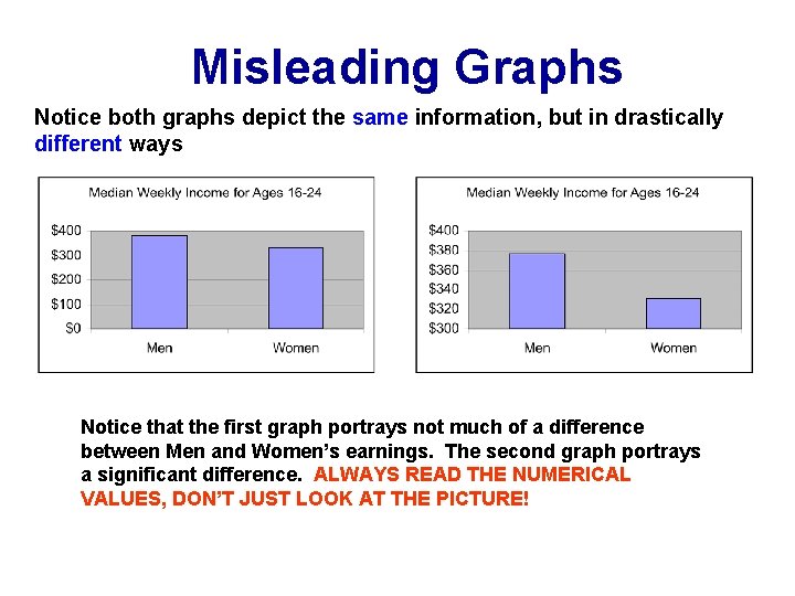
Misleading Graphs Notice both graphs depict the same information, but in drastically different ways Notice that the first graph portrays not much of a difference between Men and Women’s earnings. The second graph portrays a significant difference. ALWAYS READ THE NUMERICAL VALUES, DON’T JUST LOOK AT THE PICTURE!
- Slides: 28