Section 9 1 Scatter Diagrams and Linear Correlation
- Slides: 14

Section 9. 1 Scatter Diagrams and Linear Correlation

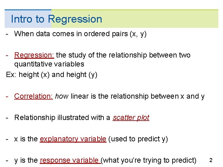
Intro to Regression - When data comes in ordered pairs (x, y) - Regression: the study of the relationship between two quantitative variables Ex: height (x) and height (y) - Correlation: how linear is the relationship between x and y - Relationship illustrated with a scatter plot - x is the explanatory variable (used to predict y) - y is the response variable (what you’re trying to predict) 2

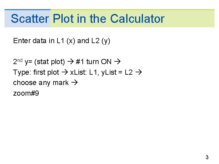
Scatter Plot in the Calculator Enter data in L 1 (x) and L 2 (y) 2 nd y= (stat plot) #1 turn ON Type: first plot x. List: L 1, y. List = L 2 choose any mark zoom#9 3

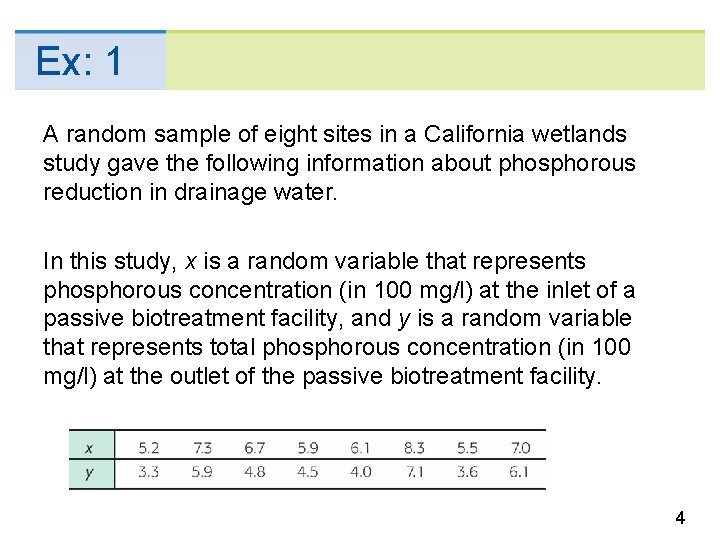
Ex: 1 A random sample of eight sites in a California wetlands study gave the following information about phosphorous reduction in drainage water. In this study, x is a random variable that represents phosphorous concentration (in 100 mg/l) at the inlet of a passive biotreatment facility, and y is a random variable that represents total phosphorous concentration (in 100 mg/l) at the outlet of the passive biotreatment facility. 4

Linear Regression - Many curves can closely follow the scatter of points - We focus on straight lines - Linear relationships are simplest and most widely used - If the data values follow a linear pattern goal: calculate a line of best fit - Negative Correlation (Weak, Moderate, Strong) - Positive Correlation (Weak, Moderate, Strong) - No Correlation (cloud-like or non-linear shape) 5

Strength of Correlation Examples 6

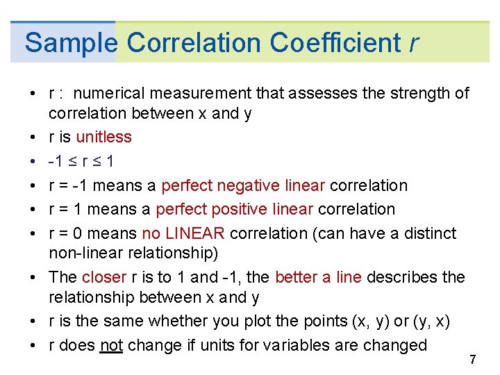
Sample Correlation Coefficient r • r : numerical measurement that assesses the strength of correlation between x and y • r is unitless • -1 ≤ r ≤ 1 • r = -1 means a perfect negative linear correlation • r = 1 means a perfect positive linear correlation • r = 0 means no LINEAR correlation (can have a distinct non-linear relationship) • The closer r is to 1 and -1, the better a line describes the relationship between x and y • r is the same whether you plot the points (x, y) or (y, x) • r does not change if units for variables are changed 7

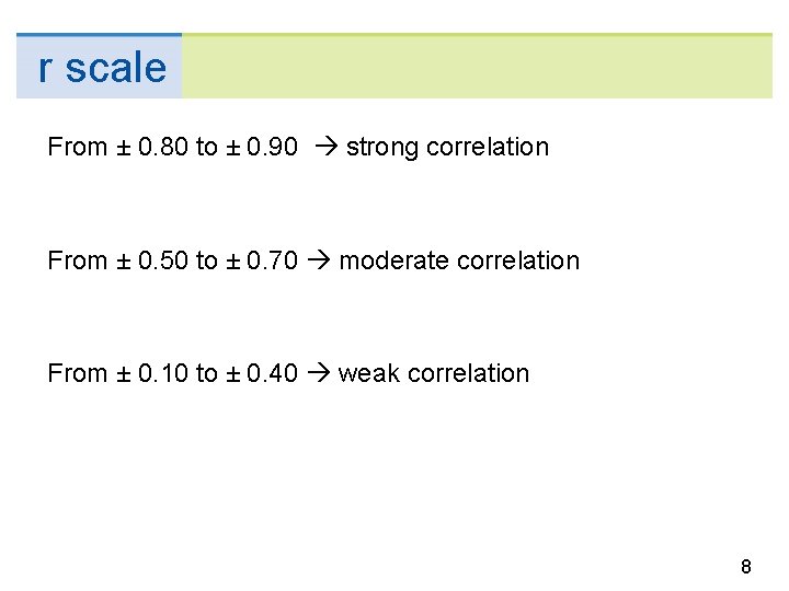
r scale From ± 0. 80 to ± 0. 90 strong correlation From ± 0. 50 to ± 0. 70 moderate correlation From ± 0. 10 to ± 0. 40 weak correlation 8

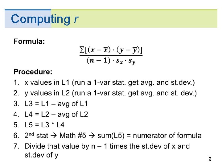
Computing r 9

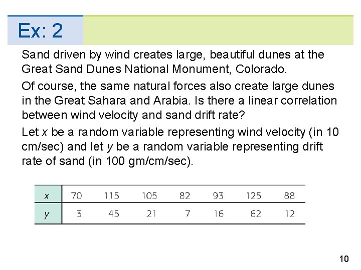
Ex: 2 Sand driven by wind creates large, beautiful dunes at the Great Sand Dunes National Monument, Colorado. Of course, the same natural forces also create large dunes in the Great Sahara and Arabia. Is there a linear correlation between wind velocity and sand drift rate? Let x be a random variable representing wind velocity (in 10 cm/sec) and let y be a random variable representing drift rate of sand (in 100 gm/cm/sec). 10

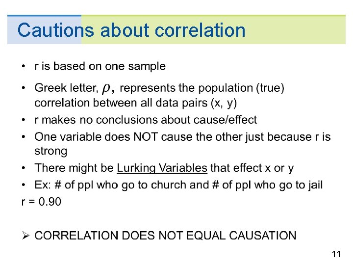
Cautions about correlation 11

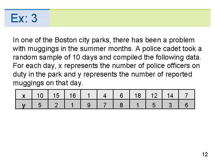
Ex: 3 In one of the Boston city parks, there has been a problem with muggings in the summer months. A police cadet took a random sample of 10 days and compiled the following data. For each day, x represents the number of police officers on duty in the park and y represents the number of reported muggings on that day. x 10 15 16 1 4 6 18 12 14 7 y 5 2 1 9 7 8 1 5 3 6 12

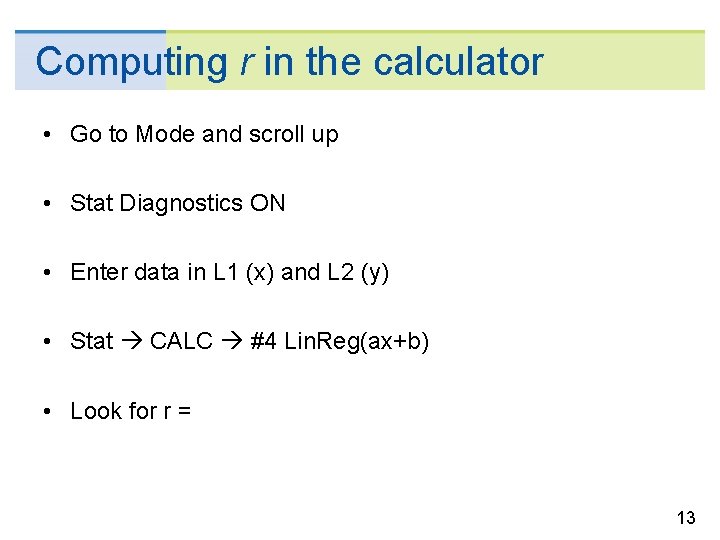
Computing r in the calculator • Go to Mode and scroll up • Stat Diagnostics ON • Enter data in L 1 (x) and L 2 (y) • Stat CALC #4 Lin. Reg(ax+b) • Look for r = 13

14