Section 6 7 Scatter Diagrams and Linear Correlation


- Slides: 21
Section 6. 7 - Scatter Diagrams and Linear Correlation IB Mathematical Studies SL
Syllabus reference Content Detail
Inferential Statistics Two variable statistics involves discovering if two variables are related or linked to each other in some way. e. g. - Does IQ determine income? - Is there a link between foot size and the height of a person? � One variable is independent (x-axis) whilst the other is dependent (y-axis) � This section of statistics involves conclusions that can be made about data that has not been collected using data that has been collected. � Hence we can infer or predict certain points based on the data collected. Often this involves sampling as analysing an entire population can be difficult. �
Methods � A scatter plot is necessary to quickly determine whether the variables are related, however, more formally we may need to measure: � (1) Correlation – initially it may be necessary to determine if a relationship exists between two or more variables (Pearson’s product moment correlation coefficient) � (2) Regression analysis – if a relationship appears to exist we can then conduct further analysis to determine the type and strength of the relationship (Linear Regression)
Correlation refers to the relationship or association between two variable. � They are classified qualitatively in three ways: � › Direction – positive, negative, none › Strength – weak, moderate, strong › Type – linear or non-linear Exam hint - use this language! They are classified quantitatively by Pearson’s productmoment correlation coefficient � Outliers must also be considered and usually appear as isolated points away from the main body (group) of data. � Dancing Statistics: https: //www. youtube. com/watch? v=VFja. Bh 12 C 6 s �
Correlation Scatter graphs Positive linear correlations Negative linear correlations
CAUTION! - Causation � Be careful not to jump to conclusions when you determine a strong correlation between two variables – why? › It does not mean that a causal relationship exists, i. e. one variable does not necessarily cause the other. › e. g – there is a strong correlation between arm length and running speed, does that mean that short arms cause a reduction in running speed? How Ice Cream Kills! https: //www. youtube. com/watch? v=VMUQSMFGB Do �
Pearson’s product moment correlation coefficient Formula for “r” r tells how strong a correlation is between two variables � There are several formulae for calculating “r” but the one given and used in the IB course is: � Exam hint – make sure you know that sx is σx and sy is σy on your GDC! › sxy is the covariance (It will always be given if required). �If not given then use calculator method › Sx is the standard deviation of x data values › Sy is the standard deviation of y data values
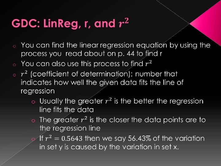
Using GDC to find “r” � Read p. 44 in your book and follow along with the example to practice using the GDC to calculate r � r lies between -1 and 1 › The closer to 1 the r-value is, the stronger the (positive) correlation › The closer to 0 the r-value is, the weaker the correlation › The closer to -1 the r-value is, the stronger the (negative) correlation
Linking “r” to terminology Correlation coefficient value Description of strength & direction 1 Perfect positive 0. 8 to 1 Strong positive 0. 6 to 0. 8 Moderate positive 0. 4 to 0. 6 Weak positive 0 to 0. 4 No correlation -0. 4 to 0 No correlation -0. 6 to -0. 4 Weak negative -0. 8 to -0. 6 Moderate negative -1 to -0. 8 Strong negative -1 Perfect negative Note: These are only guideline values, there is no specific division points where the description has to change from strong to moderate etc.
Another chart
Correlation Scatter graphs with “r” values
Example – correlation coefficient � Use the data in the table below to calculate the r –value, given sxy=7. 92 # 1 2 3 4 5 6 7 8 9 10 x 72 85 94 92 73 81 86 95 78 72 y 6 5 6 7 4 4 6 7 5 3 › Calculate the standard deviation of x › Calculate the standard deviation of y › Evaluate “r” using the IB formula and compare it to your calculator.
Line of Best Fit & Linear Regression � The line of best fit is the “quick and easy” way of finding the trend of the data › By eye it should have approximately the same number of data points above the line as below › A more accurate method is to calculate the mean of the x data and y data and ensure the trend line passes through this point called the mean point � Linear regression is the most accurate process for determining the trend line, as the process takes every data point in to account via a formula.
Syllabus reference Content Detail
Example – line of best fit � A statistician wants to know if there is a correlation between HSC maths scores and the Math Studies IB exam scores. She collected the following data from 10 randomly selected students. # 1 2 3 4 5 6 7 8 9 10 HSC 72 85 94 92 73 81 86 95 78 72 IB 6 5 6 7 4 4 6 7 5 3 › › › Is there a correlation ? If so, what kind? Draw the scatter plot of IB vs HSC Draw the line of best fit by finding the mean of each variable. If an HSC score is 77, predict the corresponding IB score. If an IB score was a 2, predict the corresponding HSC score.
Formula for Linear Regression � The line of best fit by the process of linear regression can be found using the given IB formula: › sxy is the covariance (It will always be given if required). › Sx is the standard deviation of x data values › sx 2 = (sx)2 i. e the std dev of x, then squared
Example – regression line � Find the equation of the line of best fit in y=ax+b form using the linear regression formula, if: sxy = 9. 23 sx = 3. 46 = (14. 4, 35. 2)
Extrapolation vs Interpolation Once you have a line of best fit you can use that equation to infer or predict what would happen to one variable if the other changes. � If you are predicting values within the range of your current data then you are said to be “interpolating”. � › The accuracy of interpolation depends on the accuracy of your line of best fit and your r-value � If you are predicting values outside the range of your data then you are “extrapolating”. › The accuracy of extrapolation not only on the accuracy of your line of best fit but also whether it is reasonable to assume that the same trend will continue outside your range of data.
Graph of extrapolation and interpolation ranges