Section 3 Production Possibilities Curves Curve graph Schedule

Section 3: Production Possibilities Curves
� Curve = graph � Schedule � Why? = chart Because they like to sound smart!
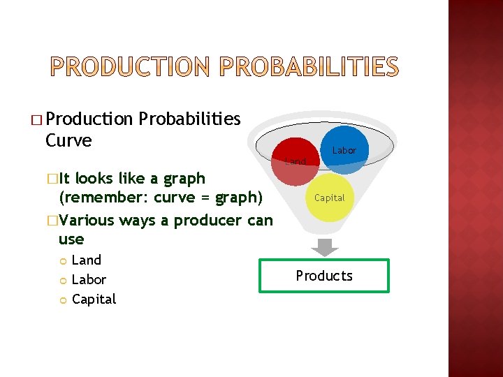
� Production Probabilities Curve Labor Land �It looks like a graph (remember: curve = graph) �Various ways a producer can use Land Labor Capital Products
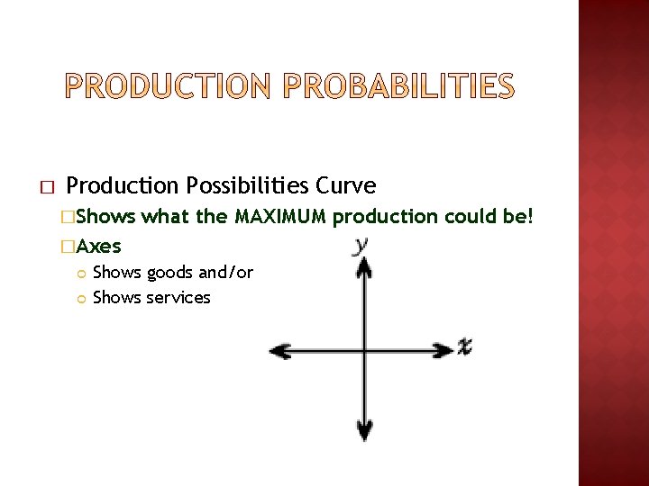
� Production Possibilities Curve �Shows what the MAXIMUM production could be! �Axes Shows goods and/or Shows services
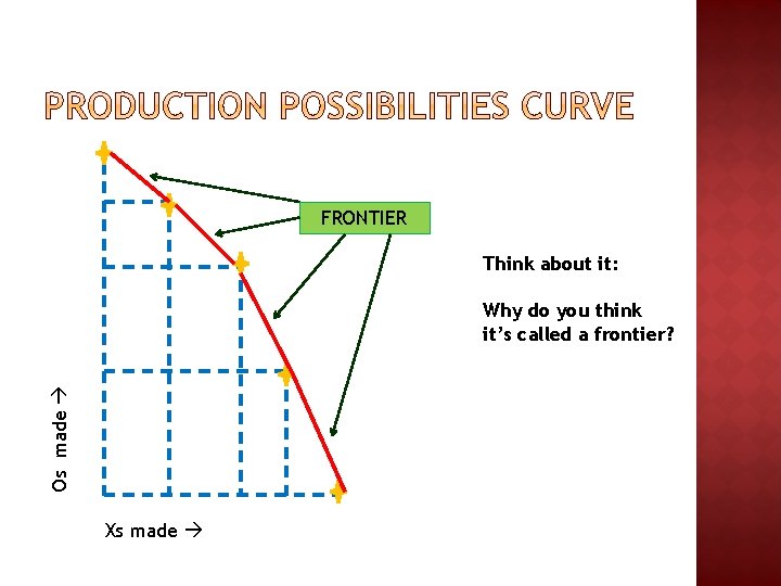
FRONTIER Think about it: Os made Why do you think it’s called a frontier? Xs made
� It’s found at the outer edge of a production possibilities curve � Represents the FURTHEST you can go out to regarding production �Using all of your CURRENT resources �Using all of them at 100% capacity �It curves down to show trade-offs in increments = (margins) along the way �It’s about RIGHT HERE and RIGHT NOW
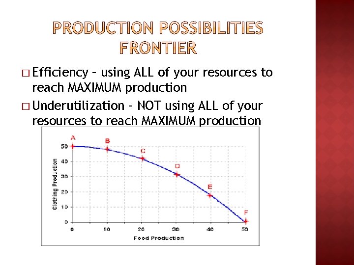
� Efficiency – using ALL of your resources to reach MAXIMUM production � Underutilization – NOT using ALL of your resources to reach MAXIMUM production
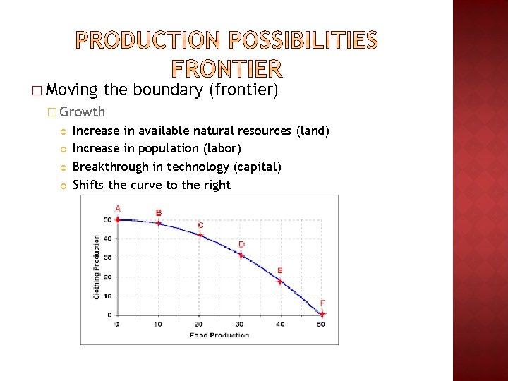
� Moving the boundary (frontier) � Growth Increase in available natural resources (land) Increase in population (labor) Breakthrough in technology (capital) Shifts the curve to the right
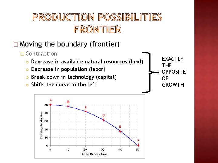
� Moving the boundary (frontier) � Contraction Decrease in available natural resources (land) Decrease in population (labor) Break down in technology (capital) Shifts the curve to the left EXACTLY THE OPPOSITE OF GROWTH
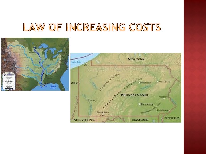
� The more resources you move into one product the more it costs you �Why? Some areas are better suited to produce certain goods Forcing new (but worse) areas to do this doesn’t pay off as much!

� Complete the writing prompt at the end of your packet … you might need to use the back of the page!
- Slides: 12