Section 2 2 Histograms Frequency Polygons Ogives Histograms

- Slides: 24

Section 2 -2 Histograms, Frequency Polygons Ogives

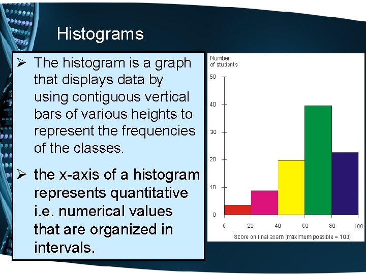
Histograms Ø The histogram is a graph that displays data by using contiguous vertical bars of various heights to represent the frequencies of the classes. Ø the x-axis of a histogram represents quantitative i. e. numerical values that are organized in intervals.

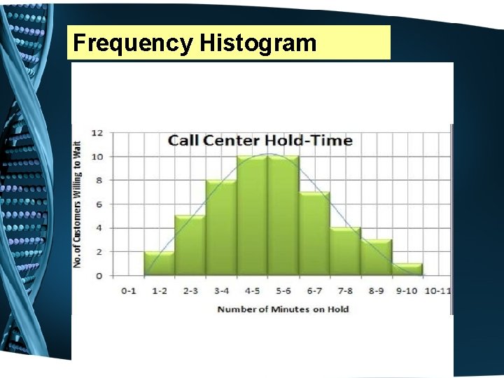
Frequency Histogram

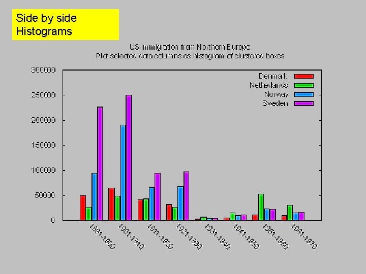
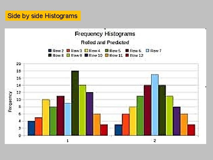
Side by side Histograms

Side by side Histograms


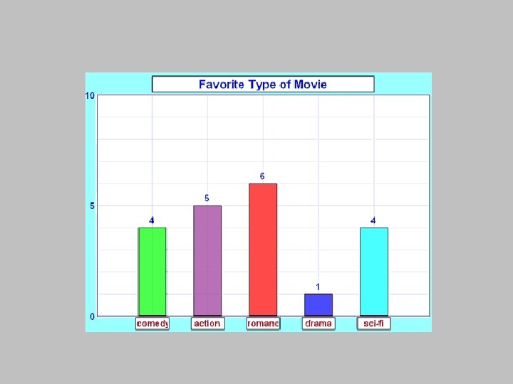
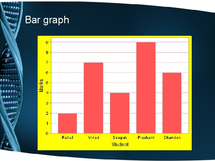
Bar graph • A Bar Graph (also called Bar Chart) is a graphical display of data using bars of different heights. • The x-axis will display qualitative i. e. categorical data.


Bar graph

Histograms Please refer to the states temperatures data from section 2 -2.

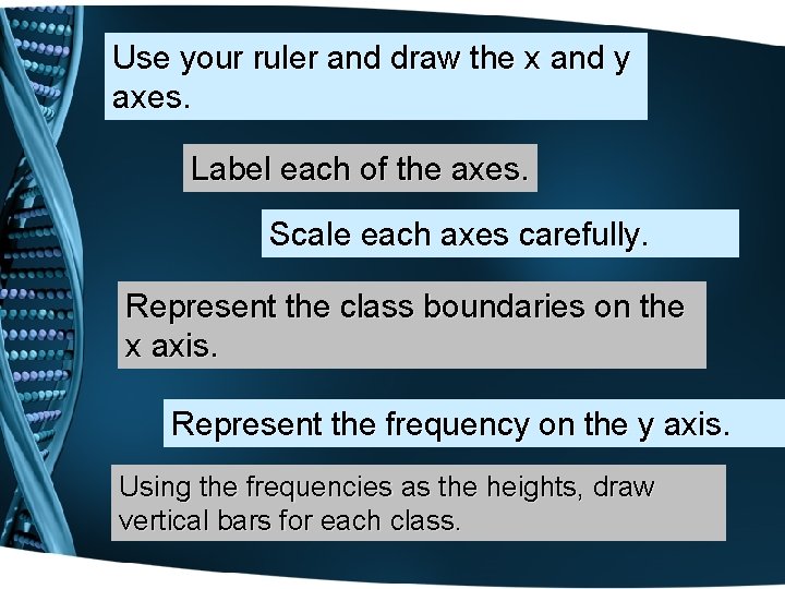
Use your ruler and draw the x and y axes. Label each of the axes. Scale each axes carefully. Represent the class boundaries on the x axis. Represent the frequency on the y axis. Using the frequencies as the heights, draw vertical bars for each class.

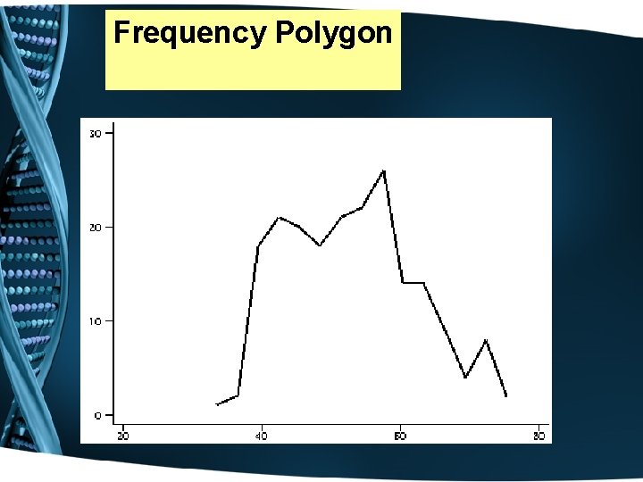
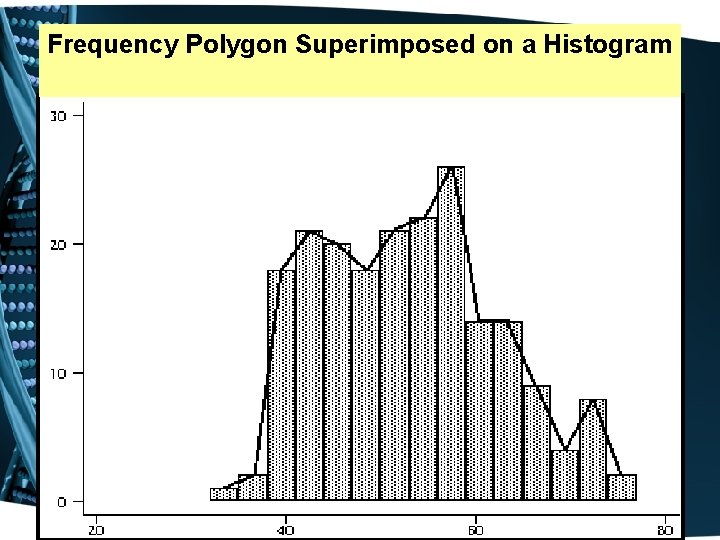
The Frequency Polygon The frequency polygon is a graph that displays the data by using lines to connect points plotted for the frequencies at the midpoints of the classes. The frequencies are represented by the heights of the points.


Frequency Polygon

Frequency Polygon Superimposed on a Histogram

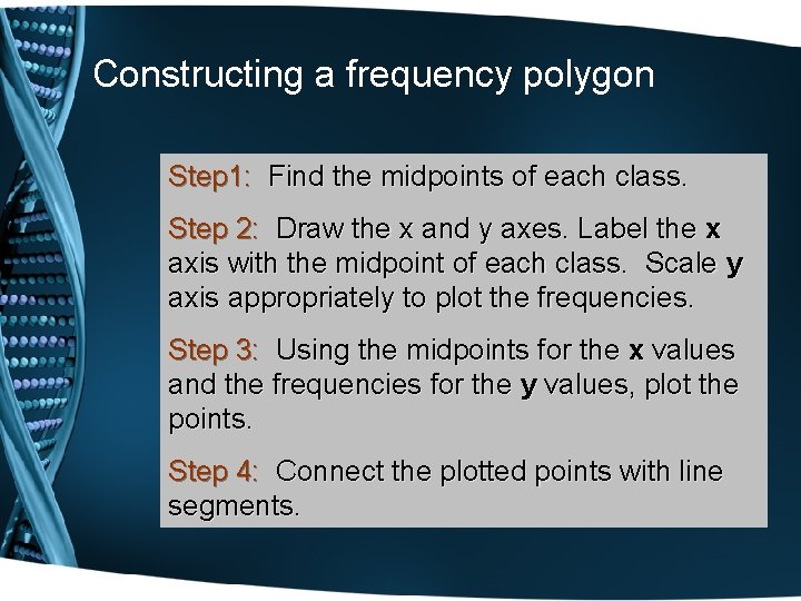
Constructing a frequency polygon Step 1: Find the midpoints of each class. Step 2: Draw the x and y axes. Label the x axis with the midpoint of each class. Scale y axis appropriately to plot the frequencies. Step 3: Using the midpoints for the x values and the frequencies for the y values, plot the points. Step 4: Connect the plotted points with line segments.

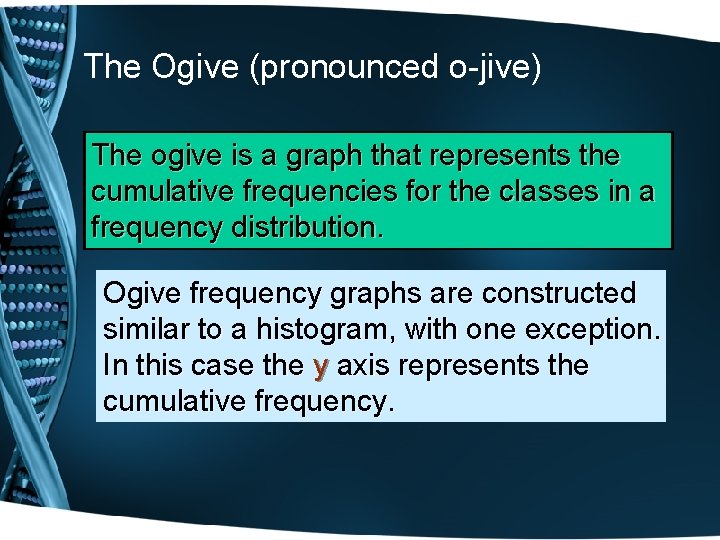
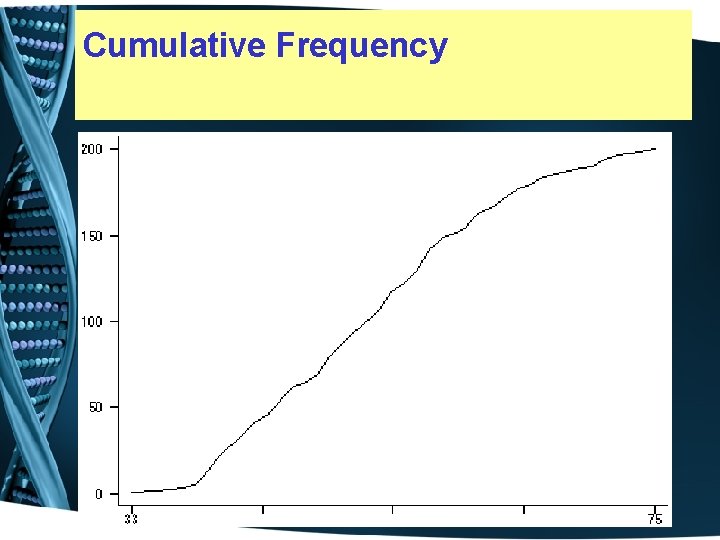
The Ogive (pronounced o-jive) The ogive is a graph that represents the cumulative frequencies for the classes in a frequency distribution. Ogive frequency graphs are constructed similar to a histogram, with one exception. In this case the y axis represents the cumulative frequency.

Cumulative Frequency

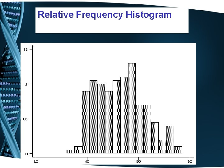
Relative frequency graphs are constructed similar to a histogram, with one exception. In this case the y axis represents the relative frequency.

Relative Frequency Histogram

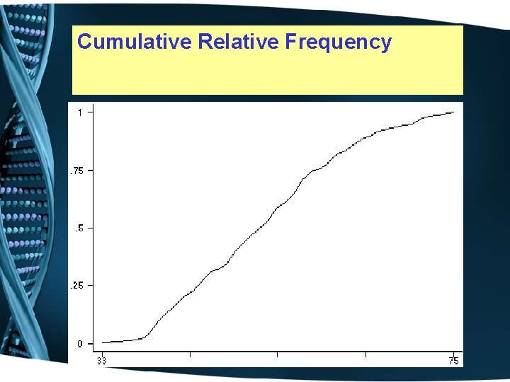
Cumulative Relative frequency graphs Relative cumulative frequency graphs are constructed similar to a histogram, with one exception. In this case the y axis represents the cumulative relative frequency.

Cumulative Relative Frequency

Graphing Calculator • Page 61 – Constructing histograms from raw data • Page 62 – Constructing a Histogram from a frequency distribution table

Homework: Read pages 51 -60. Applying Concepts 2 -2 page 60 Make sure to answer all questions completely. Graphs must be done on graph paper; make sure to use a ruler. Homework Exercises 2 -2, page 61 starting with # 1 every other odd problem.