Section 2 2 Graphical Displays of Data Copyright





- Slides: 54

Section 2. 2 Graphical Displays of Data Copyright © by Hawkes Learning All rights reserved.

Objectives o Create and interpret the basic types of graphs used to display data. o Distinguish between the basic shapes of a distribution. Copyright © by Hawkes Learning All rights reserved.

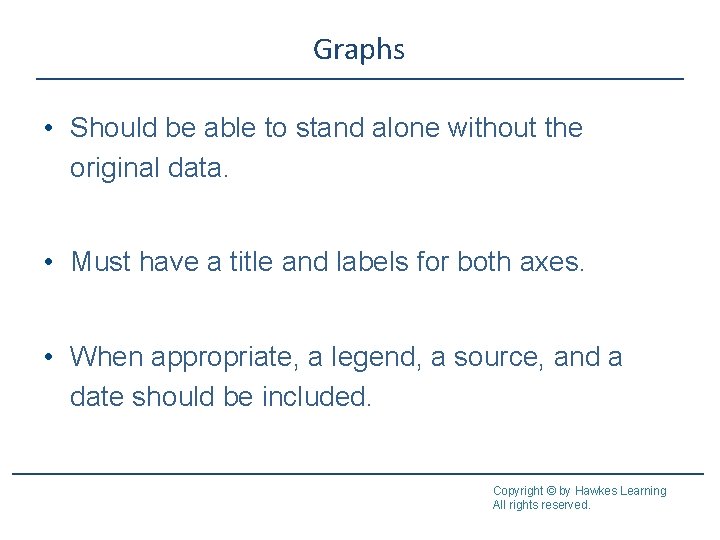
Graphs • Should be able to stand alone without the original data. • Must have a title and labels for both axes. • When appropriate, a legend, a source, and a date should be included. Copyright © by Hawkes Learning All rights reserved.

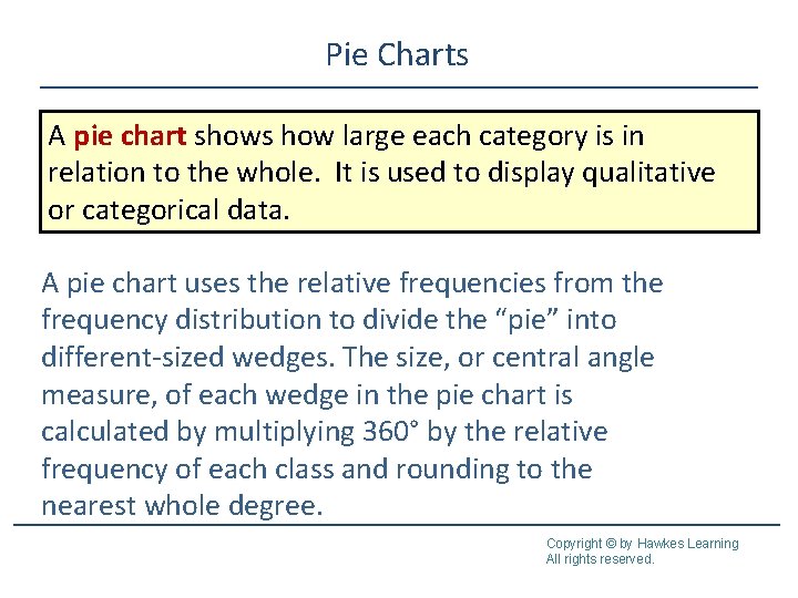
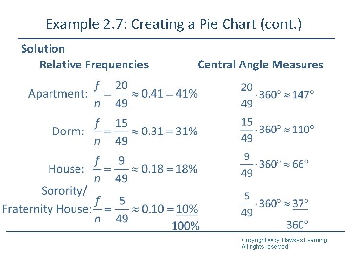
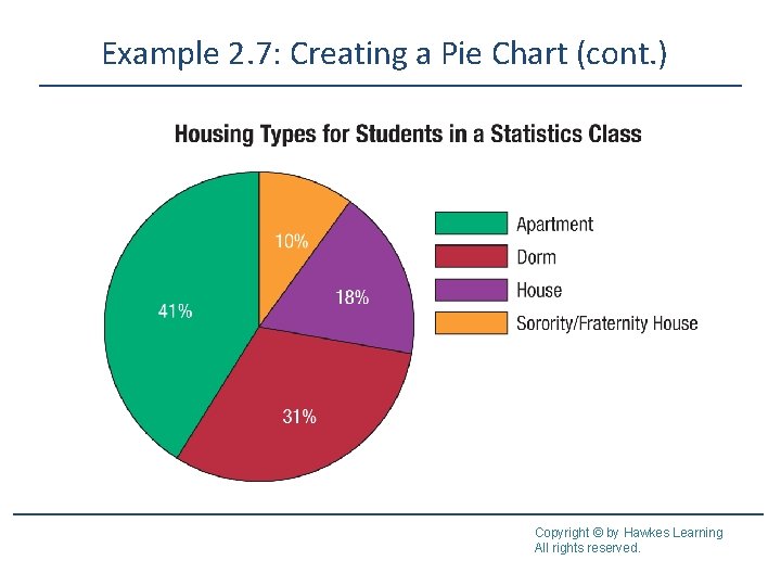
Pie Charts A pie chart shows how large each category is in relation to the whole. It is used to display qualitative or categorical data. A pie chart uses the relative frequencies from the frequency distribution to divide the “pie” into different-sized wedges. The size, or central angle measure, of each wedge in the pie chart is calculated by multiplying 360° by the relative frequency of each class and rounding to the nearest whole degree. Copyright © by Hawkes Learning All rights reserved.

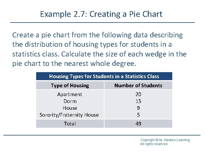
Example 2. 7: Creating a Pie Chart Create a pie chart from the following data describing the distribution of housing types for students in a statistics class. Calculate the size of each wedge in the pie chart to the nearest whole degree. Housing Types for Students in a Statistics Class Type of Housing Number of Students Apartment Dorm House Sorority/Fraternity House 20 15 9 5 Total 49 Copyright © by Hawkes Learning All rights reserved.

Example 2. 7: Creating a Pie Chart (cont. ) Solution Relative Frequencies Central Angle Measures Copyright © by Hawkes Learning All rights reserved.

Example 2. 7: Creating a Pie Chart (cont. ) Copyright © by Hawkes Learning All rights reserved.

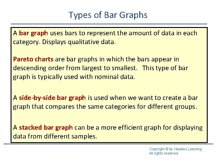
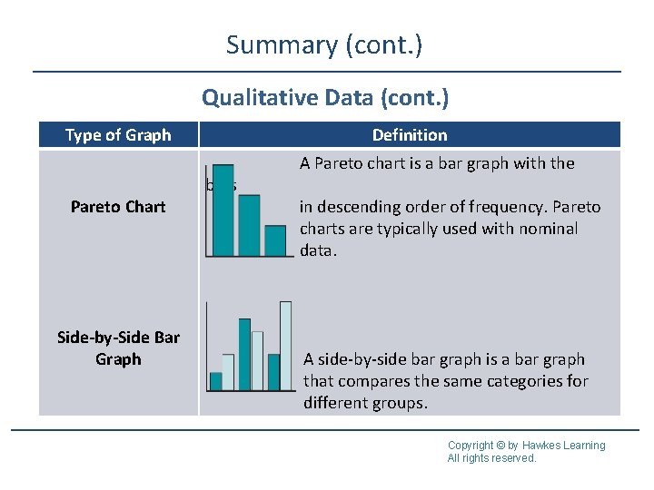
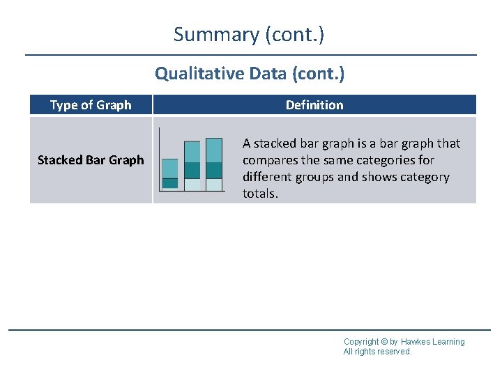
Types of Bar Graphs A bar graph uses bars to represent the amount of data in each category. Displays qualitative data. Pareto charts are bar graphs in which the bars appear in descending order from largest to smallest. This type of bar graph is typically used with nominal data. A side-by-side bar graph is used when we want to create a bar graph that compares the same categories for different groups. A stacked bar graph can be a more efficient graph for displaying data from different samples. Copyright © by Hawkes Learning All rights reserved.

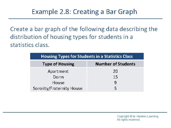
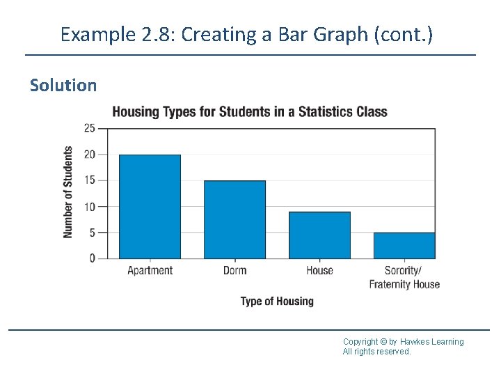
Example 2. 8: Creating a Bar Graph Create a bar graph of the following data describing the distribution of housing types for students in a statistics class. Housing Types for Students in a Statistics Class Type of Housing Number of Students Apartment Dorm House Sorority/Fraternity House 20 15 9 5 Copyright © by Hawkes Learning All rights reserved.

Example 2. 8: Creating a Bar Graph (cont. ) Solution Copyright © by Hawkes Learning All rights reserved.

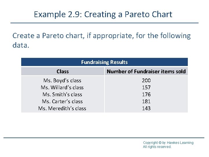
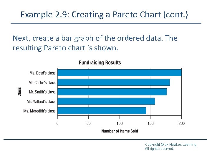
Example 2. 9: Creating a Pareto Chart Create a Pareto chart, if appropriate, for the following data. Fundraising Results Class Number of Fundraiser items sold Ms. Boyd’s class Ms. Willard’s class Ms. Smith’s class Ms. Carter’s class Ms. Meredith’s class 200 157 176 181 143 Copyright © by Hawkes Learning All rights reserved.

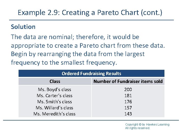
Example 2. 9: Creating a Pareto Chart (cont. ) Solution The data are nominal; therefore, it would be appropriate to create a Pareto chart from these data. Begin by rearranging the data from the largest frequency to the smallest frequency. Ordered Fundraising Results Class Number of Fundraiser items sold Ms. Boyd’s class Ms. Carter’s class Ms. Smith’s class Ms. Willard’s class Ms. Meredith’s class 200 181 176 157 143 Copyright © by Hawkes Learning All rights reserved.

Example 2. 9: Creating a Pareto Chart (cont. ) Next, create a bar graph of the ordered data. The resulting Pareto chart is shown. Copyright © by Hawkes Learning All rights reserved.

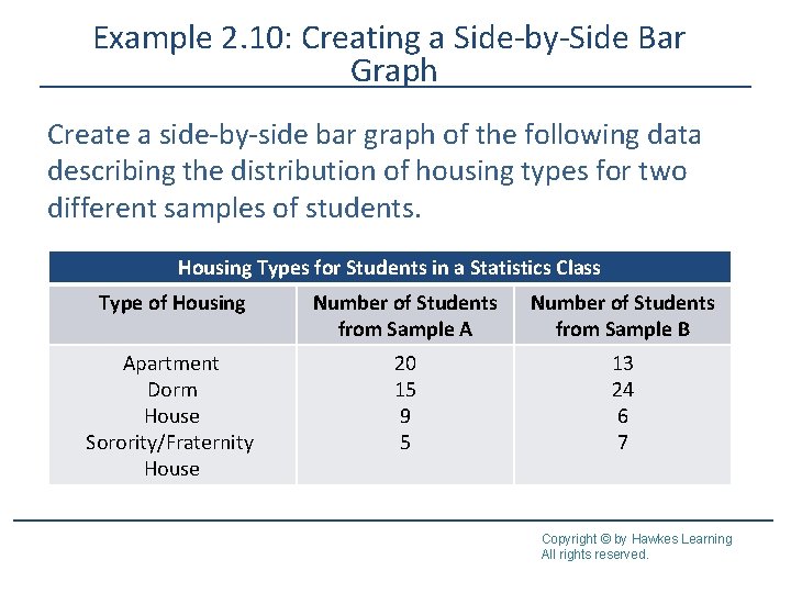
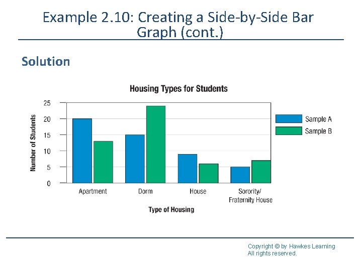
Example 2. 10: Creating a Side-by-Side Bar Graph Create a side-by-side bar graph of the following data describing the distribution of housing types for two different samples of students. Housing Types for Students in a Statistics Class Type of Housing Number of Students from Sample A Number of Students from Sample B Apartment Dorm House Sorority/Fraternity House 20 15 9 5 13 24 6 7 Copyright © by Hawkes Learning All rights reserved.

Example 2. 10: Creating a Side-by-Side Bar Graph (cont. ) Solution Copyright © by Hawkes Learning All rights reserved.

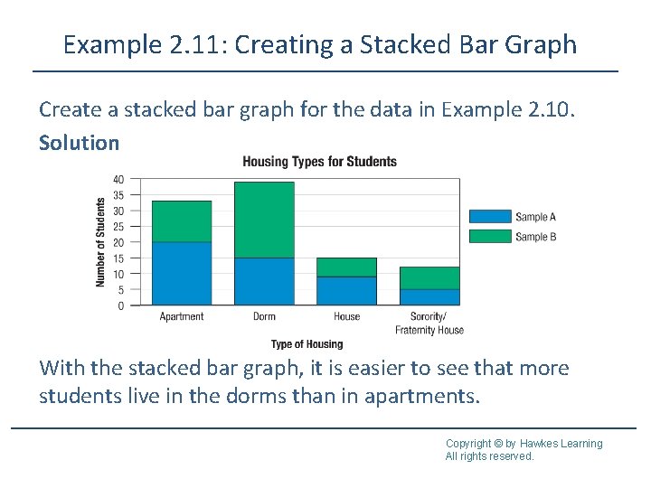
Example 2. 11: Creating a Stacked Bar Graph Create a stacked bar graph for the data in Example 2. 10. Solution With the stacked bar graph, it is easier to see that more students live in the dorms than in apartments. Copyright © by Hawkes Learning All rights reserved.

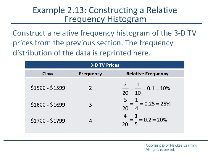
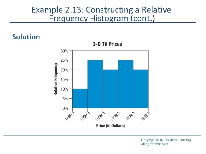
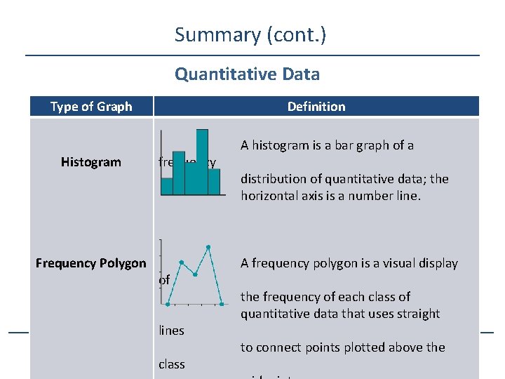
Histograms A frequency histogram, shortened to histogram, is a bar graph of a frequency distribution of quantitative data. A relative frequency histogram is a histogram in which the heights of the bars represent the relative frequencies of each class rather than simply the frequencies. Copyright © by Hawkes Learning All rights reserved.

Characteristics of Histograms • A bar graph of a frequency distribution. • The horizontal axis is a real number line. • The width of the bars represent the class width from the frequency table and should be uniform. • The bars in a histogram should touch. • The height of each bar represents the frequency of the class it represents. Copyright © by Hawkes Learning All rights reserved.

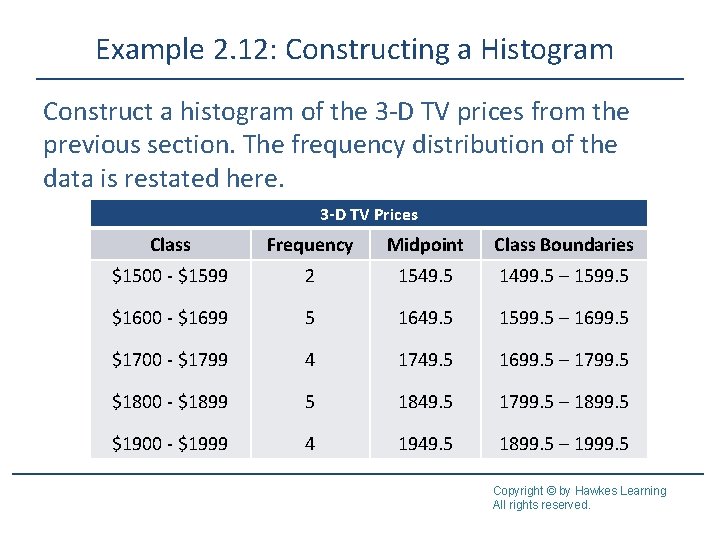
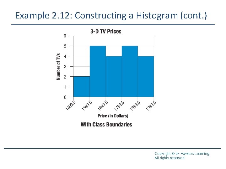
Example 2. 12: Constructing a Histogram Construct a histogram of the 3 -D TV prices from the previous section. The frequency distribution of the data is restated here. 3 -D TV Prices Class Frequency Midpoint Class Boundaries $1500 - $1599 2 1549. 5 1499. 5 – 1599. 5 $1600 - $1699 5 1649. 5 1599. 5 – 1699. 5 $1700 - $1799 4 1749. 5 1699. 5 – 1799. 5 $1800 - $1899 5 1849. 5 1799. 5 – 1899. 5 $1900 - $1999 4 1949. 5 1899. 5 – 1999. 5 Copyright © by Hawkes Learning All rights reserved.

Example 2. 12: Constructing a Histogram (cont. ) Solution Copyright © by Hawkes Learning All rights reserved.

Example 2. 12: Constructing a Histogram (cont. ) Copyright © by Hawkes Learning All rights reserved.

Example 2. 13: Constructing a Relative Frequency Histogram Construct a relative frequency histogram of the 3 -D TV prices from the previous section. The frequency distribution of the data is reprinted here. 3 -D TV Prices Class Frequency $1500 - $1599 2 $1600 - $1699 5 $1700 - $1799 4 Relative Frequency Copyright © by Hawkes Learning All rights reserved.

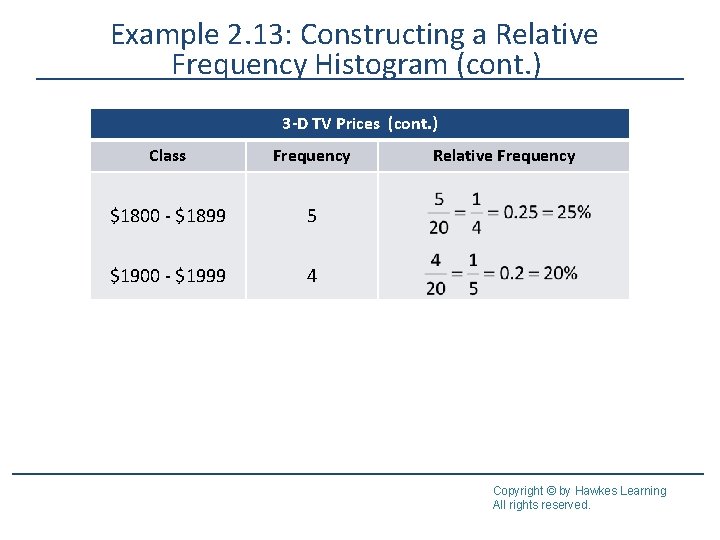
Example 2. 13: Constructing a Relative Frequency Histogram (cont. ) 3 -D TV Prices (cont. ) Class Frequency $1800 - $1899 5 $1900 - $1999 4 Relative Frequency Copyright © by Hawkes Learning All rights reserved.

Example 2. 13: Constructing a Relative Frequency Histogram (cont. ) Solution Copyright © by Hawkes Learning All rights reserved.

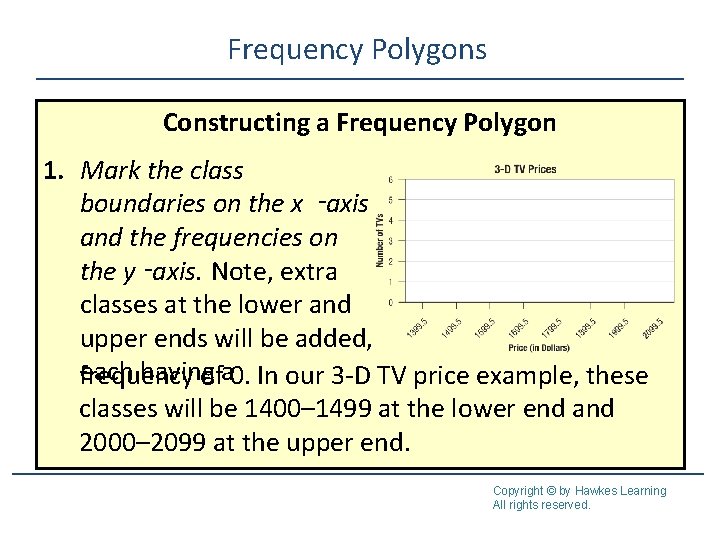
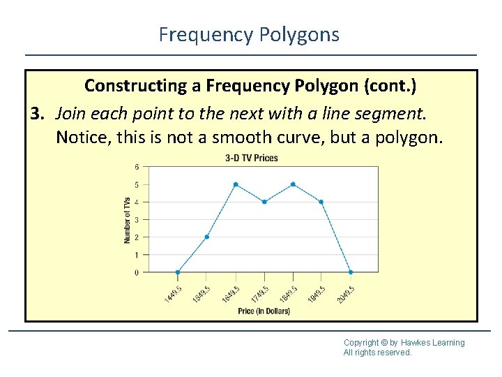
Frequency Polygons A frequency polygon is a visual display created by plotting a point at the frequency of each class above each class midpoint and connecting the points using straight lines. Copyright © by Hawkes Learning All rights reserved.

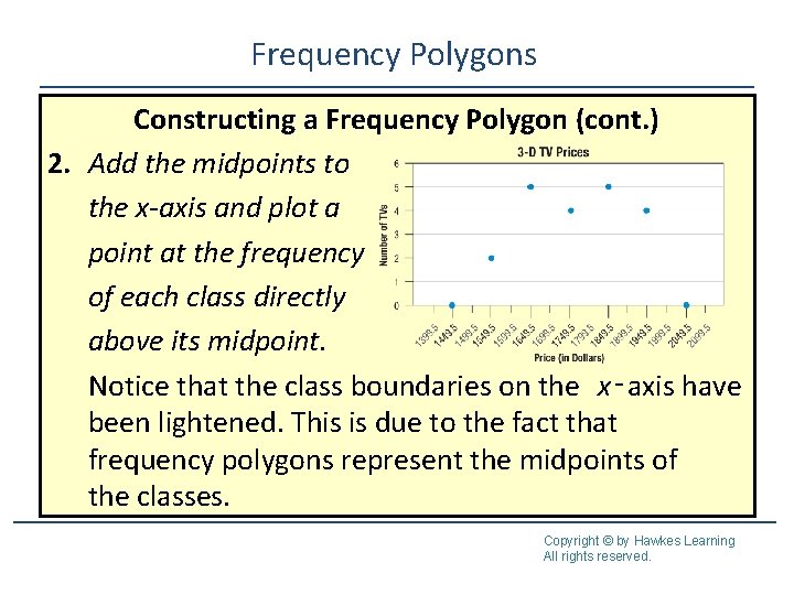
Frequency Polygons Constructing a Frequency Polygon 1. Mark the class boundaries on the x ‑axis and the frequencies on the y ‑axis. Note, extra classes at the lower and upper ends will be added, each having frequency ofa 0. In our 3 -D TV price example, these classes will be 1400– 1499 at the lower end and 2000– 2099 at the upper end. Copyright © by Hawkes Learning All rights reserved.

Frequency Polygons Constructing a Frequency Polygon (cont. ) 2. Add the midpoints to the x-axis and plot a point at the frequency of each class directly above its midpoint. Notice that the class boundaries on the x‑axis have been lightened. This is due to the fact that frequency polygons represent the midpoints of the classes. Copyright © by Hawkes Learning All rights reserved.

Frequency Polygons Constructing a Frequency Polygon (cont. ) 3. Join each point to the next with a line segment. Notice, this is not a smooth curve, but a polygon. Copyright © by Hawkes Learning All rights reserved.

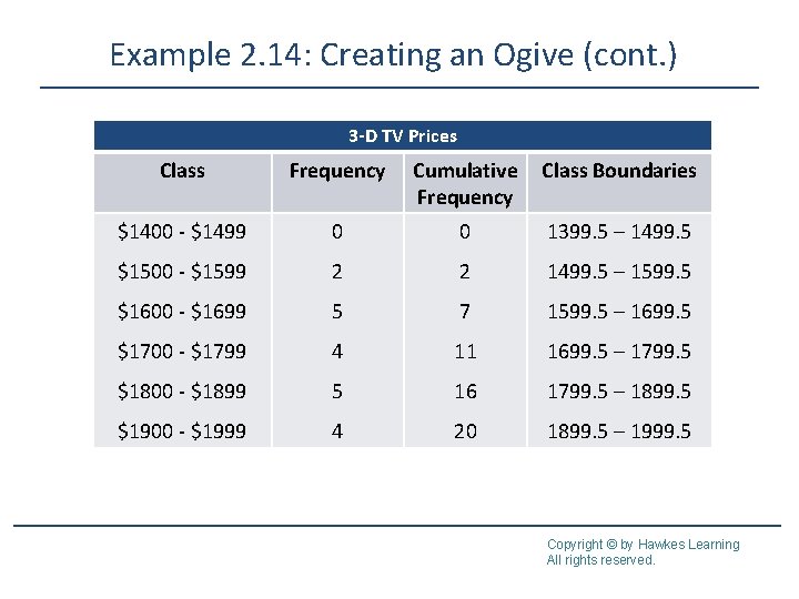
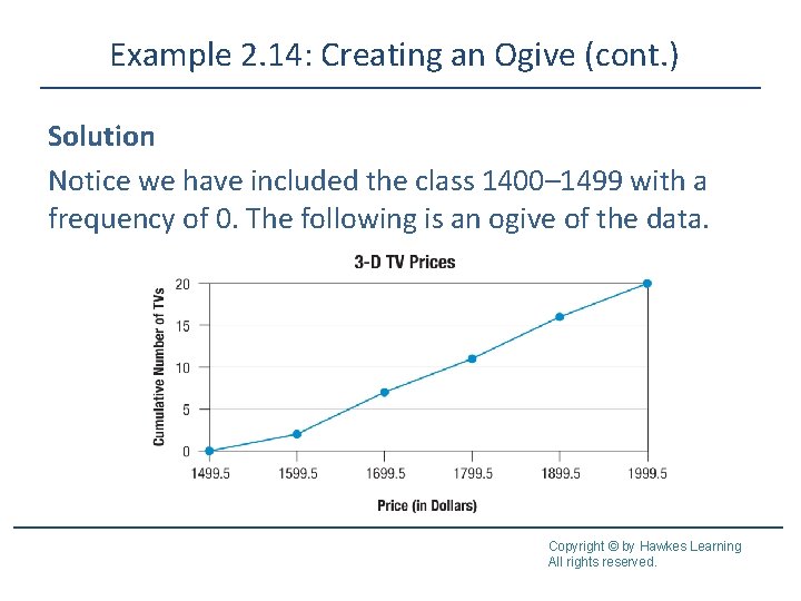
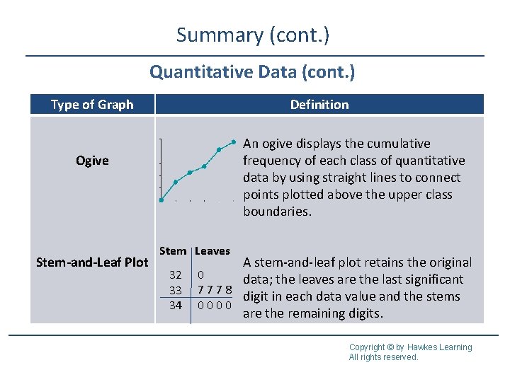
Ogive An ogive (pronounced “oh-jive”) is a line graph which depicts the cumulative frequency of each class from a frequency table. To create an ogive, begin by tabulating the cumulative frequency for each class. Unlike when creating a frequency polygon, we only include an extra class at the lower end for this graph, giving it a frequency of 0. Next, plot a point at the cumulative frequency for each class directly above its upper class boundary. The ogive is created by joining the points together with line segments. Copyright © by Hawkes Learning All rights reserved.

Example 2. 14: Creating an Ogive Below is the frequency distribution of the 3 -D TV prices with the cumulative frequency column included. Create an ogive of the data. Copyright © by Hawkes Learning All rights reserved.

Example 2. 14: Creating an Ogive (cont. ) 3 -D TV Prices Class Frequency Cumulative Frequency Class Boundaries $1400 - $1499 0 0 1399. 5 – 1499. 5 $1500 - $1599 2 2 1499. 5 – 1599. 5 $1600 - $1699 5 7 1599. 5 – 1699. 5 $1700 - $1799 4 11 1699. 5 – 1799. 5 $1800 - $1899 5 16 1799. 5 – 1899. 5 $1900 - $1999 4 20 1899. 5 – 1999. 5 Copyright © by Hawkes Learning All rights reserved.

Example 2. 14: Creating an Ogive (cont. ) Solution Notice we have included the class 1400– 1499 with a frequency of 0. The following is an ogive of the data. Copyright © by Hawkes Learning All rights reserved.

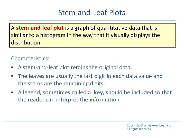
Stem-and-Leaf Plots A stem-and-leaf plot is a graph of quantitative data that is similar to a histogram in the way that it visually displays the distribution. Characteristics: • A stem-and-leaf plot retains the original data. • The leaves are usually the last digit in each data value and the stems are the remaining digits. • A legend, sometimes called a key, should be included so that the reader can interpret the information. Copyright © by Hawkes Learning All rights reserved.

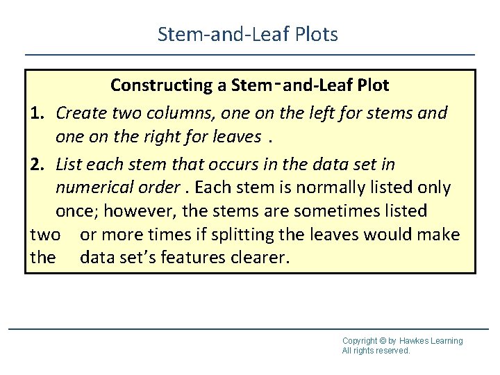
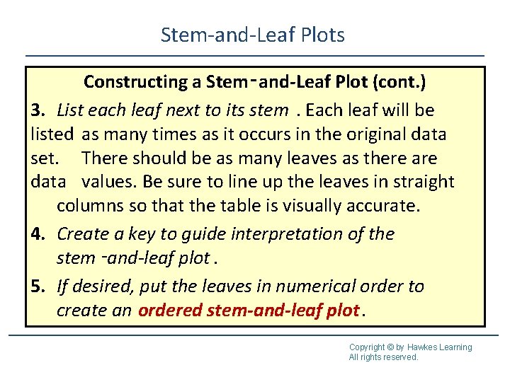
Stem-and-Leaf Plots Constructing a Stem‑and-Leaf Plot 1. Create two columns, one on the left for stems and one on the right for leaves. 2. List each stem that occurs in the data set in numerical order. Each stem is normally listed only once; however, the stems are sometimes listed two or more times if splitting the leaves would make the data set’s features clearer. Copyright © by Hawkes Learning All rights reserved.

Stem-and-Leaf Plots Constructing a Stem‑and-Leaf Plot (cont. ) 3. List each leaf next to its stem. Each leaf will be listed as many times as it occurs in the original data set. There should be as many leaves as there are data values. Be sure to line up the leaves in straight columns so that the table is visually accurate. 4. Create a key to guide interpretation of the stem ‑and-leaf plot. 5. If desired, put the leaves in numerical order to create an ordered stem-and-leaf plot. Copyright © by Hawkes Learning All rights reserved.

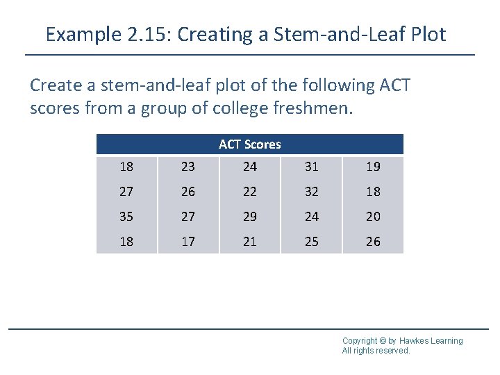
Example 2. 15: Creating a Stem-and-Leaf Plot Create a stem-and-leaf plot of the following ACT scores from a group of college freshmen. ACT Scores 18 23 24 31 19 27 26 22 32 18 35 27 29 24 20 18 17 21 25 26 Copyright © by Hawkes Learning All rights reserved.

Example 2. 15: Creating a Stem-and-Leaf Plot (cont. ) Solution ACT Scores Stem 1 2 3 Leaves 8 9 8 8 7 3 4 7 6 2 7 9 4 0 1 5 6 1 2 5 Key: 1|8 = 18 Copyright © by Hawkes Learning All rights reserved.

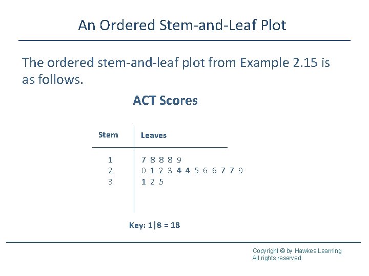
An Ordered Stem-and-Leaf Plot The ordered stem-and-leaf plot from Example 2. 15 is as follows. ACT Scores Stem 1 2 3 Leaves 7 8 8 8 9 0 1 2 3 4 4 5 6 6 7 7 9 1 2 5 Key: 1|8 = 18 Copyright © by Hawkes Learning All rights reserved.

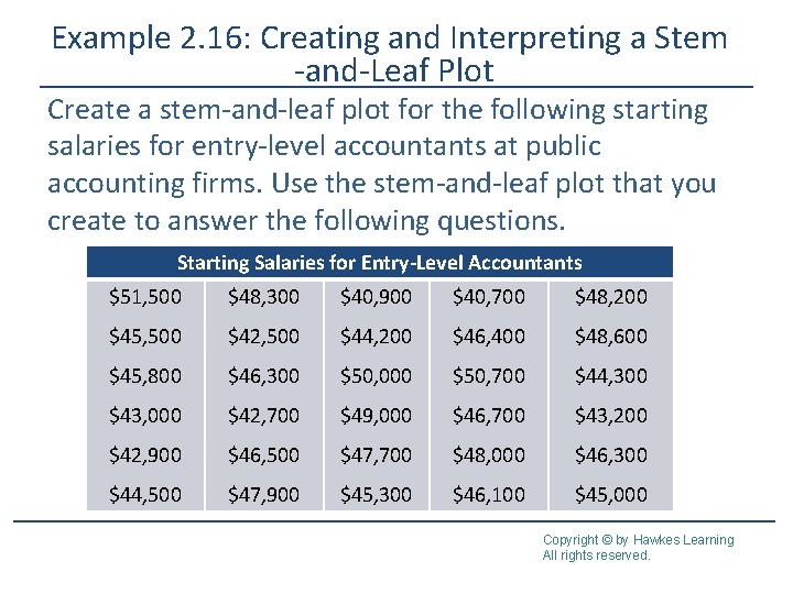
Example 2. 16: Creating and Interpreting a Stem -and-Leaf Plot Create a stem-and-leaf plot for the following starting salaries for entry-level accountants at public accounting firms. Use the stem-and-leaf plot that you create to answer the following questions. Starting Salaries for Entry-Level Accountants $51, 500 $48, 300 $40, 900 $40, 700 $48, 200 $45, 500 $42, 500 $44, 200 $46, 400 $48, 600 $45, 800 $46, 300 $50, 000 $50, 700 $44, 300 $43, 000 $42, 700 $49, 000 $46, 700 $43, 200 $42, 900 $46, 500 $47, 700 $48, 000 $46, 300 $44, 500 $47, 900 $45, 300 $46, 100 $45, 000 Copyright © by Hawkes Learning All rights reserved.

Example 2. 16: Creating and Interpreting a Stem -and-Leaf Plot (cont. ) a. What were the smallest and largest salaries recorded? b. Which salary appears the most often? c. How many salaries were in the range $41, 000– $41, 900? d. In which salary range did the most salaries lie: $40, 000–$44, 900, $45, 000–$49, 900, or $50, 000 and above? Copyright © by Hawkes Learning All rights reserved.

Example 2. 16: Creating and Interpreting a Stem -and-Leaf Plot (cont. ) Solution This example is different than Example 2. 15 in that the data have more than two digits and every data value ends in two zeros. It is important to choose the stems of the numbers so that the last significant digit in each data point will be the leaf in the chart Copyright © by Hawkes Learning All rights reserved.

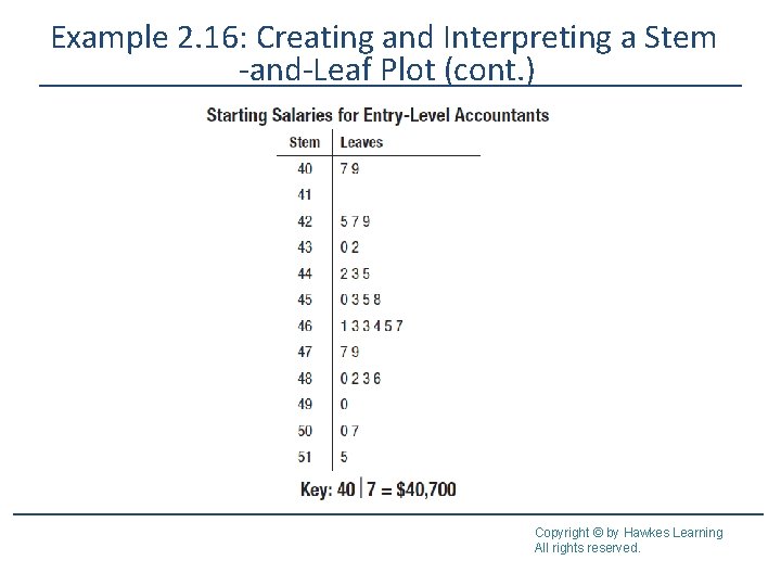
Example 2. 16: Creating and Interpreting a Stem -and-Leaf Plot (cont. ) Listing the zeros as the leaves for each different stem would be of little use to anyone interpreting the stemand-leaf plot. Instead, the key will denote that the salaries listed are in hundreds. Using the first two digits of each salary as a stem, we have the following plot. (Note: It is helpful to first list the salaries in numerical order. ) Copyright © by Hawkes Learning All rights reserved.

Example 2. 16: Creating and Interpreting a Stem -and-Leaf Plot (cont. ) Copyright © by Hawkes Learning All rights reserved.

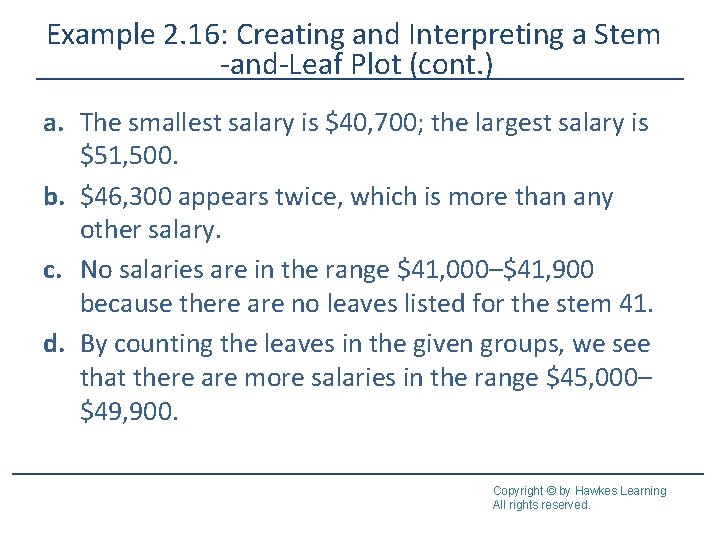
Example 2. 16: Creating and Interpreting a Stem -and-Leaf Plot (cont. ) a. The smallest salary is $40, 700; the largest salary is $51, 500. b. $46, 300 appears twice, which is more than any other salary. c. No salaries are in the range $41, 000–$41, 900 because there are no leaves listed for the stem 41. d. By counting the leaves in the given groups, we see that there are more salaries in the range $45, 000– $49, 900. Copyright © by Hawkes Learning All rights reserved.

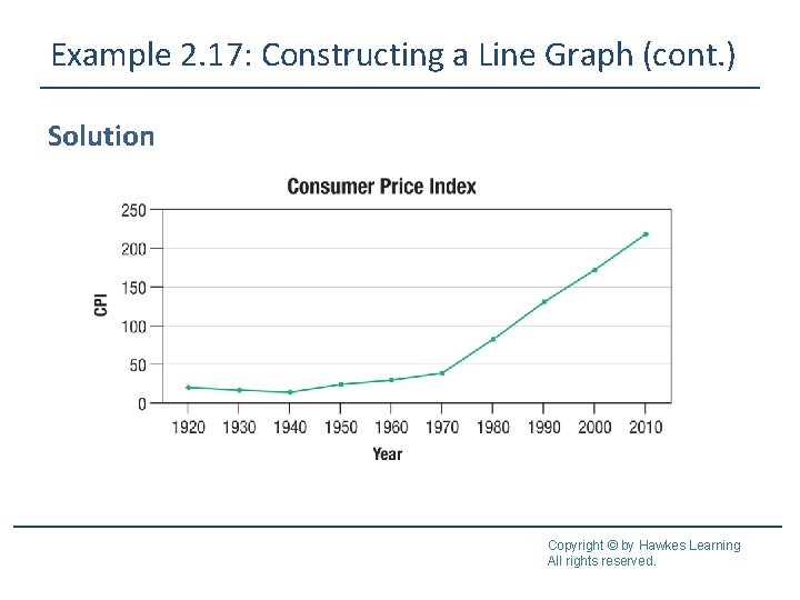
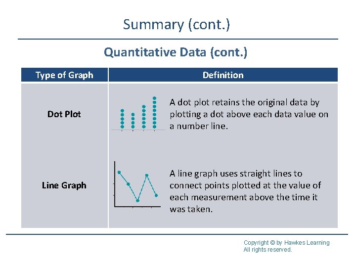
Dot Plots and Line Graphs A dot plot is similar to a stem-and-leaf plot because it retains the original data, however instead of grouping certain points together, the data that are exactly the same appear together. A line graph is used when data are measurements over time. The horizontal axis represents time. The vertical axis represents the variable being measured. Straight lines are used to connect points plotted at the value of each measurement above the time it was taken. Copyright © by Hawkes Learning All rights reserved.

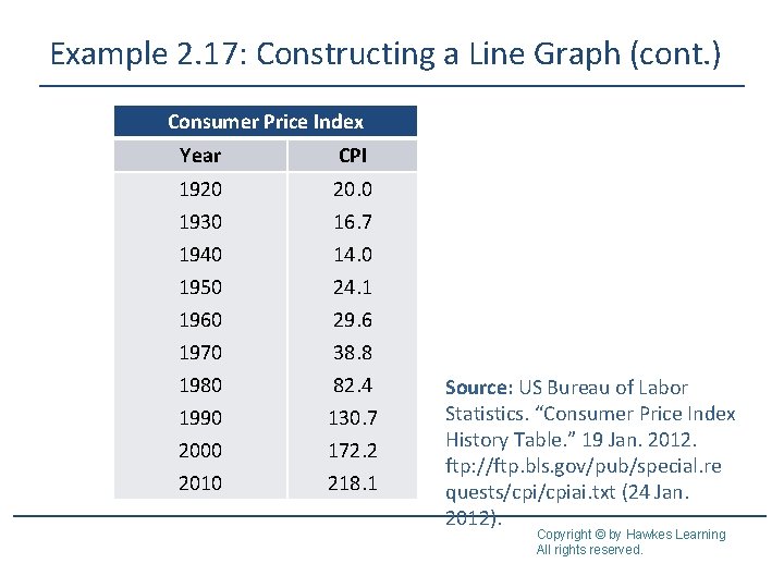
Example 2. 17: Constructing a Line Graph The Consumer Price Index (CPI) is a measure of the average change in value over time for a basket of goods and services. It is an index calculated by the US Bureau of Labor and Statistics. The table below shows the values of the CPI from several years. Construct a line graph of these data. Copyright © by Hawkes Learning All rights reserved.

Example 2. 17: Constructing a Line Graph (cont. ) Consumer Price Index Year CPI 1920 20. 0 1930 1940 1950 1960 1970 1980 1990 2000 2010 16. 7 14. 0 24. 1 29. 6 38. 8 82. 4 130. 7 172. 2 218. 1 Source: US Bureau of Labor Statistics. “Consumer Price Index History Table. ” 19 Jan. 2012. ftp: //ftp. bls. gov/pub/special. re quests/cpiai. txt (24 Jan. 2012). Copyright © by Hawkes Learning All rights reserved.

Example 2. 17: Constructing a Line Graph (cont. ) Solution Copyright © by Hawkes Learning All rights reserved.

Summary Qualitative Data Type of Graph Pie Chart Bar Graph Definition category A pie chart shows how large each is in relation to the whole; that is, it uses the relative frequencies from the frequency distribution to divide the “pie” into different-sized wedges. It can only be used to display qualitative data. In a bar graph, bars are used to represent the amount of data in each category; one axis displays the categories of qualitative data and the other axis displays the frequencies. Copyright © by Hawkes Learning All rights reserved.

Summary (cont. ) Qualitative Data (cont. ) Type of Graph Pareto Chart Side-by-Side Bar Graph Definition bars A Pareto chart is a bar graph with the in descending order of frequency. Pareto charts are typically used with nominal data. A side-by-side bar graph is a bar graph that compares the same categories for different groups. Copyright © by Hawkes Learning All rights reserved.

Summary (cont. ) Qualitative Data (cont. ) Type of Graph Stacked Bar Graph Definition A stacked bar graph is a bar graph that compares the same categories for different groups and shows category totals. Copyright © by Hawkes Learning All rights reserved.

Summary (cont. ) Quantitative Data Type of Graph Histogram Frequency Polygon Definition frequency of lines class A histogram is a bar graph of a distribution of quantitative data; the horizontal axis is a number line. A frequency polygon is a visual display the frequency of each class of quantitative data that uses straight Copyright © by Hawkes Learning to connect points plotted above the All rights reserved.

Summary (cont. ) Quantitative Data (cont. ) Type of Graph Definition An ogive displays the cumulative frequency of each class of quantitative data by using straight lines to connect points plotted above the upper class boundaries. Ogive Stem-and-Leaf Plot Stem Leaves 32 33 34 A stem-and-leaf plot retains the original 0 data; the leaves are the last significant 7778 digit in each data value and the stems 0000 are the remaining digits. Copyright © by Hawkes Learning All rights reserved.

Summary (cont. ) Quantitative Data (cont. ) Type of Graph Dot Plot Line Graph Definition A dot plot retains the original data by plotting a dot above each data value on a number line. A line graph uses straight lines to connect points plotted at the value of each measurement above the time it was taken. Copyright © by Hawkes Learning All rights reserved.