Section 2 2 Fitting Lines to Data Points
- Slides: 24

Section 2. 2 Fitting Lines to Data Points: Modeling Linear Functions Copyright © 2017, 2013, 2010 Pearson Education, Inc.

Objectives § Find exact § Determine linear models for data if a set of data can be modeled exactly or approximately § Create scatter plots for sets of data (TI 83/84) § Find the best fit linear models for data (TI 83/84) § Determine if a linear model is a “good” fit for data (TI 83/84) § *Find SSE and average error of the best fit linear model (TI 83/84) § Use the best fit linear model to make predictions (TI 83/84) § Identify the type of a prediction (interpolation vs extrapolation) and understand which is more accurate § Solve problems using linear models (TI 83/84) * not on the textbook but required (look for handouts) Copyright © 2017, 2013, 2010 Pearson Education, Inc. 2

Exact and Approximate Linear Models If the first differences of data outputs are constant for uniform inputs, the rate of change is constant and a linear function can be found that fits the data exactly. • If the first differences are “nearly constant, ” a linear function can be found that is an approximate fit for the data. • Copyright © 2017, 2013, 2010 Pearson Education, Inc. 3

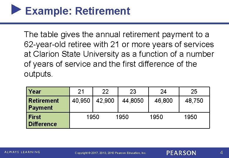
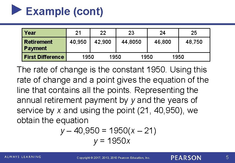
Example: Retirement The table gives the annual retirement payment to a 62 -year-old retiree with 21 or more years of services at Clarion State University as a function of a number of years of service and the first difference of the outputs. Year Retirement Payment First Difference 21 22 23 24 25 40, 950 42, 900 44, 8050 46, 800 48, 750 1950 Copyright © 2017, 2013, 2010 Pearson Education, Inc. 1950 4

Example (cont) Year Retirement Payment First Difference 21 22 23 24 25 40, 950 42, 900 44, 8050 46, 800 48, 750 1950 The rate of change is the constant 1950. Using this rate of change and a point gives the equation of the line that contains all the points. Representing the annual retirement payment by y and the years of service by x and using the point (21, 40, 950), we obtain the equation y – 40, 950 = 1950(x – 21) y = 1950 x Copyright © 2017, 2013, 2010 Pearson Education, Inc. 5

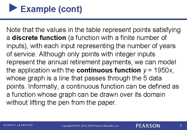
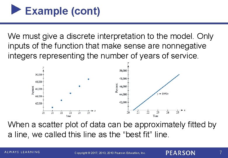
Example (cont) Note that the values in the table represent points satisfying a discrete function (a function with a finite number of inputs), with each input representing the number of years of service. Although only points with integer inputs represent the annual retirement payments, we can model the application with the continuous function y = 1950 x, whose graph is a line that passes through the 5 data points. Informally, a continuous function can be defined as a function whose graph can be drawn over its domain without lifting the pen from the paper. Copyright © 2017, 2013, 2010 Pearson Education, Inc. 6

Example (cont) We must give a discrete interpretation to the model. Only inputs of the function that make sense are nonnegative integers representing the number of years of service. When a scatter plot of data can be approximately fitted by a line, we called this line as the “best fit” line. Copyright © 2017, 2013, 2010 Pearson Education, Inc. 7

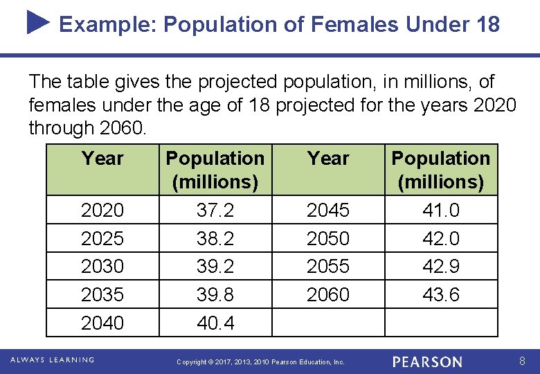
Example: Population of Females Under 18 The table gives the projected population, in millions, of females under the age of 18 projected for the years 2020 through 2060. Year 2020 2025 2030 2035 2040 Population (millions) 37. 2 38. 2 39. 8 40. 4 Year 2045 2050 2055 2060 Copyright © 2017, 2013, 2010 Pearson Education, Inc. Population (millions) 41. 0 42. 9 43. 6 8

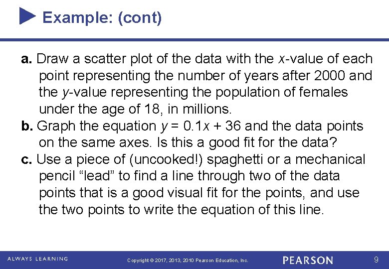
Example: (cont) a. Draw a scatter plot of the data with the x-value of each point representing the number of years after 2000 and the y-value representing the population of females under the age of 18, in millions. b. Graph the equation y = 0. 1 x + 36 and the data points on the same axes. Is this a good fit for the data? c. Use a piece of (uncooked!) spaghetti or a mechanical pencil “lead” to find a line through two of the data points that is a good visual fit for the points, and use the two points to write the equation of this line. Copyright © 2017, 2013, 2010 Pearson Education, Inc. 9

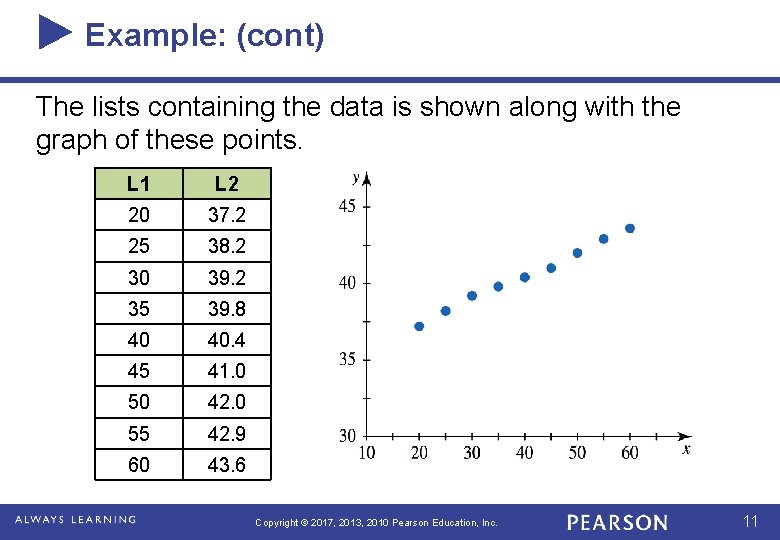
Example: (cont) Solution: a. By using x as the number of years after 2000, we have aligned the data with x = 0 representing 2000, with x = 20 representing 2020, and so forth. In the lists of a graphing calculator (or columns of an Excel spreadsheet), we enter the aligned input data representing the years in the table and the output data representing the population of females under the age of 18 (in millions). Copyright © 2017, 2013, 2010 Pearson Education, Inc. 10

Example: (cont) The lists containing the data is shown along with the graph of these points. L 1 L 2 20 37. 2 25 38. 2 30 39. 2 35 39. 8 40 40. 4 45 41. 0 50 42. 0 55 42. 9 60 43. 6 Copyright © 2017, 2013, 2010 Pearson Education, Inc. 11

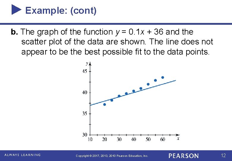
Example: (cont) b. The graph of the function y = 0. 1 x + 36 and the scatter plot of the data are shown. The line does not appear to be the best possible fit to the data points. Copyright © 2017, 2013, 2010 Pearson Education, Inc. 12

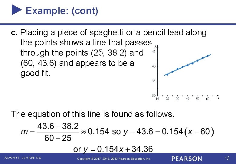
Example: (cont) c. Placing a piece of spaghetti or a pencil lead along the points shows a line that passes through the points (25, 38. 2) and (60, 43. 6) and appears to be a good fit. The equation of this line is found as follows. Copyright © 2017, 2013, 2010 Pearson Education, Inc. 13

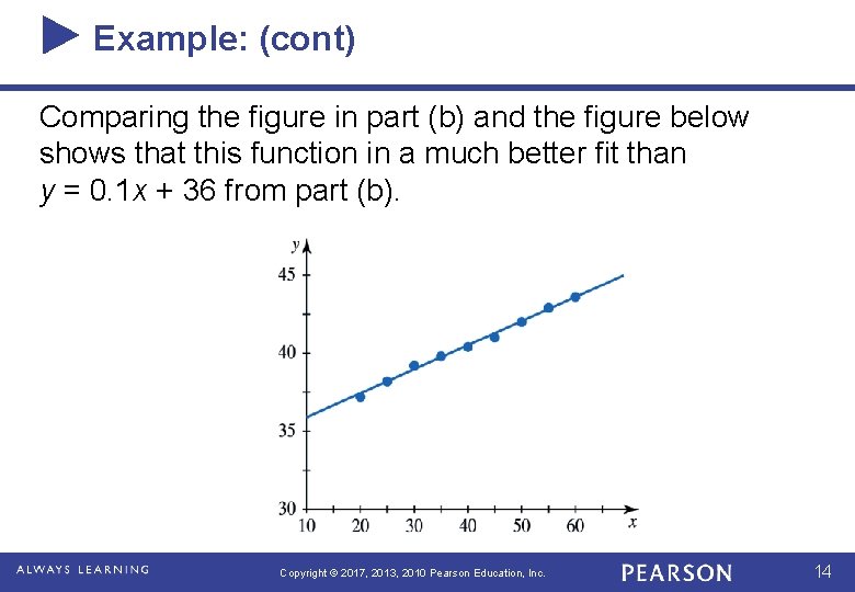
Example: (cont) Comparing the figure in part (b) and the figure below shows that this function in a much better fit than y = 0. 1 x + 36 from part (b). Copyright © 2017, 2013, 2010 Pearson Education, Inc. 14

Fitting Lines to Data Points: Linear Regression A procedure that defines the best-fit line as the line for which the sum of the squares of the vertical distances from the data points to the line is a minimum. Copyright © 2017, 2013, 2010 Pearson Education, Inc. 15

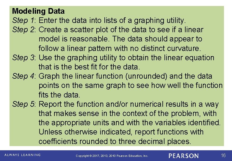
Modeling Data Step 1: Enter the data into lists of a graphing utility. Step 2: Create a scatter plot of the data to see if a linear model is reasonable. The data should appear to follow a linear pattern with no distinct curvature. Step 3: Use the graphing utility to obtain the linear equation that is the best fit for the data. Step 4: Graph the linear function (unrounded) and the data points on the same graph to see how well the function fits the data. Step 5: Report the function and/or numerical results in a way that makes sense in the context of the problem, with the appropriate units and with the variables identified. Unless otherwise indicated, report functions with coefficients rounded to three decimal places. Copyright © 2017, 2013, 2010 Pearson Education, Inc. 16

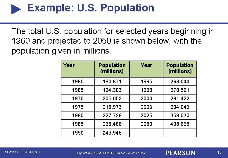
Example: U. S. Population The total U. S. population for selected years beginning in 1960 and projected to 2050 is shown below, with the population given in millions. Year Population (millions) 1960 180. 671 1995 263. 044 1965 194. 303 1998 270. 561 1970 205. 052 2000 281. 422 1975 215. 973 2003 294. 043 1980 227. 726 2025 358. 030 1985 238. 466 2050 408. 695 1990 249. 948 Copyright © 2017, 2013, 2010 Pearson Education, Inc. 17

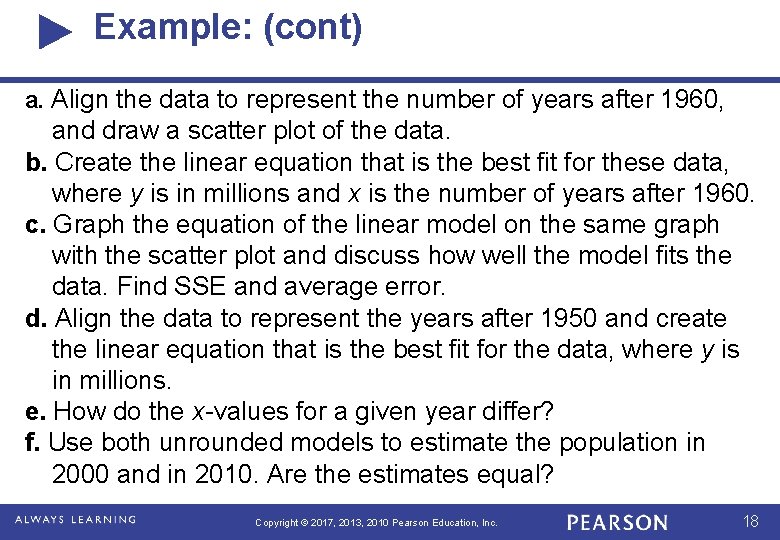
Example: (cont) a. Align the data to represent the number of years after 1960, and draw a scatter plot of the data. b. Create the linear equation that is the best fit for these data, where y is in millions and x is the number of years after 1960. c. Graph the equation of the linear model on the same graph with the scatter plot and discuss how well the model fits the data. Find SSE and average error. d. Align the data to represent the years after 1950 and create the linear equation that is the best fit for the data, where y is in millions. e. How do the x-values for a given year differ? f. Use both unrounded models to estimate the population in 2000 and in 2010. Are the estimates equal? Copyright © 2017, 2013, 2010 Pearson Education, Inc. 18

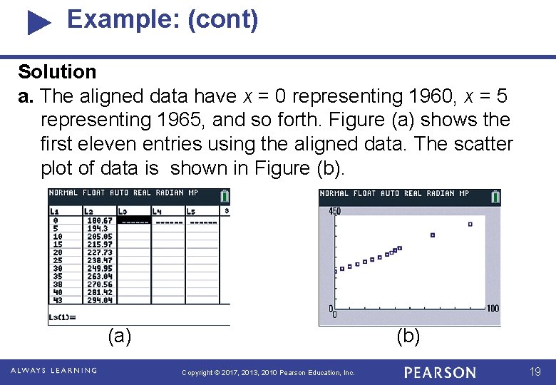
Example: (cont) Solution a. The aligned data have x = 0 representing 1960, x = 5 representing 1965, and so forth. Figure (a) shows the first eleven entries using the aligned data. The scatter plot of data is shown in Figure (b). (a) (b) Copyright © 2017, 2013, 2010 Pearson Education, Inc. 19

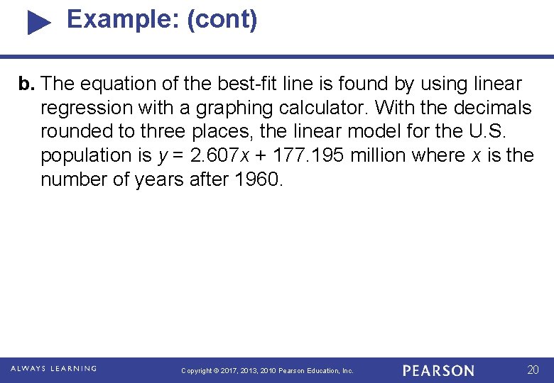
Example: (cont) b. The equation of the best-fit line is found by using linear regression with a graphing calculator. With the decimals rounded to three places, the linear model for the U. S. population is y = 2. 607 x + 177. 195 million where x is the number of years after 1960. Copyright © 2017, 2013, 2010 Pearson Education, Inc. 20

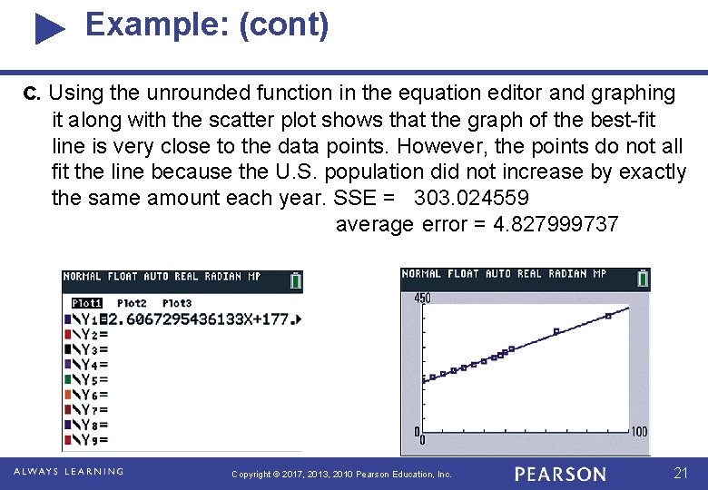
Example: (cont) c. Using the unrounded function in the equation editor and graphing it along with the scatter plot shows that the graph of the best-fit line is very close to the data points. However, the points do not all fit the line because the U. S. population did not increase by exactly the same amount each year. SSE = 303. 024559 average error = 4. 827999737 Copyright © 2017, 2013, 2010 Pearson Education, Inc. 21

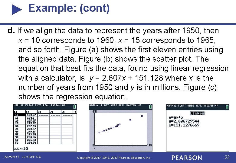
Example: (cont) d. If we align the data to represent the years after 1950, then x = 10 corresponds to 1960, x = 15 corresponds to 1965, and so forth. Figure (a) shows the first eleven entries using the aligned data. Figure (b) shows the scatter plot. The equation that best fits the data, found using linear regression with a calculator, is y = 2. 607 x + 151. 128 where x is the number of years from 1950 and y is in millions. Figure (c) shows the regression equation. Copyright © 2017, 2013, 2010 Pearson Education, Inc. 22

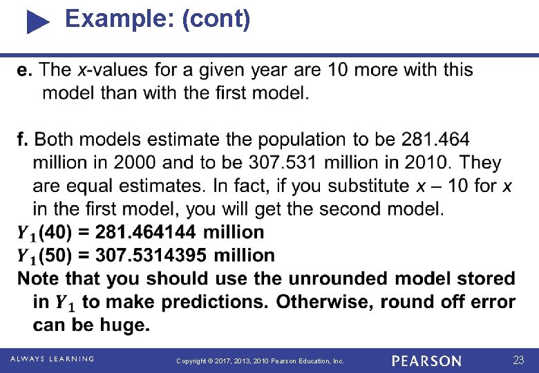
Example: (cont) Copyright © 2017, 2013, 2010 Pearson Education, Inc. 23

Interpolations vs Extrapolations If we use our approximation model to predict the value of the dependent variable for an independent variable that is in the midst of our data, then we are performing interpolation. For example, in the previous example, predicting the population in year 2010 or 2045 is an interpolation since we used the data values between 1960 and 2050 to find the model. If we use our approximation model to predict the value of the dependent variable for an independent variable that is outside the range of our data, then we are performing extrapolation. For example, in the previous example, predicting the population in year 2060 or 1940 is an extrapolation since we used the data values between 1960 and 2050 to find the model. Interpolation is preferred. This is because we have a greater likelihood of obtaining a valid estimate. When we use extrapolation, we are making the assumption that our observed trend continues for values of independent variable outside the range we used to form our model. This may not be the case, and so we must be very careful when using extrapolation techniques. Copyright © 2017, 2013, 2010 Pearson Education, Inc. 24