Screen Based Controls Chapin Brinegar MIT 511 Fall
Screen Based Controls Chapin Brinegar MIT 511, Fall 2011
Agenda What will you learn in this training? 1 Screen Based Controls 2 Required vs. Optional 3 Labels 4 Case Sensitivity 5 Minimizing Entry Chapin Brinegar MIT 511, Fall 2011 6 Proximity 7 8 9 Data Fields 10 Other Tips Multiple Responses Familiarity
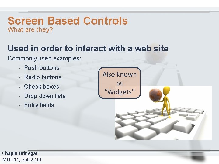
Screen Based Controls What are they? Used in order to interact with a web site Commonly used examples: • Push buttons • Radio buttons • Check boxes • Drop down lists • Entry fields Chapin Brinegar MIT 511, Fall 2011 Also known as “Widgets”
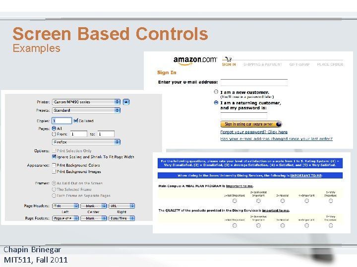
Screen Based Controls Examples Chapin Brinegar MIT 511, Fall 2011
Screen Based Controls Designers should ensure that widgets are used in a conventional manner • Increase performance • Increase accuracy • Decrease time and effort required by user Chapin Brinegar MIT 511, Fall 2011
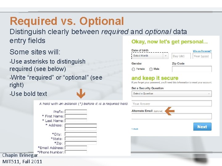
Required vs. Optional Distinguish clearly between required and optional data entry fields Some sites will: • Use asterisks to distinguish required (see below) • Write “required” or “optional” (see right) • Use bold text Chapin Brinegar MIT 511, Fall 2011
Label Buttons Clearly Ensure that a pushbutton’s label indicates its action A label should show what action will be applied when clicked: • • • Update Go Submit Continue Cancel Enter Home Next Previous Chapin Brinegar MIT 511, Fall 2011
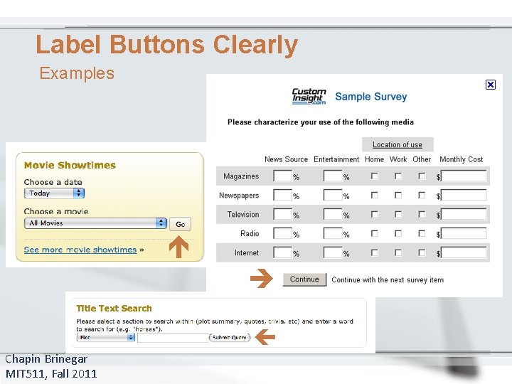
Label Buttons Clearly Examples Chapin Brinegar MIT 511, Fall 2011
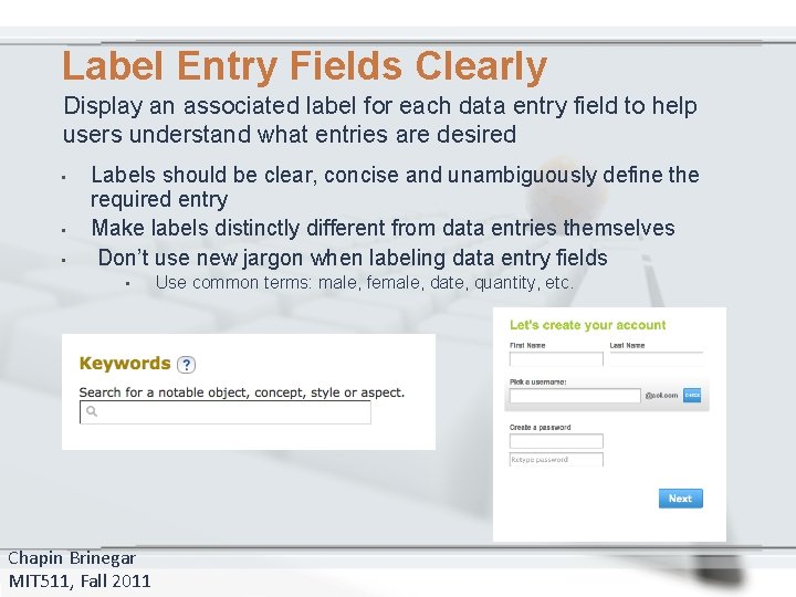
Label Entry Fields Clearly Display an associated label for each data entry field to help users understand what entries are desired • • • Labels should be clear, concise and unambiguously define the required entry Make labels distinctly different from data entries themselves Don’t use new jargon when labeling data entry fields • Chapin Brinegar MIT 511, Fall 2011 Use common terms: male, female, date, quantity, etc.
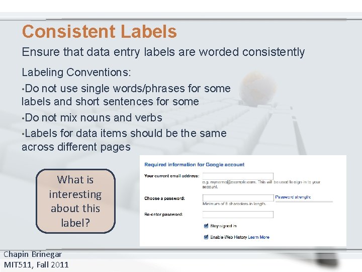
Consistent Labels Ensure that data entry labels are worded consistently Labeling Conventions: • Do not use single words/phrases for some labels and short sentences for some • Do not mix nouns and verbs • Labels for data items should be the same across different pages What is interesting about this label? Chapin Brinegar MIT 511, Fall 2011
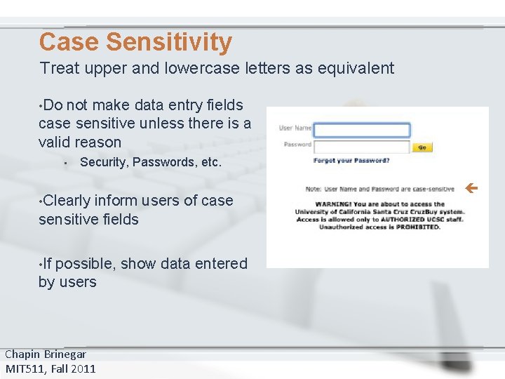
Case Sensitivity Treat upper and lowercase letters as equivalent • Do not make data entry fields case sensitive unless there is a valid reason • Security, Passwords, etc. • Clearly inform users of case sensitive fields • If possible, show data entered by users Chapin Brinegar MIT 511, Fall 2011
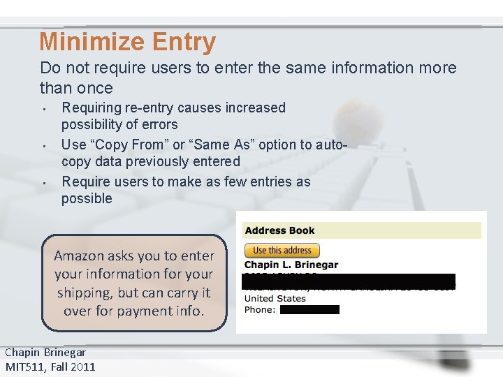
Minimize Entry Do not require users to enter the same information more than once • • • Requiring re-entry causes increased possibility of errors Use “Copy From” or “Same As” option to autocopy data previously entered Require users to make as few entries as possible Amazon asks you to enter your information for your shipping, but can carry it over for payment info. Chapin Brinegar MIT 511, Fall 2011
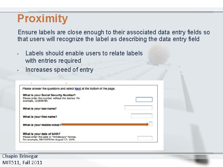
Proximity Ensure labels are close enough to their associated data entry fields so that users will recognize the label as describing the data entry field • • Labels should enable users to relate labels with entries required Increases speed of entry Chapin Brinegar MIT 511, Fall 2011
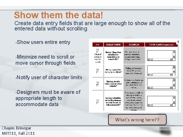
Show them the data! Create data entry fields that are large enough to show all of the entered data without scrolling • Show users entire entry • Minimize need to scroll or move cursor through fields • Notify user of character limits • Designers must be aware of appropriate length to accommodate data What’s wrong here? ? Chapin Brinegar MIT 511, Fall 2011
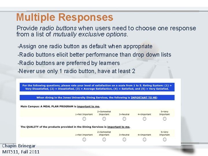
Multiple Responses Provide radio buttons when users need to choose one response from a list of mutually exclusive options. • Assign one radio button as default when appropriate • Radio buttons elicit better performance than drop down lists • Radio buttons are preferred by learners • Never use only 1 radio button, have at least 2 Chapin Brinegar MIT 511, Fall 2011
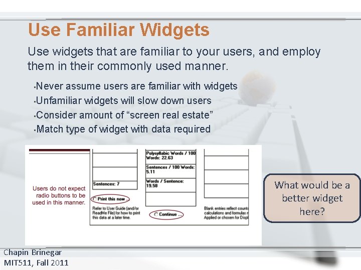
Use Familiar Widgets Use widgets that are familiar to your users, and employ them in their commonly used manner. • Never assume users are familiar with widgets • Unfamiliar widgets will slow down users • Consider amount of “screen real estate” • Match type of widget with data required What would be a better widget here? Chapin Brinegar MIT 511, Fall 2011
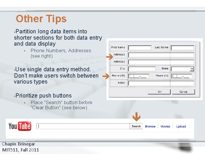
Other Tips long data items into shorter sections for both data entry and data display • Phone Numbers, Addresses (see right) • Use • Prioritize • single data entry method. Don’t make users switch between various types • Partition push buttons Place “Search” button before “Clear Button” (see below) Chapin Brinegar MIT 511, Fall 2011
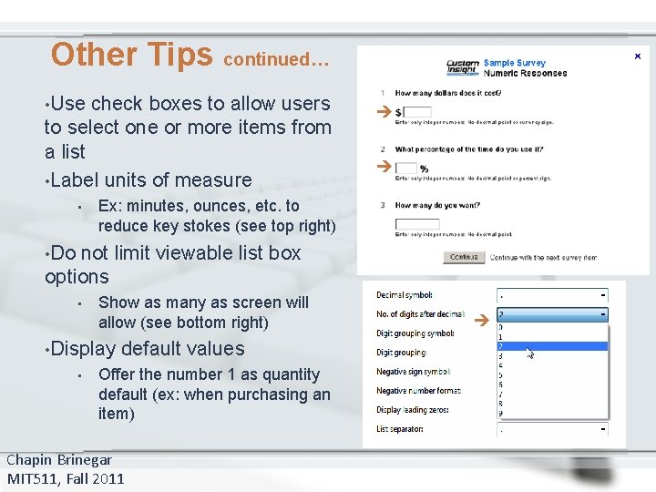
check boxes to allow users to select one or more items from a list • Label units of measure • • Use Other Tips continued… Ex: minutes, ounces, etc. to reduce key stokes (see top right) not limit viewable list box options • Show as many as screen will allow (see bottom right) • Display • default values Offer the number 1 as quantity default (ex: when purchasing an item) Chapin Brinegar MIT 511, Fall 2011 • Do
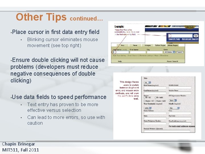
Other Tips continued… • Place • cursor in first data entry field Blinking cursor eliminates mouse movement (see top right) • Ensure double clicking will not cause problems (developers must reduce negative consequences of double clicking) • Use • • data fields to speed performance Text entry has proven to be more effective versus selection Can lead to more errors, so use with caution Chapin Brinegar MIT 511, Fall 2011
Questions? Resources Used: www. usability. gov/pdfs/chapter 13. pdf http: //office. microsoft. com/en-us/images/ www. amazon. com www. campusdining. net www. custominsight. com www. imdb. com www. aol. com www. microsoft. com http: //www. presentermedia. com/ Chapin Brinegar MIT 511, Fall 2011
- Slides: 20