Scientific Poster Design J Douglas Willen Ph D
- Slides: 20

Scientific Poster Design J. Douglas Willen, Ph. D. Academic Technologist, Swarthmore College

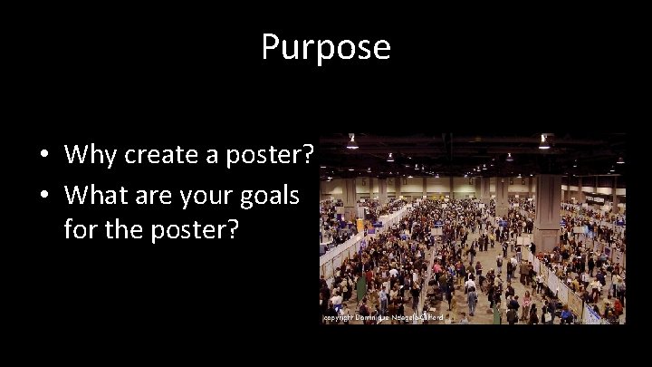
Purpose • Why create a poster? • What are your goals for the poster?

Why create a poster? Goals: 1. Get attention! 2. Generate interest in your work. 3. Present your most interesting findings.

The Swarthmore Challenge Swarthmore students typically use too much text. (faculty too!) “Posters with too many words will cause viewers to just read your figures or, more likely, to avoid your poster altogether. ” Colin Purrington (Former Professor of Biology and poster design expert)

Think about professional ads • Notice how advertisers present material in a supermarket or on posters for shows, and online ads. • A poster is very much like a TV ad – you need to grab the viewer’s attention and give them the critical details that make them want to learn more (and then to talk to you!)

Your poster • After getting the attention of the potential reader, your poster serves as the support material for the story you want to present. • It needs to stand on it’s own too, but too much text will make folks avoid your poster!

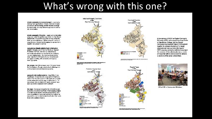
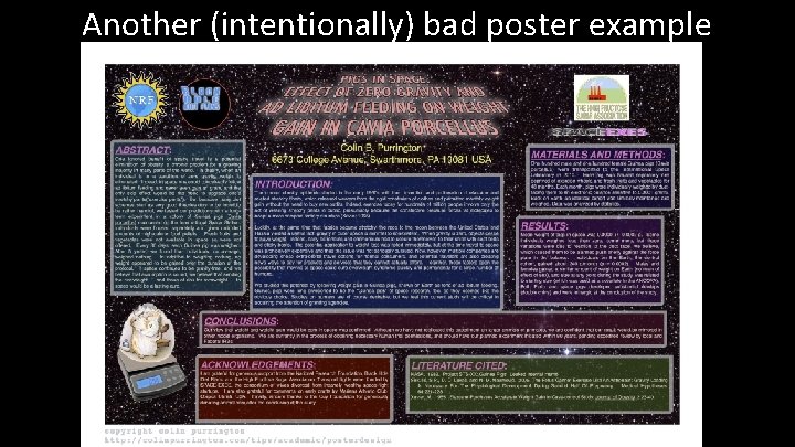
What’s wrong with this one?

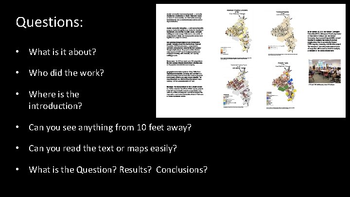
Questions: • What is it about? • Who did the work? • Where is the introduction? • Can you see anything from 10 feet away? • Can you read the text or maps easily? • What is the Question? Results? Conclusions?

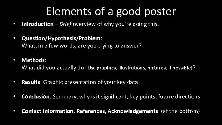
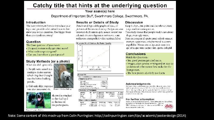
Elements of a good poster • Introduction – Brief overview of why you’re doing this. • Question/Hypothesis/Problem: What, in a few words, are you trying to answer? • Methods: What did you actually do (Use graphics, illustrations, pictures, if possible)? • Results: Graphic presentation of your key data. • Conclusion: Summary, why is it significant, key points, future directions. • Contact information, References, Acknowledgements (at the bottom)

Note: Some content of this mock-up from Colin Purrington: http: //colinpurrington. com/tips/academic/posterdesign (2014)

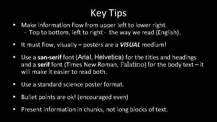
Key Tips • Make information flow from upper left to lower right. - Top to bottom, left to right - the way we read (English). • It must flow, visually – posters are a VISUAL medium! • Use a san-serif font (Arial, Helvetica) for the titles and headings and a serif font (Times New Roman, Palatino) for the body text – it will make it easier to read both. • Use a standard science poster format. • Bullet points are ok! (encouraged even) • Present information in chunks, not long blocks of text.

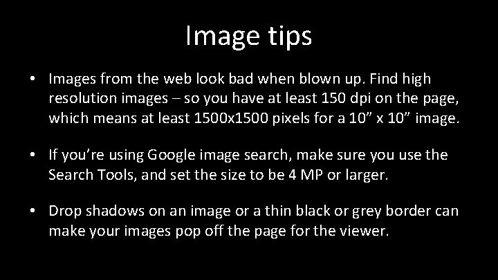
Image tips • Images from the web look bad when blown up. Find high resolution images – so you have at least 150 dpi on the page, which means at least 1500 x 1500 pixels for a 10” x 10” image. • If you’re using Google image search, make sure you use the Search Tools, and set the size to be 4 MP or larger. • Drop shadows on an image or a thin black or grey border can make your images pop off the page for the viewer.

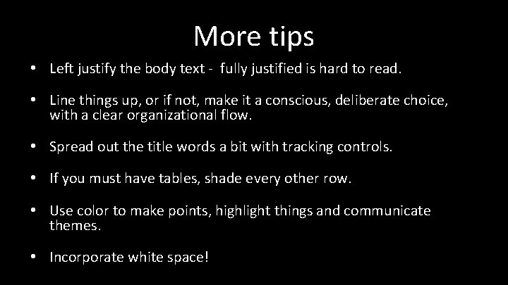
More tips • Left justify the body text - fully justified is hard to read. • Line things up, or if not, make it a conscious, deliberate choice, with a clear organizational flow. • Spread out the title words a bit with tracking controls. • If you must have tables, shade every other row. • Use color to make points, highlight things and communicate themes. • Incorporate white space!

Another (intentionally) bad poster example

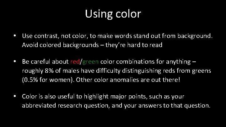
Using color • Use contrast, not color, to make words stand out from background. Avoid colored backgrounds – they’re hard to read • Be careful about red/green color combinations for anything – roughly 8% of males have difficulty distinguishing reds from greens (0. 5% for women). Other color anomalies are out there! • Color is also useful to highlight major points, such as your abbreviated research question, and your answers to that question.

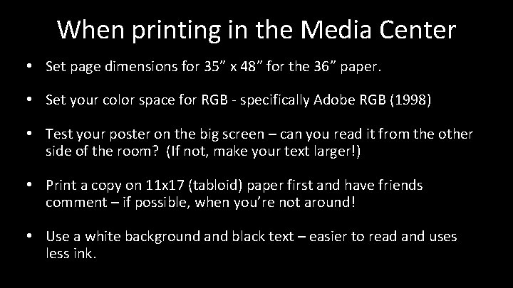
When printing in the Media Center • Set page dimensions for 35” x 48” for the 36” paper. • Set your color space for RGB - specifically Adobe RGB (1998) • Test your poster on the big screen – can you read it from the other side of the room? (If not, make your text larger!) • Print a copy on 11 x 17 (tabloid) paper first and have friends comment – if possible, when you’re not around! • Use a white background and black text – easier to read and uses less ink.

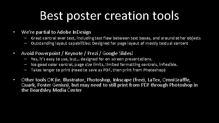
Best poster creation tools • We’re partial to Adobe In. Design • Avoid Powerpoint / Keynote / Prezi / Google Slides! • Other tools OK (ie. Illustrator, Photoshop, Inkscape (free), La. Tex, Omni. Graffle, Quark, Poster Genius), but may need to still print from PDF through Photoshop in the Beardsley Media Center – Great control over text, including text flow between text boxes, and around other objects – Outstanding layout capabilities: Designed for page layout of mostly textual content – Yes, it’s easy to use, but… designed for on screen presentations. – No good color control, page size limits, limited formatting controls, inflexible. – Takes longer to print (need to save as PDF, then print from Photoshop)

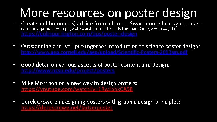
More resources on poster design • Great (and humorous) advice from a former Swarthmore faculty member (2 nd most popular web page at Swarthmore after only the main College web page!): https: //colinpurrington. com/tips/poster-design • Outstanding and well put-together introduction to science poster design: http: //www. aep. cornell. edu/aep/upload/Scientific-Posters-2013 sm. pdf • Good detail on various aspects of poster content and design: http: //www. ncsu. edu/project/posters • Mike Morrison on a new way to design posters: https: //youtube. com/watch? v=1 Rw. Jbhk. CA 58 • Derek Crowe on designing posters with graphic design principles: https: //derekcrowe. net/butterposter

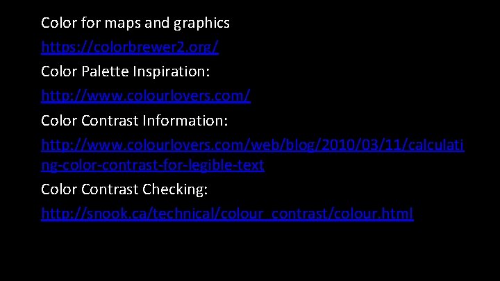
Color for maps and graphics https: //colorbrewer 2. org/ Color Palette Inspiration: http: //www. colourlovers. com/ Color Contrast Information: http: //www. colourlovers. com/web/blog/2010/03/11/calculati ng-color-contrast-for-legible-text Color Contrast Checking: http: //snook. ca/technical/colour_contrast/colour. html

Creative Commons: http: //search. creativecommons. org/ Create your own QR code: http: //qrcode. kaywa. com/