Scientific Inquiry and the Scientific Method Understanding the
- Slides: 27

Scientific Inquiry and the Scientific Method Understanding the World Around Us

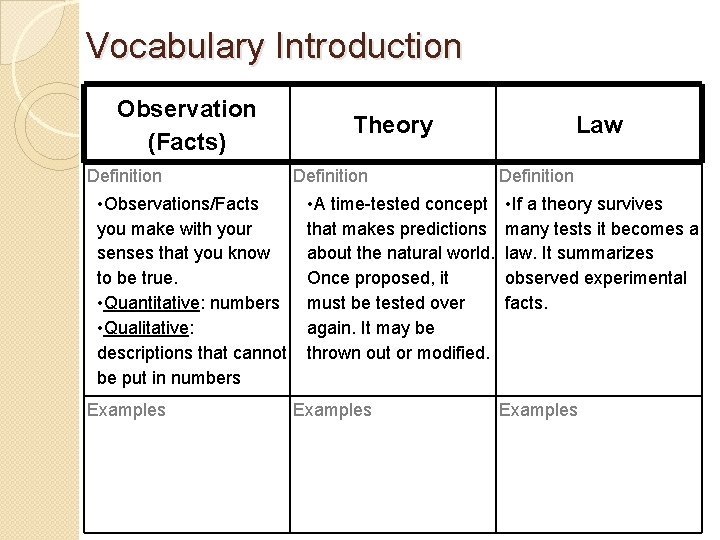
Vocabulary Introduction Observation (Facts) Definition • Observations/Facts you make with your senses that you know to be true. • Quantitative: numbers • Qualitative: descriptions that cannot be put in numbers Examples Theory Definition • A time-tested concept that makes predictions about the natural world. Once proposed, it must be tested over again. It may be thrown out or modified. Examples Law Definition • If a theory survives many tests it becomes a law. It summarizes observed experimental facts. Examples

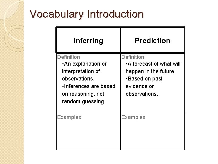
Vocabulary Introduction Inferring Prediction Definition • An explanation or interpretation of observations. • Inferences are based on reasoning, not random guessing Definition • A forecast of what will happen in the future • Based on past evidence or observations. Examples

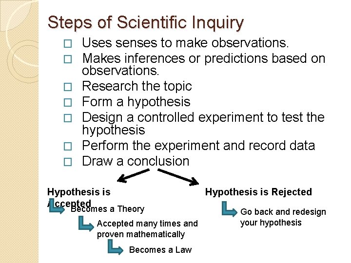
Steps of Scientific Inquiry � � � � Uses senses to make observations. Makes inferences or predictions based on observations. Research the topic Form a hypothesis Design a controlled experiment to test the hypothesis Perform the experiment and record data Draw a conclusion Hypothesis is Accepted Hypothesis is Rejected Becomes a Theory Accepted many times and proven mathematically Becomes a Law Go back and redesign your hypothesis

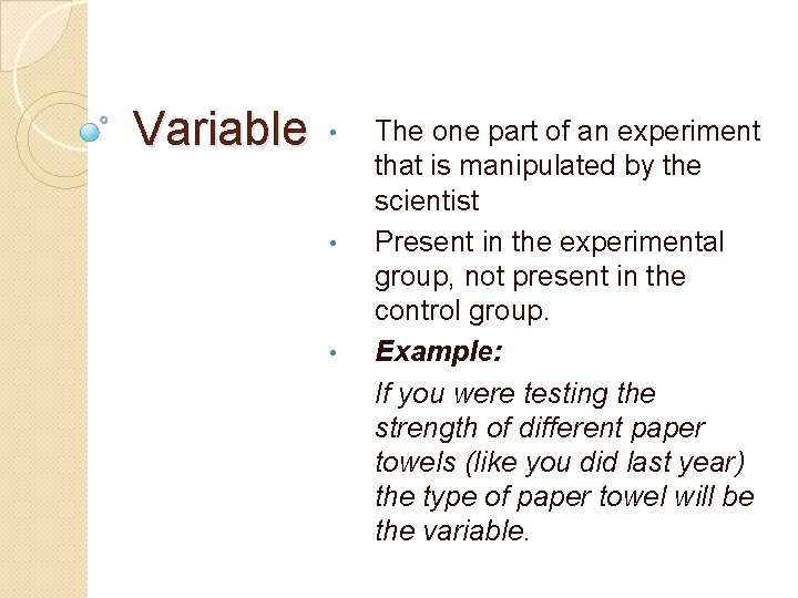
Variable • • • The one part of an experiment that is manipulated by the scientist Present in the experimental group, not present in the control group. Example: If you were testing the strength of different paper towels (like you did last year) the type of paper towel will be the variable.

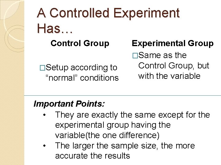
A Controlled Experiment Has… Control Group �Setup according to “normal” conditions Experimental Group �Same as the Control Group, but with the variable Important Points: • They are exactly the same except for the experimental group having the variable(the one difference) • The larger the sample size, the more accurate the results

Describe in detail your control group Describe in detail your experimental group What is the variable (the one difference between the groups)?

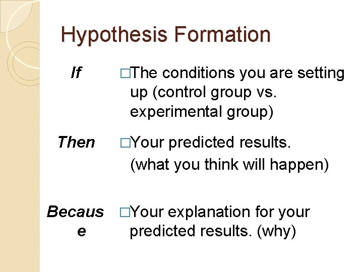
Hypothesis Formation If �The conditions you are setting up (control group vs. experimental group) Then �Your predicted results. (what you think will happen) Becaus �Your explanation for your e predicted results. (why)

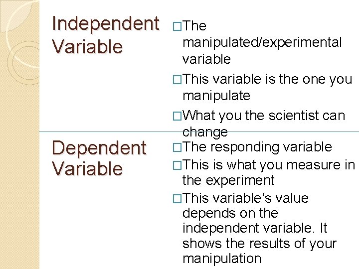
Independent Variable Dependent Variable �The manipulated/experimental variable �This variable is the one you manipulate �What you the scientist can change �The responding variable �This is what you measure in the experiment �This variable’s value depends on the independent variable. It shows the results of your manipulation

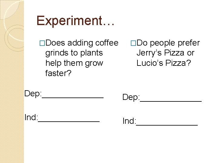
Experiment… �Does adding coffee grinds to plants help them grow faster? �Do people prefer Jerry’s Pizza or Lucio’s Pizza? Dep: _____________ Ind: _____________

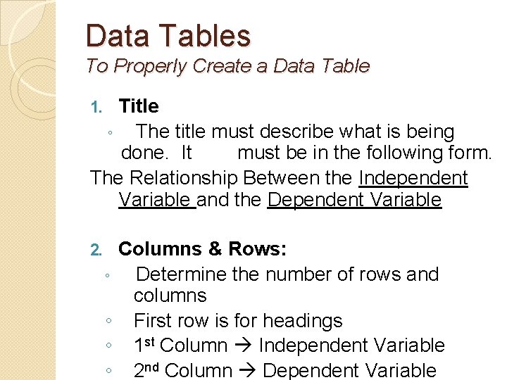
Data Tables To Properly Create a Data Table Title ◦ The title must describe what is being done. It must be in the following form. The Relationship Between the Independent Variable and the Dependent Variable 1. 2. ◦ ◦ Columns & Rows: Determine the number of rows and columns First row is for headings 1 st Column Independent Variable 2 nd Column Dependent Variable

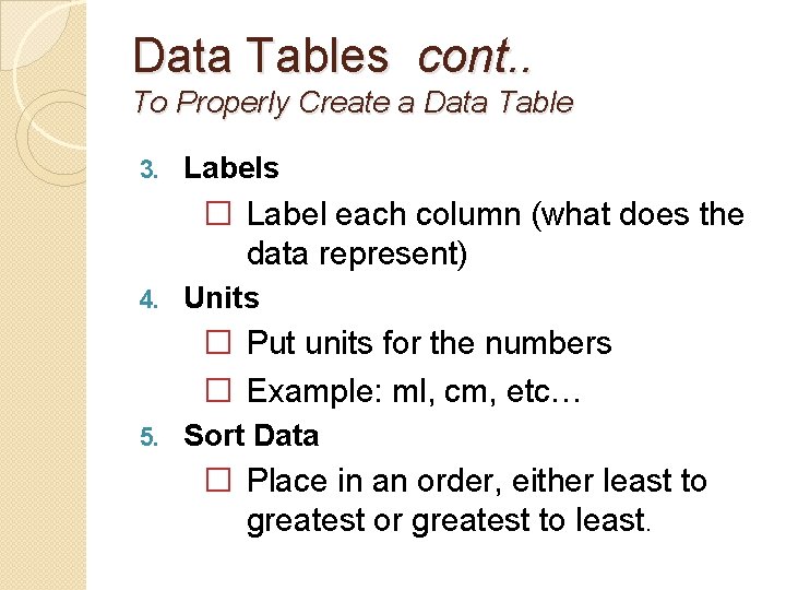
Data Tables cont. . To Properly Create a Data Table 3. Labels � Label each column (what does the data represent) 4. Units � Put units for the numbers � Example: ml, cm, etc… 5. Sort Data � Place in an order, either least to greatest or greatest to least.

Constructing a Graph �Graphs and charts are great because they communicate information visually. Graphs are often used in newspapers, magazines and businesses around the world.

Constructing a Graph… Title: Relationship between the independent variable and the dependent variable. Axis: Independent Variable goes on the x-axis (horizontal) Dependent Variable goes on the y-axis (vertical) Labels & Units: Each axis must have a label and include the units in which you are measuring.

Constructing a Graph… Scaling: Numbering the Grid How to Scale A Graph 1. Count the Spaces in each axis 2. Divide the upper range of data by the number of spaces to get equal intervals on each line.

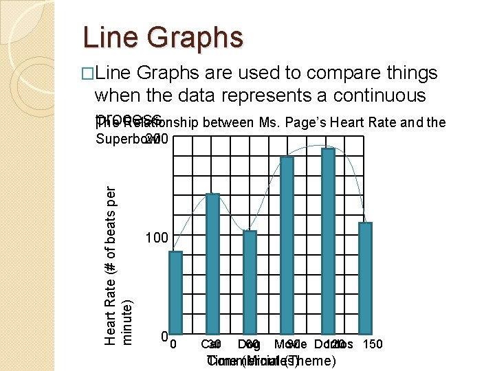
Constructing a Graph cont. . Line Graph vs. Bar Graph • • • Line Graphs are used to compare things when the data represents a continuous process. Bar Graphs are used to graph information that is not continuous. Example: Mrs. Fugarino believes that student’s behavior in class is directly related to the teacher’s hair color. She conducted a study and discovered the following results which are graphed below.


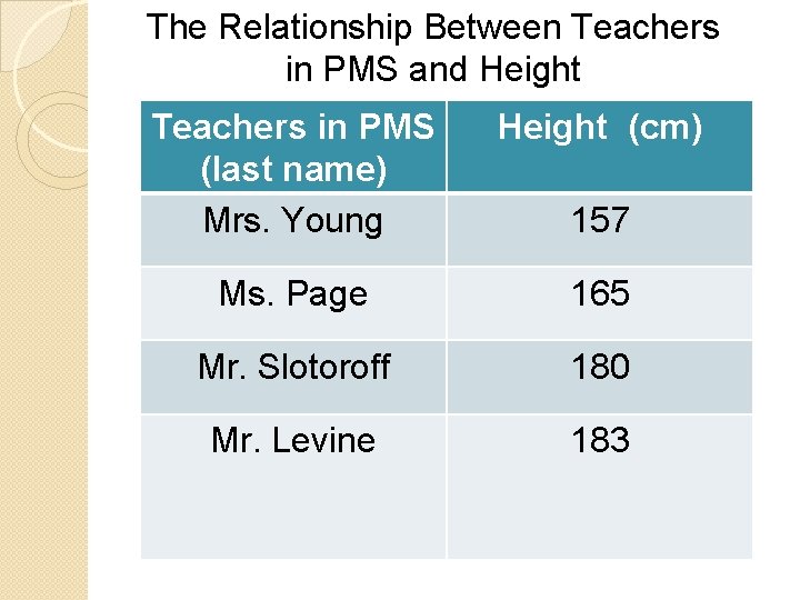
The Relationship Between Teachers in PMS and Height Teachers in PMS (last name) Mrs. Young Height (cm) Ms. Page 165 Mr. Slotoroff 180 Mr. Levine 183 157

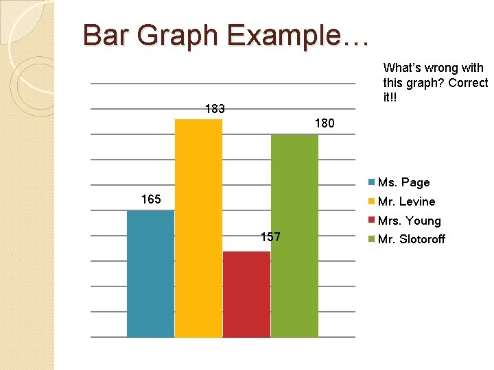
Bar Graph Example… What’s wrong with this graph? Correct it!! 183 180 Ms. Page 165 Mr. Levine Mrs. Young 157 Mr. Slotoroff

Line Graphs �Line Graphs are used to compare things when the data represents a continuous process. The Relationship between Ms. Page’s Heart Rate and the Heart Rate (# of beats per minute) 200 Superbowl 100 0 0 Car 30 Dog 60 Movie 90 Doritos 120 150 Time (Minutes) Commercial (Theme)

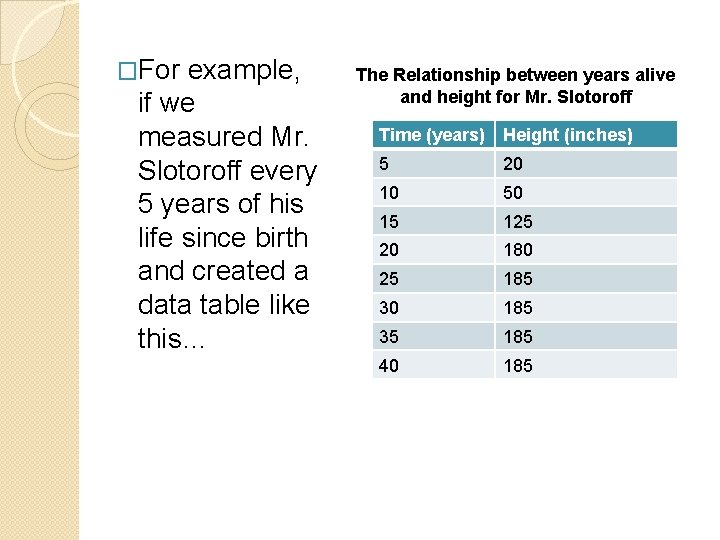
�For example, if we measured Mr. Slotoroff every 5 years of his life since birth and created a data table like this… The Relationship between years alive and height for Mr. Slotoroff Time (years) Height (inches) 5 20 10 50 15 125 20 180 25 185 30 185 35 185 40 185

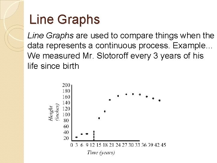
Line Graphs are used to compare things when the data represents a continuous process. Example… We measured Mr. Slotoroff every 3 years of his life since birth

Analyzing a Line Graph Although we did not measure Mr. Slotoroff after 20 tons of chocolate, we can still determine his approximate height at that point. This is called Interpolation • Using the graph to determine values between 2 points of data.

Analyzing a Line Graph We can also figure out how tall he will be after 100 tons of chocolate. We can extend the line graph, which is called Extrapolation. Extrapolatio • Using the graph to determine values n beyond the graph.

Line of Best Fit The points on a line graph can be connected with a line because they represent a continuous relationship. When connecting the dots you are assuming that what happens between the dots is the same pattern as the dots themselves The dots make a pattern or trend. Scientists look at the trend of data, not the individual data points. To better represent the trend of data, they draw a “line of best fit”. This line is a better representation of the trend in the data than you would get connecting the dots

Types of Graphs Histograms � The bars are touching each other � Each bar represents an interval or range ◦ (5 – 10, 10 – 15, etc…)

Graphing Example I think the amount of rain has an effect on the production of corn for high fructose corn syrup (HFS) in all your overly sweetened carbonated and non-carbonated drinks. My results are as follows � 2002 we had 7 cm of rain and produced 45 bushels � 2003 we had 15 cm of rain and produced 60 bushels � 2004 we had 30 cm of rain and produced 20 bushels � 2005 we had 11 cm of rain and produced 50 bushels � 2006 we had 26 cm of rain and produced 48 bushels