School Logo Poster Title Authors and affiliation first

- Slides: 1

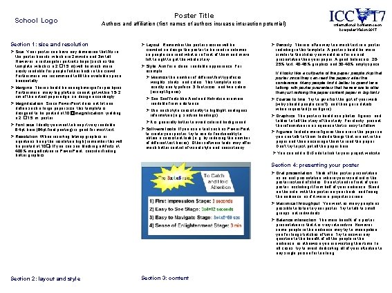
School Logo Poster Title Authors and affiliation (first names of authors increase interaction potential) Section 1: size and resolution Ø Size: Your poster can have any dimension that fits in the poster boards, which are 2 m wide and 3 m tall. However, a rectangular portrait shape (such as this template, which is a 2 � 1. 5 m) will be much more easily readable for people further back in the crowd. Furthermore, we recommend to fill the available space horizontally. Ø Margins: There should be enough margin for pushpins. Furthermore, many big plotters cannot get within 1. 5 -2 cm of the actual paper edge, so design accordingly. Ø Magnification: Since Power. Point does not let one define such a large paper size, this template is designed to be printed at 10 �magnification, yielding a 2 � 1. 5 m poster. Ø Font size: Ideally you want to keep it very readable: 6. 4 pt here (64 pt final printing) is good for most text. Ø Resolution: When inserting bitmap graphics or equations, keep the resolution high (remember this will be printed at 10�). If you can see blocking artifacts at 400% magnification in Power. Point, consider finding better graphics. Ø Layout: Remember the poster session will be crowded so design the poster to be read in columns so people can read what is in front of them and move left to right to get the whole story. Ø Style: Aim for a clean, readable appearance. For example: Ø Minimize the number of different font typefaces, weights, slants, and colors. This template uses exactly one typeface, 3 font sizes, and two colors (except figures). Ø San Serif fonts like Arial and Helvetica are more readable from a distance. Ø Use each style consistently to highlight analogous information (e. g. section headings). Ø It is generally better to avoid colored background. Ø Software tools: If you use a tool such as Power. Point to create your poster, try to use its functionality to obtain a consistent look (e. g. by reducing the number of different text boxes). Other software tools may offer much better control of visual style and consistency. International Conference on Computer Vision 2017 Ø Density: There is often way too much text in a poster, including in this template. A poster should be more similar to the slides you would use for an oral presentation than your paper. A good balance is: 2025% text, 40 -45% graphics and 30 -40% empty space. If it looks like a cut/paste of the paper, people skip that poster since they can read the papers after the conference. Many people find it better to spend time talking with poster presenters that have more to offer than just redoing the paper content paper in big fonts. Ø Coarse to fine: Try to give first the gist of your work (why should people care? ), and then go in details when requested (see figure). Ø Graphics: The poster should use photos, figures, and tables to tell the story of the study. For clarity, present the information in a sequence that is easy to follow. Ø Figures: Include more figures than are in the paper so you can talk to them. Include things that are not in the paper and then encourage them to read the paper. Don’t try to just put all the paper here. Ø You can add a Qr. Code to link to your project website. Section 4: presenting your poster Ø Oral presentation: Think of the poster presentation as an oral presentation, where your visual aid is the poster instead of slides. Do not stand in front of your poster, occluding it from half of your audience. Stand on the side, with the poster on your back, and facing the audience, as if it were a projector screen. Ø Maximize throughput: You want as many people as possible to listen to your poster. Try to talk to small groups, not individuals. Ø Balance interaction: The main benefit of a poster presentation is that it is very interactive. However, some people in the audience may try to monopolize you for long stretches of time. Try to answer any question to the benefit of all the people in the audience, as otherwise you are wasting their time. In all cases, try to avoid dedicating all of your attention to any single person for too long. Section 2: layout and style Section 3: content