Scatterplots and Correlation Section 3 1 Part 1


 • • • Ch. 1 Test A")


- Slides: 18
Scatterplots and Correlation Section 3. 1 Part 1 of 2 Reference Text: The Practice of Statistics, Fourth Edition. Starnes, Yates, Moore
Starter 3. 1 Seven different families drove to their vacation destinations. The table below shows the distance they drove (in miles) and the time it took them (in hours). Represent the data graphically and write a description of the data. Distance 400 411 247 385 229 217 325 Time 6. 5 7 4. 1 6. 5 3. 8 5. 4
Today’s Objectives • Identify variables as explanatory or response variables • (honestly…it’s a fancy way to label independent and dependent variables) • Given a two-variable data set, construct and interpret a scatterplot • Describe an association in terms of: (your new best friend, just like C. U. S. S) • Linear or not (does it look linear or not? !) • Relationship: weak, moderate, strong (are the data points all over the place? ) • Direction: pos or neg (slope!) • Context
Scatterplots • The association between two quantitative variables can be shown on one graph by plotting data points as ordered pairs on axes. Such a graph is called a scatterplot. • Scatter plots do not have connected points • If it seems that one variable is a response to the other, then plot that variable on the y axis. It is called the response variable (dependent variable). • The x axis then has the explanatory variable. (independent variable) 1. Decide which variable should go on each axis. • Remember, the e. Xplanatory variable goes on the X-axis! 2. Label and scale your axes. 3. Plot individual data values.
• Displaying Relationships: Scatterplots Make a scatterplot of the relationship between body weight and pack weight. Body weight (lb) Backpack weight (lb) 120 187 109 103 131 165 158 116 26 30 26 24 29 35 31 28 Scatterplots and Correlation Since Body weight is our e. Xplanatory variable, be sure to place it on the X-axis!
Describing Associations • Four main concepts make up the description of an association between two variables: linear, relationship, direction, and Context. – Linear or not (form): is a description of the shape of the graph • A straight line is typical, but not the only shape possible. – Relationship (strength): is a description of how clearly the data follow the form stated. • The starter had a fairly strong linear pattern; more random dots would have been weaker. – Direction: is positive or negative and agrees with the slope of the line • In positive associations, an increase in the explanatory variable leads to an increase in the response variable – Context: Always report your answers in context of the problem! Communication is HUGE factor in AP Stats • In positive associations, an increase in the explanatory variable leads to an increase in the response variable
• Interpreting Scatterplots and Correlation Outlier ü There is one possible outlier, the hiker with the body weight of 187 pounds seems to be carrying relatively less weight than are the other group members. Strength Direction Form ü There is a moderately strong, positive, linear relationship between body weight and pack weight.
Describing Associations • Four main concepts make up the description of an association between two variables: linear, relationship, direction, and Context. – Linear or not (form): • “this scatter plot does not show a linear pattern” • “ there seems to be a somewhat linear pattern in the graph, (that is, the overall pattern follows a straight line)” • “the form of the relationship is linear. That is, the overall pattern follows a straight line from lower left to upper right” – Relationship (strength): • The overall relationship in the graph is Strong: COMPARE THE TWO VARIABLES • The overall relationship in the graph is Moderately Weak: COMPARE THE TWO VARIABLES • The overall relationship in the graph is Weak: COMPARE THE TWO VARIABLES
Describing Associations • Four main concepts make up the description of an association between two variables: linear, relationship, direction, and Context. – Direction: • Positive: The overall pattern moved from lower left to upper right • Negative: The overall pattern moved from upper left to lower right – Context: Always report your answers in context of the problem! Communication is HUGE factor in AP Stats
• Interpreting Scatterplots Strength Direction Form Consider the SAT example from page 144. Interpret the scatterplot. There is a moderately strong, negative, curved relationship between the percent of students in a state who take the SAT and the mean SAT math score. Further, there are two distinct clusters of states and two possible outliers that fall outside the overall pattern.
SAT Activity • Write your most recent SAT math and verbal scores on a slip of paper and drop in the box as I pass through the room. – NO NAMES PLEASE!! – Clearly state which is math, which is verbal. • Using graph paper, put math on the horizontal axis and verbal on the vertical. – Scales should run from 200 to 800 • As I call out the paired numbers, plot each point on your graph. • Write a description of the association between math and verbal scores.
Today’s Objectives • Identify variables as explanatory or response variables • Given a two-variable data set, construct and interpret a scatterplot • Describe an association in terms of: • Linear or not (does it look linear or not? !) • Relationship: weak, moderate, strong (are the data points all over the place? ) • Direction: pos or neg (slope!) • Context
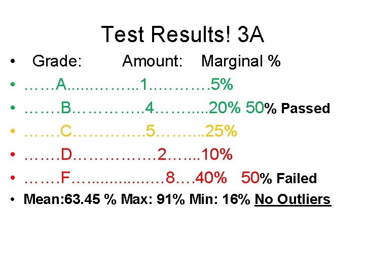
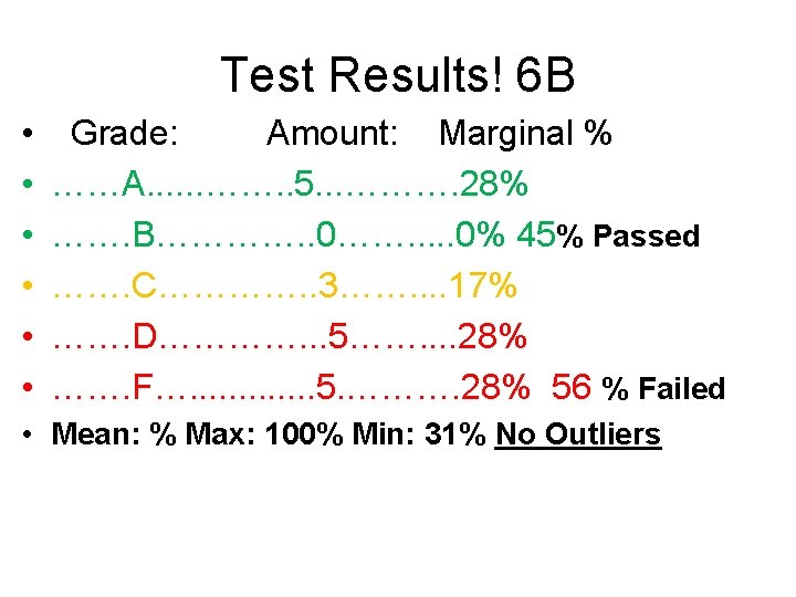
Tracking AP Stats • 2018 -2019 (WHS) • • • Ch. 1 Test A 2/2 B 11/3 C 8/1 D 8/8 F 1/4 Ch. 2 Test A 1/ B 4/ C 5/ D 2/ F 8/ Ch. 3 Test
14/15 VS 15/16 VS 16/17 VS 17/18 VS 18/19 14/15 15/16 16/17 17/18 18/19 Chapter 1 Test A -5 A -7 A-4 B-5 B-9 B-8 B-14 B-12 C-6 C-20 C-14 C-9 C-8 D-2 D-10 D-8 D-16 D-7 F-1 F-9 F-5 F-5
14/15 VS 15/16 AP Stats 14/15 15/16 16/17 17/18 Chapter 1 Test A -5 A -7 A-4 B-5 B-9 B-8 C-6 C-20 D-2 F-1 14/15 15/16 Chapter 2 Test Chapter 5 Test A -5 A- A- A- B-14 B-6 B- B- B- C-14 C-9 C-4 C- C- C- D-10 D-8 D-16 D-1 D- D- D- F-9 F-5 F-2 F- F- F-
Homework 3. 1 Homework Worksheet 3. 1 Additional Homework Start Chapter 3 Reading Guide