
Scatter Plots Vocabulary Describing trends and patterns What
Scatter Plots Vocabulary Describing trends and patterns

What do you notice about the two graphs?

Scatter Plot 1 - Correlation ● Data points seem to all follow a pattern The scatter plot shows a correlation in the data.

Scatter Plot 2 - No Correlation ● Data points are all randomly spread out The scatter plot shows no correlation in the data.
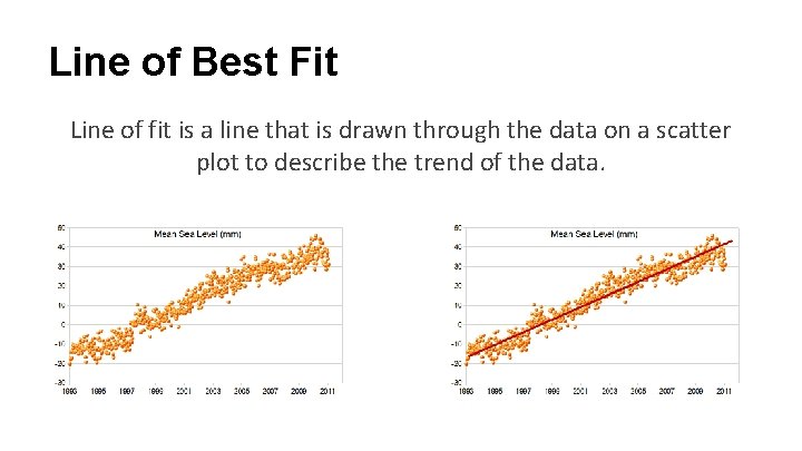
Line of Best Fit Line of fit is a line that is drawn through the data on a scatter plot to describe the trend of the data.

The strength of a correlation can vary

Types of correlation A strong correlation is when a data set closely follows its correlation. The scatter plot shows a strong correlation in the data.
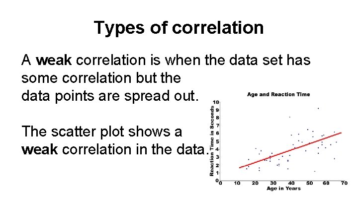
Types of correlation A weak correlation is when the data set has some correlation but the data points are spread out. The scatter plot shows a weak correlation in the data.
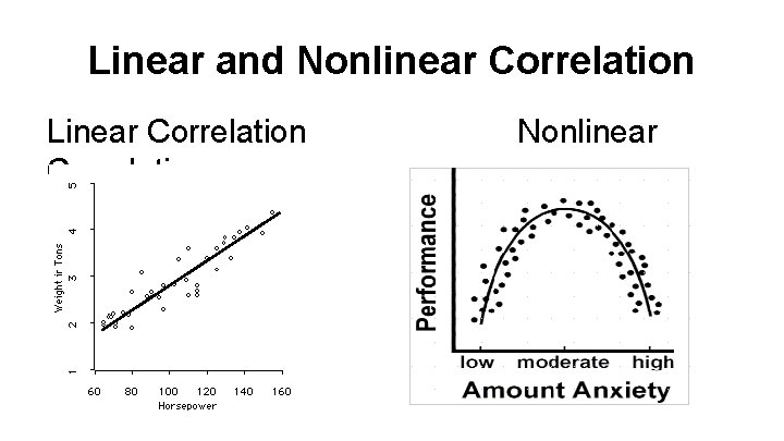
Linear and Nonlinear Correlation Linear Correlation Nonlinear

Slope and Correlation Positive Correlation Negative
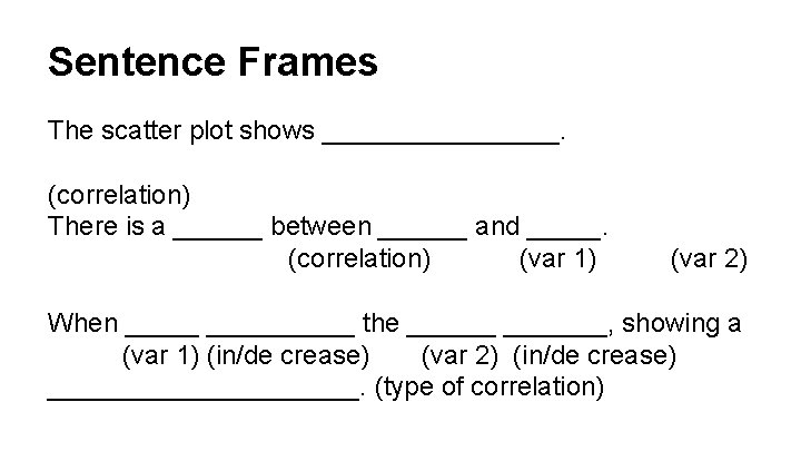
Sentence Frames The scatter plot shows ________. (correlation) There is a ______ between ______ and _____. (correlation) (var 1) (var 2) When __________ the _______, showing a (var 1) (in/de crease) (var 2) (in/de crease) ___________. (type of correlation)
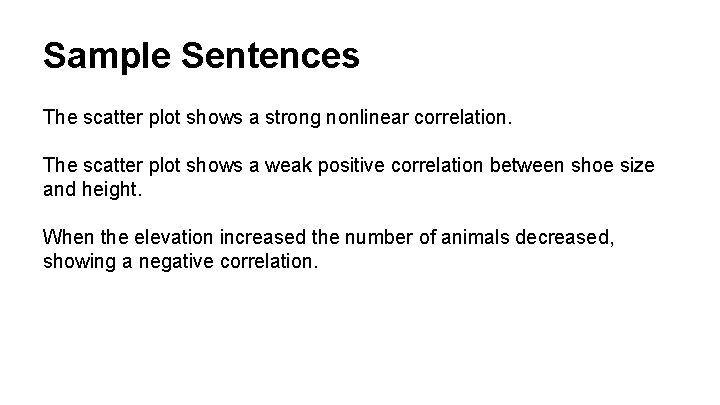
Sample Sentences The scatter plot shows a strong nonlinear correlation. The scatter plot shows a weak positive correlation between shoe size and height. When the elevation increased the number of animals decreased, showing a negative correlation.
- Slides: 12