SCATTER PLOTS Scatter plots are used to graph


 between")
- Slides: 12
SCATTER PLOTS
Scatter plots are used to graph bivariate data because the relationships between the variables can be seen easily. Bivariate data is used to explore the relationship between 2 variables.
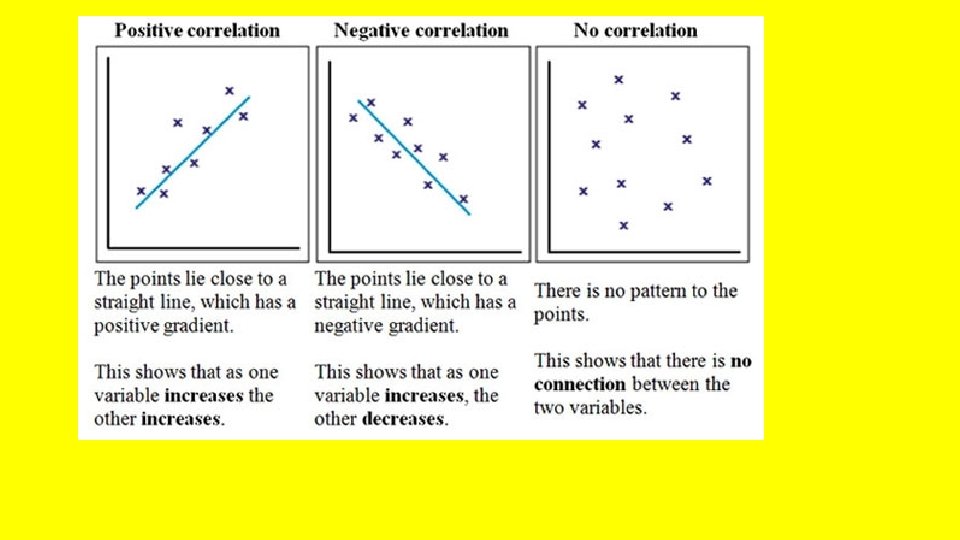
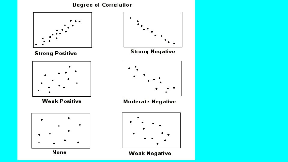
Scatter plots provide a convenient way to determine correlation exists between two variables. whether a ______ positive A _____ correlation occurs when both variables increase. negative A ______ correlation occurs when one variable increases and the other variable decreases. If the data points are randomly scattered there is little _______ or no correlation.
Is there a relationship between the height and weight of an object according to the data plotted in this scatterplot? Explain.
Since all the points appear to move up from left to right, then the graph shows that as the height _______ the weight ________ When both variables increase, the correlation is __________. If the data shows a trend, then a trend line can be drawn to help make predictions.
Is this bivariate data? How do you know? What are the two variables? Does it appear that this bivariate data has a relationship? Explain. If it appears that a correlations exists, then a trend line, or line of best fit can be drawn. Draw a line of best fit in the scatterplot.
If it appears that a correlation exists, then a trend line, or line of best fit can be drawn.
Is this bivariate data? How do you know? What are the variables? Does it appear that this data has a relationship? Explain. Draw a trend line if you see that there may be a correlation or relationship. Lines of best fit can be used to make predictions.
Lines of best fit can be used to make predictions. How much money would you predict would be collected if 40 visitors attended? Explain. How many visitors would you predict attended if $150 was collected? Explain.
Can a best fit line be drawn? Explain. Is there a correlation (relationship) between the bivariate data shown in the scatter plot? What could the variables be?