Scatter Plots Describing Data Patterns http youtu beOyh

Scatter Plots & Describing Data Patterns http: //youtu. be/Oyh. Air 08 y. OI with Ms. Straka and Ms. Tumbleston

Scatter Plots. . . can be described using a variety of terms.
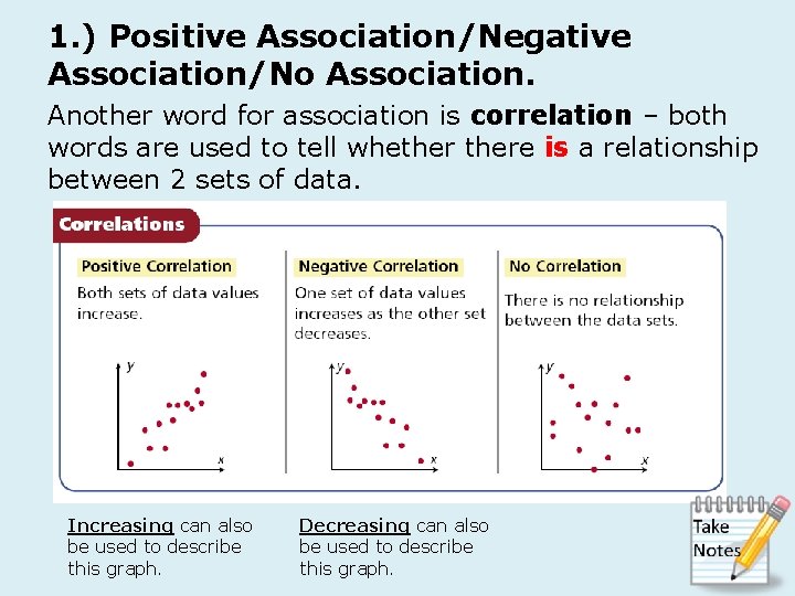
1. ) Positive Association/Negative Association/No Association. Another word for association is correlation – both words are used to tell whethere is a relationship between 2 sets of data. Increasing can also be used to describe this graph. Decreasing can also be used to describe this graph.
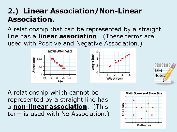
2. ) Linear Association/Non-Linear Association. A relationship that can be represented by a straight line has a linear association. (These terms are used with Positive and Negative Association. ) A relationship which cannot be represented by a straight line has a non-linear association. (This term is used with No Association. )
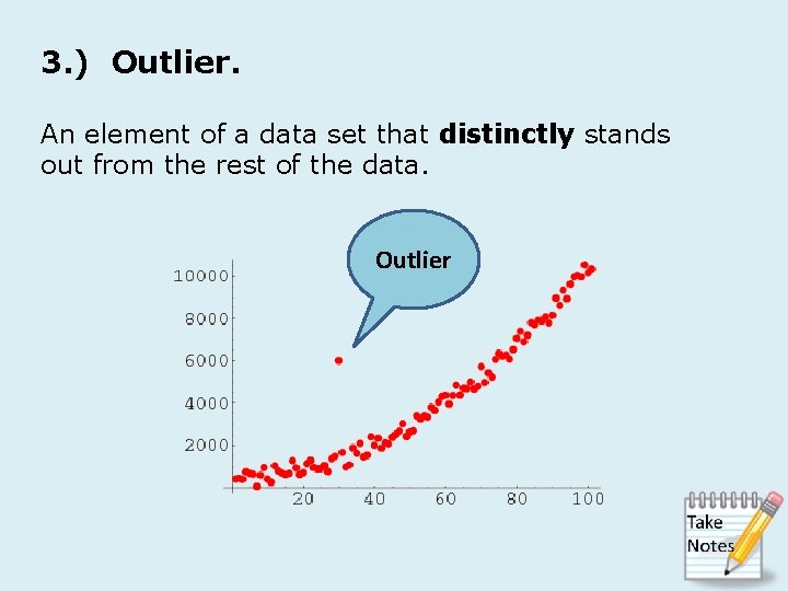
3. ) Outlier. An element of a data set that distinctly stands out from the rest of the data. Outlier

Commercial Break. . . Mayim Bialik, the star of The Big Bang Theory and 90’s sitcom Blossom, earned a Ph. D. in neuroscience at UCLA. She really is a neuroscientist just like the character she plays on The Big Bang Theory. Mayim Bialik
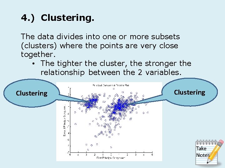
4. ) Clustering. The data divides into one or more subsets (clusters) where the points are very close together. • The tighter the cluster, the stronger the relationship between the 2 variables. Clustering
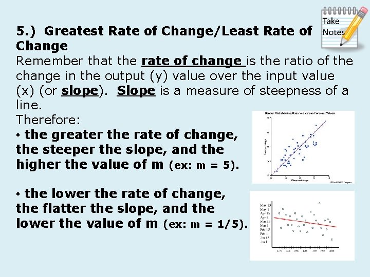
5. ) Greatest Rate of Change/Least Rate of Change Remember that the rate of change is the ratio of the change in the output (y) value over the input value (x) (or slope). Slope is a measure of steepness of a line. Therefore: • the greater the rate of change, the steeper the slope, and the higher the value of m (ex: m = 5). • the lower the rate of change, the flatter the slope, and the lower the value of m (ex: m = 1/5).
6. ) Initial Value • The starting point or beginning value in the situation. It is the y-intercept (b).
- Slides: 9