SCATTER PLOTS AND SMOOTHING An Example Car Stopping


- Slides: 19
SCATTER PLOTS AND SMOOTHING
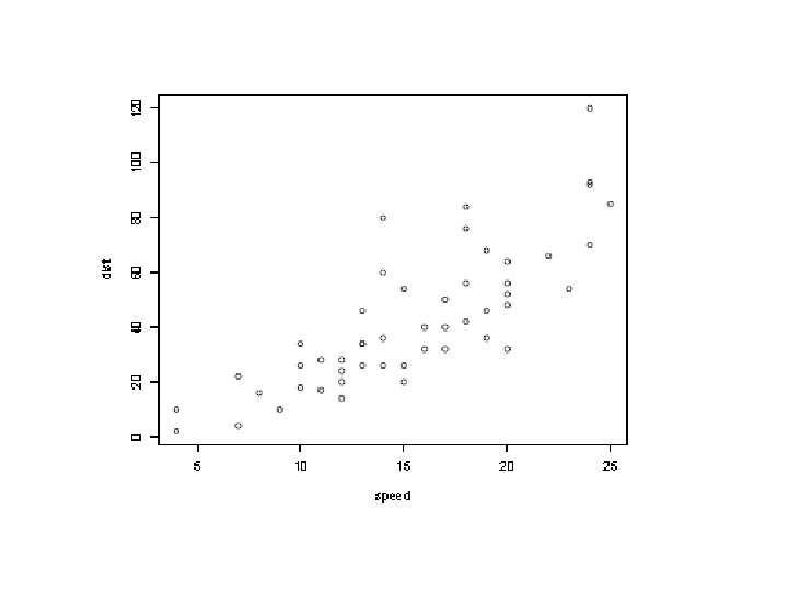
An Example – Car Stopping Distances • An experiment was conducted to measure how the stopping distance of a car depends on its speed. • The experiment used a random selection of cars and a variety of speeds. • The measurements are contained in the R data set “cars, ” which can be loaded with the command: data(cars)
Graphical Investigation • We are going to use the value to investigate the relationship between speed and stopping distance. • The best way to investigate the relationship between two related variables is to simply plot the pairs of values (Scatter plot). • The basic plot is produced with plot. > data(cars) > attach(cars) > plot(speed, dist) • Using default labels is fine for exploratory work, but not for publication.
Car Stopping Distances – Imperial Units
Car Stopping Distances – Metric Units
Comments • There is a general trend for stopping distance to increase with speed. • There is evidence that the variability in the stopping distances also increases with speed. • It is difficult to be more precise about the form of the relationship by just looking at the scatter of points.
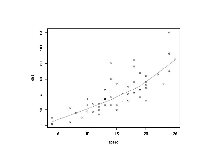
Scatterplot Smoothing • One way to try to uncover the nature of the relationship is to add a line which conveys the basic trend in the plot. • This can be done using a technique known as scatterplot smoothing. • R has a smoothing procedure called LOWESS which can be used to add the trend line. • LOWESS is a relatively complicated procedure, but it is easy to use. plot(speed, dist) lines(lowess(speed, dist))
Mathematical Modelling • While the curve obtained by the LOWESS lets us read off the kind of stopping distance we can expect for a given speed, it does not help understanding why the relationship is the way it is. • It is possible to use the data to try to fit a well defined mathematical curve to the data points. This suffers from the same difficulty. • It is much better to try to understand the mechanism which produced the data.
Conclusions • The “smooth” confirms that stopping distance increases with speed, but it gives us more detail. • The relationship is not of the form y = a+bx but has an unknown mathematical form. • If we are just interested in determining the stopping distance we can expect for a given speed this doesn’t matter. • We can just read the answer off the graph.
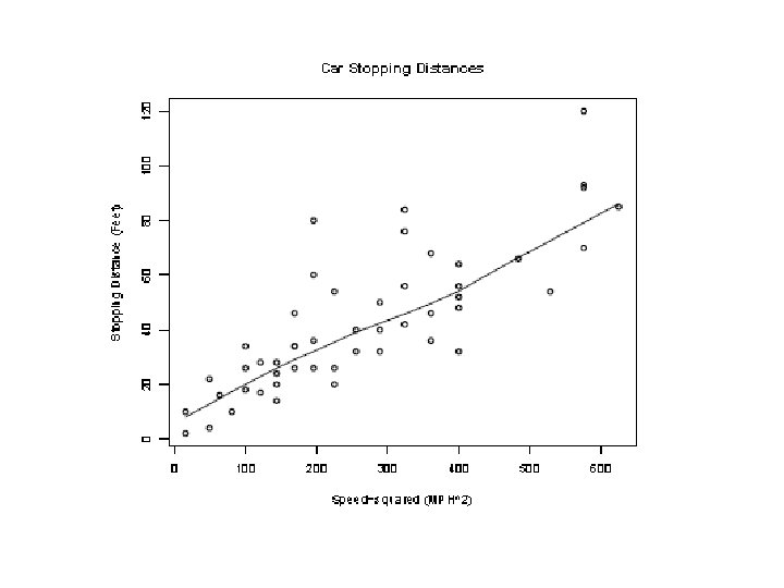
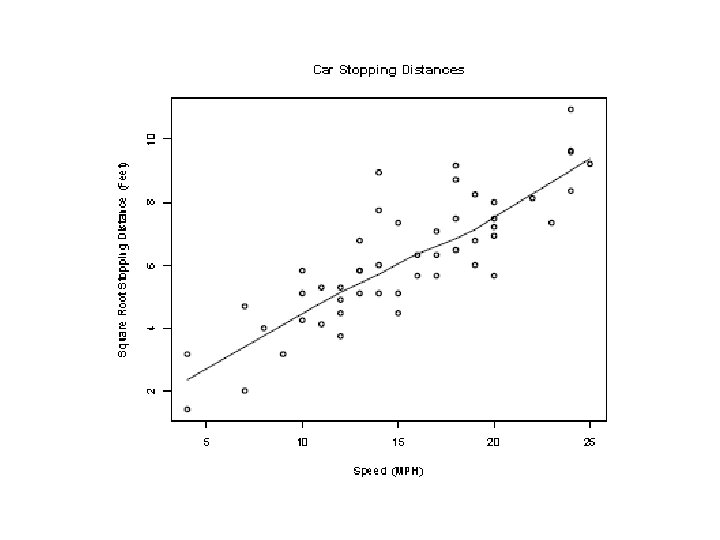
Using Plots • We can check whether these are really the underlying relationships with scatterplots. • Either plot distance against speed-squared or plot the square-root of distance against speed.
Producing the Plots > plot(speed^2, dist, main = "Car Stopping Distances", xlab = "Speed-squared (MPH^2)", ylab = "Stopping Distance (Feet)") > lines(lowess(speed^2, dist)) > plot(speed, sqrt(dist), main = "Car Stopping Distances", xlab = "Speed (MPH)", ylab = "Square Root Stopping Distance (Feet)") > lines(lowess(speed, sqrt(dist)))
Conclusions • Both the plots indicate that there is close to a straight line relationship between speedsquared and distance. • From a statistical point-of-view, the second plot is preferable because the scatter of points about the line is independent of speed. (i. e. it is possible to compare apples with apples).
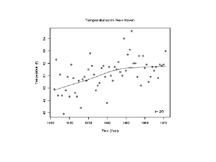
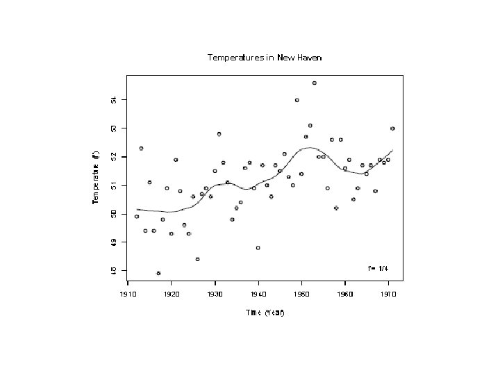
Controlling The Amount of Smoothing • The amount of smoothing in lowess is controlled by and optional argument called “f. ” • This gives the fraction of the data which will be used as “neighbours” of a given point, when computing the smoothed value at that point. • The default value of f is 2/3. • The following examples will show the effect of varying the value of f. > lines(lowess(nhtemp, f = 2/3)) > lines(lowess(nhtemp, f = 1/4))