SCATTER PLOTS AND EQUATIONS OF LINES FIRST THE








- Slides: 32

SCATTER PLOTS AND EQUATIONS OF LINES

FIRST THE DATA • Data must be collected and organized. • For this example, you will be asked to write down some data about people you may know. • Use your best estimate, even if you do not know that person. • Decide quickly, and write it down.

HOW OLD ARE THEY, REALLY?

Mick Jagger

Ashley Tisdale

Keanu Reeves

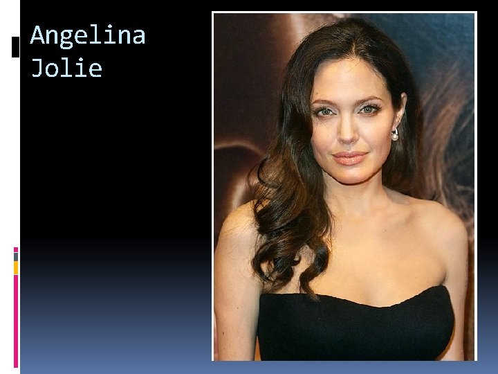
Angelina Jolie

Justin Timberlake

Cher

Jamie Foxx

Taylor Swift

Tony Hawk

Hillary Duff

Hugh Jackman

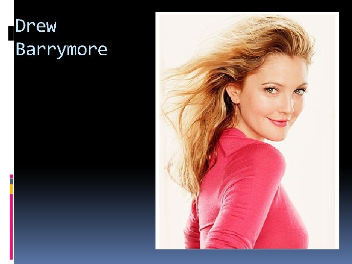
Drew Barrymore

George Clooney

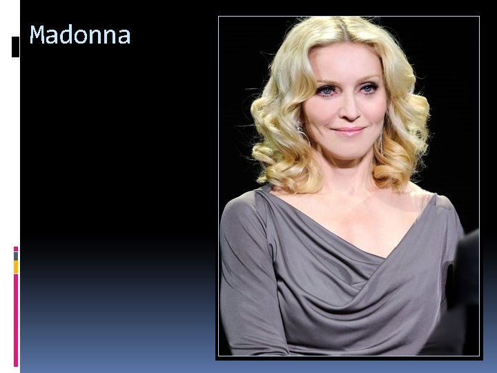
Madonna

Tom Cruise

Jennifer Aniston

Johnny Depp

Julia Roberts

Jay Leno

Paula Abdul

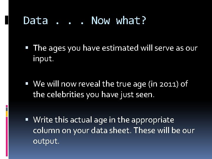
Data. . . Now what? The ages you have estimated will serve as our input. We will now reveal the true age (in 2011) of the celebrities you have just seen. Write this actual age in the appropriate column on your data sheet. These will be our output.

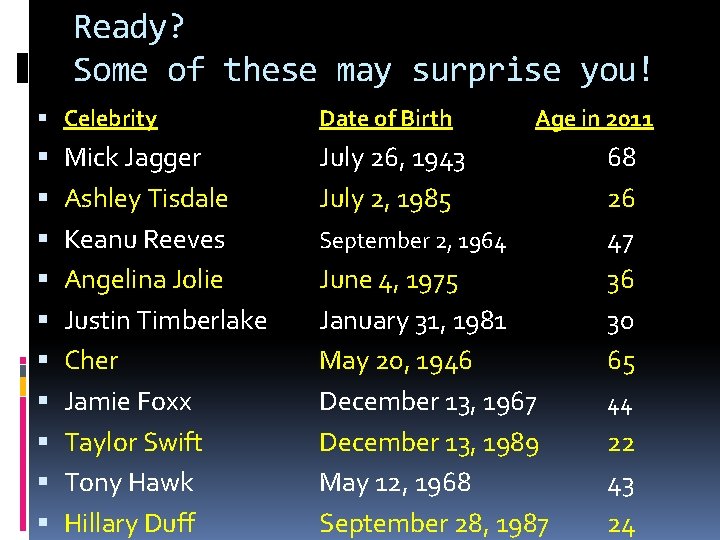
Ready? Some of these may surprise you! Celebrity Mick Jagger Ashley Tisdale Keanu Reeves Angelina Jolie Justin Timberlake Cher Jamie Foxx Taylor Swift Tony Hawk Hillary Duff Date of Birth Age in 2011 July 26, 1943 July 2, 1985 September 2, 1964 June 4, 1975 January 31, 1981 May 20, 1946 December 13, 1967 December 13, 1989 May 12, 1968 September 28, 1987 68 26 47 36 30 65 44 22 43 24

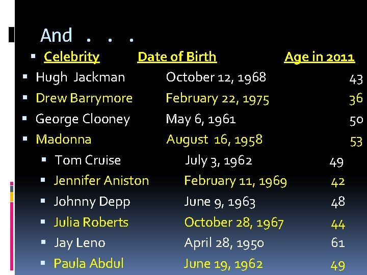
And. . . Celebrity Date of Birth Age in 2011 Hugh Jackman October 12, 1968 43 Drew Barrymore February 22, 1975 36 George Clooney May 6, 1961 50 Madonna August 16, 1958 53 Tom Cruise July 3, 1962 49 Jennifer Aniston February 11, 1969 42 Johnny Depp June 9, 1963 48 Julia Roberts October 28, 1967 44 Jay Leno April 28, 1950 61 Paula Abdul June 19, 1962 49

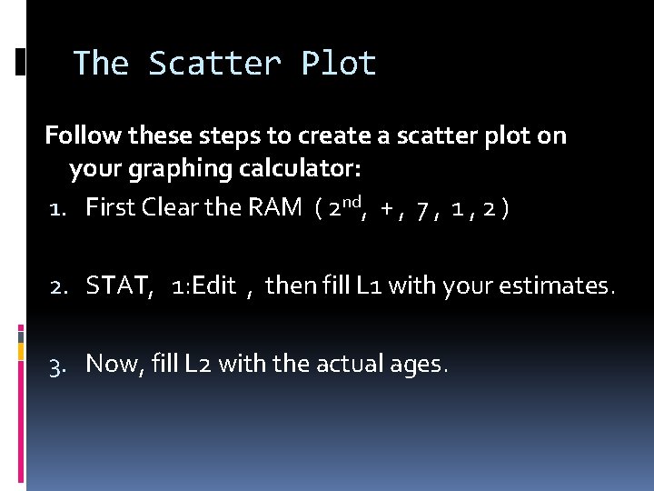
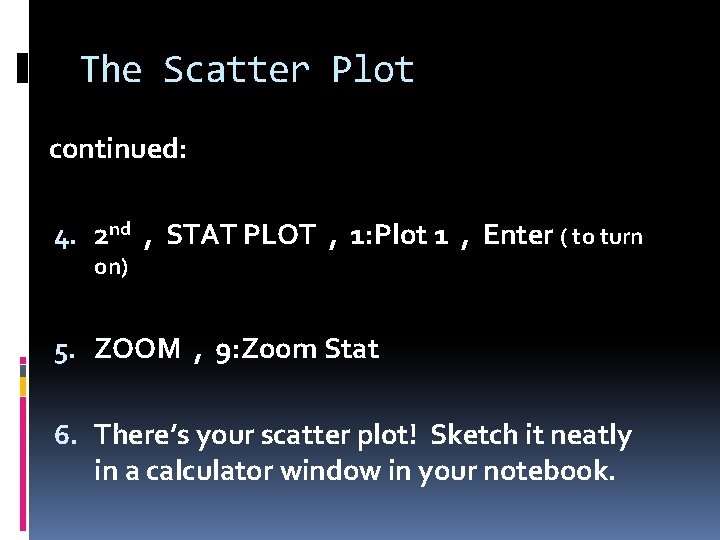
The Scatter Plot Follow these steps to create a scatter plot on your graphing calculator: 1. First Clear the RAM ( 2 nd, + , 7 , 1 , 2 ) 2. STAT, 1: Edit , then fill L 1 with your estimates. 3. Now, fill L 2 with the actual ages.

The Scatter Plot continued: 4. 2 nd , STAT PLOT , 1: Plot 1 , Enter ( to turn on) 5. ZOOM , 9: Zoom Stat 6. There’s your scatter plot! Sketch it neatly in a calculator window in your notebook.

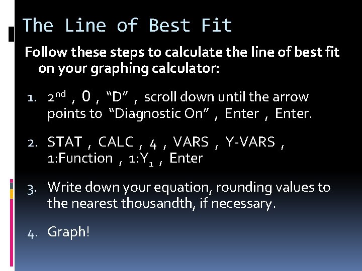
The Line of Best Fit Follow these steps to calculate the line of best fit on your graphing calculator: 1. 2 nd , 0 , “D” , scroll down until the arrow points to “Diagnostic On” , Enter. 2. STAT , CALC , 4 , VARS , Y-VARS , 1: Function , 1: Y 1 , Enter 3. Write down your equation, rounding values to the nearest thousandth, if necessary. 4. Graph!

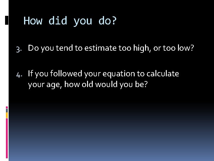
How did you do? 3. Do you tend to estimate too high, or too low? 4. If you followed your equation to calculate your age, how old would you be?

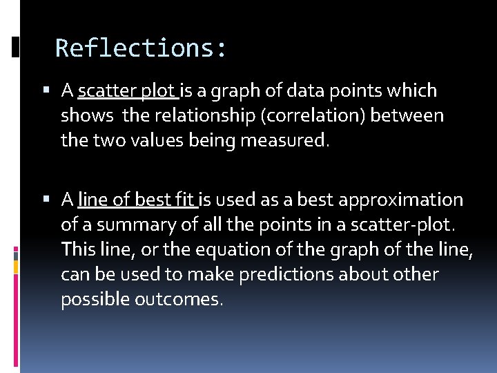
Reflections: A scatter plot is a graph of data points which shows the relationship (correlation) between the two values being measured. A line of best fit is used as a best approximation of a summary of all the points in a scatter-plot. This line, or the equation of the graph of the line, can be used to make predictions about other possible outcomes.

Reflections: The correlation coefficient is a measure of how well the predicted values, or estimates, "fit" with the reallife data. The correlation coefficient (r 2) is a number between 0 and 1. If there is no relationship between the predicted values and the actual values, the correlation coefficient is very low. A value of 0 would mean that the predicted values are no better than random numbers. A perfect fit gives a coefficient of 1. 0 and means that the output is 100% predictable by the input using the equation of the line of regression.