Scatter Plots and Equations of Lines ALGEBRA 1
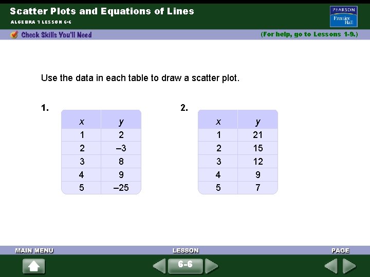
Scatter Plots and Equations of Lines ALGEBRA 1 LESSON 6 -6 (For help, go to Lessons 1 -9. ) Use the data in each table to draw a scatter plot. 1. 2. x 1 2 3 4 5 y 2 – 3 8 9 – 25 x 1 2 3 4 5 6 -6 y 21 15 12 9 7
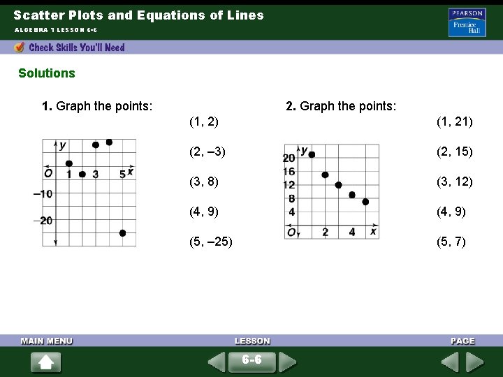
Scatter Plots and Equations of Lines ALGEBRA 1 LESSON 6 -6 Solutions 1. Graph the points: 2. Graph the points: (1, 2) (1, 21) (2, – 3) (2, 15) (3, 8) (3, 12) (4, 9) (5, – 25) (5, 7) 6 -6
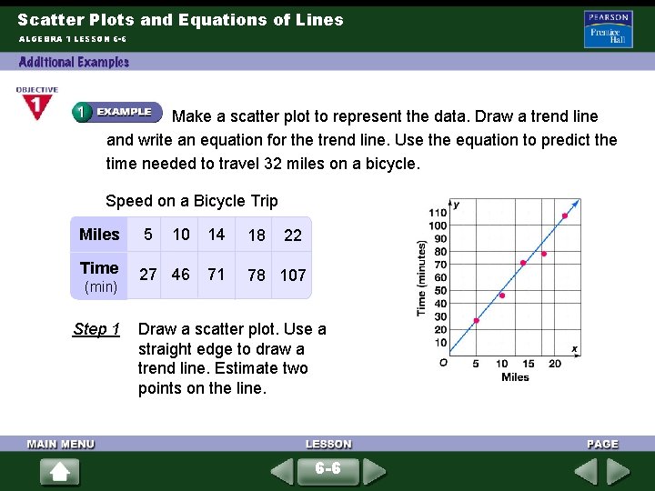
Scatter Plots and Equations of Lines ALGEBRA 1 LESSON 6 -6 Make a scatter plot to represent the data. Draw a trend line and write an equation for the trend line. Use the equation to predict the time needed to travel 32 miles on a bicycle. Speed on a Bicycle Trip Miles 5 10 14 18 Time 27 46 71 78 107 (min) Step 1 22 Draw a scatter plot. Use a straight edge to draw a trend line. Estimate two points on the line. 6 -6
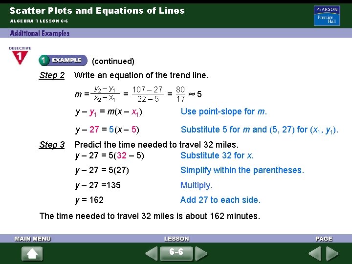
Scatter Plots and Equations of Lines ALGEBRA 1 LESSON 6 -6 (continued) Step 2 Write an equation of the trend line. y 2 – y 1 m= x –x = 2 1 Step 3 80 107 – 27 = 17 22 – 5 5 y – y 1 = m(x – x 1) Use point-slope for m. y – 27 = 5(x – 5) Substitute 5 for m and (5, 27) for (x 1, y 1). Predict the time needed to travel 32 miles. y – 27 = 5(32 – 5) Substitute 32 for x. y – 27 = 5(27) Simplify within the parentheses. y – 27 =135 Multiply. y = 162 Add 27 to each side. The time needed to travel 32 miles is about 162 minutes. 6 -6
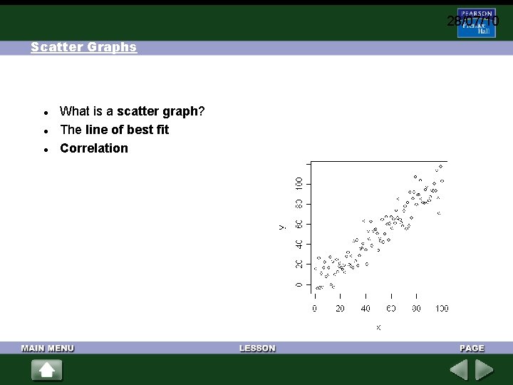
28/07/10 Scatter Graphs What is a scatter graph? The line of best fit Correlation
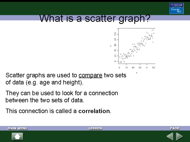
What is a scatter graph? Scatter graphs are used to compare two sets of data (e. g. age and height). They can be used to look for a connection between the two sets of data. This connection is called a correlation.
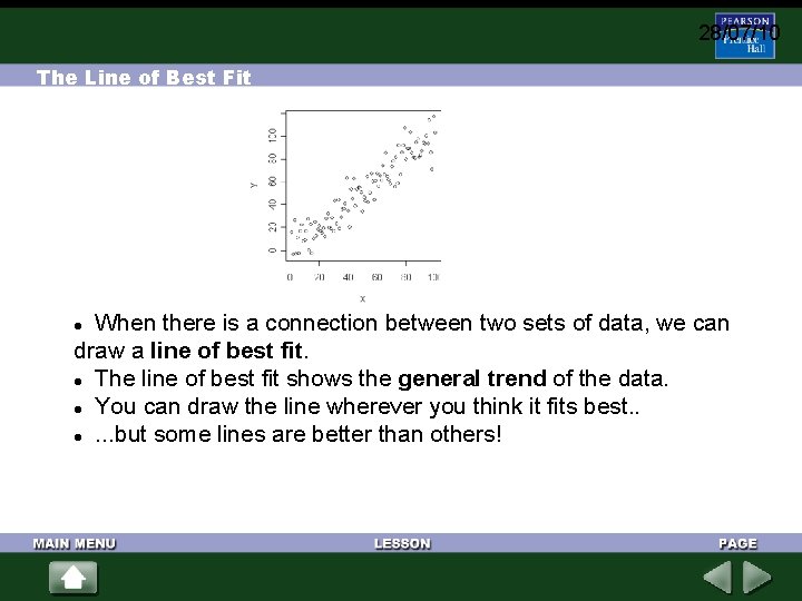
28/07/10 The Line of Best Fit When there is a connection between two sets of data, we can draw a line of best fit. The line of best fit shows the general trend of the data. You can draw the line wherever you think it fits best. . . but some lines are better than others!
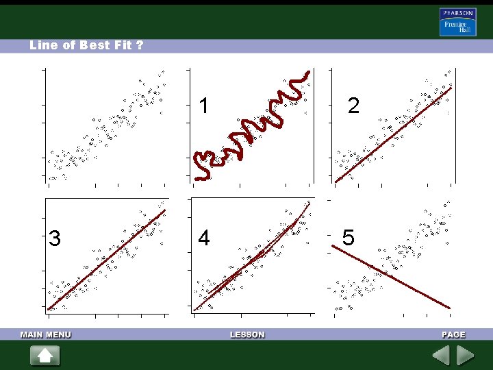
Line of Best Fit ? 3 1 2 4 5
Lines of Best Fit Do you agree or disagree with each statement? 1. The line should go through all of the points. 2. It is always easy to see where the line should go. 3. The line must go from bottom left to top right. 4. There should be about the same number of points above the line as below it. 5. There is always only one correct line for each graph. 6. The line should go through as many points as possible. 7. The line must go through zero.
Lines of Best Fit Do you agree or disagree with each statement? 1. The less 'scatter' there is about the line, the stronger the relationship is between the two sets of data. 2. A line going up (from left to right) shows that as one quantity increases, so does the other. 3. If there are more points on the graph, it is harder to tell whether or not there is a correlation.
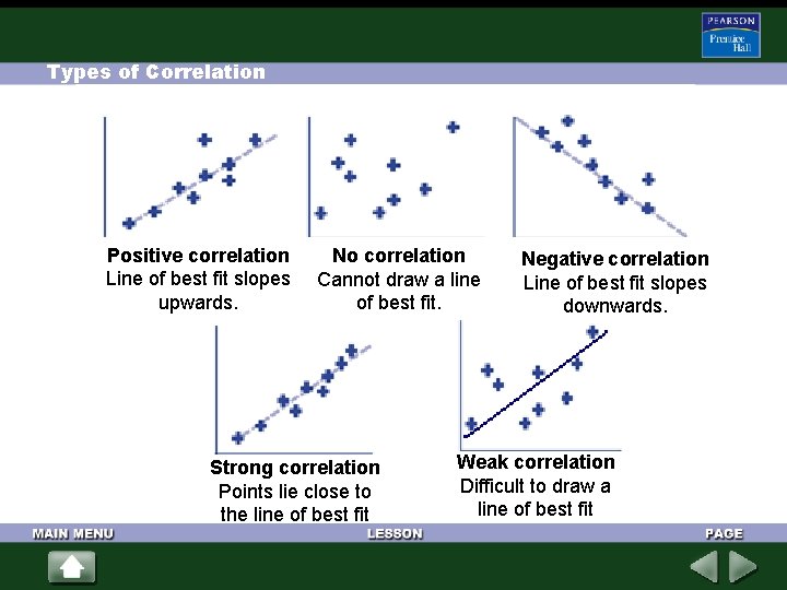
Types of Correlation Positive correlation Line of best fit slopes upwards. No correlation Cannot draw a line of best fit. Strong correlation Points lie close to the line of best fit Negative correlation Line of best fit slopes downwards. Weak correlation Difficult to draw a line of best fit
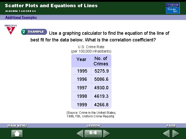
Scatter Plots and Equations of Lines ALGEBRA 1 LESSON 6 -6 Use a graphing calculator to find the equation of the line of best fit for the data below. What is the correlation coefficient? U. S. Crime Rate (per 100, 000 inhabitants) Year No. of Crimes 1995 5275. 9 1996 5086. 6 1997 4930. 0 1998 4619. 3 1999 4266. 8 [Source: Crime in the United States, 1999, FBI, Uniform Crime Reports] 6 -6
Scatter Plots and Equations of Lines ALGEBRA 1 LESSON 6 -6 (continued) Step 1 Use Desmos table feature on the graphing calculator. Enter the data for years and then enter data for crimes. Step 2 Use the y 1~mx 1+b to create an equation for best fit line. The equation for the line of best fit is y = – 248. 55 x + 501190 for values a and b rounded to the nearest hundredth. The value of the correlation coefficient is – 0. 9855. 6 -6
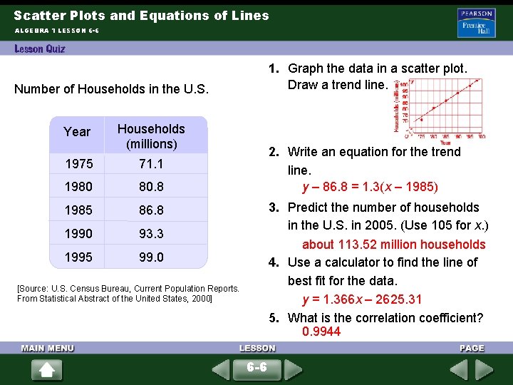
Scatter Plots and Equations of Lines ALGEBRA 1 LESSON 6 -6 1. Graph the data in a scatter plot. Draw a trend line. Number of Households in the U. S. Year Households (millions) 1975 71. 1 1980 80. 8 1985 86. 8 1990 93. 3 1995 99. 0 2. Write an equation for the trend line. y – 86. 8 = 1. 3(x – 1985) 3. Predict the number of households in the U. S. in 2005. (Use 105 for x. ) about 113. 52 million households 4. Use a calculator to find the line of best fit for the data. y = 1. 366 x – 2625. 31 5. What is the correlation coefficient? 0. 9944 [Source: U. S. Census Bureau, Current Population Reports. From Statistical Abstract of the United States, 2000] 6 -6
- Slides: 14